Collection of 60s Advertising
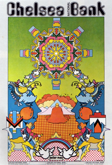
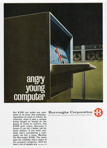
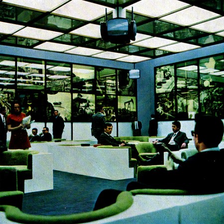
Just found a nice size collection of 1960’s Advertising from around the world on Flickr, plenty more photos of exhibitions, typefaces, tv ad’s, and print.


Just found a nice size collection of 1960’s Advertising from around the world on Flickr, plenty more photos of exhibitions, typefaces, tv ad’s, and print.
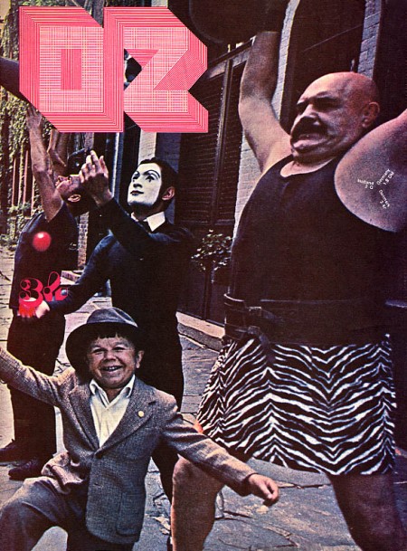
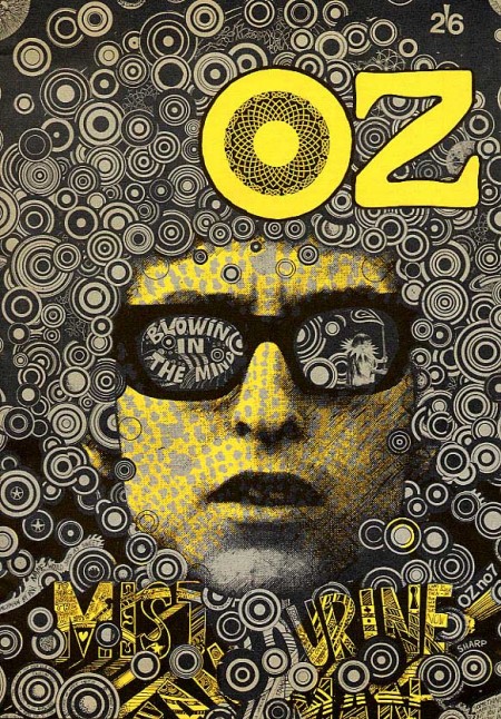
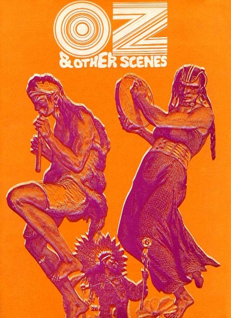
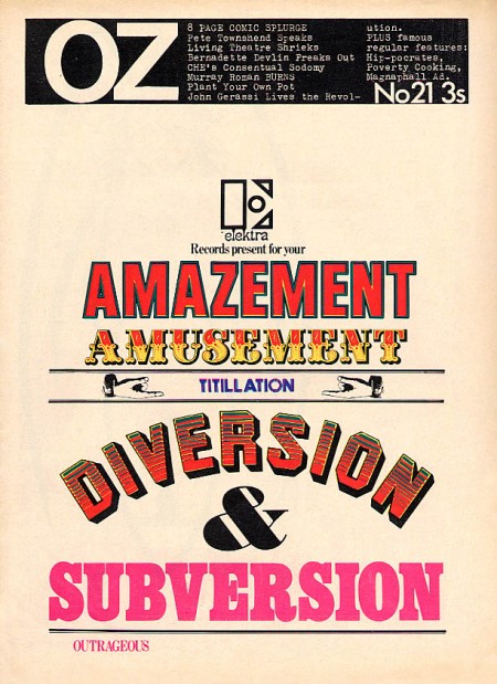
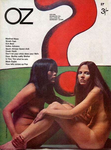
I love the 60’s because everyone was tripping balls all the time and then they would come out with crazy magazines to prove it. Case in point: OZ. These covers need no explanation, they are simply incredible. The overall idea of the magazine is definitely reminiscent of Avant Garde, but a lot of Herb Lubalin’s work seems somewhat tame and reserved compared with the over the top stuff (at least for the time) we see in OZ. My favorite cover is the one featuring The Doors “Strange Days” album photo with maybe the most awesome magazine logo ever slapped right on top of it. Also, the date and cover info are printed in the weight lifter’s armpit so that’s a bonus. It must have been nice back then when all you had to do to “freak out the establishment” was put some naked girls or a midget with circus people on your cover.
OZ started out as an Australian satirical humor magazine but then moved to the UK and began life anew as a “psychedelic hippy” magazine (I am sure the genre was overflowing at the time). Featuring art by Hapshash and the Coloured Coat and design direction by Martin Sharp, issues of OZ have become collectors items in the years since it’s demise [source].
You can browse cover scans of all the of UK issues of OZ here. On a side note, Google books features the some of the text of “Graphic Design: Reproduction & Representation Since 1800” which makes mention of OZ and Sharp.
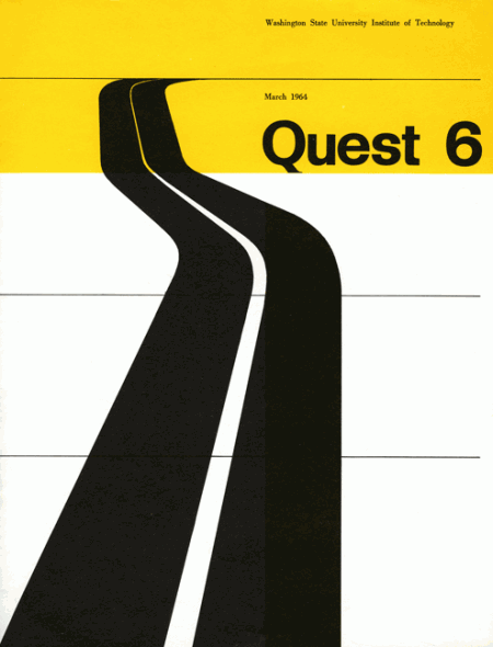
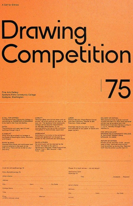
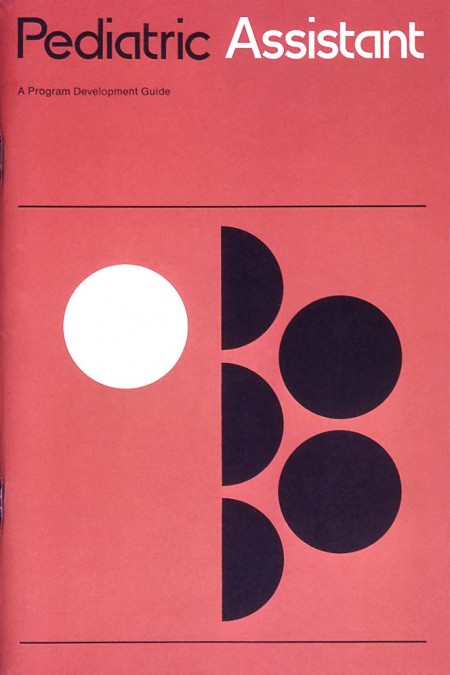
Ellen McFadden (aka Alki1) has the best design-related Flickr stream out there. Her husband, Irwin McFadden, did some amazing design during the 60’s and 70’s and Mrs. McFadden was kind enough to post up some examples on her Flickr. Bonus: Name that Bauhaus-eque font.