We’re proud to be allowed to be streaming the new Gold Panda album for the ISO50 readers. If you love the record be sure to support it physically, this one should be around for years to come. Below is a more detailed description/story around the album but if you want just the music then enjoy above.
Nearly three years after the release of his debut album Lucky Shiner, Gold Panda returns with his second album Half Of Where You Live, to be released on Ghostly International and his own NOTOWN label (UK). The album is the product of a period spent touring the world multiple times around, absorbing influences and probing potential new avenues of creative exploration.
Half Of Where You Live represents a stylistic and thematic advancement from Gold Panda’s previous work, expanding on the ideas he presented on 2012’s Mountain/Financial District 7” and this March’s Trust EP. It reflects its creator’s nomadic existence — you can see the influence of his travels in track titles like ‘Brazil’ and “Enoshima,” in the oriental textures of “My Father In Hong Kong 1961” and “We Work Nights,” and in the sounds of “Junk City II,” conceived as a hypothetical soundtrack to ’90s anime and the films of controversial director Takashi Miike.
“These films depicted a post-economic boom Tokyo in the 1990s”, the producer explains, “and there was a last days feeling in them. [The feeling] still lurks [in Japan]. I saw a return to that possible dystopia. I’ve seen people in Osaka walking around, jobless, mental, stricken. I think real desperation and poverty is returning; it’s quite scary.”
The whole album, in fact, is described as a “city album” by its maker, and it’s easy to see why — each track possesses a different aesthetic and reflects a different environment. Gold Panda describes it as “a jump from location to location… I felt like I was stealing a piece of each place I went to.” ‘Community’ is a house-tinged reflection on cultural divides in London, while “Brazil” catalogs Gold Panda’s arrival in Sao Paolo: “I wanted to make a track that soundtracked my ride from the airport to downtown” he explains. “The [vocal] sample is kind of like an excited chant, bigging up the place, then it all gets confusing to replicate the traffic and buildings.”
Taking on this loose concept has meant a more considered approach for Gold Panda, and the music has harsher edges than his previous work, and an almost hauntological feel at times. Crucially, though, this new approach hasn’t compromised the producer’s creative freedom, and the album still flows with his trademark organic vibrancy. “I’ve tried to really focus on just a few elements,” he explains. “I tried to avoid chopped up female vocals this time around, as it’s become pretty well done, and anything that was too solid structurally. Ultimately, though, you just you find your groove and settle into a sound and realize you only really need to please yourself.”
While i’m guessing some of us are counting down the minutes before WWDC 2013 starts off here’s a game you can play its called The 100 Meter Scroll, post your scores below, good luck and don’t break your trackpad or mighty mouse.
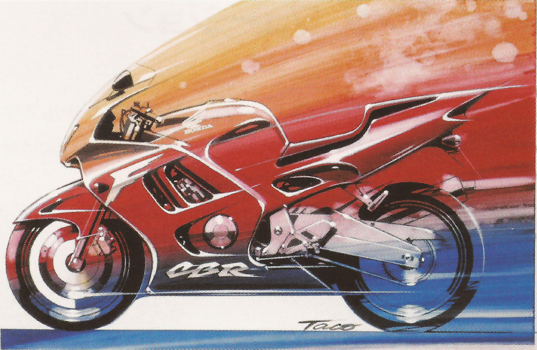
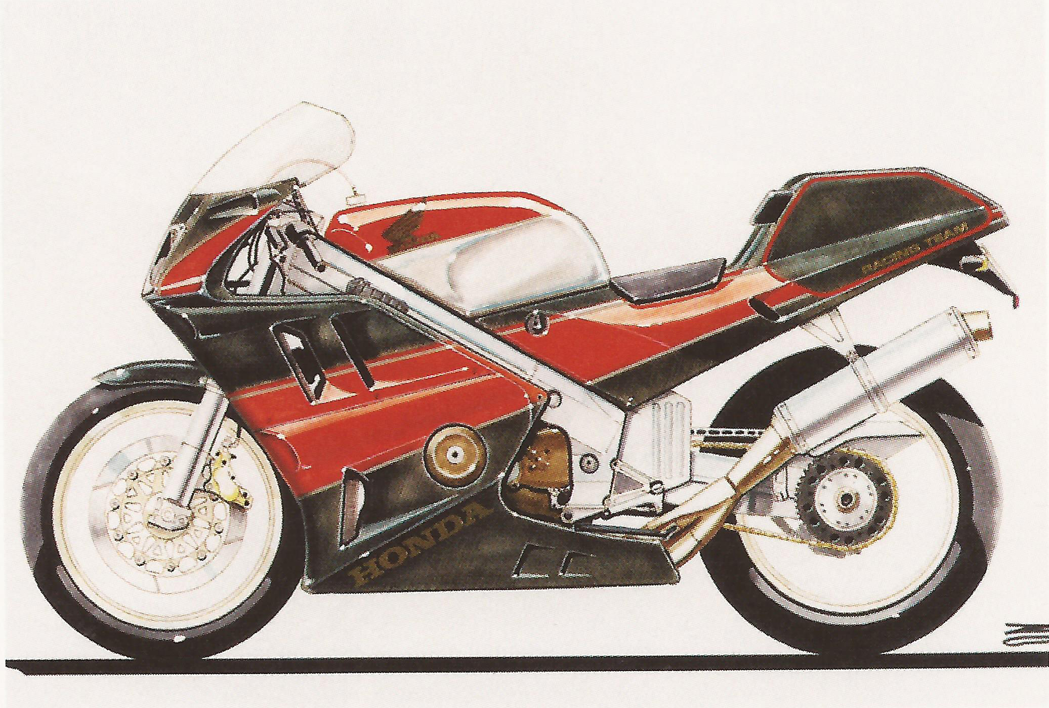
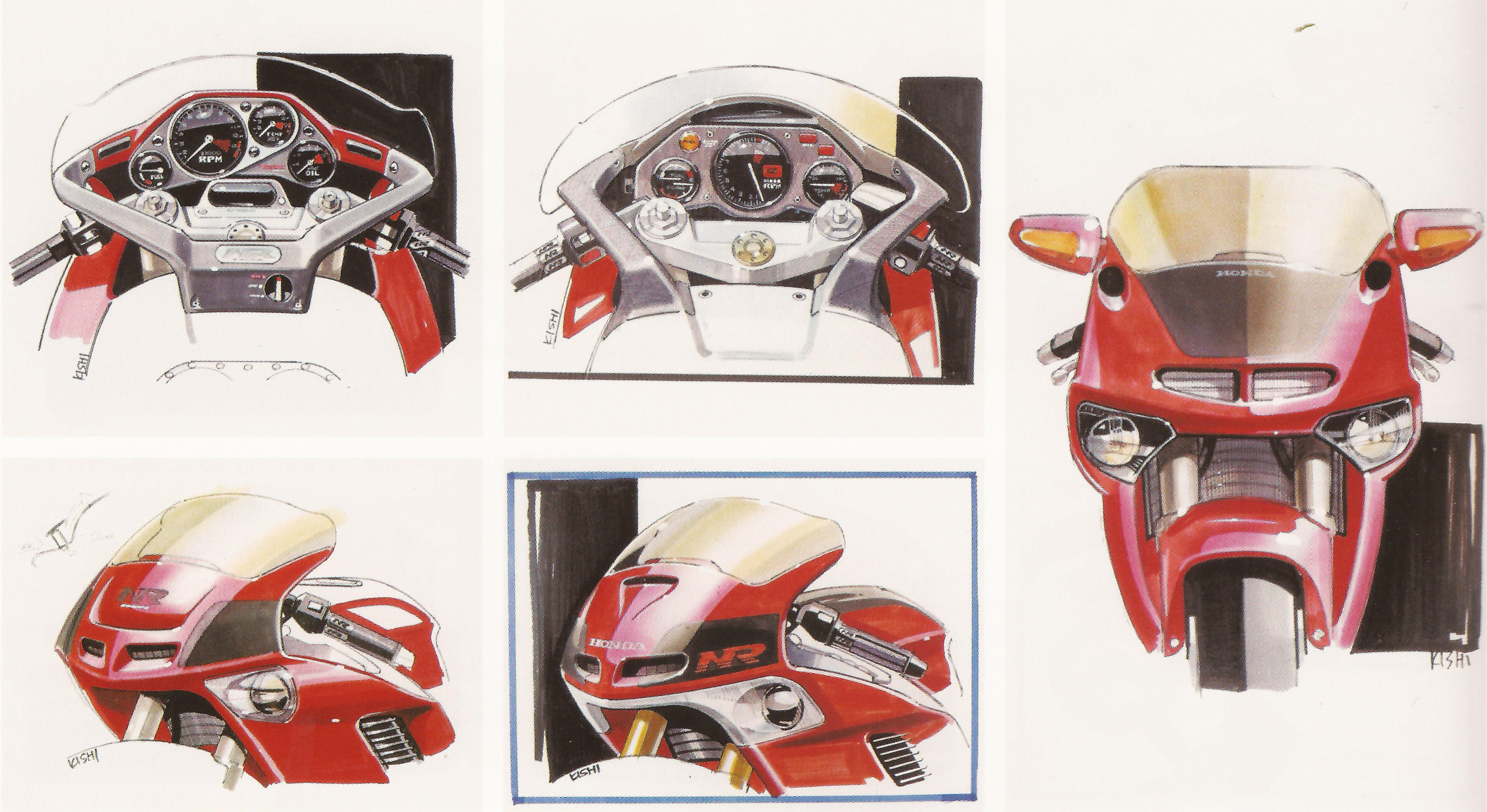
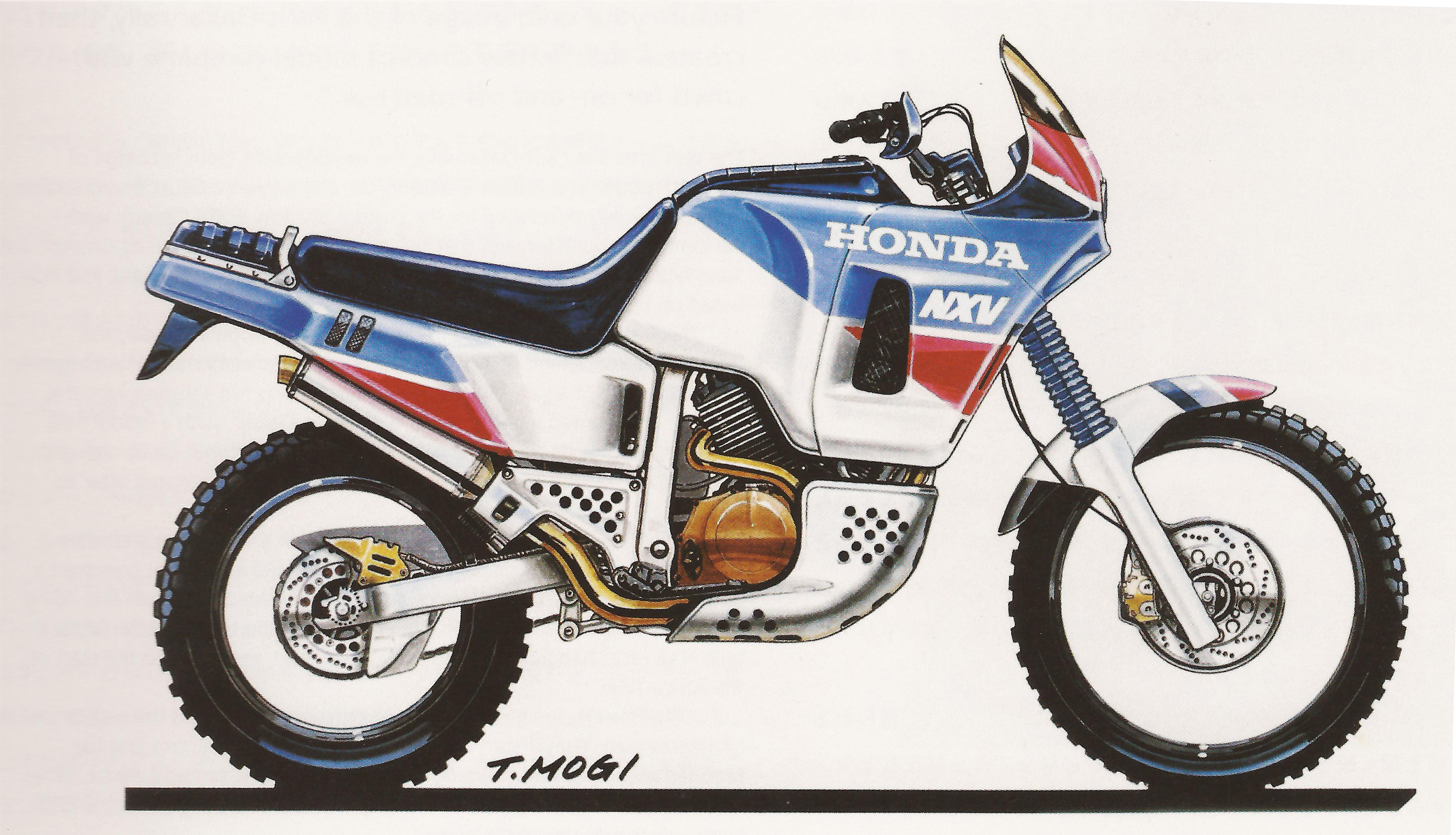
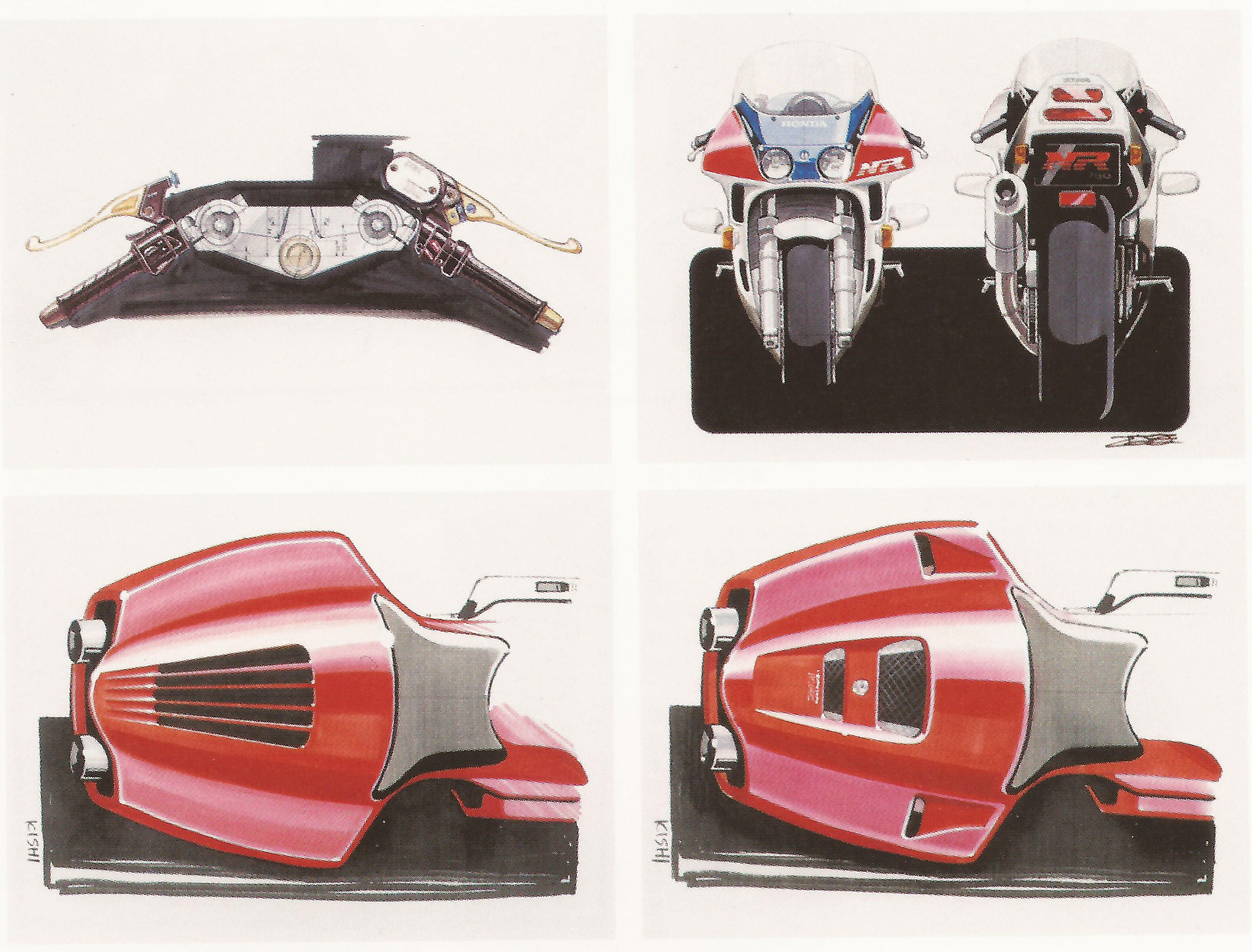
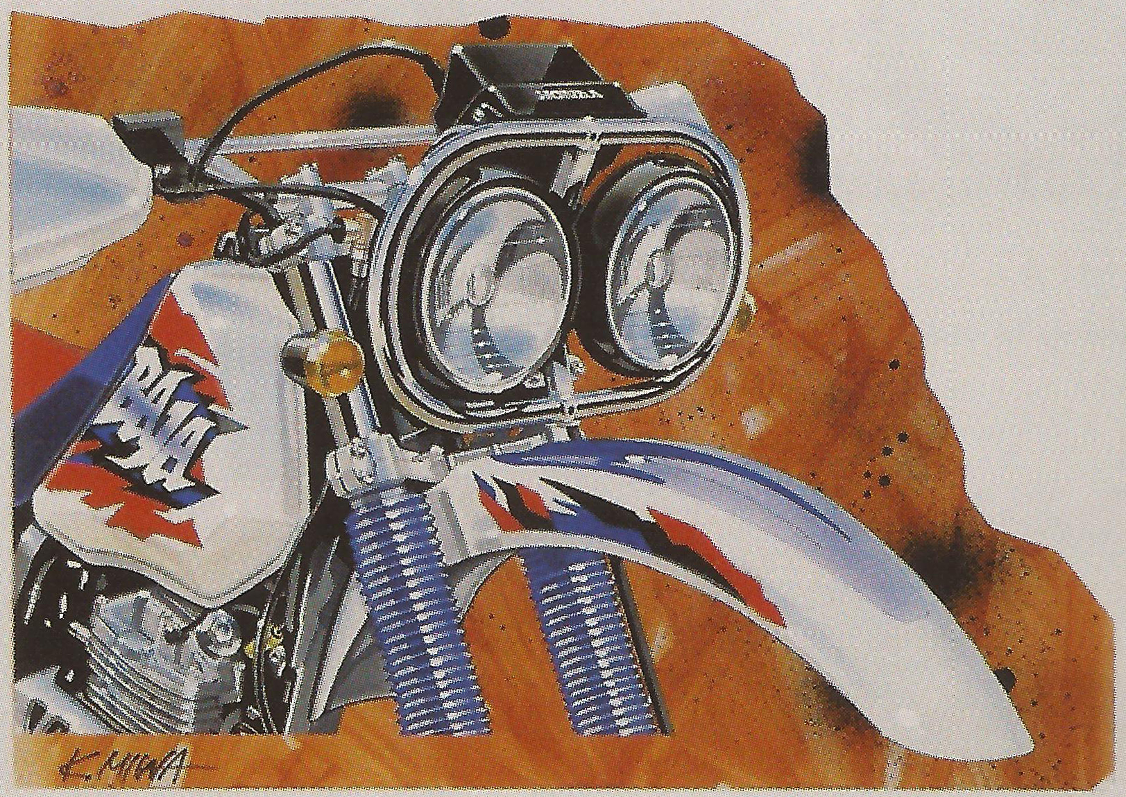
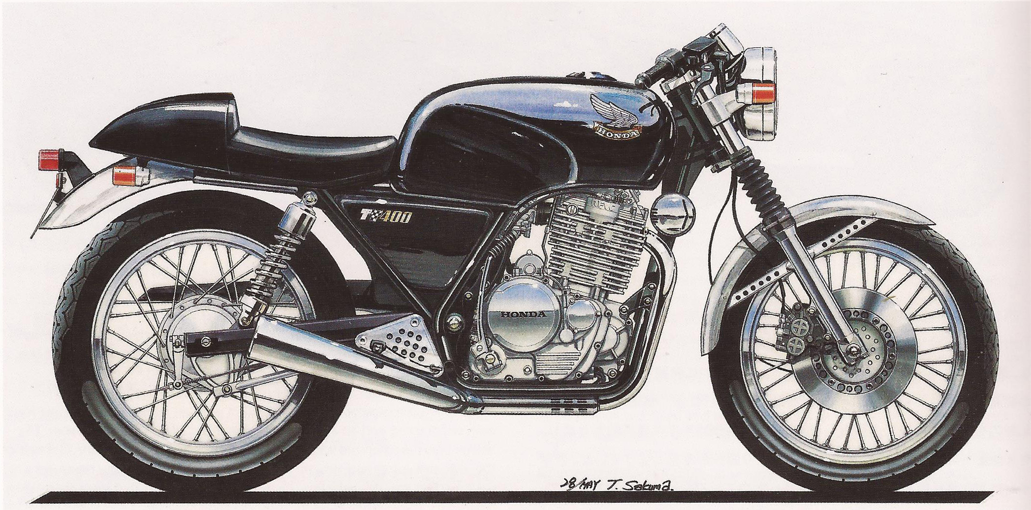
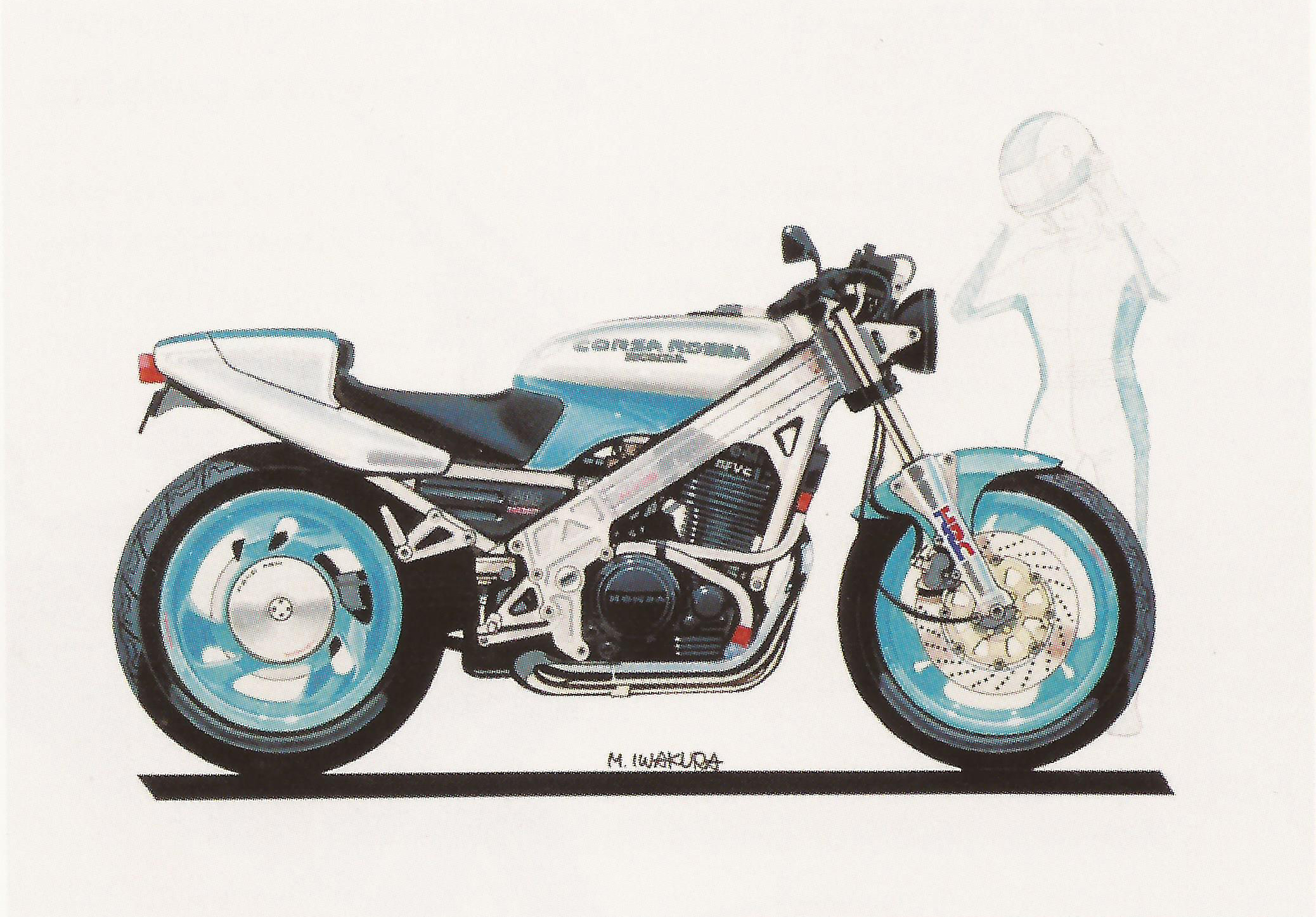
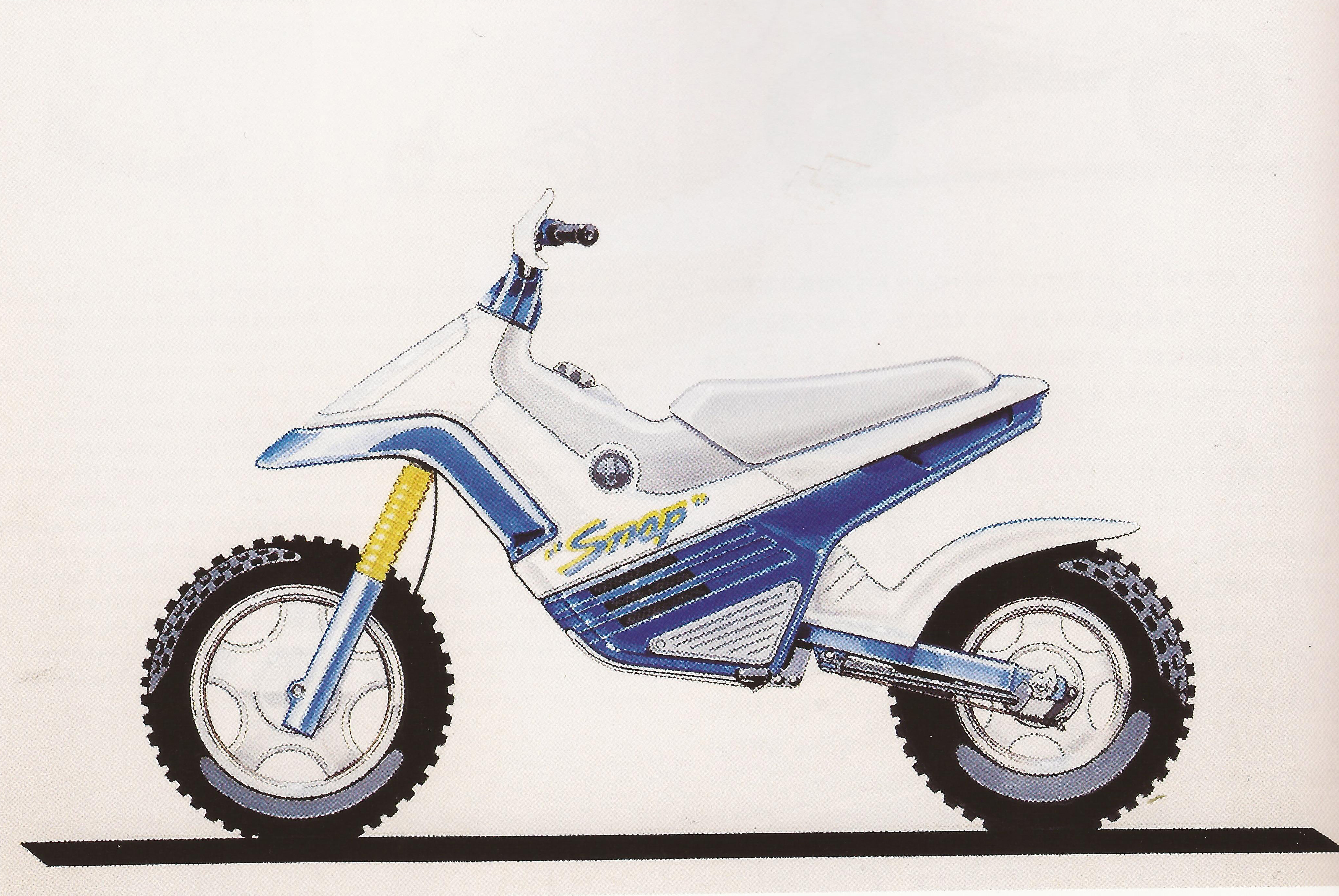
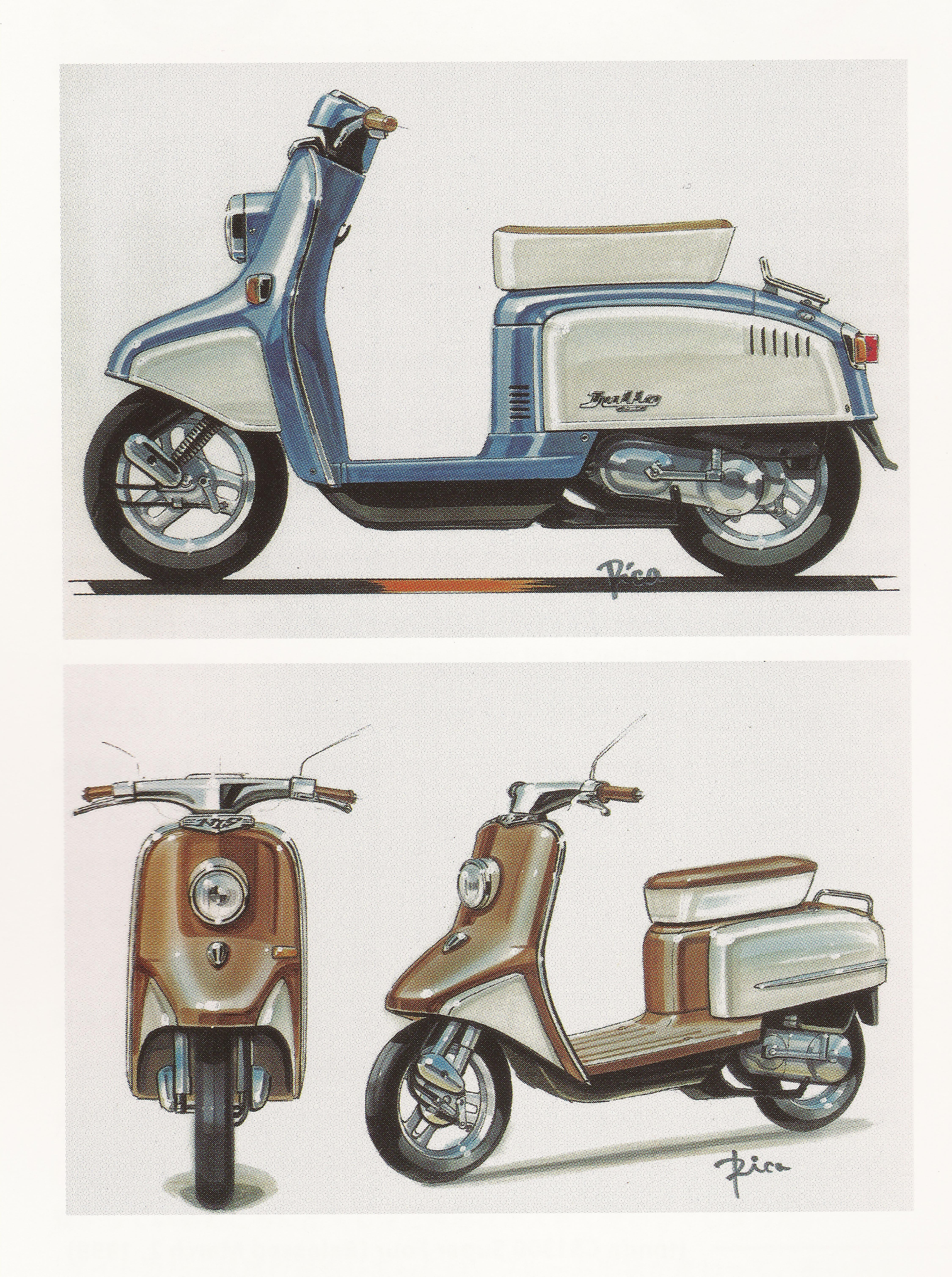
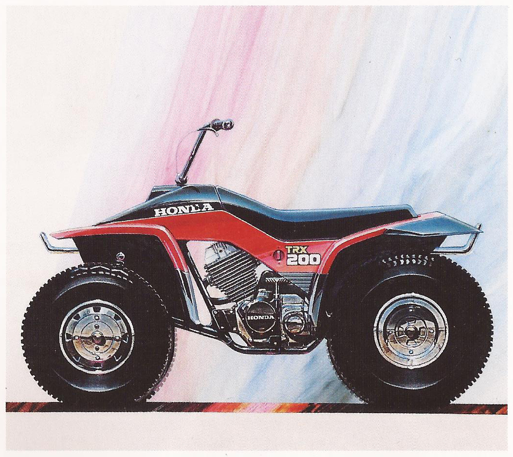
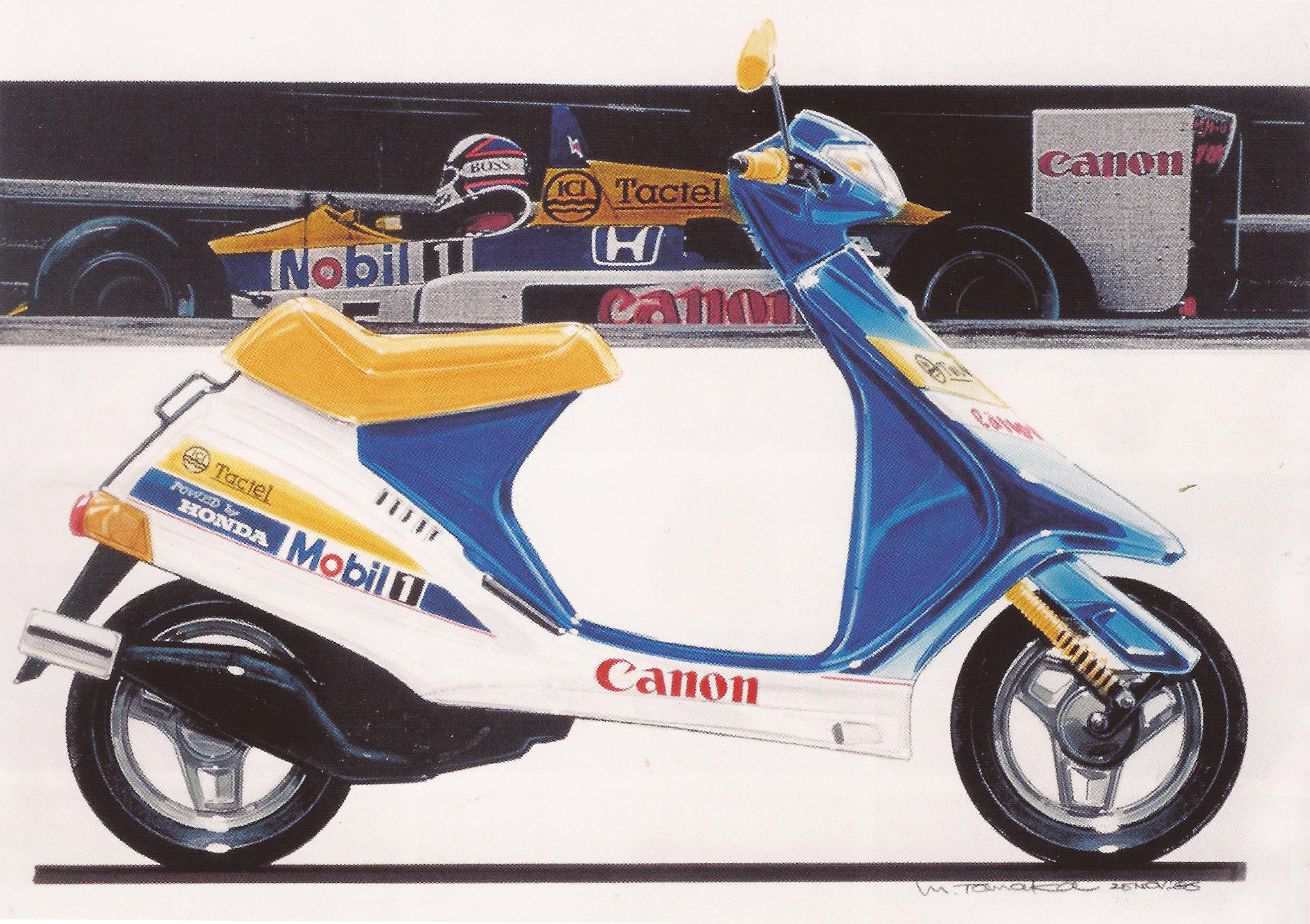
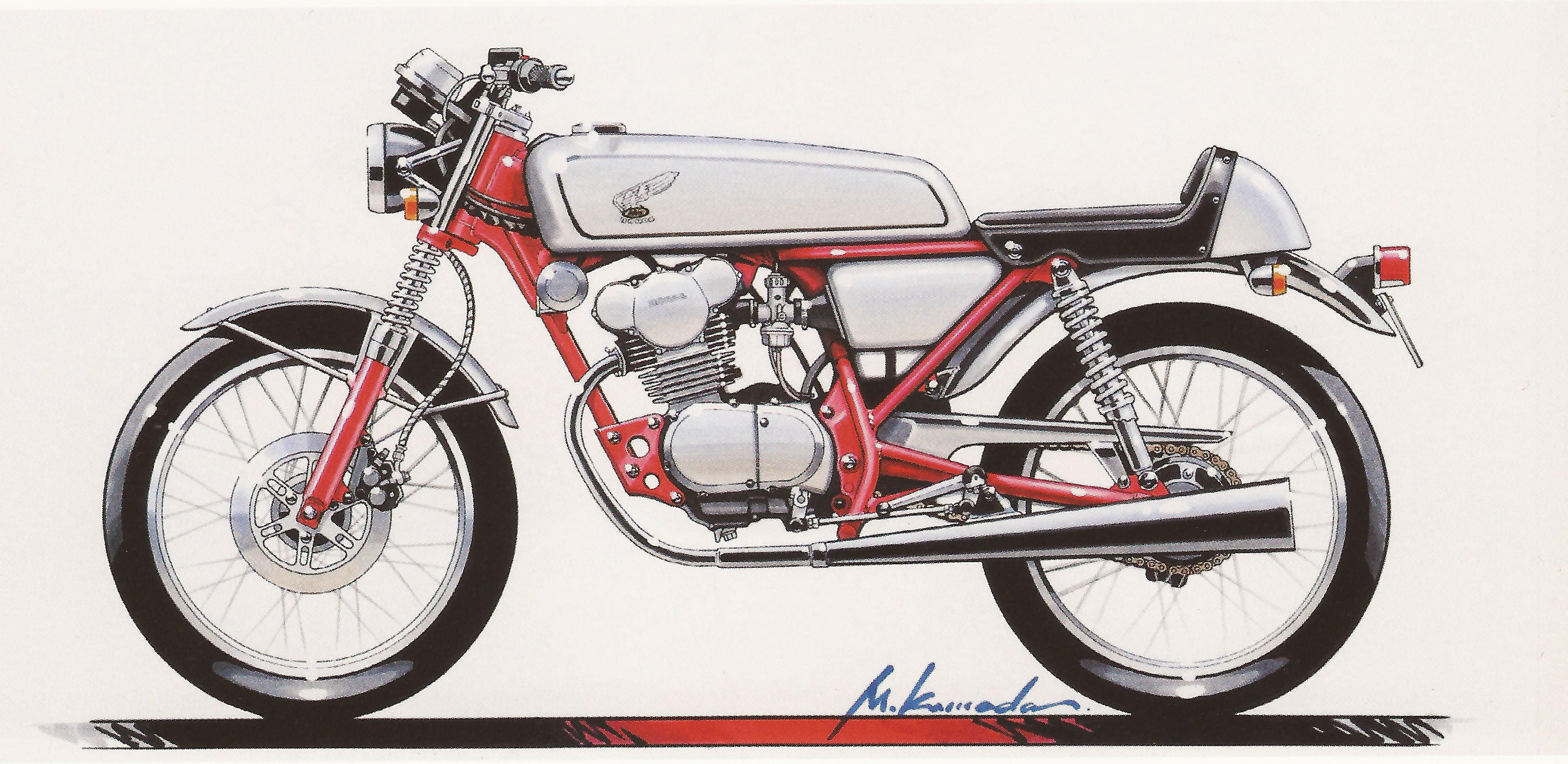
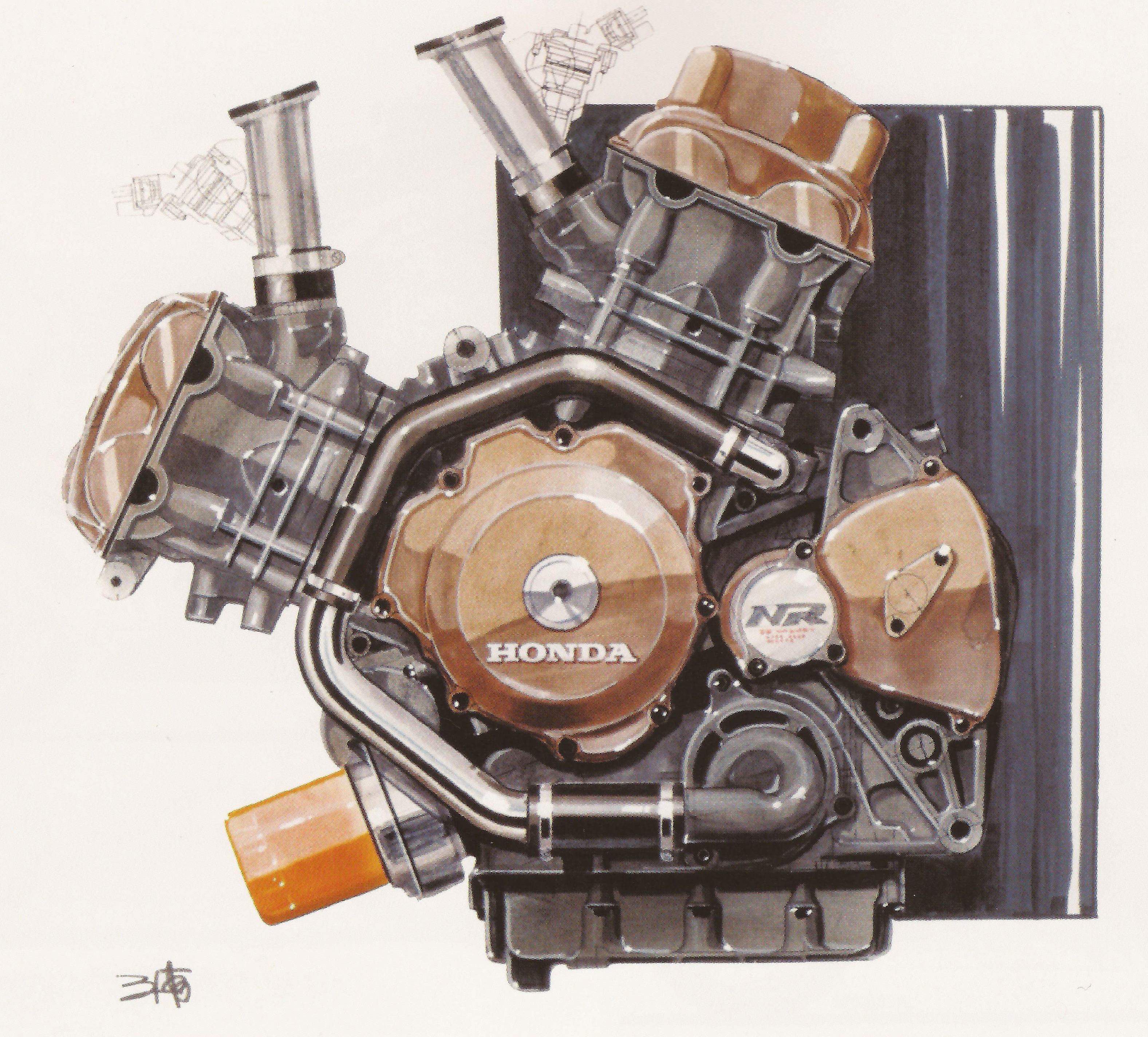
So Tycho just got back from the amazing Taico Festival [yes, really] in Nagano, and on our off day in Tokyo I had the pleasure of visiting the Tower Records book store in Shibuya. I cannot stress enough, this place was coffeetable book PARADISE, I walked out of there with slight buyers remorse, that is, until the flight back when the “in flight entertainment” consisted of endless episodes of Everybody Loves Raymond. I digress. Although they didn’t have the one i’ve been looking for for years, Part 1, they did have this second volume of Honda Design drawings from the mid eighties throughout the 2000’s. In this post I featured just a few of the exquisite hand-drawn mockups of some timeless Honda machines.
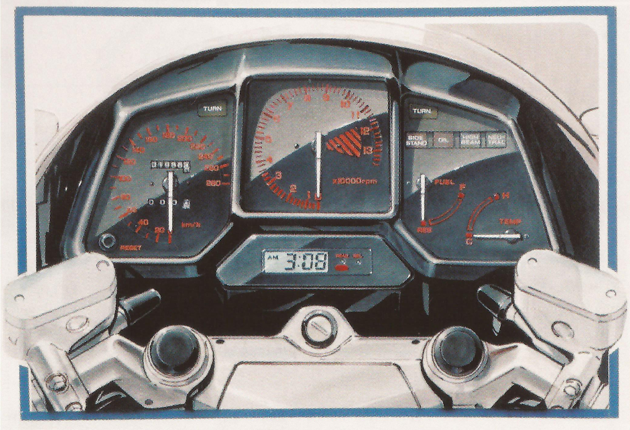
Just got my CB360 on the road yesterday [with rebuilt Mikuni carbs and CB750 forks], so this seemed like a fitting post for the weekend as I gear up to blast around the Berkshires. Enjoy!
[Published by Dainippon Kaiga, ISBN 978-4-499-32107-7]
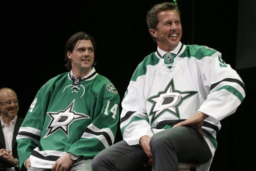
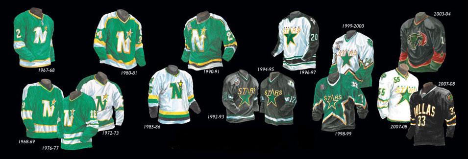
I love talking to you guys about sports logos and jerseys, so lets get to it on these Dallas ones for 2014. Let’s start with the state shaped logo- not bad, it’s about as literal as you can get, right? They went the minimal route; the shading is a bit over overkill along with the outlining and italic D. The circle one is junk, it looks like it was following some sort of 3 color rule in the center and the designer gave up.
Now to the main logo, the D over the star… cooooome oooonn mannnnnnn. First off, let’s get some ideas going about why they even kept the Stars’ name when they moved from Minnesota to Dallas? I’m guessing a sheriff badge sort of thing right? Well, now it’s just losing soo much character, at least go with that literal over shaded state shaped logo. Also, the outline of the bottom left hand corner of the D and the whole bottom of the D looks screwy because of the use of italic. The black outline has all sorts of jacked up crap going on. This is a multi-million dollar professional team that just approved a hack job, who approved this? Could you imagine pitching an italic star to the Dallas Cowboys fans? Cows would be let loose into the streets.
Look… for the people that think I just want retro back, that’s not the case. I’ve seen beautiful and horrid line work from the 50s to the 80s, I’ve seen over worked and garbage through the 90s to now. I don’t even like the North Stars logo that much when you compare it to others during that time (i.e. Calgary, Hartford, Edmonton, etc. all gorgeous), but I do appreciate the creative effort. I understand the need of a redesign when your old logo is just the word and a star, but the reason it was maybe bothering the higher ups was because it probably wasn’t selling and because it was too plain for fans. This new logo is one whole level worse than a Heineken bottle cap and also with less colors.
Going to end this on a positive note, if I had to wear the green jersey with a different logo on it, I’d proudly do it- it’s laid out nicely and riffing off classic jersey layouts that work with some nice class worked into it.
Recently Sub Pop Records announced that Washed Out has a finished album and you’ll be able to have it in your hands August 13th, they shared this very short trailer but its still promising none the less.
To play the media you will need to either update your browser to a recent version or update your Flash plugin.
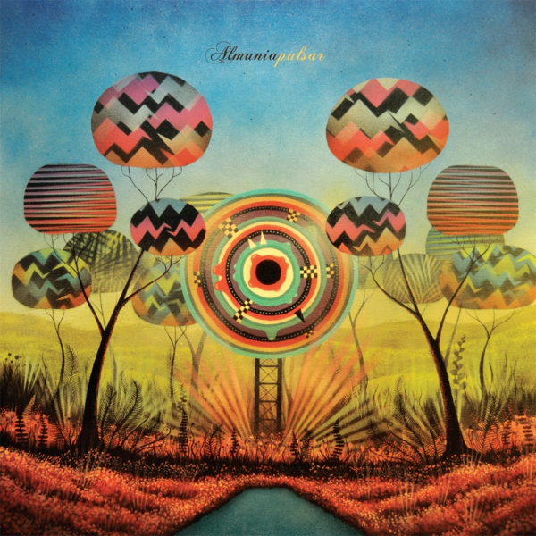
Looking for that essential hidden summer album to share with friends that have been loving Bibio and Prins Thomas/Lindstrom world? Then you’ll love this slow burning dub disco LP from Almunia. It has moments where the acoustics range everywhere from Jose Gonzalez to synth journey’s by Hatchback. HIGHLY RECOMMENDED.
I adore these tracks to no end: The Magician, Secret Marriage, and Ode To Mom
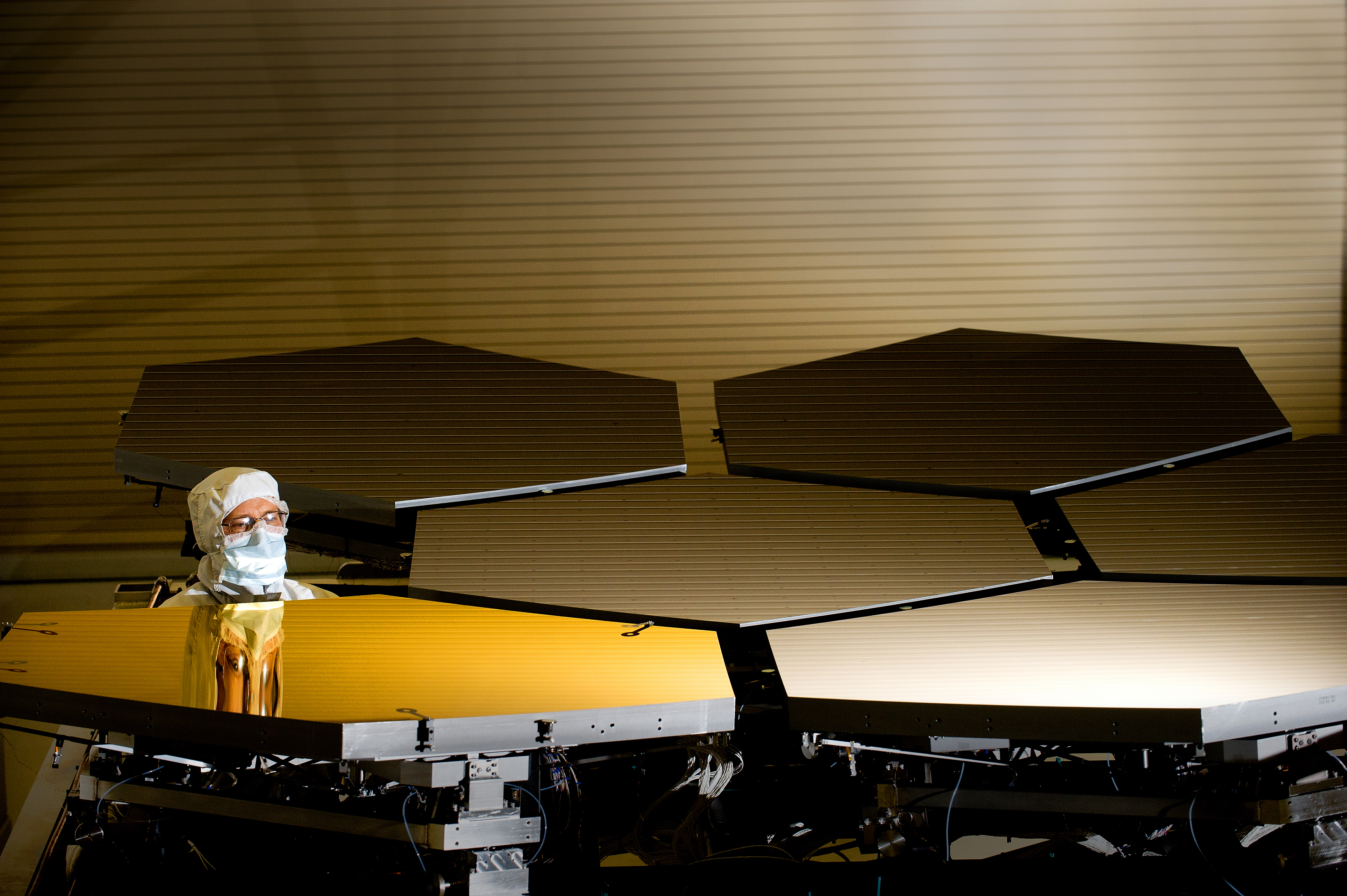
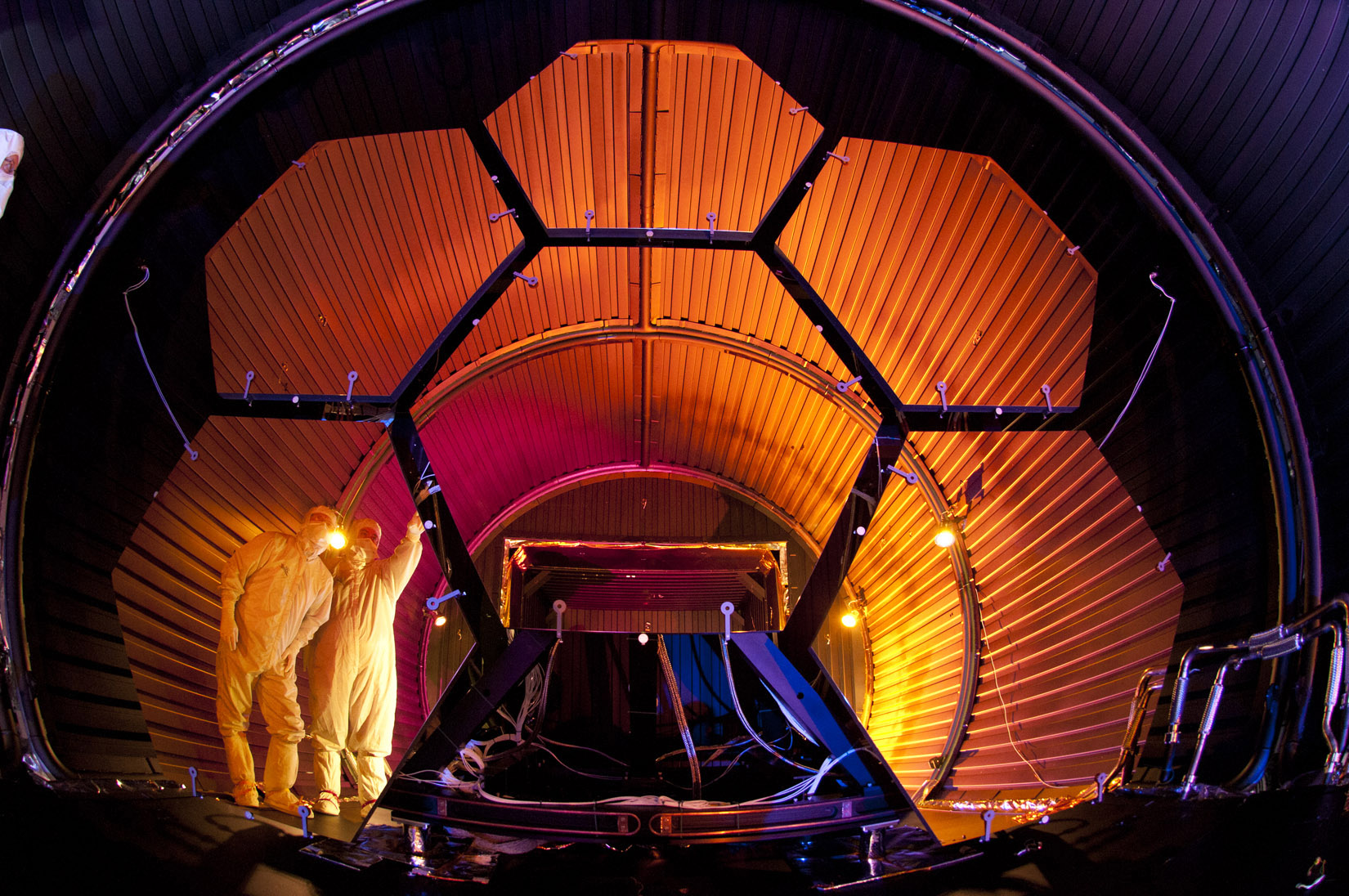
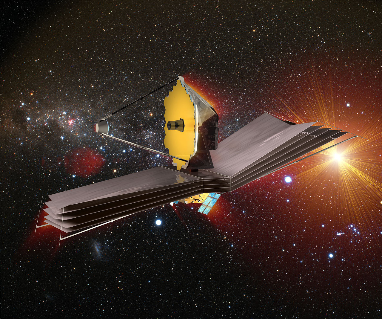
Over twenty years in the making and set for a 2018 launch, the James Webb Space Telescope (JWST) is the single most advanced space telescope ever constructed. Successor to NASA’s beloved Hubble Space Telescope, JWST has been purpose-built for studying the infrared portion of the electromagnetic spectrum to give astronomers an ability of seeing past clouds of dust and gas and further back to the beginning of the Universe than we ever have. How far? According to NASA the JWST will see the Universe’s very first star formations taking place only 100 to 250 million years after the Big Bang. Such distant and precise observations promise to unleash a torrent of new discoveries and unlock fundamental quandaries about the origin of the cosmos and life in the Universe.
A few interesting facts:
• JWST’s primary mirror is a 6.5 meter diameter gold coated beryllium reflector that is too large for contemporary launch vehicles, so the mirror is being composed of 18 hexagonal segments (as seen above), which will all unfold after the telescope is launched. Why Hexagons? It’s beyond my comprehension, but supposedly this has something to do with hexagons having a perimeter less than that of a square over a given area, which translates to a gained efficiency for steering the mirror segments and focusing the telescope.
• The telescope will maintain an L2 orbit, meaning that it will orbit in earth’s shadow and around the sun, not the earth. The idea here is to eliminate all possible heat / light sources, such as Earth’s heat-shimmer, and keep the telescope as cold as possible. How cold? Extremely. Cold. The JWST’s mid-infrared instrument (MIRI) will operate at a set temperature of 7 Kelvins, or -266° C / -447° F, through the use of a helium refrigerator, or cryocooler system (source).
• Although JWST’s primary goal is to study the first galaxies or stars that formed after the Big Bang, the telescope is also capable of measuring the physical and chemical properties of planetary systems within our Milky Way and will investigate the potential for life in those planetary systems.
• When launched, some scientists suggest the telescope will represent a greater technological achievement than landing on the moon.