Dallas Stars New Jersey / Logo
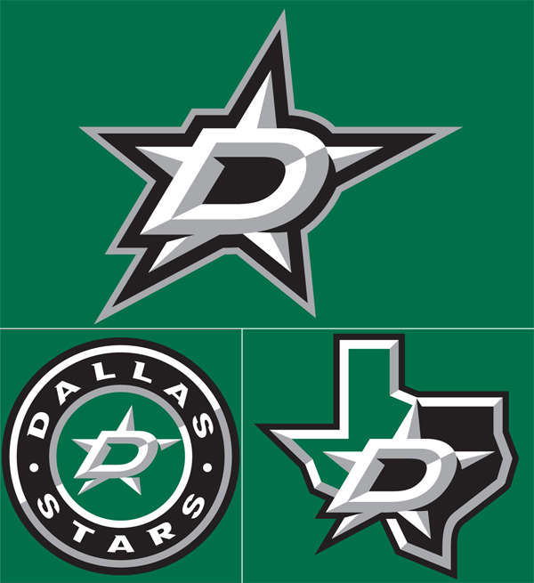
I love talking to you guys about sports logos and jerseys, so lets get to it on these Dallas ones for 2014. Let’s start with the state shaped logo- not bad, it’s about as literal as you can get, right? They went the minimal route; the shading is a bit over overkill along with the outlining and italic D. The circle one is junk, it looks like it was following some sort of 3 color rule in the center and the designer gave up.
Now to the main logo, the D over the star… cooooome oooonn mannnnnnn. First off, let’s get some ideas going about why they even kept the Stars’ name when they moved from Minnesota to Dallas? I’m guessing a sheriff badge sort of thing right? Well, now it’s just losing soo much character, at least go with that literal over shaded state shaped logo. Also, the outline of the bottom left hand corner of the D and the whole bottom of the D looks screwy because of the use of italic. The black outline has all sorts of jacked up crap going on. This is a multi-million dollar professional team that just approved a hack job, who approved this? Could you imagine pitching an italic star to the Dallas Cowboys fans? Cows would be let loose into the streets.
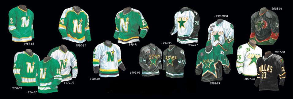
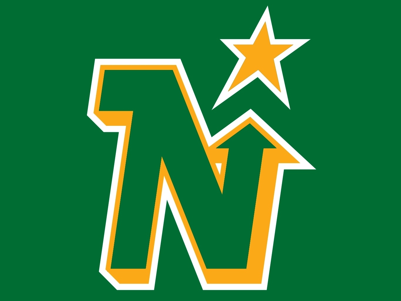
Look… for the people that think I just want retro back, that’s not the case. I’ve seen beautiful and horrid line work from the 50s to the 80s, I’ve seen over worked and garbage through the 90s to now. I don’t even like the North Stars logo that much when you compare it to others during that time (i.e. Calgary, Hartford, Edmonton, etc. all gorgeous), but I do appreciate the creative effort. I understand the need of a redesign when your old logo is just the word and a star, but the reason it was maybe bothering the higher ups was because it probably wasn’t selling and because it was too plain for fans. This new logo is one whole level worse than a Heineken bottle cap and also with less colors.
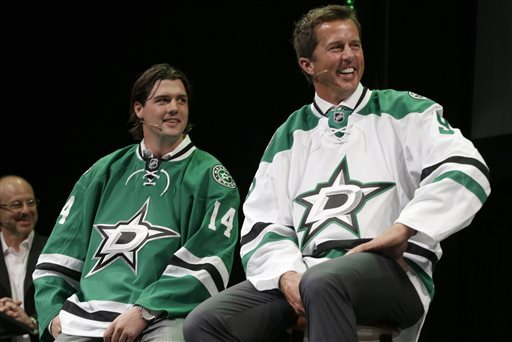
Going to end this on a positive note, if I had to wear the green jersey with a different logo on it, I’d proudly do it- it’s laid out nicely and riffing off classic jersey layouts that work with some nice class worked into it.

27 Comments Leave A Comment
Spencer says:
June 6, 2013 at 9:42 amI’m feeling an iso50 redesign competition..
Red Rash says:
June 6, 2013 at 10:02 amHorrendous! Going with silver instead of gold? Booo. Italicized D and Star? blech.
autumn says:
June 6, 2013 at 10:09 amI totally agree with the opinion written here…I LOVED the stars jerseys back when they won the cup in 99.
Carolina also introduced new uniforms this week. Although they didn’t stray too far from the previous design, they definitely accomplished more simplicity. http://hurricanes.nhl.com/club/gallery.htm?location=/jersey
Jakub says:
June 6, 2013 at 10:11 amSorry for the earlier writing, I was sneezing from insane allergies and barely could think straight, doing a bit better now
Jakub says:
June 6, 2013 at 10:13 am@autumn I’m with you, not much risk there but I think the fans liked that logo, I need to see a before and after
Dustin says:
June 6, 2013 at 10:17 amYou can never beat the Edmonton Oilers jerseys/logo. Best ever.
Brian says:
June 6, 2013 at 10:30 amKeep up the good work, Jakub. Apparently the teams are listening. http://sports.nationalpost.com/2011/11/18/toronto-blue-jays-logos-through-the-years/
James says:
June 6, 2013 at 11:25 amBeing from Dallas, I had high hopes for it…but when they showed it on our local news the other night I thought, “Wow, a year or so worth of time spent on this?” I think it’s kinda lame…but maybe it’s because I’m a designer and I’m picky. :)
mg33 says:
June 6, 2013 at 11:26 amAs a Texan I’d be remiss if I didn’t share one of the greatest crimes against team logos ever: 1970s Rangers logo with a baseball wearing a cowboy hat. Really.
http://latenightparents.com/wp-content/uploads/2012/04/Old-Rangers-Logo.gif
autumn says:
June 6, 2013 at 3:28 pmThis Montreal jersey is my favorite – http://www.icejerseys.com/products/Montreal-Canadiens-Reebok-Authentic-Centennial-Jersey-194546-White-p7107/
simple, classic.
Also here’s a Bleacher Report ranking the NHL logos. It’s from 2011 so Atlanta is featured rather than Winnepeg and there are some outdated logos. Still a good read in my opinion.
http://bleacherreport.com/articles/727812-nhl-power-rankings-ranking-each-teams-logo
kyle says:
June 6, 2013 at 8:18 pmWhy are jerseys soooo big when worn without the sports gear? Why not have one for on-field and one for off?
My says:
June 7, 2013 at 6:59 amWell, yes the star abruptly turned
Jonathan says:
June 7, 2013 at 7:07 amJakub,
Texas is “the lone star state” so keeping the star name after moving from Minnesota makes sense.
Dubsonic says:
June 7, 2013 at 7:13 amLooks like Jamie Benn is wearing some sort of mutated Ninja Star. There are ninja’s in Dallas right?
neilson says:
June 7, 2013 at 8:36 amrecall this monstrosity sported by the canucks in ’78?
The “Flying V” by san francisco design agency, Beyl & Boyd.
http://raidergirls.com/raiders_blog/wp-content/uploads/2010/04/tiger-williams-nhl-enforcer.jpg
autumn says:
June 7, 2013 at 9:39 am@neilson – Those are amazing…especially worn with the Cooper lid.
Patrick says:
June 7, 2013 at 10:17 amAgreed Jakub,
logo is awful. I am a huge sports fan always with an eye to what colors and styles embody a team’s personality and function. No other jersey is as timeless as the NY Yankees. Granted I hate the Yankees, but they fulfill the “pinstripe” mentality. A glaring sore spot in the world of baseball is the Miami Marlin’s new uniforms. I read an article saying the OWNER picked out the logo and colors. Now, that owner is a blowhard, and this is a proven fact, but in many cases the owners do get final say. And who better to choose a team’s color scheme and logo design than an 80 year old suit who made his fortune selling pizzas from a discount pizza chain. At least the guys from Detroit didn’t screw that up. As for hockey, and Basketball for that matter, the logos are too generic for anyone to care about them in any meaningful way. God forbid someone got offended by a color scheme or a cartoon with goofy eyeballs. New design idea: A giant silhouette of the state of Texas with giant crossed eyes and a star for a nose. Voila. Perhaps you could run a contest for a Dallas Star redesign?
Jakub says:
June 7, 2013 at 11:06 amNIce one @PATRICK, getting into the spirit of discussion instead of my grammar HA!
I would be into a redesign contest, maybe to see if people actually do it, lets get 10 comments below from people that would actually turn something in.
neilson says:
June 7, 2013 at 1:17 pm@ jakub, let’s do this redesign thang.
Jordan says:
June 7, 2013 at 7:05 pm@jakub
I would try
Alex says:
June 7, 2013 at 10:41 pmSeriously? The North Stars logo is more crap than our current one. Its a freaking lobsided N with a star thrown on top–but since its incredibly old people pray to the thing. The mustard yellow is also a horrible color scheme with green. On top of that, the North Stars didn’t win a single thing–and the Stars did. You’re entitled to your opinion, but a great amount of fans are truly embracing this look and are glad of the change. Quit acting like our former jerseys were even decent, and that our former logo was also great.
Chris says:
June 10, 2013 at 4:50 pmA run down over at Brand New points out that the client dismissed the first pitch and pushed their own ideas onto the designers.
I think this job, as they all are, is a result of the different kinds of relationships there are in the design process. Sometimes clients can have illusions as to their visual prowess, but since they are paying the bill…
Tibor Kalman said the best client is one who is smarter than you. Sometimes jobs can be hijacked when it’s the other way round.
Jay says:
June 12, 2013 at 8:05 amAccording to:
http://www.underconsideration.com/brandnew/archives/twinkle_twinkle_big_star.php
it was done by Reebok
matt says:
June 20, 2013 at 2:25 pmAt least it’s not as bad as the Canucks design by committee nightmare
Costanza says:
June 27, 2013 at 2:06 amHey you two, three and almost four!We’ve been thnnikig of you lots and lots as the big day approaches. We miss you so much and can’t wait to have the girls get together again. I think it’s a boy. Just my opinion.Lots of loveKFrom the new digs in New West!
Allana says:
July 2, 2013 at 8:14 pmSometimes, students cosopme the thesis papers by their own. But some students choose to buy the nice thought connected with this post from the buy thesis service, because that is more simple.
Amnion says:
July 4, 2013 at 1:28 amHi, I saw you Video 내 노래야’, and I wanted to say You Are Awesome!!! I’m 31 years old, I have an Korean poapssrt but I lived in USA until I was ten years old so I can see the same sight that you see about K-Pops. And I understand what you wanted to say in that M/V. I listen all kind of musics around the world but I feel the same what you think. After I saw that M/V of yours I felt so good. Some guys will try to pick on you for that but fxxxem(sorry for the hard language). You are great.I don’t know why I’m writing this here but I just wanted to say you are great. Keep rock’in the world michael!PS My american name is Michael too. ^^