World of Logotypes
Posted by Scott
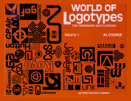
World of Logotypes book by Al Cooper. Great 3 color and a lot of those logos are classics for sure.
Update: Some great scans from the book and more info are here.
World of Logotypes book by Al Cooper. Great 3 color and a lot of those logos are classics for sure.
Update: Some great scans from the book and more info are here.
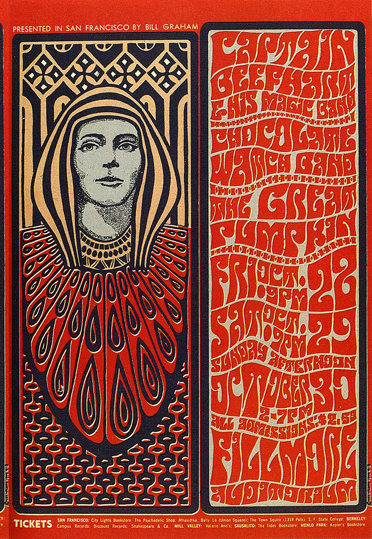
Here’s a nice example of the Fillmore West style by Wes Wilson. This style is a conglomeration of many of the early 20th century design themes. While a bit less than legible, the illustrative lettering indicative of this style is a work of art in itself. The psychedelic and Art Nouveau themes associated with the Fillmore movement have always been a great inspiration to me but I have always felt them to be a little overstated. When I do explore these themes in my own work I tend to temper them with a more minimalist slant.
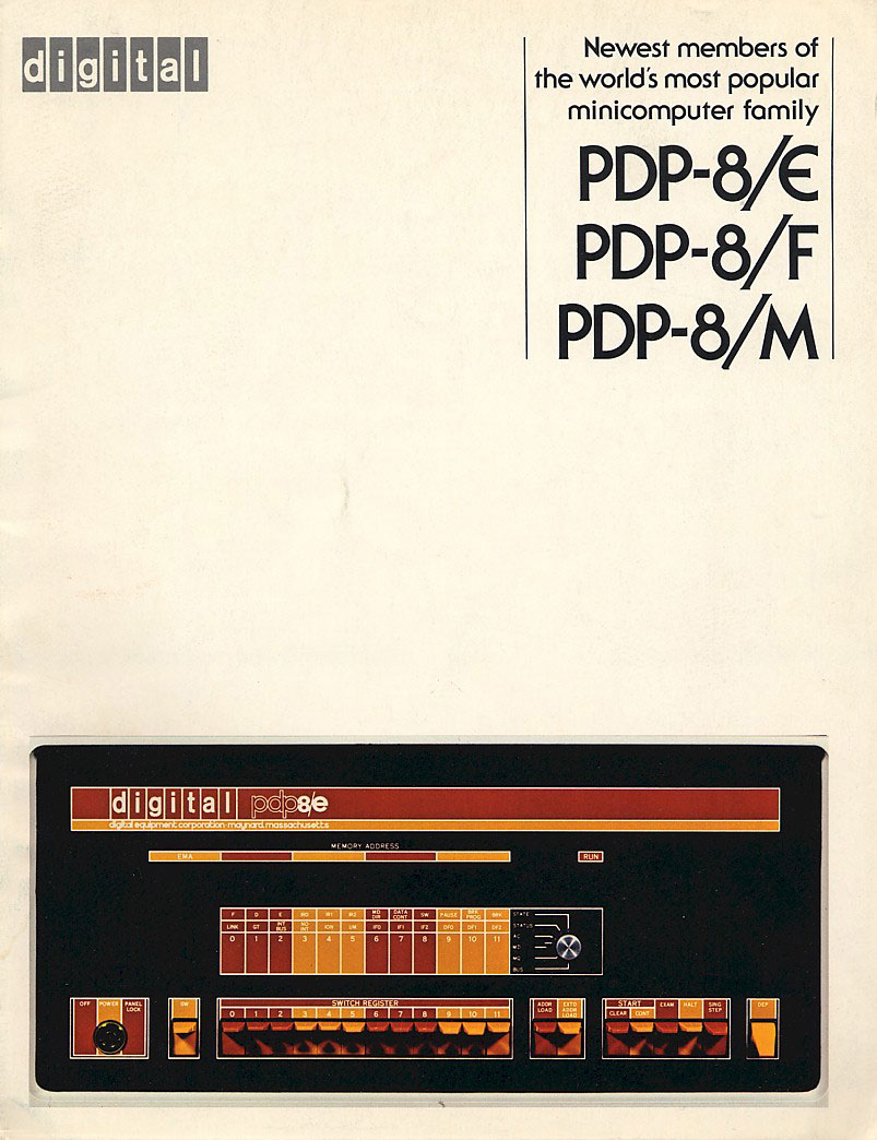
Whatever a “Minicomputer” is, this was the first one. It cost almost $15,000 in 1974 making it a pretty, but pricey machine. During this period Digital produced a lot of machines featuring interfaces similar to this. I love the color combos and the excellent grid based design. Those toggle switches complete this bold yet welcoming example of top-shelf 70’s industrial design. The color scheme could be construed as somewhat garish for a computer, but remember, this was the 70’s and they were probably trying to “break the design mold” of this particular class of devices. Unfortunately, soon after these became obsolete the industry veered right back into beige/grey tones and boring, toggle-less interfaces. The only standout enterprise-level computer hardware that comes to mind after this were the Silicon Graphics machines of the 90’s and the Sun Systems stuff around the turn of the century. More info on this particular model is here. I like the “digital” logo and it fits nicely up there in the corner. But I couldn’t resist tweaking the text in the upper right to make it look like a poster. You can click the image to see the original version. I have some examples of similar Digital equipment in blue and green I will be posting soon.
Wanted to add that I love the style of the photo. It’s almost as if it’s a drawing, one of those old product shots that sort of blurs the line between photo and illustration. Wonder how they achieved this? Was it an intended effect or a byproduct of the printing method?
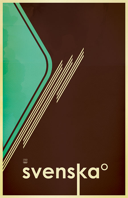
This is a variant of the Svenska print I did that has yet to make it into printed form. I will be posting random variations of some of my released work to hopefully give a better look at the process of working through a design and refining the various elements. The original Svenska print is here and version 2 is here.

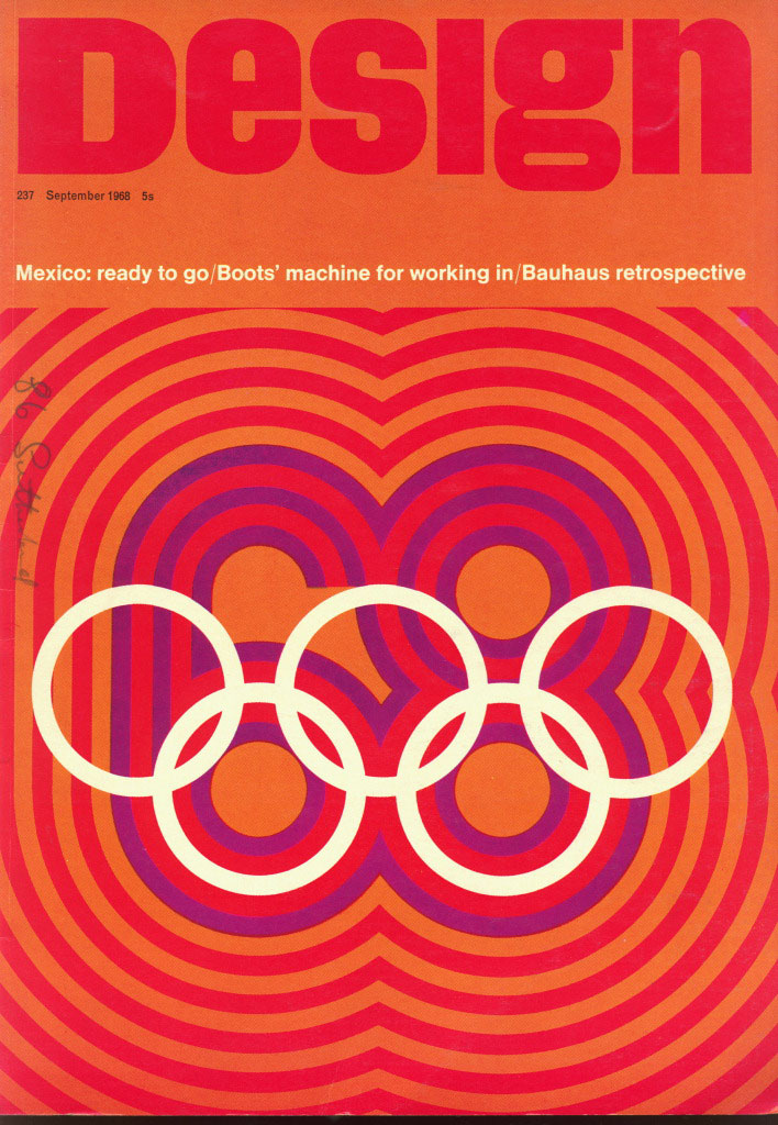
It’s hard to comment on something so perfect. First we have the header for Design Magazine itself. The type is beautiful, they’ve even managed to gracefully compress the ‘g’ so it doesn’t throw off the grid too much. And then of course we have one of the greatest logo designs of all time right beneath it incorporating an amazing color scheme. It’s all there. The logo for the ’68 Mexico Olymipics was created by American designer Lance Wyman (click the above image for a full size version). The posters for the games were a collaborative effort, an example and some info are here.
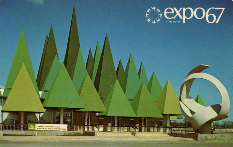
This incredible image came my way via Jakub … Not sure if they have the world expo anymore, but I doubt it would look this good. Click through for more pics – Image above now links to larger version via George. Continue reading →
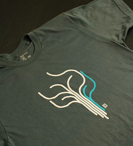
The new “Paths 2” shirt is available now at The ISO50 Shop. It’s printed on an American Apparel Asphalt tee and features an Aqua / Cream colorway. Check it out >

Welcome to the new front-end of ISO50. I’ve decided to shift the site into a blog format to make it easier to update and get more fresh content up. I will be posting all sorts of things, my own work, other’s work that I find inspirational, and anything design related that I think would make for good viewing. Your comments are welcome and appreciated, I will do my best to answer any questions.
You can always visit the ISO50 Portfolio to see all my work, or you can check out the ISO50 Shop for prints, clothing, music and more. The Blog will be located at blog.iso50.com, keep an eye on it for new work, unreleased stuff, and all things ISO50 / Tycho related.