April 7th is a huge release date for electronic juggernauts The Juan MacLean and Junior Boys, both putting out Best Of like albums that you’ll probably see on many lists this year. This song Work is just perfection in my eyes of what i’d love to take in the studio, it has the dark drive and its sexy beyond belief. Those distant Tangerine Dream synths and rolling leads just grab me right from when they start. The Juan MacLean does jam out on his new album, full of pop length songs and the vox upfront, reminds me a little of how Adult. started out meets Human League.
Todd Terje makes America’s Horse With No Name a bit easier to play out for all the slow disco DJ’s out there, a lovely simple edit.
I found this Manoo remix of Yacoub on a mix by Culoe De Song, just a real nice groove, i’m sure when i’m older i’ll be listening to only this kind of music, all my friends and I will have ponytails, steel round framed eyeglasses and our world music vinyl collections will be sprawled across our living rooms, almost crushing the newly mined gold bird cages holding our rare cockatoos and sometimes even being bookended at times by 500+ euro authentic African rain sticks, while the house reeks of Nag Champa and the kiln is burning my latest failed attempt at a clay vase.
“Omron 86R & Braun 4 776 calculators. Interesting similarities and differences, especially layout, letter forms, color and shapes. The Braun’s 12.5mm total thickness versus the Omron’s 25mm is a clear sign of the 10 year age difference between the two designs.
Omron 86R & Braun 4 776 calculators. The Braun’s font is clearly Akzidenz Grotesk, but the closest I can find for the Omron’s font is Univers 53 Extended. Any better ideas? “
Dieter always wins out, but that Omron still has it’s own thing going.
Grain Edit posted up some Jacques Auriac posters along with the video below. These are really amazing, it’s a shame there doesn’t seem to be any higher res scans around the net. There are some more shots from an Auriac book over at Grain Edit’s original post.
Praveen & Benoît’s Songs Spun Simla Remixes has a few lovely surprises with remixes from our favorite mix contributor Tom Croose doing a slow shuffle remix to names like Daedelus, Machinedrum, and David Last but one of my personal favorites is this Shigeto remix called The Tunnel is Still There (Shigeto’s Deep Tunnel Diving Remix). The Shigeto remix grabs a certain energy from the song and runs with it, below is video for the remix that HeadUp did using footage from Koyaanisqatsi and Powaqqatsi.
o9 released Church of the Ghetto PC in 2004 on Schematic who have gave us Phoenecia and Richard Devine. The song Terminal Silver has a hint of the ever classic Alberto Balsalm by Aphex Twin but its a bit more digital and bubbly.
I’ve been hearing about this Mount Kimbie duo for some time now, pretty nice stuff and its kind of hard to pin down their sound and style. Either way its really nice to listen to especially this song WIlliam which has these foggy PBS sounds to it but moves into a nice
Praveen & Benoît – The Tunnel is Still There (Shigeto’s Deep Tunnel Diving Remix)
[audio:tunnel.mp3]
o9 – Terminal Silver
[audio:terminal.mp3]
Mount Kimbie – William
[audio:william.mp3]
Praveen & Benoît – Chiaroscuro (Daedelus Remix)
[audio:chiar.mp3]
Praveen & Benoît – The Tunnel is Still There (Shigeto’s Deep Tunnel Diving Remix) video
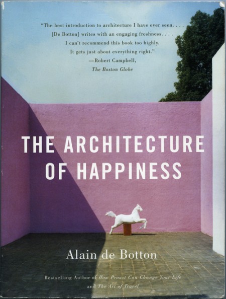
I purchased The Architecture of Happiness by Alain de Botton because I loved the cover. I think it was the colors that first caught my eye. I was also intrigued by the shadow and the shape it created; how it almost touches the statue in the most perfect way. The eye follows the line it creates, and it helps reinforce the hierarchy of the page really effectively. For whatever reason, and as the title indicates the book may elucidate, the whole design makes me happy every time I look at it.
Why this design makes me happy, and to a greater extent, why architecture of a certain aesthetic caliber appeals to us, is largely what this book explores. It is a must read for designers of all disciplines as it pursues the question at the core of what we do: Why make things look beautiful (what does “beautiful” even mean?) and not just purely functional? One of my favorite parts of the book describes the principles of some nineteenth century engineers that felt like they had determined the end-all criteria for evaluating structural design:
The engineers had landed on an apparently impregnable method of evaluating the wisdom of a design: they felt confidently able to declare that a structure was correct and honest in so far as it performed its mechanical functions efficiently; and false and immoral in so far as it was burdened with non-supporting pillars, decorative statures, frescos or carvings. Exchanging discussions of beauty for considerations of function promised to move architecture away from a morass or perplexing, insoluble disputes about aesthetics towards an uncontentious pursuit of technological truth, ensuring that it might henceforth be as peculiar to argue about the appearance of a building as it would be to argue about the answer to a simple algebraic equation.
As the rest of the book unfolds, Botton examines, as eloquently as he does above, the alternative to what these engineers proposed. Why it is that we strive to make things beautiful, and what qualities beautiful work possesses. The parallels between his chosen arena of architecture, and other realms of design, are easily drawn, and make it very worthwhile for interested minds in every field. My favorite paragraph is on page 72, and does a nice job bringing together a lot of what he discusses in the book:
In essence, what works of design and architecture talk to us about is the kind of life that would most appropriately unfold within and around them. They tell us of certain moods that they seek to encourage and sustain in their inhabitants. While keeping us warm and helping us in mechanical ways, they simultaneously hold out an invitation for us to be specific sorts of people. They speak of visions of happiness. [Buy on Amazon]
– – – –
On an unrelated Note: Peter, of Buchanan-Smith, wrote in to clarify the attribution information of a previous post on designer Josef Reyes. The work presented was produced by the studio Buchanan-Smith, where Reyes works as a designer, and the post has been updated to credit the work to the Buchanan-Smith studio. Definitely make sure to check out their site, they have a lot of great work.
You’re looking at the Xerox Star which “represented the most complete implementation of the ‘Desktop Metaphor’ of any system until the advent of mature Desktop graphical interfaces later on the Mac and PC/Unix/Linux in the 1990s” [source:digibarn] Digibarn has posted up several Polaroids from 1981 depicting the various facets of the Star 8010’s interface (a few of which are shown below). I don’t know what’s more amazing: how ahead of it’s time this GUI was, or how little the OS interface has changed in the past 28 years. This was nearly three decades ago and we’re still clicking folder icons and using archaic pointing devices. Where’s my Minority Report interface!? My wrist hurts.
Check out all the rest of the hi-res Polaroids here.
Just a quick summary of this case since the details and “facts” have been shifting so much: Designer Jon Engle cried foul and the entire internet rushed to his aid. Engle accused a stock art site of stealing his designs and then billing him $18,000 for them. But as it turns out, he may be the real culprit. Read on and come to your own conclusions. This is an epic tale!
DOUBLE EDIT!: It just keeps looking worse for old Jonny-boy’s case. Jo just linked to a nice summary of this whole disaster which can be found here. Frank also sent in this link to some side-by-side comparisons of Jon’s work and the StockArt stuff. If this turns out to be all wrong, why did this guy do it? Perhaps he didn’t think it would blow up so big? If in fact this is all some elaborate hoax, $18,000 is probably the least of Jon Engle’s worries now. What a mess!
Edit: Wow! This is a saga for the history books. After posting this article, a few astute readers pointed out this thread on Reddit. Pretty interesting information there. I guess it’s up to you to decide who’s at fault here.
The alleged story — in Jon’s words — can be found here. But in light of recent information, you may want to take it all with a grain of salt. Either way, quite an interesting train wreck of a story this will be if it all turns out to be as upside-down as it’s starting to look.