While digging around for Omni covers for last week’s post, I came across blog reader Eric Carl’s Flickr and his downright incredible set of vintage sci-fi / fantasy paperback covers. These really are mind-blowingly good and positively dripping with inspiration. I’ve never seen any of these before but I feel I’ve been somehow influenced by them anyways. They encapsulate everything I love about this period in design; just look at that typography! The “Dark Universe” cover is just off the charts good. Thanks so much for posting these Eric! Quick question if you’re reading this Eric: Do you actually own these? How did you come across find such a nice collection? Link
HUUUUGE bonus: can anyone name the font used in “Dark universe”? Is that even a font or do you think it’s hand drawn? Let us know in the comments.
Lusine does it again with a gorgeous ambient album called Language Barrier, I don’t know how he does it but he cuts up the lyrics and they still sound like honey being poured onto baby oil, makes me want to bash any music I make out the window using that cricket bat from Spinal Tap.
Modeselektor + Apparat = Moderat, I wasn’t a big fan of Modeselektor besides one song that i’ll post next time but i’ll buy anything that has Apparat on it. This pairs up nicely with the Telefon Tel Aviv album, I really need to sit with this record again because only a few tracks grabbed me. A New Error has that colossal analog drive to it that is always nice to lose yourself in for a few miniutes.
I was doing my best to steer clear of this Dark Was The Night compilation just because I felt like everyone already had it and no one needed to read about it but here it is The Books feat. Jose Gonzalez covering Nick Drake and all its glory, all joking aside this is an amazing cover and love both the musicians doing the cover.
DJ Koze just put out a CD that compiles all the remixes he did over the years, I especially love this Heiko Voss one and the Matthew Dear one is pretty outstanding as well.
With spring all but here (at least in San Francisco) I thought it would be a good time to whip up some new tees using American Apparel’s summer-friendly Tri-Blend Heather shirts (50% Polyester / 25% Cotton / 25% Rayon). The result is this new 1976 on American Apparel Tri-Blend Heather Blue. When I first designed the original version of the 1976 tee, I had this sort of vintage track tee vibe in mind. At the time, AA didn’t offer a Tri-Blend shirt in blue so I ended up going with the cotton baby blue — which I think has it’s own thing going on — but once I saw the new tri-blend blue I knew it would be perfect for a subtle remix.
Shirts have always been a fun design challenge for me. Unless you’re a pretty big company, you’re pretty limited in your color choices when it comes to blank shirts. Sure, American Apparel (one of the blank shirt manufacturers with the best cuts and colors) has a great selection of colors, but most are pretty straight-forward, bright colors. For most of my designs I envision washed out, faded colors and there really aren’t that many companies offering that kind of blank these days. AA’s tri-blends come very close and the fit and feel are incredible, so I usually end up going with that combo. But it can be a rather daunting task to balance your Pantone ink choices with the dye colors to try and reproduce the style and look you’re going for. You can always mock it up in Photoshop, but you really never know what it’s going to look like until you print one up and see the real thing.
After all that comes the task of trying to get photos of the shirts that accurately reproduce the color and texture, which can be even harder than designing the shirts in the first place. This time around I had a Gretag card and some color-correct CF lights so it went a little more smoothly. I shot in NEF format RAW on the Nikon and got some pretty usable output this time. The process of brining the RAW shots in is always a bit tedious, but it definitely yields more accurate and flexible results. I usually try to get one shot that’s as color accurate as possible (first shot above) for the storefront, and then another, more effected version (second image above) to give another perspective on the shirt. I’m still planning to rent a better lens for a day or so and see if that helps any, although after this most recent session I am feeling a little more confident with my D80. Also, a quick thanks to my little brother Kirk for modeling the shirt! I usually have to hold the remote while taking the shots of myself and it’s a lot harder to frame up shots and get the settings down that way.
At any rate, the ISO50 1976 Tri-Blend Heather Blue is now available for your enjoyment, get them while they last!
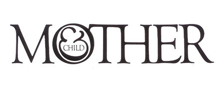
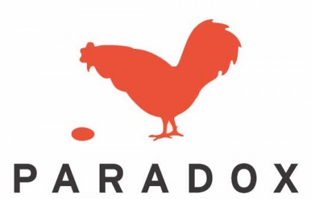
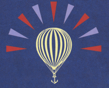
I am usually reluctant to list my favorites of anything. It’s hard to establish a consistent criteria with which to judge all items fairly, and even if you do, the list changes so frequently that it’s pointless to commit it to writing. My one exception has always been logo design, and Scott’s recent post got me thinking about it again. For as long as I’ve been interested in design I have always maintained the exact same favorite logos. They aren’t necessarily in any particular order, but the three pictured above are far and away my favorite marks of all time. I’ve never been satisfied with logos that gain their strength over time or with gradual brand association; for me, a successful mark works right away.
Mother and Child by Herb Lublin
The immediate cleverness of this one is probably what is most attractive to me. I remember staring at it for about five minutes the first time I saw it in the back of Area. I couldn’t believe how at once simple and wonderfully complicated it was. The ampersand has always been my favorite symbol, so to see it employed so unusually was also very exciting.
Paradox by Christopher Simmons
Another perfectly clever image. It needs no explanation and the “aha” moment occurs instantly. I’m still impressed how much wit was able to be squeezed into one tiny little mark. Like many great logos, it appears incredibly simple and seemingly obvious, but only after it’s come to fruition at the hand of another designer.
Modest Mouse by The Decoder Ring
What a perfect single image. This is one I can’t look at without feeling incredibly jealous for not thinking of it first. It encapsulates so many different feelings and emotions in one single mark, while still managing to be aesthetically pleasing at the same time (though I can’t stand the colors). The designer sums it up nicely: It’s an idea I came up with because it represents stasis — the balloon will never go up or down. It’s just a general feeling I have about everything: Every time we seem to cure or solve something, another problem pops up.
Of course there are many other wonderful logos out there, but this is a top 3 after all. List yours if you can think of them!
I haven’t done a mix since 2005’s Pink Rest At Low Levels which you can download here, its an ambient/IDM mix of my favorite music I’d listened to when I would fool around in Adobe Illustrator. This new mix called Goodnight Gracie is kind of an ode to a weekly I did for 3+ years with Matthew Dear, Ryan Elliott, and Scott Brandon at a lounge called Goodnight Gracie in Ann Arbor. Ryan Elliott and Matthew Dear now are big international DJ’s and Scott and I took the night over once they started touring. Ryan would let me open nearly every night and play ambient and deep melodic house before they went on so I could hear Broker/Dealer on decent speakers, I hope you can at least enjoy the end.
Markus Guentner – Untitled 3 – In Moll – Kompakt (2001) Audion – I Am The Car – Unreleased – Spectral Sound (2009) UND – Ambivalente – Maxfield – Defrag Sound Processing (2005) Pleite – Pleite – Pleite – Trapez (2003) The Librarian – The Hornet’s Nest (Teef Antihisatmine rmx) – ModeTwo – Moodgadget (2009) Sten – Way To The Stars – The Essence – Dial (2008) Omar S. – Oasis #1 – Oasis EP – FXHE (2005) Pepe Bradock – Deep Burnt – Burning – Kif Recordings (1999) Cobblestone Jazz – 5th Element – 5th Element EP – Itiswhatitis Recordings (2002) Daso & Pawas – Det (Schatrax Beats Plus rmx) – Det – Spectral Sound (2008) Pigon – Promises – Promises – Dial (2007) Lusine – Excess – Push EP – Ghostly International (2003) Slowdive – Good Day Sunshine – Souvlaki – SBK (1994) M83 – I Guess I’m Floating – Before The Dawn Heals Us – Gooom (2005)
Introduced in 1976, the Leica R3 was a compact SLR based partly on the Minolta XE (the MOT — pictured above — being the motor driven variant). These can be had on the cheap via ebay, would make a great secondary camera for film stuff.
Prefuse 73 patches together a very strong 30 track LP called Everything She Touched Turned Ampexian, The artwork looks like it was thought out nicely and so was the record. Mr. Herren has reached a great level in music making which is instead of selling out and going the Steve Aoki celebrity DJ route and writing ringtone rap like some other fading stars that i follow on twitter. Herren sounds like he got to a point where he could really push his sound past glitch hop and more into sampling live instruments in the studio which should be every musicians dream but it isn’t anymore. Now he probably will get to work with great musicians and if anything I hope to hear some more collaborations with him and other New York bands.
New Doom is finally out in stores, it features this amazing Raekwon track and he also MC’s over J Dilla’s Lightworks!
Sex Trothler better known under the name Seth Troxler releases again on another Brooklyn based label called Wolf+Lamb Music. The sound reminds of straight early to mid 90s Detroit Techno that was minimalist, melodic, raw, and forward thinking. The vocal is a definite plus, it sounds like a proud diva, something many other younger producers would never of had the courage to touch.
I remember seeing Omni magazine when I was a kid and wanting it. For some reason I was never able to get my hands on an issue, so I still don’t know what it’s about, something to do with sci-fi apparently. Anyways, the covers and style are excellent regardless of the content. You can find an archive of all the issues here, although the images aren’t very large.