This is a pretty passionate subject for me, probably one that I could argue over for the rest of my life so I decided to finally make a series of posts. Lets start with the NHL aka the National Hockey League. Who has the best and worst logo and why is the question, if you want to join the argument, here is a list of logos.
I will be doing the best NHL logos in a different post and we will go through a few other sports as well.
TOP 5 WORST NHL LOGOS
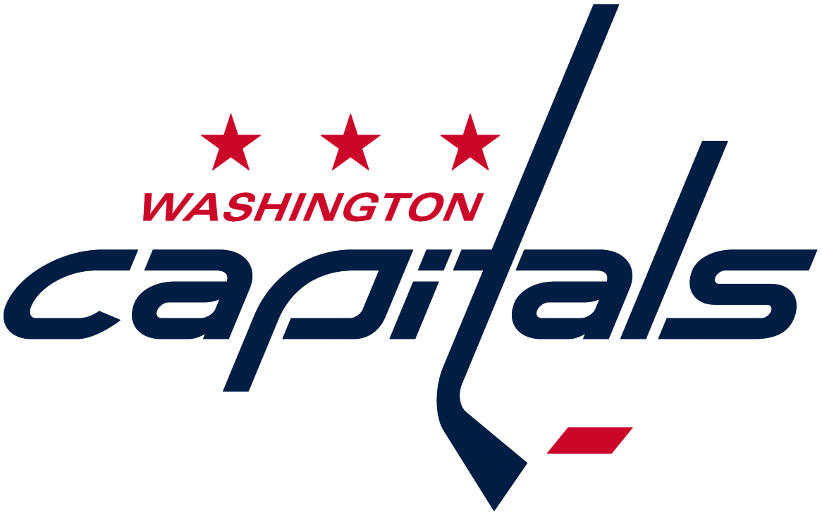
#5 Washington Capitals
Let me point out a few things before I start explaining the problems I have with it. First off, not a boring font, not a great font but hey i’m actually alright with the ITA situation with the stick and connections its making. Now step away from it and stare, what is it? I want to sell merchandise for my hockey team and make something special for the city that will support it. What is this though? a love for a font and i’m adding a hockey stick because hey its hockey?? It honestly looks like a rushed college graphic designers homework assignment that was turned in without a passion or connection with the sport. An agency maybe doesn’t even care for the sport? could that be what happened here? I’m not going to question the 3 stars or the color scheme but seriously if I was from DC i’d just sort of feel bummed out by this.
#4 Winnipeg Jets
I’ll start off with 2 nice things to say, first off nice work on fitting in the Canadian maple leaf and second i’m happier with this than their old logo which isn’t saying something that nice.
Okay now, i’m into an icon that represents an organization but that has to be a pretty low effort in the jet icon world. Also, why so literal with the leaf and the jet? I also have a problem with its something hard to get excited over, as a fan i’m already excited about the team why not add some cherries on the top for the people of Winnipeg? its like a vague statement without any effort for surprise. I mean this city JUST got their hockey team back and they revealed that…the city was in tears announcing they got their team back and a designer turned in a C- / D+ effort, you give a graduate design class this project and 2 to 3 students in each school across the continent would turn in hands down better executions for a team in 2015 that has the word jet in its name.
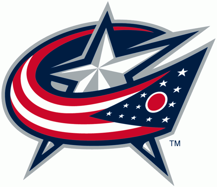
#3 Columbus Blue Jackets
Ooooooooooh boy, now we get into the portion of the list where the pros column gets a little thin. We have a star with a flag whizzing across the front like a Miss America ID ribbon strap. You want generic? here is something pretty generic. You already made the average sports fan happy by using colors that most people would wear and I guess the patriotic angle works BUT who made this rule on why things need to look 3D and more importantly angled and tilted?? I completely understand its better than their old logo which is a ribbon cutting disaster but if you’re building a city from scratch to fall in love with hockey then this 2nd step forward on the logo front is full of hesitation and conservative ideas, someone with an imagination needs to step in and start working with them, they aren’t a lost cause.
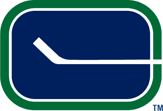
#2 Vancouver Canucks
My beloved Canucks, my first sports team that I completely adored. I never was a fan when this logo came around in the past and in the present because I was pretty much a fan only in the 90s during the Pavel Bure era. Some people might argue with me that I just like a simple logo, this…I don’t know… who let this out in the public? I’m sure more than one person is in the decision making of a logo out in public, I don’t think there was much thinking going on. Again with the fascination with the hockey stick, we understand one is used to play them sport but putting over a hockey rink and saying thats your cities logo…no, no you can’t turn that in. Its almost frightening that adults were in charge and approved this.
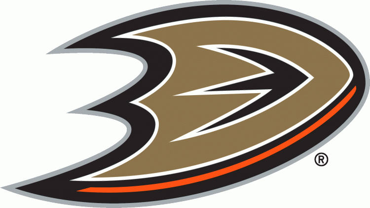
#1 Anaheim Ducks
Well well well, look how far you’ve read into this rant, i’m surprised you stuck around.
Look at this logo… maybe blow it up full screen i’ll wait… and gaze at the glory of it and imagine the confused faces across the country when they saw this the first time.
Its a D for Duck THAT. IS. MAYBE? A BACKWARDS DUCK FOOT?? or a chubby boomerang that would never work because of the surface area and die-cuts. Maybe a shield!?..no, no its not, its just a copper D that was abused in illustrator by a Mountain Dew loving bro. I can’t wrap my head around it and I don’t expect anyone else too either especially anyone in California that showed up to the unveiling of this logo. You go from team colors of teal and purple with a duck mask into this batman weapon made of Taco Bell ingredients.
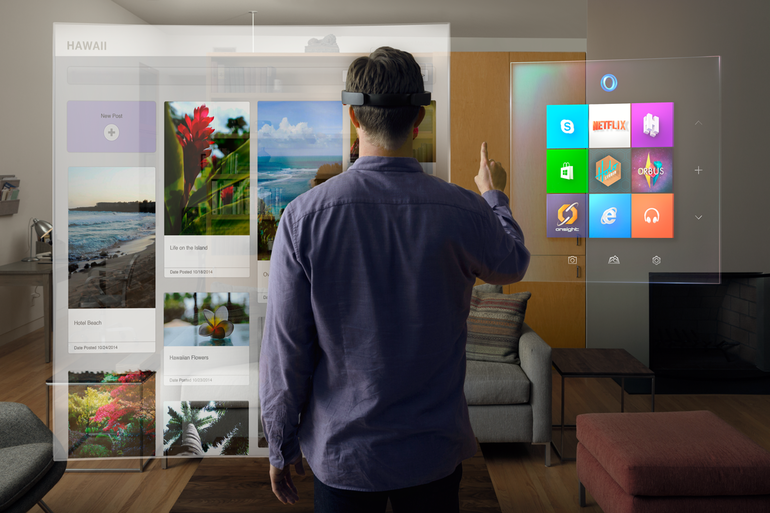
Well things just got a little more closer to that reality with Microsoft’s HoloLens. Instead of products like Google Glass and Oculus Rift, which put the user in a virtual world – the HoloLens puts you in a virtual environment by taking elements from a digital world and making them an interactive part of your world.
“In one demo, a Minecraft scene was displayed over a real living room. A Microsoft minder asked me to select a virtual hammer (a tool in the game) and start smashing the coffee table in the room. She wanted me, in other words, to use a digital object to interact with a real one. I did so and was stunned by what happened: Before my eyes, the real coffee table splintered into digital debris, and then it was no longer there. HoloLens had perfectly erased the coffee table from the environment.”
“Using real photography from the Curiosity rover, Microsoft was able to re-create a Martian landscape and overlay a 3D-map around a small, conference-room-size environment. I can walk around, bend down and look at rocks. I can even see NASA’s Curiosity rover, which is larger than a standard motor vehicle.”
“With HoloLens, I’m not just able to see what it’s like to walk around on Mars, but I’m also able to interact with the contents on the surface. Using a finger gesture called Air Tap, the HoloLens lets me mark certain spots on the surface for investigation and even lets me talk with another floating figure and collaborate on examining the surface.”
You can read more about Windows Holographic and the HoloLens on The Verge.
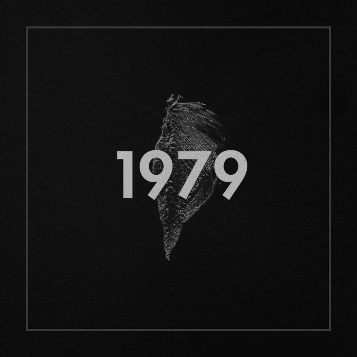
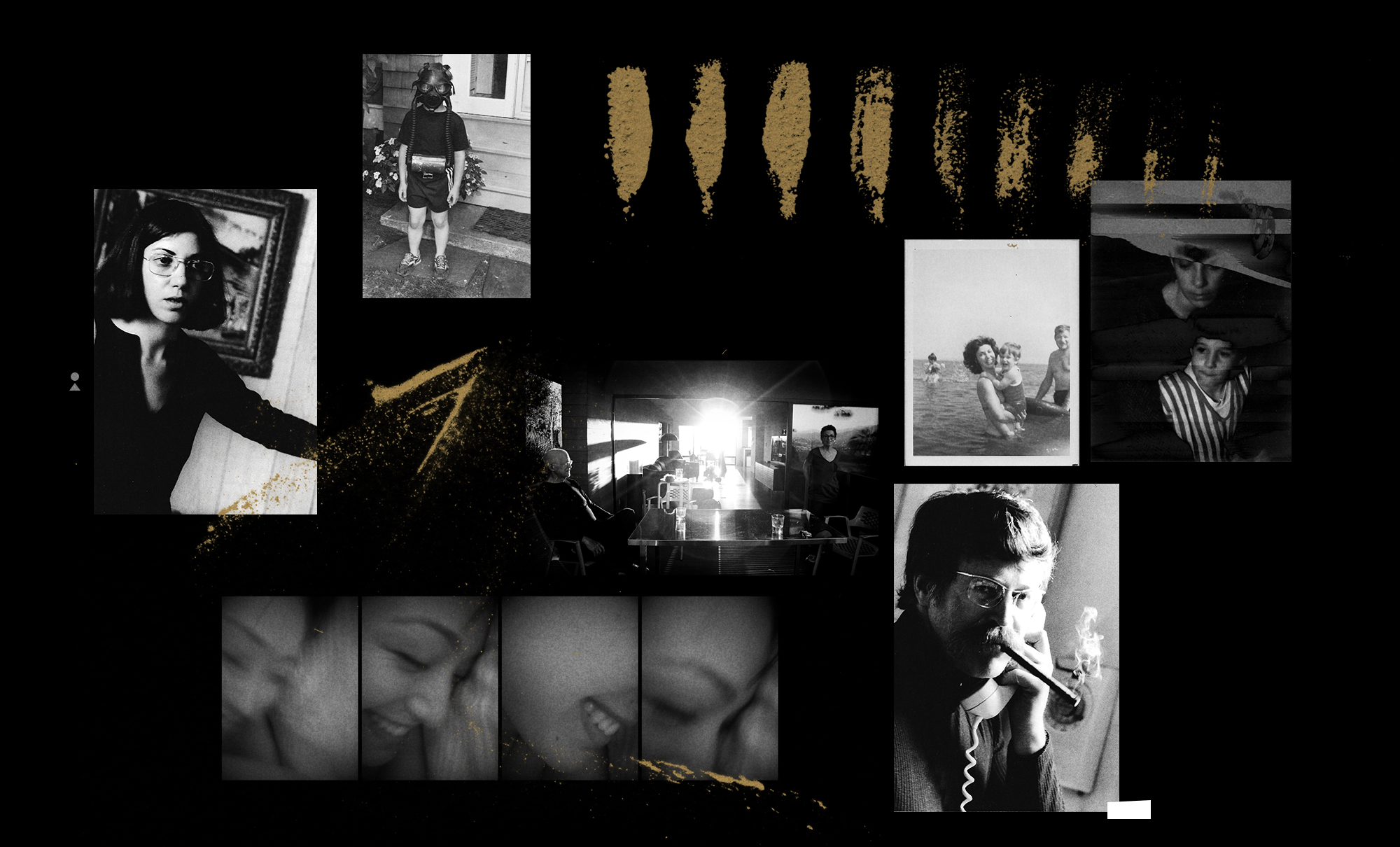
In a time where the devaluation of music seems to be at it’s peak, fans and audiences expect every release to be either for free or donation based, which forces musicians to tour extensively or resort to day jobs in order to support themselves. Deru, an electronic artist who questions this establishment, explores an innovative release of his latest album, 1979. His approach influences listeners to place themselves in an appropriate listening environment, delivering an entirely new experience.
To help him with his vision, Deru enlisted a team of people including the visual artist, Effixx, who collaborated previously on the Outliers, Iceland: Vol. 1 project.
I sat with Deru & Effixx to discuss the themes and concept behind 1979:
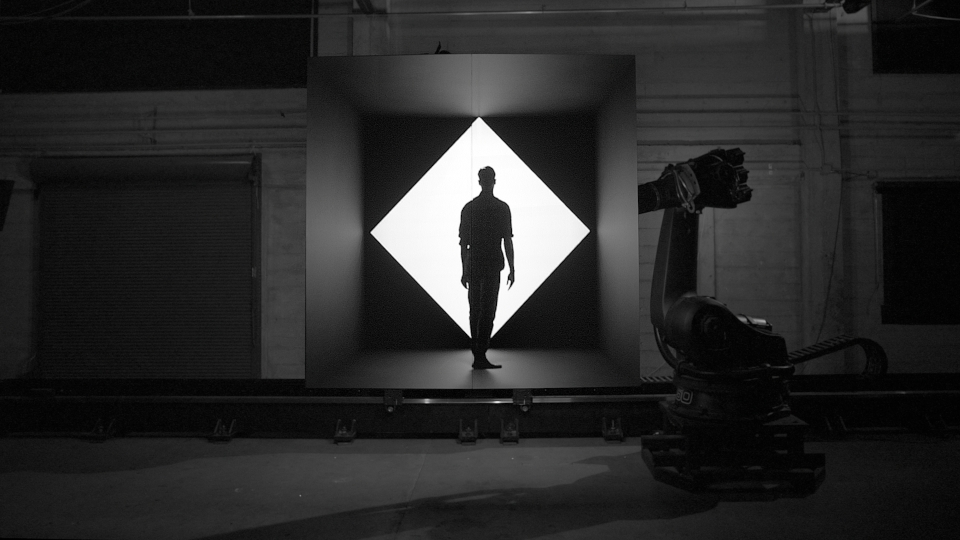
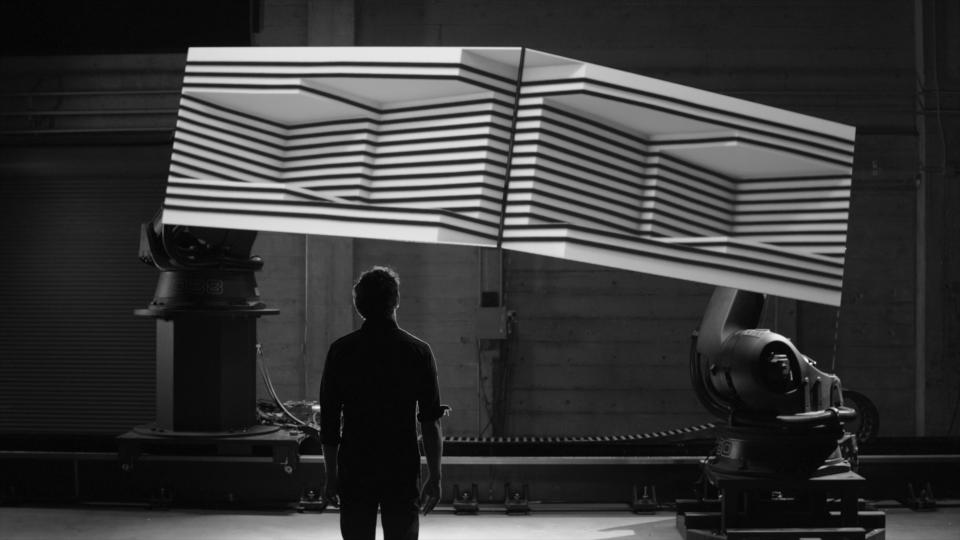
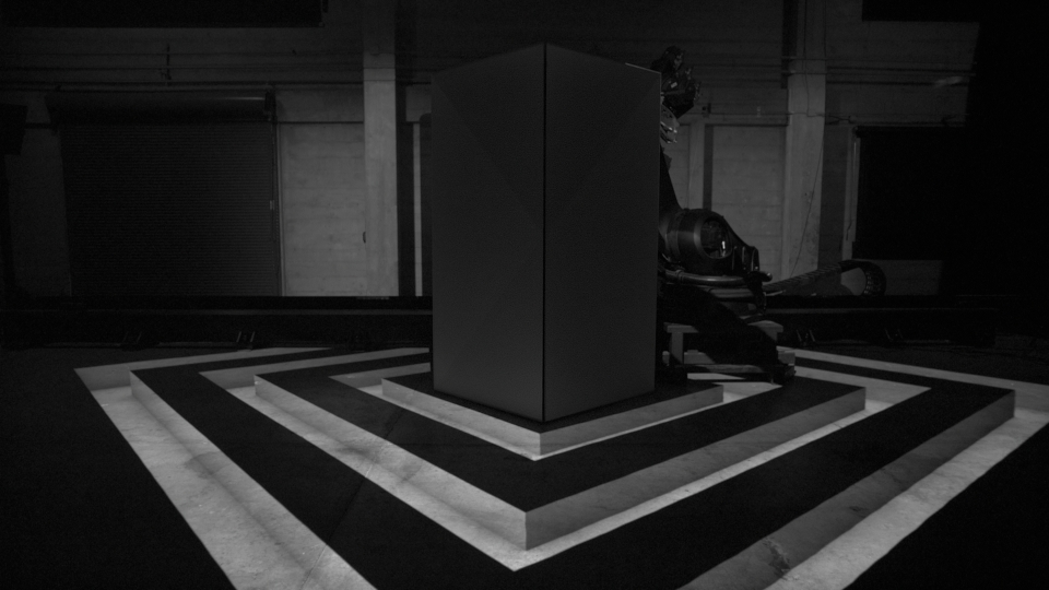
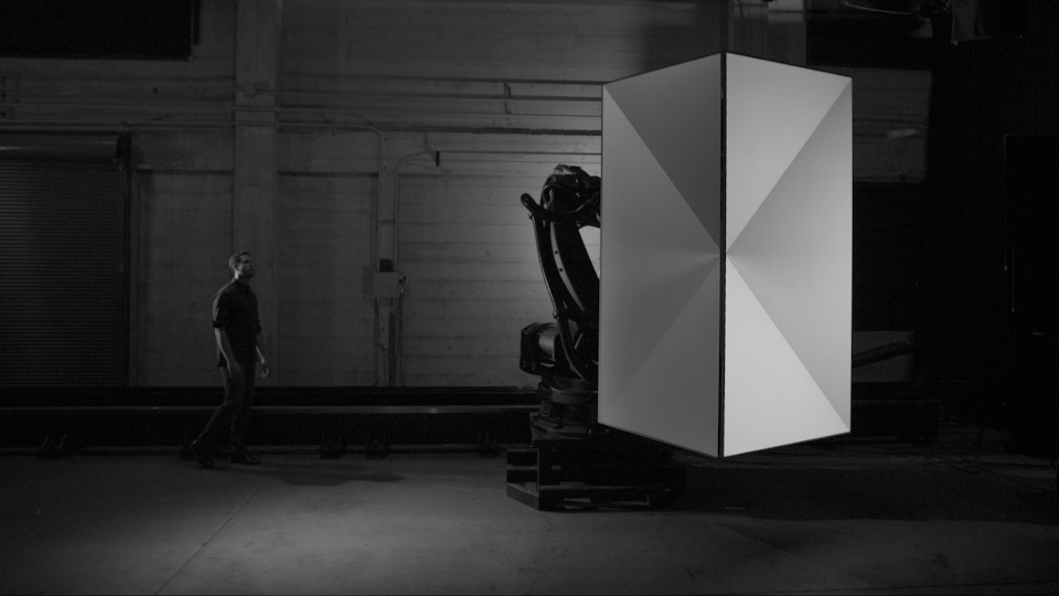
We’ve truly entered an exiting era of new “user experiences” and no front is exempt. From web and mobile platforms, art installations, to film and video games, there seems to be a sense that no frontier is unreachable and what one day seemed impossible, has been surpassed beyond our wildest dreams, forever altering our perception on whats “real”. Enter Box.
Box is a live performance film by Bot & Dolly, that documents a first ever live synchronized performance using 3D Projection Mapping, Robots and Actors:
Box explores the synthesis of real and digital space through projection-mapping on moving surfaces. The short film documents a live performance, captured entirely in camera. Bot & Dolly produced this work to serve as both an artistic statement and technical demonstration. It is the culmination of multiple technologies, including large scale robotics, projection mapping, and software engineering. We believe this methodology has tremendous potential to radically transform theatrical presentations, and define new genres of expression.
About Bot & Dolly
Bot & Dolly is a design and engineering studio that specializes in automation, robotics and filmmaking.
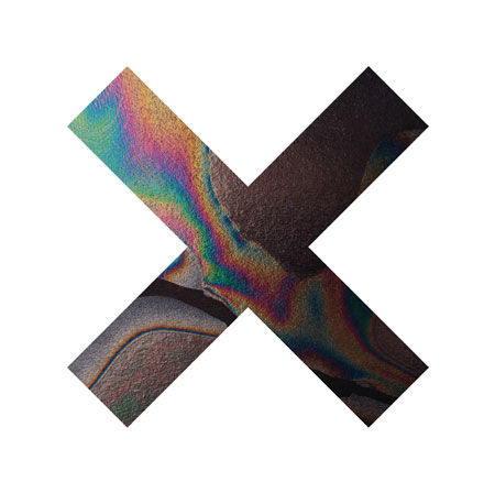
The XX have opened up and share Coexist with us a week before their physical album comes out on Sept. 11th on Young Turks. Also, visit their site and share the album with friends, they put some time in putting together a visual map of people sharing the album and how its hopping around.
To play the media you will need to either update your browser to a recent version or update your Flash plugin.
HIGHLY RECOMMENDED: Concentration and noting the repetition aren’t the key points to listening to a song like this by Steve Roach. It honestly takes exercise for most people on this planet to enjoy it. Some people like body music, familiar structure and others don’t, the fans of this style aren’t synth connoisseurs like others think, for me its like my brain has taste buds and someone pouring maple syrup on my brain, no drugs involved. This kind of music is the closest you can get to an actually exhilarating journey without moving and its made by a person that cares about quality thru and thru, I truly believe if there was a study this kind of sound is addictive.
Shed releases his hybrid genre LP today, there’s actually a few songs I wanted to share but this one stuck with me, probably not the best representation of what the rest of the album sounds like but it spoke to me, full on glide mode. If you’re looking for the LP, its here.
One sound(the smashing kick with the claps) I don’t agree on with Supreme Cuts just because the unethical use of them in rave music that wasn’t good in the least bit but thats only 5% of the time. But this might the most humble and well done outro i’ve heard in a while, give the listener what they are use to hearing at the end while it fades out, sequence wise i’m impressed and I really like the song as a whole.
Throwing Snow keeps making best music at the highest bpm that is head noddy but never screaming for my attention.
What you are observing above is basically this (as described by Jon-Kyle Mohr):
Sound frequencies are displayed as they are heard. Lower frequencies are mapped low (bottom) to high (top). Brightness is determined by amplitude.
Sweeping tones and rhythmic patterns create intricate structures. The circular form is in memorial of dead formats; the CD, MiniDisc and others. R.I.P.
Andrew Ohlman, who also happens to be a member of the Cargo Collective team, compiled a Quartz sketch which does similar things called Circular Spectrogram.
You can download the Circular Spectrogram application here to create your own visuals (currently only available for Mac users).


")
")
")
")
")
")
")
")
")