TMA-1 Headphones Winner
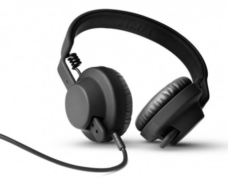
Congratulations to Éric from Rezé, France who won the TMA-1 headphones giveaway. Thanks to AIAIAI and The Ghostly Store for hooking it up!

Congratulations to Éric from Rezé, France who won the TMA-1 headphones giveaway. Thanks to AIAIAI and The Ghostly Store for hooking it up!
In my new, and sure to be infrequent column, I’m discussing brands of note, some old, others new, and those long gone. As someone interested in the development of brands, these posts are less about business, and instead about where art and industry marry in historic form.
An unexpected brand making well-deserved headlines is J. Crew. Yes, that one. I had the same reaction when a few of my trusted friends made me aware of the brand and it’s current status. My memories of the brand were from the mid-90’s, of $98 Rollneck sweaters and greater misdeeds. Now I count myself amongst the fans for this most seemingly common of brands.
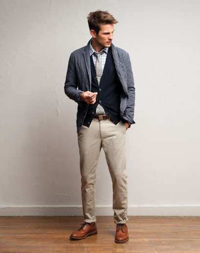
In it’s current moment, J. Crew has become less of a product line and more of a sensibility. The best example of J. Crew as a ‘perspective’ is their ‘In Good Company’ collection, which combines the 2000’s obsession with brand collaboration and good old fashioned curation, pairing the company up with well-worn heritage brands like Sebago and England’s 86 year-old outerwear brand, Belstaff. This is what is affectionately call an “ethos grab” or the adoption of the traits from greater brands via their inclusion in your own.
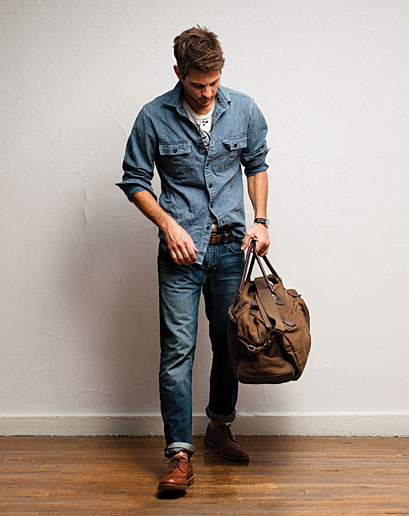
Riding on a wave of preppy fascination ushered in by a few East Coast indie bands, men’s clothing saw a sea change in recent years towards a more subtle look, taking over for a trend of logos and bright colors. J. Crew also wisely eschewed an overt prep direction, Instead opting for classic American and work-inspired clothing.
Like any brand resurgence (Apple, being one), it starts at the top and it infects the whole company. Mickey Drexler is the patriarch of this evolution, and his attitudes towards hiring and culture have informed the brand’s ascendency since he joined in 2003. Creative director Jenna Lyons has become a celebrity in her own right.

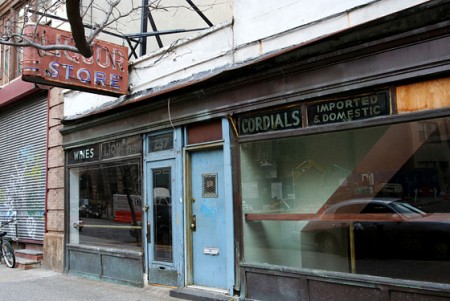
The inclusion of Andy Spade, co-founder (with his wife) of Kate Spade and his own confusingly named Jack Spade brand, was another brilliant hire, whose sly blend of Midwestern charm and a hint of old school smarm (David Spade is his brother) created the best asset perhaps of J. Crew-dom, the Liquor Store shop in Tribeca. A barely refurbished bar as men’s shop, and a signless work of retail genius.
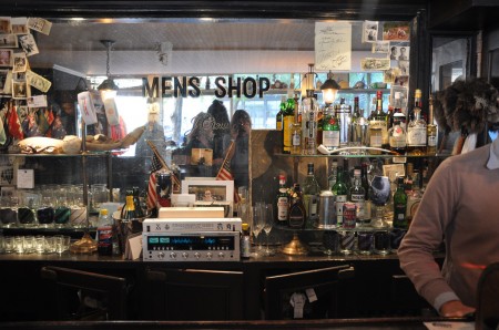
Mr. Spade on the relative anonymity and modest scale of Liquor Store:
“It’s odd that people think they have to brand everything with their own name to be successful. Certain companies are experts at certain things. I love brands that show humility and don’t try to be all things to all people. How many brands that got bigger got better?”
J. Crew
Founded: 1983
Golden Age: 2008- ?
Typeface: Goudy Old Style
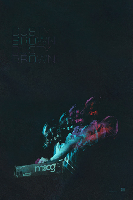
In case you missed the latest newsletter (sign up here), there are two new prints available at the shop. First is the Dusty Brown poster featuring artwork from their This City is Killing Me EP. It’s a limited edition giclee available in four formats. More info / purchase here.
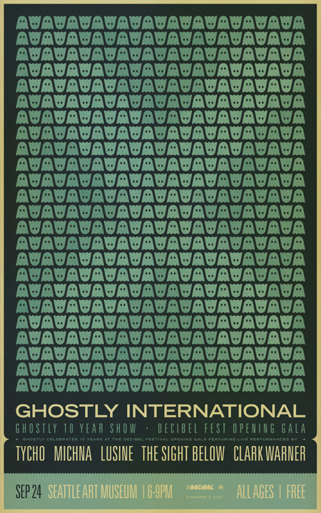
There’s also a very limited run of prints from the Ghostly 10 year show at Seattle Decibel Fest. This edition is limited to 200 pieces, 11×17″, $15. More info / purchase here.
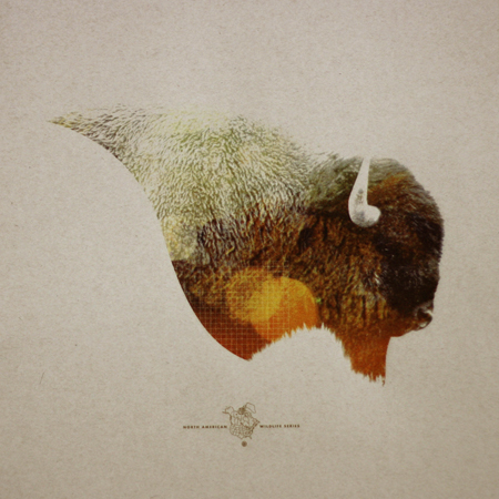
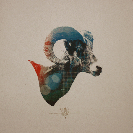
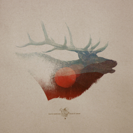
Mark Weaver has got to be one of the most consistently stellar (not to mention prolific) designers I know. I saw his “How To Destroy Angels” cover printed tinty tiny next to a review in Rolling Stone and knew immediately, Mark Weaver! The prints above are from his North American Wildlife limited edition series. They are for sale on his shop as of this week.
Be sure to also check out Mark’s answer to how he overcomes creative block: …”To achieve full creative potential I must sit in the woods, watch Mad Men, and listen to Boards of Canada simultaneously.” One of my favorite answers.

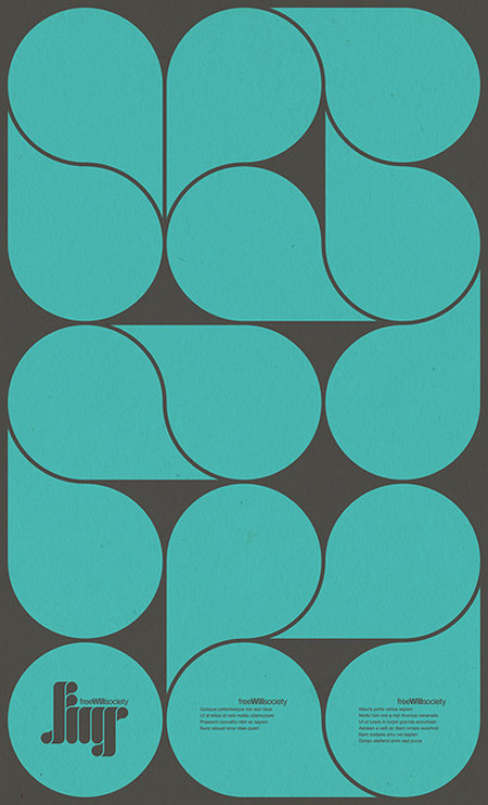
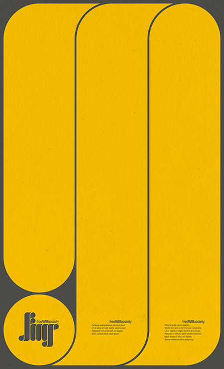
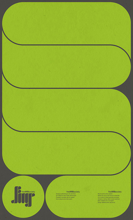
More visually stimulating work by Mihaul Mihaylov. This time in poster form. I particularly enjoy the repetition of shape curve from the logo to the main graphic elements.
See more of his work on Behance.

If Kraftwerk got a little more thuggish with their production and Joy Division sat down at computers to make their music then that project had a baby in the 80’s it would be called Com Truise. [all of that description is a good thing] The man just shoots out hits in my mind. Pyragony touches what recent synth pop artist can’t even grasp at, that flowing 80s FULL sound and this remix?! finally Pat Benatar teen girl fans can agree on something with the preppy girls, this song is an anthem for both.
Gold Panda has something up his sleeve, what he chooses to repeat and loop and lay over itself puts a smile on my face every time.
I want more Hotel Mexico, it has hints of Memoryhouse but with that violin intro it gets abit hoe down-ish but in a good way, maybe some similarities to Small Black even, whatever it is I want more.
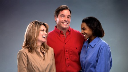
The video for Ratatat’s new single Drugs is absolutely horrible, which is exactly what they wanted. Carl Burgess scoured the depths of the Getty Images archives and pieced together this string of painful moments set to music. The recycled mediocrity vibe is strong and there is a fair amount of uglification going down via some video post. I have to imagine someone involved in this project is a big Tim & Eric fan, and perhaps watched one too many Aphex Twin videos.
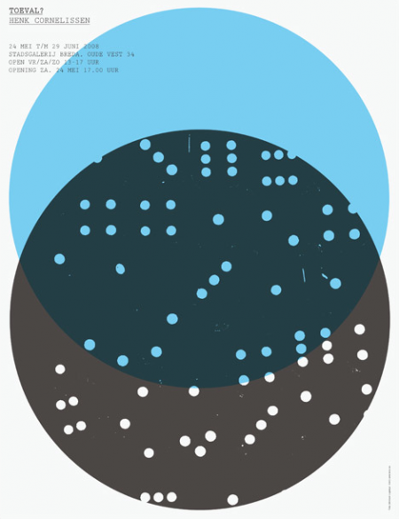
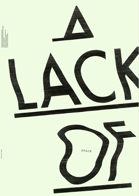
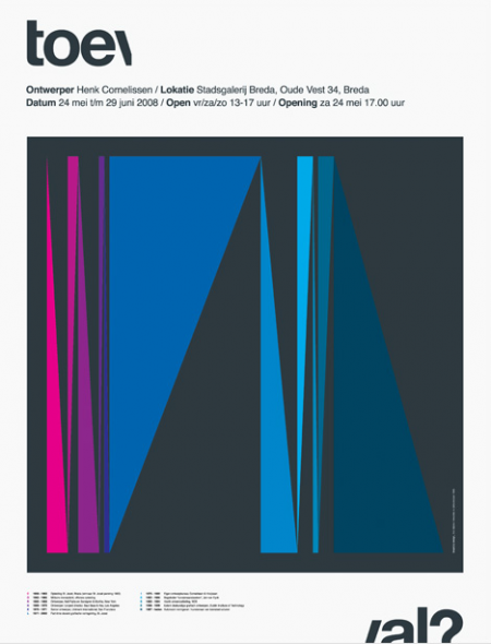
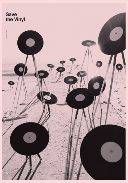
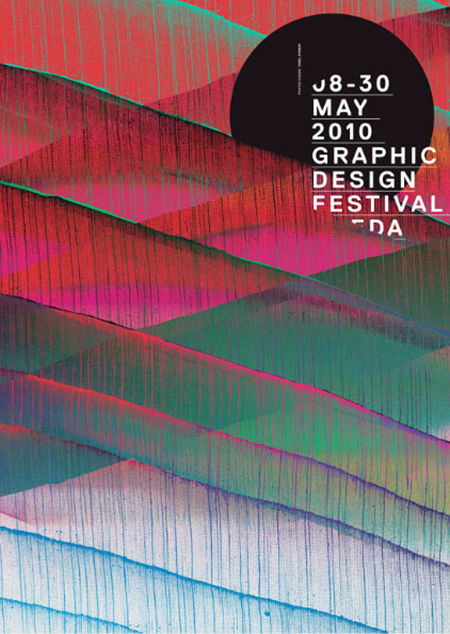
Toko is a multidisciplinary design studio based out of Sydney (formerly Rotterdam). Their work is difficult to pin down as they exhibit design prowess in many styles and mediums. In the works above you may notice a consistent ‘distress’ to each poster — whether it be a simple fade or a TV-like distortion. Almost looks as if the posters were laid out and then tampered with by some visually gifted distress-gremlin later on. I especially love the “A Lack of Space” piece.
Also notice they are sporting one of those ever so shiny .nu domain names.