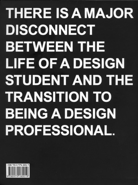
I just finished reading Never Sleep, the new book by Andre Adreev and Dan Covert of dress code. As a student, the back of the book (pictured) kind of freaked me out when I first saw it. My brief and occasional foray into the world of freelance has exposed me to some differences between school and the professional world of design, but I’ve always figured I’ll be in for a wake up call when I graduate regardless. I was psyched to see a book written about this exact process, and I spent last night (as the title suggested) reading the lot of it.
The book chronicles Andre and Dan’s transition from design school to the professional world. They describe, in-depth, just about every aspect of their journey; studying at CCA, working for MTV, and the eventual creation of their own studio in NYC. Along the way, they include examples of their own work from each stage of their career, as well as various essays by professors and professional designers (many of which are available on the site). The book describes just about everything that happened to Andre and Dan, even the occasional IM conversation, and this makes for a very engaging read. The third person narrative is just about as random as it is amusing, and is ultimately very accessible and insightful for the struggling design student (that’s me).
Dan is Ohio. Andre is Bulgaria. They is dress code. At the combined age of 50 their work has been recognized by shiny awards, appeared in lots of magazines, coffee table books, and 3 museums. They met while studying graphics designs at California College of the Arts. Then moved to New York and got jobs with MTV working in motion and print—before stupidly leaving their dream jobs to start a studio of their own. (Buy)
Here is the second installment of Images From Where? and By Who? where we try to figure out who did the original design, photograph or product and if that becomes too easy then its hopefully just a nice small collection of images that might be inspiring for your day of creating.
The first image I just found yesterday and it had nothing attached and the link was generic. I would love to know if these are miniature or full size because i’d save up and buy that small brown one on the right.
The second image i’ve shown Scott once and told him if I could ever have any special power it would be being able to draw the way this car is drawn, incredible work in my opinion.
The third image is just of this generic floppy disc sleeve, you see I use to be a buyer sometimes for a few thrift stores back in Michigan and i’d spend a lot of time looking for a lot of things that looked exactly like this, to most it looks like whatever 80’s junk but i’d probably frame it.
Burial and Four Tet have just put together probably this years best collaborative effort on vinyl. The vinyl release contains two 9 minute tracks that show off both of their skills of making catchy repetitive melodies that lay over airy soundscapes and softened keys. Moth has the potential to become a great piece to space out too while Wolf Cub asks for more of your attention while it plucks along and kicks into dubstepville.
ISO50 is back online after the server apparently took a much needed 24 hour nap, hope you didn’t miss us too much…
Anyways, before the outage I had planned on posting this amazing prefab home from architects Horden Cherry Lee. The “Micro Compact Home” is a joint Japanese/German project and it shows. You really can’t go wrong with that combination and you also can’t go wrong when your new home is delivered into the mountains by some Swiss helicopter. Awesome. Loving that antenna too, or is it a flag pole? Either way it makes the whole thing about 100 times better.
Spring is finally creeping into town (although very slowly here in San Francisco) and I’ve been way into the AA tri-blend tees this year. So I printed up a modified version of the Vuela Print on Heather Grey tees for your sunny weather enjoyment. As always, you can get yours over at the ISO50 Shop. I’m also clearing out a lot of the older designs to get ready for summer so you’ll find lots of shirts marked down 20-30%. All marked down shirts are the final pressing of that particular design/colorway.
On a related note I’ve been spending a lot more time trying to learn the ins and outs of product photography. I’ve been shooting the products for years but I’ve never spent enough time worrying about the color accuracy of the output. After all this time working with cameras you’d think it would come easy, but I was surprised to find how difficult it was to get good shots when the goal is creating a color accurate representation of an inanimate object. With my creative photography I’m always trying my best to make things appear inaccurate and I guess old habits die hard. For the shots above I used a tungsten photo bulb/can light along with a Quad CF lamp from Calumet. I had been using 3 lights but it turned out that hitting the subject from the right side and front with lights and letting some natural light in from the left (there was a window there) made for better dynamics so I’ve been sticking with the 2 light setup.
The last couple product shoots were the first times I’ve used a Gretag card to calibrate the camera color temperature under the lights. That and shooting in NEF RAW really went a long way to getting a solid foundation, but there was still a lot of work done in post. Having the calibrated monitor definitely helped at that point, but the real key I found was changing my own perception of the image and training myself to see it in a different way than I’m used to. I always catch myself slipping and trying to make the shots look interesting or enhanced and then have to step back and realize that this needs to be a literal representation of the real object. At any rate, I’ve got a ways to go (can’t even imagine how they get all those high end fashion shots) but it’s been surprisingly interesting learning the subtitles and nuance of a new kind of photography. It certainly is it’s own art form. I’m sure a lot of you have some product photography chops, feel free to share any of your tricks of the trade in the comments.
Also, I know I’ve been promising it for a long time, and I assure you, a very detailed post about color calibration is on the way. The project has sort of taken on a life of it’s own and I’ve brought Alex on board to help with research and production. We’re going to be shooting an interview with a color expert in the next couple weeks and we should wrap the post soon after that so stay tuned!
I don’t know much about Bonobo, I really never gave them a real chance in the past because I thought it wasa lounge act mostly because of their album covers just reminded me of those ungodly generic Hotel Costa compilations. This Recurring track is sensational, reminds me of earlier Four Tet and just for you Four Tet followers the new Burial/Four Tet collab 12″ is mind blowing, i’ll post soon.
I was going to wait and make a post titled: Shout Out Out Out Out + Chk Chk Chk + Tings Tings and a bunch of other bands that feel the need that they need to have the same word in their band name twice or more but I got bored of it and erased it. Let’s just get to the real point here which is Shout Out Out Out Out is pretty great no matter what bad choices they make for a band name. The vocal is really catchy and parts of that cover are real nice but I feel that the better designed pieces are the smaller parts and the centered simple illustrations that aren’t as interesting take up too much of the cover, i’m not hating at all here i’m just saying is all.
One of the first 2xLP’s I ever bought that was for DJing something other than Techno or House but still only electronic was Miss Kittin & The Hacker: First Album, it had this feeling all the way thru similar to a beautiful girl that you looks sweet but rude and cold to everyone.
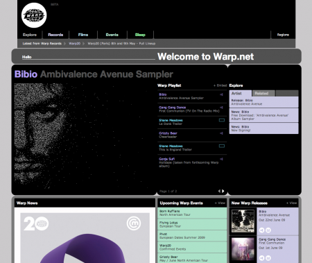
I’m not a web designer or am I Scott or many of you talented graphic designers but i’m really impressed with the new Warp website. I like how they finally used that Pantone patented purple they’ve owned for the first time in a proper way. Not to ever diss the old design which was done by Designer Republic which had a great interactive flash feature and gave each newly signed musician a color. I also like that this new site doesn’t feel like lego pieces stacked and that I can easily recognize what’s the important new news right from the start. Nice work guys
I posted on the Brionvega TS522 portable radio a while back. Now here’s the perfect companion, the Brionvega Doney TV. It is, of course, way expensive (edit: apparently not, around $300 actually, thanks sean) and way hard to get a hold of. And if you’re looking for something even more future-retro, there’s also this concept (if that’s the remote laying there, I’m sold.
Here’s another shot of the TS522 for good measure…So Rams-esque: