Vasava’s Impossible Objects
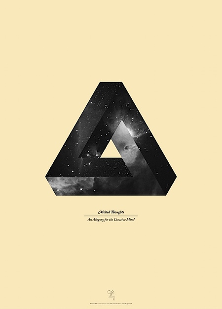
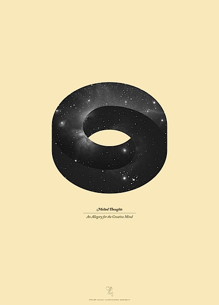
Spanish firm Vasava created these Escher-esque posters as part of a campaign for Adobe CS4. Beautiful.


Spanish firm Vasava created these Escher-esque posters as part of a campaign for Adobe CS4. Beautiful.
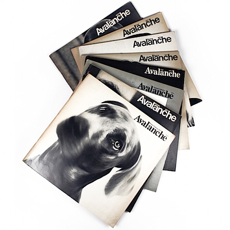
Loving these Avant-Garde-Esque covers. Via FFFFOUND
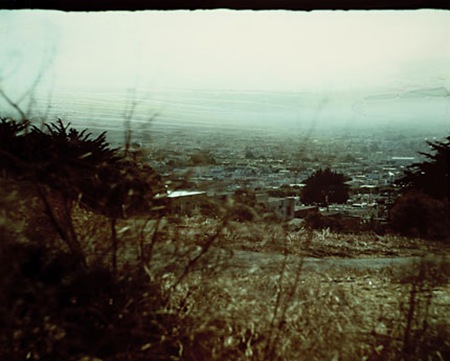
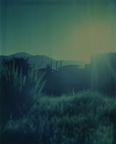
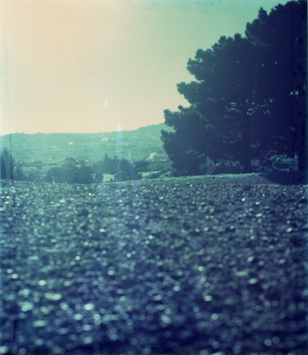
John Chiara is a local San Francisco photographer who built his own truck-sized camera. He details it’s operation in the above video and it’s nothing short of impressive the way he creates and manipulates the exposures. John’s process and results are fascinating, and it’s not just about the scale of the camera, the results themselves are truly beautiful. You can see more of his work at the Von Lintel Gallery site and get more info at the LighDark site.
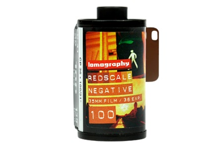
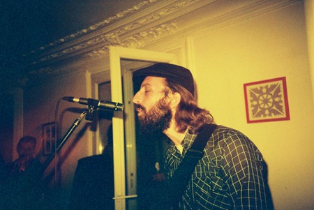
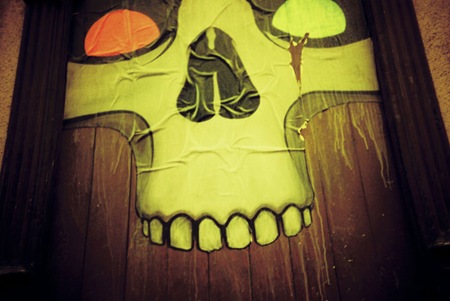
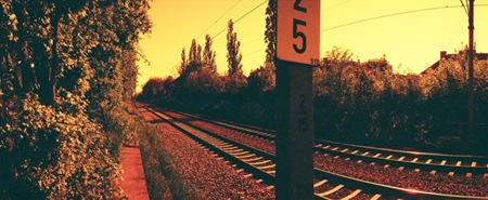
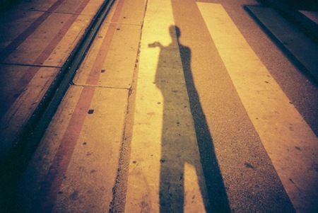
Lomo has released "the world’s very first pre-loaded and ready-to-shoot RedScale film" and the results look pretty interesting. Redscale is an old concept; it involves loading the film backwards and shooting through the base which has a protective coating which shifts colors into the red. Now you don’t have to go through the hassle of loading your film backwards to get this effect. Lomography

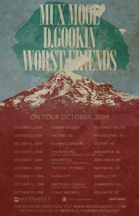 Some of the finest and most diverse acts that Moodgadget has to offer (from the Synchronicity Suite compilation) will be on tour starting October 2nd. Alex / HeadUp who contributes a good amount of feedback on the ISO50 blog did the tour poster for us. I wanted to give you all and Scott some exclusive tracks from Worst Friends, D. Gookin, and Mux Mool so please enjoy them and if you come out to a show let me know i’ll be working the merch table and hopefully blogging on here at the same time.
-Jakub
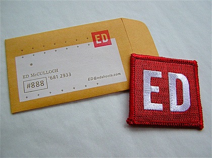
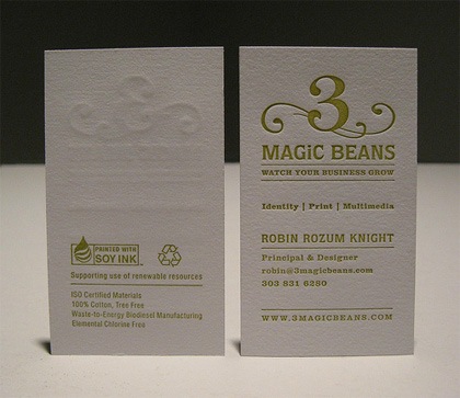
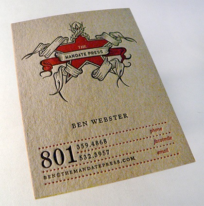
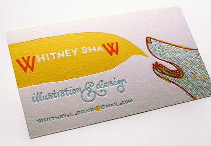
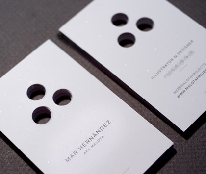
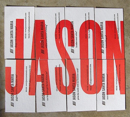
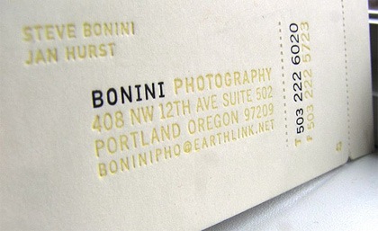
Fubiz has a post up entitled "70 Amazing Business Cards" and while I wouldn’t go as far as to call all of them "amazing", there are some nice examples in the list making it a good resource if you’re looking to make some for yourself. My personal favorites are the embossed style, I love that texture, it makes the card feel so much more substantial.
I have always been sort of torn on the subject of business cards. On one hand, I love the type-based examples, they’re so clean and to the point. But on the other hand, that doesn’t always say much about the work the holder of the card might expect to find on your site. For mine, I ended up settling on mini posters on each side with the pertinent info worked into the original poster designs, sort of a quick glimpse of my portfolio.
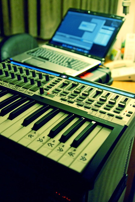
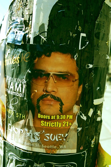
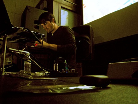
I just got home from Seattle after playing Decibel Fest on Saturday night. The show was a lot of fun and the crowd had some amazing energy. Thanks to everyone for coming out, I appreciate you having me up and hope to see you all again real soon. The Sight Below, Deru, and Lusine were incredible, was great to be able to catch their sets on such a huge sound system. I don’t have any pics from the set so if anyone has some posted on Flickr or something, let us know.
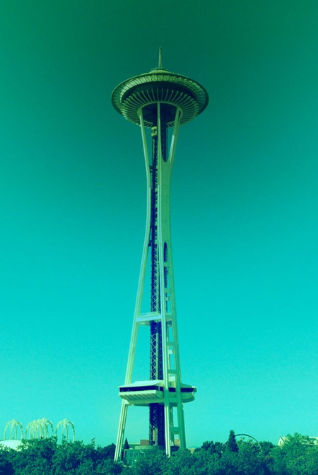
I wish I could have taken a lot more pics around town, but time was short and I never got a day to make it out with the camera. I did manage to get one shot (above) of the Space Needle from the hotel window. I love that thing, all we have in San Francisco is a stretched out pyramid. I’ve been to Seattle in the past but it was a nice refresher course this time around. There’s really a great vibe there that reminds me a lot of SF, but with way better coffee shops. They also have some amazing food; we had breakfast at a crepe place called "611" this morning. Off the charts.
I’ll post tomorrow on the VJ who did visuals for Lusine, it was incredible.
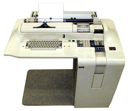
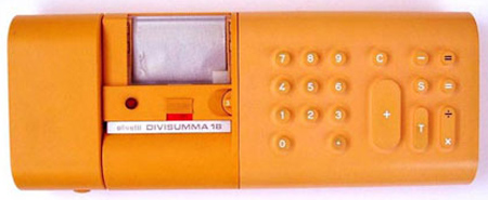
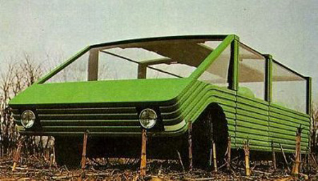 Originally we posted the Sutra which is the vehicle above but digging deeper I find the typewriter workspace is just as fascinating.