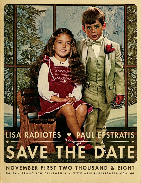
After reading Jefta’s comment in the J.Casey piece I realized I hadn’t been posting much of my own work lately so I decided to put up this wedding announcement I did for my friends Paul and Lisa. I normally wouldn’t post personal work of this nature but I was happy with the result and thought it would make a good exception. To tell you the truth, these are usually my favorite projects; there’s no money involved, no client to compromise for, and no concerns over whether it will be well received by the public. Sadly, it seems this sort of project is the exception not the rule which is unfortunate given that most of us started out in this business purely out of love and enjoyment of art and the process. The other good part of these projects is the timeline, or lack thereof. But as usual, I put this project off until the last minute so I only had a night to complete it, which ended up making it a bit more enjoyable as I knew there wouldn’t be the inevitably endless revision process to attend to after completion. As this was intended to look like a retouch or a painted piece, I was a bit more free to be heavy handed with the lighting effects. This would have been far more difficult if I was going for a photo-realistic look.
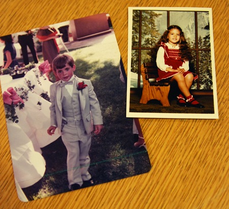
So when my friends approached me about creating this we threw around various ideas. In the end they came up with the idea of combining photos of them as kids. Unfortunately all the photos I had to choose from were very different in terms of lighting and color. I’ve never considered myself much of an expert at photo manipulation but this project made me realize just how little I really knew about the process; I definitely struggled trying to get the two photos (pictured below) to look right together. The shot of Lisa was an artificially lit, indoor studio portrait, the other an outdoor snapshot, so it was tough to get the lighting right. I decided to use Lisa as the reference point since she was well lit and then bring Paul closer to that tonal range / lighting condition. The original shot of Paul was taken at dusk as the sun was pretty low in the sky behind him so I ended up doing a lot of gradient masking of color balance and curves transition layers to compensate for the overly dynamic lighting that resulted from the conditions of the original shot. The background imagery had to be scaled up a bit, I cloned one of the windows and did some tweaking to the contents to make room for the added subject. Finally, I added some shadows to Paul’s right side to account for the new position of the lighting and Lisa’s position relative to his.
As for the art direction, I wanted this to feel a lot like an illustration or painting so I did a lot of dynamic lighting, unsharp mask, and some artistic filters to shift it in that direction. The imagery of the existing studio shot of Lisa had a distinctly European thing going on so I tried to push further in that direction to evoke a sort of vintage Swiss-era poster vibe. For that reason, and because this was just the announcement and not the wedding invitation itself, I chose the Futura typeface to give it a fresher feel (than a typical wedding invitation) while at the same time maintaining a sort of classic design sensibility. And of course I went with some loose kerning to give it that Anderson-esque vibe.
Finally I applied some paper effects (blending mode stuff etc.) to give it a real world feel. I have a bunch of vintage poster reproductions hanging around my house and always enjoyed that copy-camera style they give off. While I was overseas a couple years ago I went to a gallery that had a lot of the originals of the stuff I have at home and I got to see them in person. I realized I actually enjoyed the reproductions more, they have a nice grain and vingetting that didn’t show up in the originals (which were typically painted and so also didn’t show the yellowing of aged paper and ink.) This is the kind of aesthetic I am usually trying to achieve in most of my poster work, I want it to feel like a reproduction of an original printed piece.
All in all this was a fun project, I think we as designers should take on more work like this. Free work for friends always helps reacquaint me with the aspects of design that drew me to it in the first place; it gets me excited about the process again, an emotion that I think easily spills over into the jobs that come after it.
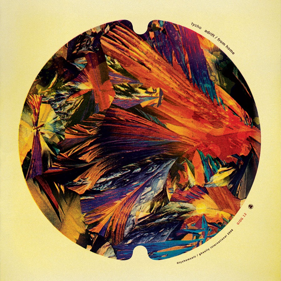
The new Tycho single / b-side entitled "Adrift / From Home" will be out next Tuesday, May 27th, 2008. This marks my second release with Ghostly International leading up to the full album scheduled for next year. This single will be available exclusively through iTunes for the first month, and at all other online retailers thereafter. While Adrift is a brand new, unreleased track, some of you may notice that From Home was originally released as part of the Past is Prologue album on Merck. This is because as part of this series of singles, I’ve decided to include the extra tracks which were included on the Merck version of Sunrise Projector (renamed Past is Prologue) so that they are available individually for people who bought the original version of the album and missed out on the new material. I’ve posted a couple clips of the songs below, enjoy.
On a design note, this of course represents new ISO50 work. It’s the first album cover I’ve done in a while and I really enjoyed the process this time around. I wanted to evoke the feeling of a 45 record from the heyday of singles and go with a really reserved, minimal type treatment. It’s also meant to carry over the circle concept from the last single. Anyways, on to the music:
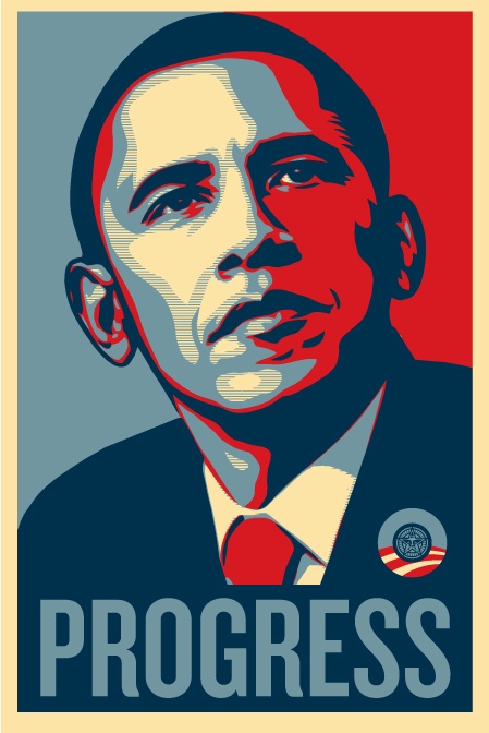
I’m sitting at San Francisco International right now waiting to fly out to Los Angeles to proof the Obama poster. I’ve got the Epson soft proof in hand (pictured above) and it’s looking good color-wise; here’s hoping they can match that with the litho. I’ll be getting a lot of shots of the process while I’m down there and, from what the campaign told me, I’ll be able to start releasing pictures of the poster within a week as long as everything goes well today. I plan on doing an in depth study of the whole process with images from various stages of the production from concept to finished product, I’ll be posting that here once the print is finished and as soon as I get the go-ahead from the campaign.
So by now you’ve no doubt seen this image. It was created by Shepard Fairey for the Barack Obama presidential campaign. It has received quite a bit of press and raised a lot of money. I really love this iconic image and have always respected Shepard’s work.
So about a month ago the Obama campaign contacted me asking if I would create the next poster and I of course accepted. After some rather grueling all-nighters working on it, I finally finished today. The print has been sent off and should be out very soon. It will be a limited run of 5000 copies which will sell for $70 each. For obvious reasons I can’t post an image here yet, but I will as soon as I get the go ahead from the campaign.
A PSB file weighing in at 2.77GB with nearly 1000 layers, this is the most complex, largest scale work I have ever created. The print is 23×40" which had to be created at full 300dpi resolution, so you can imagine the strain this put on the hardware resources of the new computer. But the new machine came through; it powered through a lot of major operations with relative ease and I can honestly say I would never have been able to create the illustration without this new computer, my old one would have choked very early in the process. I did have to composite some of the imagery in separate files and bring them in flat at the end, particularly some of the complex vectors which had to be created in Illustrator and then imported. Most of the layers in the file were Smart Objects which were scaled at double the actual resolution of the image, so it was almost like working with an 80" image. Because of all this, it was often very tedious, having to wait quite a while for even simple operations to complete towards the end of the process.
Incidentally, this was the first project I created from start to finish within OSX. I really enjoyed working with OSX most of the time, but there were a few hiccups, particularly towards the end. I don’t blame them on OSX though, they seem to be issues specific to Photoshop’s memory handling as they began to crop up when the image became very large (in excess of 2GB)..Here’s to waiting for CS4 64bit for Windows. All in all it was a pretty smooth process considering the sheer size of the data being tossed around in there.
It’s a great honor for me to be able to work with the Obama campaign and I am very excited about the impending release of the print. I’ll definitely post more information as it becomes available, I hear it will go to print very shortly, next week probably. Stay tuned for a comp.
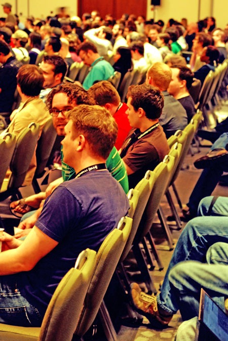
Just finished up my presentation at FITC Toronto. I really enjoyed talking and want to thank everyone who came out as well as thank FITC for having me. It’s been a pretty intense 3 days with two shows and a speech but all the work is finally done so now it’s time to relax and enjoy the conference and the city.
I was able to catch my friends from North Kingdom’s presentation just now. Unfortunately Rob was home sick but David did a great job. Incidentally, the shot above is from the NK presentation as it’s all I had available at the time of this post, the shots from mine will be arriving shortly.
Joaquim has made a short documentary detailing his trip to Stockholm for the ISO50 Workshop there this past January. Above are parts 1 & 2. Part 2 has some brief footage of the workshop itself. Thanks Joaquim!
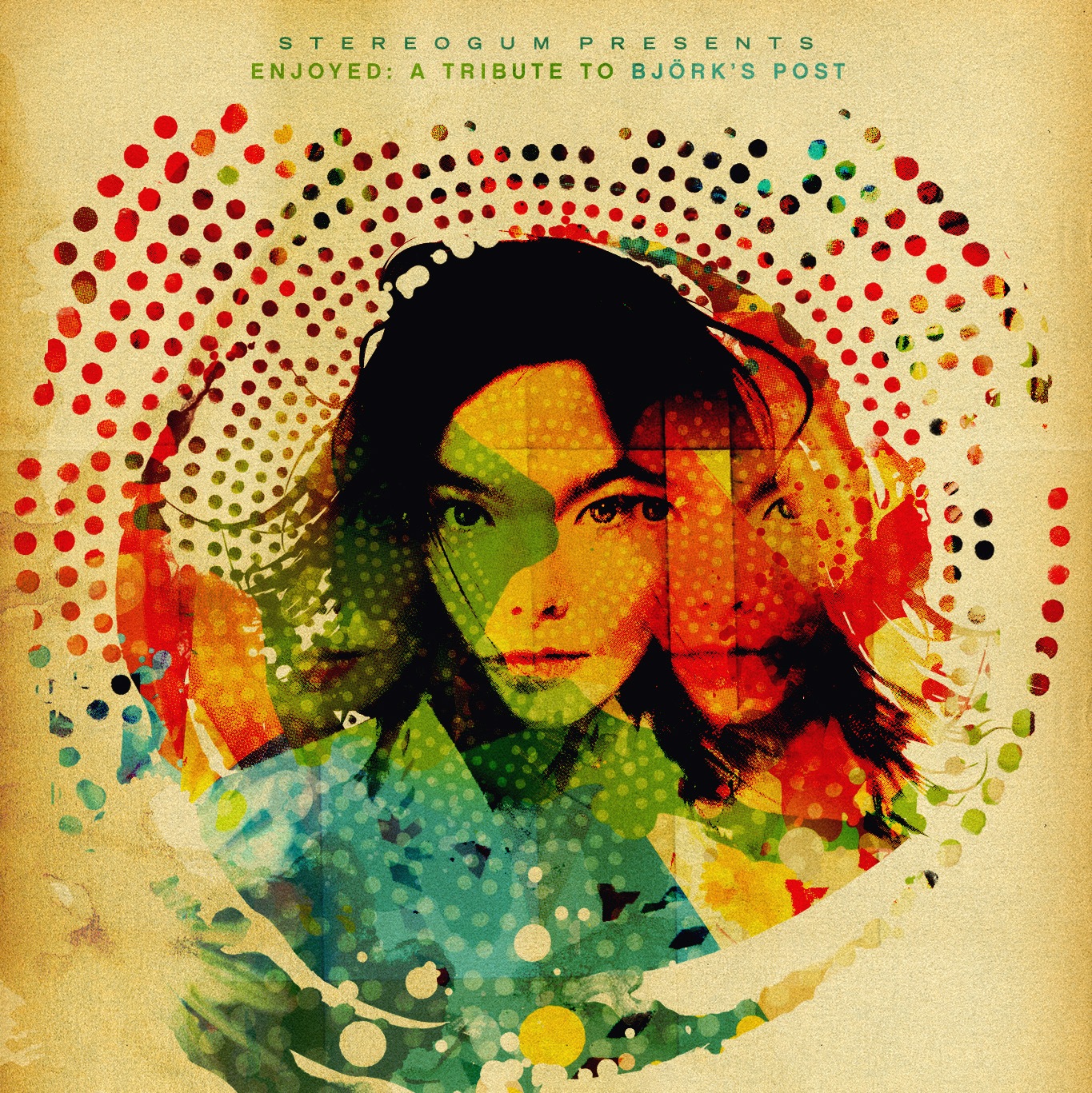
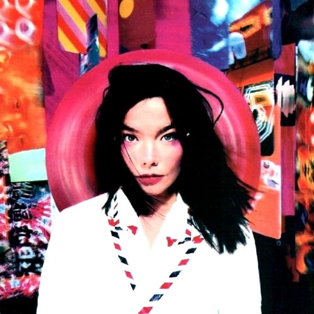
Stereogum asked me to design a cover for their latest tribute compilation. Entitled Enjoyed: A Tribute to Bjork’s Post, the collection features covers by the likes of Dirty Projectors, Xiu Xiu, and Atlas Sound to name a few. You may remember the post about Drive XV, the REM tribute, this is the follow up to that release.
In the spirit of the tribute album, they asked that I base my cover off the original. I really enjoy this sort of work as it’s a lot of fun to approach an existing composition and try to see it from another perspective.
Below is a taste of what’s in store. Check it out then download the full album for free from Stereogum!
I spent my first couple days designing on a Mac and I must say, I am now an official convert. I got all the keys and mouse behaviors tweaked to emulate the PC way of doing things (I can’t live without my right-click) and it’s finally all become clear. I feel like such a flake, I really had it set in my head that it was all about PCs and didn’t really want to listen to people who told me otherwise. All the Macs I had used in the past were other people’s and hence were set up to their liking. Also, they always just seemed really slow. This thing is really quick; not quite as quick as the PC but I am willing to sacrifice a bit of performance for the user experience and stability I have found in OS X. I know, I know – this is a huge flip-flop from my previous stance but I am completely willing to admit I’ve totally fallen in love with this operating system and I was totally wrong in all of my assumptions about it. I don’t think I will ever be without a PC (at least not for the near future), I still make music on the PC just because all of my projects and sketches are in Sonar or Vegas format which are both PC-only. But I want to start playing around with Logic and see how I like that as an alternative and perhaps make the switch all together over the next year.
I feel like this all came to a head with my disappointment in Windows Vista. I had patiently awaited it’s release thinking it would be the new PC OS that would keep me going for the next 5 years, but in reality it turned out to be a dud on a lot of fronts. Meanwhile it seems that OS X has really matured into something incredible and the switch to Intel only made it that much more enticing. I made it through an entire night of designing without one hiccup or reboot in Photoshop which is very rare. All this time I had been attributing those issues to problems inherent to Photoshop, but apparently they were Windows issues as they have all disappeared. Another big part of this is color management. I have been using the Colorvision Spyder 2 system for a couple years now and it’s just such a headache to keep all the profiles in working order in XP. On the Mac it’s been smooth sailing.
I am not about to talk bad on Windows as I sort of feel like I am abandoning an old friend. It has it’s perks; but as a lot of you have said before, for design Mac just seems to be the way to go. So go ahead, bring on the I-told-you-so’s, I deserve every last one of them. Here’s to a brave new world, sans sleep learning.