Personal Work: Save The Date
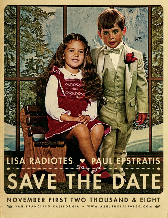
After reading Jefta’s comment in the J.Casey piece I realized I hadn’t been posting much of my own work lately so I decided to put up this wedding announcement I did for my friends Paul and Lisa. I normally wouldn’t post personal work of this nature but I was happy with the result and thought it would make a good exception. To tell you the truth, these are usually my favorite projects; there’s no money involved, no client to compromise for, and no concerns over whether it will be well received by the public. Sadly, it seems this sort of project is the exception not the rule which is unfortunate given that most of us started out in this business purely out of love and enjoyment of art and the process. The other good part of these projects is the timeline, or lack thereof. But as usual, I put this project off until the last minute so I only had a night to complete it, which ended up making it a bit more enjoyable as I knew there wouldn’t be the inevitably endless revision process to attend to after completion. As this was intended to look like a retouch or a painted piece, I was a bit more free to be heavy handed with the lighting effects. This would have been far more difficult if I was going for a photo-realistic look.
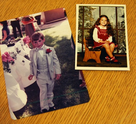
So when my friends approached me about creating this we threw around various ideas. In the end they came up with the idea of combining photos of them as kids. Unfortunately all the photos I had to choose from were very different in terms of lighting and color. I’ve never considered myself much of an expert at photo manipulation but this project made me realize just how little I really knew about the process; I definitely struggled trying to get the two photos (pictured below) to look right together. The shot of Lisa was an artificially lit, indoor studio portrait, the other an outdoor snapshot, so it was tough to get the lighting right. I decided to use Lisa as the reference point since she was well lit and then bring Paul closer to that tonal range / lighting condition. The original shot of Paul was taken at dusk as the sun was pretty low in the sky behind him so I ended up doing a lot of gradient masking of color balance and curves transition layers to compensate for the overly dynamic lighting that resulted from the conditions of the original shot. The background imagery had to be scaled up a bit, I cloned one of the windows and did some tweaking to the contents to make room for the added subject. Finally, I added some shadows to Paul’s right side to account for the new position of the lighting and Lisa’s position relative to his.
As for the art direction, I wanted this to feel a lot like an illustration or painting so I did a lot of dynamic lighting, unsharp mask, and some artistic filters to shift it in that direction. The imagery of the existing studio shot of Lisa had a distinctly European thing going on so I tried to push further in that direction to evoke a sort of vintage Swiss-era poster vibe. For that reason, and because this was just the announcement and not the wedding invitation itself, I chose the Futura typeface to give it a fresher feel (than a typical wedding invitation) while at the same time maintaining a sort of classic design sensibility. And of course I went with some loose kerning to give it that Anderson-esque vibe.
Finally I applied some paper effects (blending mode stuff etc.) to give it a real world feel. I have a bunch of vintage poster reproductions hanging around my house and always enjoyed that copy-camera style they give off. While I was overseas a couple years ago I went to a gallery that had a lot of the originals of the stuff I have at home and I got to see them in person. I realized I actually enjoyed the reproductions more, they have a nice grain and vingetting that didn’t show up in the originals (which were typically painted and so also didn’t show the yellowing of aged paper and ink.) This is the kind of aesthetic I am usually trying to achieve in most of my poster work, I want it to feel like a reproduction of an original printed piece.
All in all this was a fun project, I think we as designers should take on more work like this. Free work for friends always helps reacquaint me with the aspects of design that drew me to it in the first place; it gets me excited about the process again, an emotion that I think easily spills over into the jobs that come after it.

30 Comments Leave A Comment
Kevin Crawford says:
June 12, 2008 at 12:14 pmLooks really nice!
maro says:
June 12, 2008 at 1:09 pmYou are my Graphic Idol!!! GO GO GO! Stay tuned!
mike says:
June 12, 2008 at 1:11 pmfascinating to read the insights behind the piece!
at first glance, or to an untrained eye, there does not seem to be much to this piece, yet a further look into the process behind it reveals an abundance of thought and work that was put into it.
Scott says:
June 12, 2008 at 1:15 pmmike-
thanks….that was sort of the idea, I didn’t want the people this was intended for (paul and lisa’s family and friends) to think too hard about it, because the less they think about it the more likely they are to accept the idea that Lisa and Paul posed for this shot as children, which was impossible.
drew kora says:
June 12, 2008 at 1:38 pmweird, just got a call from a friend to do an invitation for their engagement party. you’re right…these kinds of projects a lot of fun and are a great opportunity to stretch your design legs.
Alex / HeadUp says:
June 12, 2008 at 3:06 pmThanks for posting about the process that went into it, since, as Mike alluded to, there is a lot going on below the surface…I actually didn’t realize what this was until I read your description (I guess it’s going to be a few more years before I get “Save the Date” invites for weddings…they’re coming soon tho, I’m sure). I love the vintage effects, vignetting, etc., it looks very authentic.
The most interesting aspect of the work, to me, was how you got the two completely separate photos to look like part of the same one. I myself have tried superimposing separate images into a single piece, often to no avail, only getting part of the image (such as the color balance or levels) to look consistent…no wonder, I don’t have a good handle on Gradient Masking for Color Balance or Curve Transition Layers. I’ll have to look them up, but if you could provide maybe a link or just a little more insight on that process, it would be much appreciated!
Jefta says:
June 12, 2008 at 3:20 pmwatching Todd Bentley preach on the Glory and having some good new stuff on iso50.com! it made my (mid)night!
greetings from the Netherlands
Scott says:
June 12, 2008 at 3:35 pmNot sure why it didn’t occur to me to do this earlier, but I’ve added a shot of the original photos to the post.
Grady says:
June 12, 2008 at 6:26 pmwow, great job on that photo manip. my only complaint is that the boy is slightly noisier than the girl but other than that it’s pretty spot on.
Spanna says:
June 12, 2008 at 7:53 pmwow! that is gorgeous! you pulled off the old painting feel so well, not to mention the super-imposing! The first thing I thought when I saw this was “wow, they have been friends for a long time!” haha. Really great work.
Also, encouraging words about valuing free work too. I agree but I seem to forget that sometimes… probably when my wallet is empty haha.
Jose Espinoza says:
June 12, 2008 at 7:58 pmI must say that is very very awesome.
Dan says:
June 12, 2008 at 10:58 pmi know it’s an announcement but i would enjoy this on my wall
Real nice work
Imar says:
June 13, 2008 at 12:36 amI notice that if Lisa were to stand up she would be a head and shoulders taller than Paul. Look at the height of her knees from the ground. I hope Paul has managed to catch up in real life, else it could make for some awkward wedding photos! :P
Ben Z says:
June 13, 2008 at 12:55 amReal nice stuff Scott…glad to see/hear how you went through the process (especially in one night). I also had listened to that long interview with Si Scott and enjoyed the hell out of that. Brought me back a little how you kept explaining SF and some of the west coast vibe to him, since he knew London and NYC so much more. Also kewl to see how your two styles contrasted so much (his was listening to music but not into making it at all, while you do both…which then shocked the hell out of him). So, I think it was said but that WAS Si’s work on the URB Next 100 cover right? Heading to Chicago this weekend and I saw you would be in Detroit for the ElecMusicConf yeah? Not far, so I might drive down/over(?) if my schedule allows it… hit me up on email or FBook if you have any details of dates/times you’ll be in Detroit. peace BZ
Rikkie says:
June 13, 2008 at 2:21 amGreat work Scott – at first glance I had no idea that the picture was a composite.
AlexN says:
June 13, 2008 at 4:18 amHilarious. It looks like the boy is staring right at the camera saying “don’t touch my girl” I bet the families loved it.
Can I ask what stock it was printed on?
Mylo says:
June 13, 2008 at 4:27 amBrilliant Scott. I know how hard and frustrating it can be to match up the light content of each photo and combine them into one. You explained it with ease and percision.
I think this kina post is alot more exciting for me personally, although it is also great to talk about other peoples work but the process to which you conducted the image was very interesting.
Chao
Reagan Reynolds says:
June 13, 2008 at 7:55 amGot mine in the mail last week. And though paul showed it off to a few of us a couple weeks ago, it was really cool to see the actual piece. Thanks for sharing the process, I was wondering and speculating a ton on how you achieved such a flawless result. Good work can’t wait to hang out at the wedding.
pauL e. says:
June 13, 2008 at 9:54 amiman- for the record… i am now 6’2”. scott- thanks a million for the amazing work. everyone was going crazy when we sent them out. we need to print an enlarged version to frame. lets talk website soon.
Jug says:
June 13, 2008 at 10:55 amWhat a fabulous idea!! Great execution, Scott.
NAVIS says:
June 13, 2008 at 9:48 pmI think more of these blogs would draw in more people.
As a fine artist, I love hearing about how others create their work. It gives me new ideas on how to approach my own work. I’d love to sit and watch Sam Flores or Tod Murphy paint. So I think it’d be very helpful to a lot of us readers in our own respective arts, to see how you create some of your work.
Gevi says:
June 14, 2008 at 7:31 amI really enjoyed this post, thanks for sharing. I’d thought for a while that you were a one trick pony. I’d like to see more variety, see what you can do.
Scott says:
June 14, 2008 at 12:55 pmalex-
it was printed on 100lb cover natural tone, same stuff I do all the posters at the shop on….
gevi-
ha, and what would that “one trick” be? I’d love to know why this particular piece dissuaded you of that notion.
marshall says:
June 14, 2008 at 8:16 pmThats impressive.
Gevi says:
June 15, 2008 at 1:43 pmwell with all respect it seems like you throw the same style on everything you do. If I see your work somewhere I know it’s your work because of the style. If I were to see this image somewhere else I wouldnt know you did it.
Anonymous says:
June 16, 2008 at 3:14 pmThe kerning is a little off, but other than that excellent work!
Kyle says:
June 16, 2008 at 3:21 pmYou should probably post more stuff like this. Hearing about your process and aspirations (“Anderson-esque” was a good one) is very interesting and the finished product looks amazing.
Jayden says:
June 19, 2008 at 4:35 pmGreat post Scott – I think quite a number of us have been waiting patiently for a post like this :)
TT says:
June 30, 2008 at 1:21 pmI love your work and this save the date project was phenominal as was your walk through how it came to be. You’ve inspired me to be more personal and charming in my next execution of something as simple as a save the date card. THANKS!
erin says:
August 22, 2008 at 6:04 amScott, have you ever considered doing more save-the-dates like these for people other than friends? I love it and would certainly be interested.