1967 Pontiac Brochure
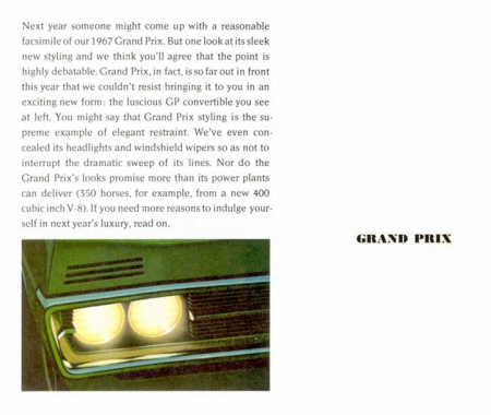
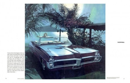
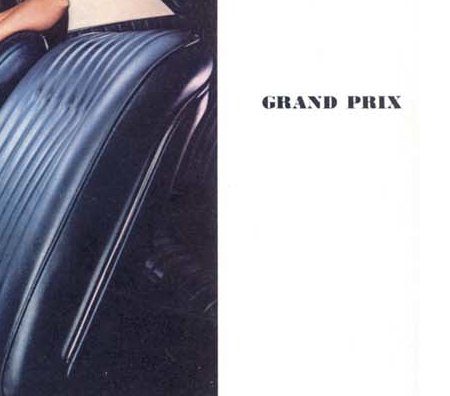
Loving this 1967 Pontiac brochure from the Old Car Brochures Archive. Check out that type on the right of each page, so nice.
I haven’t even begun to dig over there but it looks like it gets pretty deep.


Loving this 1967 Pontiac brochure from the Old Car Brochures Archive. Check out that type on the right of each page, so nice.
I haven’t even begun to dig over there but it looks like it gets pretty deep.
Was reminded of Mercedes’ beautiful 1969 C111 gullwing design after their recent concept unveiling. Beautiful Pictures; I’ll go ahead and file this under “things you can’t have, ever”. I’ve always loved cars; I used to collect die-cast models when I was a kid. I guess I picked the wrong thing to be obsessed with though because it’s becoming increasingly apparent that a 1959 Testa Rossa just isn’t in the cards for me.
I suppose it’s for the best though; nice cars are so impractical and besides, this is the sort of thing that has me dreaming these days. ($8700 MSRP!!! why do you torture us?) I feel like we as designers sort of got a raw deal; we’ll never be able to afford what our taste dictates as acceptable to us (except for that one guy who redesigned the Louis Vuitton monogram maybe? He could probably buy the car and the guy driving it). And then you see MTV Cribs and these people’s houses look like they hired Scarface and the set designer from Full House to do their interiors.
More images here
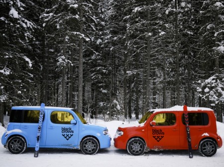
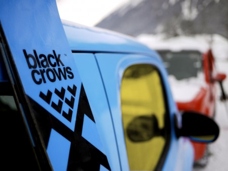
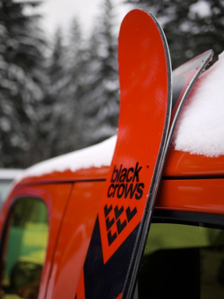
I’ve been up in Tahoe getting in a few days of skiing in before I hit the road and happened to come across some related reading. Black Crows make some very well designed skis (can’t speak to how they ride, I’m loyal to Armada) and now they make a well designed Cube. Nissan has partnered with the French ski maker to create these two special editions of Jakub’s favorite logo-shaped conveyance. The cars are interesting but the skis are the real story. I’m always complaining about the abysmal state of ski design these days but Black Crows have shown that there are still some people pushing the minimal vibe even in this age of x-treme-sports-informed maximalist design. The only problem is they’re too pretty to ride, I’d hang them on my wall though (see a couple pics below or check their site). Via We Heart
BTW: according to the EXIF on those shots they were taken with the GF1. Pretty nice, been thinking about getting something in that range (like the Canon G11 et al.) for traveling light. The shots below were shot with the mighty (yet inexplicably video-less) D700.
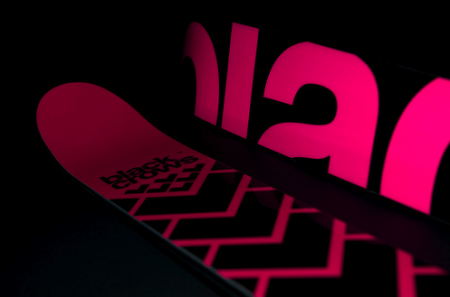
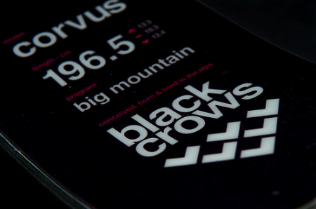
Ski images via Pixelcollector
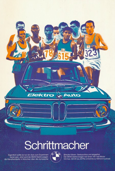
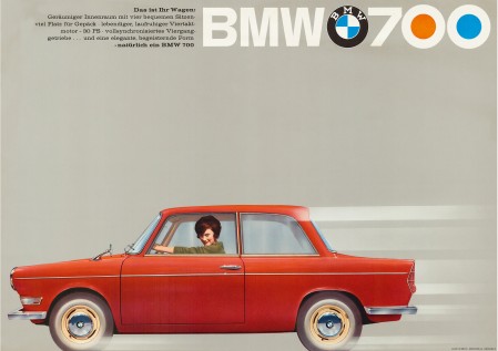
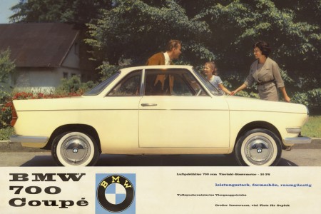
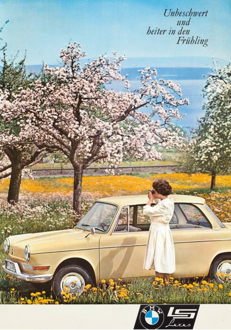
In keeping with my recent car kick I thought I’d post these vintage BMW ads. The first one — created as part of BMW’s affiliation with the 1972 Munich Olympics — is vaguely reminiscent of Otl Aicher’s posters. I’m assuming this was no accident. It’s also a big enough file that you could probably get a pretty good print out of it off a nice inkjet (click image to view full size). I really wish more vintage posters like this were available in higher resolutions. With most of this advertising stuff, the owners of the copyrights have no intention of ever printing them again, it’s a shame they can’t be reproduced and enjoyed by more people.
Via CarType

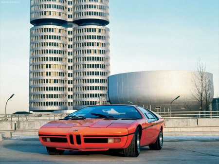
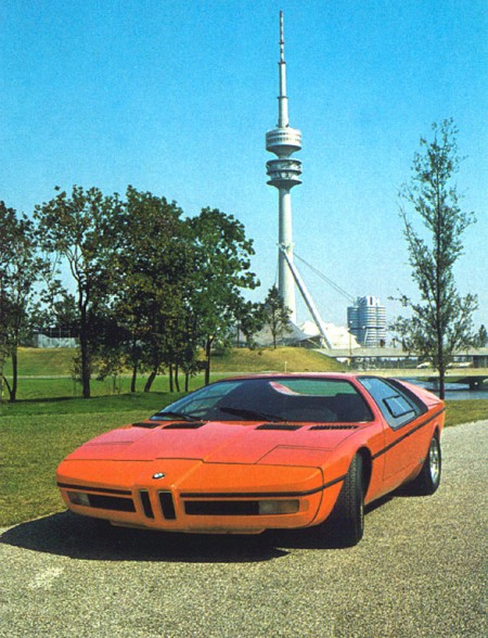
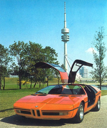
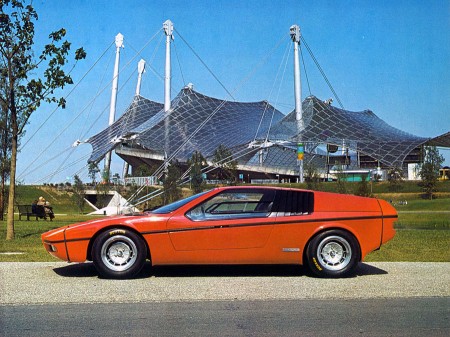
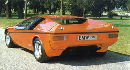
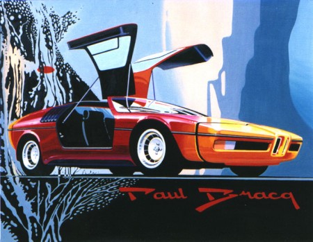
I’ve been geeking out on ’70s supercars lately and came across these gems depicting a BMW concept from 1972. The “E25 BMW Turbo” was commissioned to celebrate the 1972 Munich Olympics. BMW tasked famed automotive designer Paul Bracq to create the concept of which only two were ever built. Honestly, I love the front angles, but not really feeling that rear end. It feels very hatchback/kit-car-ish and the doulbe logos are killing me. Thankfully some of the finer points made it into production in the form of the M1 and some others.
That first shot is just off the charts; in the background you can see BMW’s Munich headquarters which was designed by architect Prof. Karl Schwanzer shortly before his death in 1975. In the other shots you can catch the games tent and the communications tower providing apt backdrops for the Turbo.
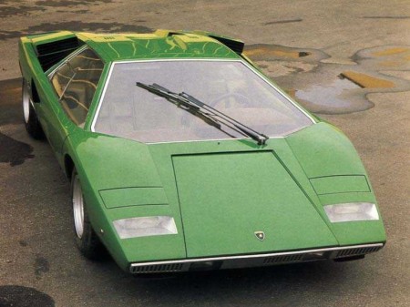
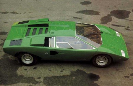
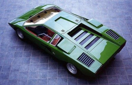
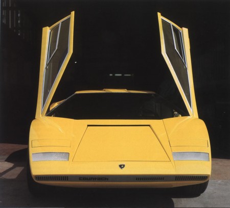
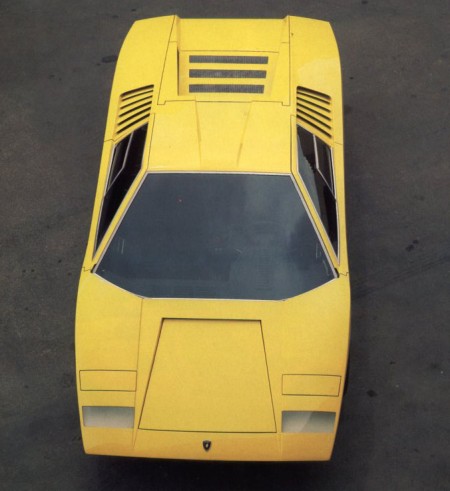
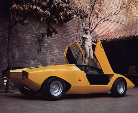
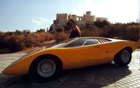
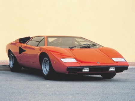
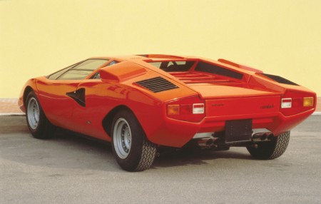
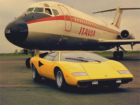
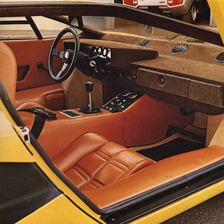
Beautiful shots of the original LP400 and concept models of the Lamborghini Countach before Crockett and Tubbs got back from Kragen with all the wings and spoilers. You may recognize some of the lines from the Bertone post, that’s because Bertone designer Marcello Gandini also designed the original Countach concept in 1971.
This is such a beautiful design, shame they had to go and muck it up with all the over the top junk. Although I guess if it didn’t have all that stuff we wouldn’t have such a perfect cliche ’80s car as a reference point in video games and movies.
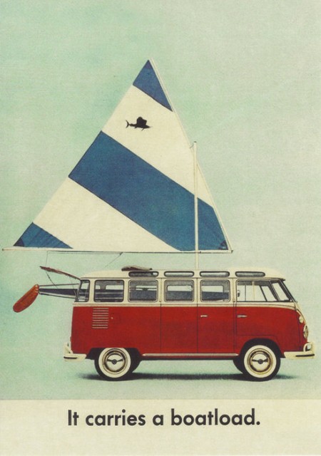
I saw this on This Isn’t Happiness today and it reminded me of my friend’s brother who used to be way into restoring VWs. He was always talking about “23 Window” buses like they were the holy grail of VW collecting (well, that and a split window Bug). I’ve seen one of these on the street in my lifetime — here in San Francisco — and one restored and sitting in a garage back home in Sacramento. I always wanted one, but at this point I think I’d settle for a new school one with the pop-top and sink and all that.
On another note: I love VW’s old adverts; they were always simple and to the point. They are all over my old Newsweeks from the 60’s, I’ll have to post some up soon.
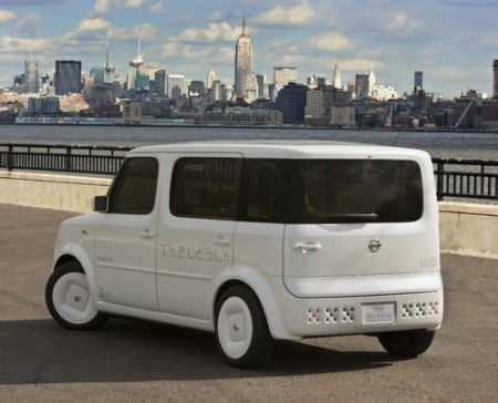
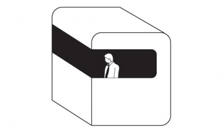
The other night i’m sitting on the computer and Mux Mool sends me a picture and starts laughing and talking about how there’s a Moodgadget car driving around. In my mind I always thought if I get enough money together one day I might buy a white Honda Element and turn it into the Moodgadget Logo. I might even put the generic man as a tint on the window but now no need because the Nissan Cube came into play. LOOK AT IT! I mean WHAAUUUT IS GOING ON!? who does that with a back window? only the Moodgadget logo.
Let me give a little background about the Moodgadget logo, a lot of people call it MOONgadget maybe because it looks like something that would land on the moon or I can’t pronounce my D’s because I might mumble sometimes but really its a dreamt up idea I had that involves my obsession with pods and early early Radiohead covers, the old Royksopp video, and those cube shaped rooms that take you up a mountain that are used mostly by tourists. The Moodgadget logo was designed by 3 friends of mine: Adrian (Creative Director of the silhouette iPod commercials), Danny (Art Director at Ghostly), and Adam (co-owner of Moodgadget) and the idea came from a dream that I had about these white pods what were controlled by these generic business men sitting inside them that floated almost assembly line style out of a glass dome flying by these row of trees and straight into the sun except for one that was in color meaning still black and white but the glass window was light blue and the guy inside had pigment to his skin. This guy wasn’t in the assembly line he was floating around exploring but not too smart of a fellow because he always questioned everything since it was all new to him and he was just overall really curious. I think that dream of the logo kind of symbolized the music industry back then for me which was a lot generic music and compilations that we’re very specific and what we do at Moodgadget is kind of break down those barriers that were up and share music that is all over the place but still catchy in a way, kind of like the music on the blog that we pick but still educates hopefully and makes you want to try listening to something new.
Let’s get back to the Nissan Cube, not my style because of how bad their commercial was for it which if I remember correctly was probably geared toward break dancers that pop n lock in their cars, people that love glowing LEDs filling their stereo screens and those people that go out to the club with a fedora hat on tipped to the side because they’re soo “street” it hurts. To be honest Nissan should of hired on a creative like Scott or some of you that send in great pieces that Scott reposts and not this Mitsubishi Eclipse regurgitation of a car commercial that probably could be sold to people like me if it was delivered to us in a way that doesn’t make me feel like a soulless 20 year old that can’t speak for himself and wants to dance to Soulja Boy or whatever ringtone Rap is popular now(the stanky leg? I dunno i’m so lame when it comes to the hot tracks on the radio) or Tiesto talentless trance music thats played in the bigger metro clubs around the world.
Either way, I’d like to see a song off this blog make it onto the next Nissan Cube commercial, maybe we’d post the commerical and the 4th generation Nissan Cube get a little help from a design firm from Sweden and we might sell a few of these cars.