OFFF Festival NYC
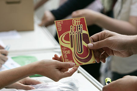
I will be speaking / giving workshops at this year’s OFFF in New York, November 2-4. In case you aren’t familiar with OFFF, it is a festival focusing on the “post-digital creation culture”. Translation: A lot of great people and great designers in one place talking about the things they do and how they do them. There are all sorts of people who attend and present at the OFFF: interactive designers, print designers, ad agencies, experimental artists; it really is an incredible experience and every year I am amazed at the things I see there. I have been involved for the past couple years, both of which were in Barcelona. This will be the first year the OFFF has come to the states, held at the BMCC Tribecca Performing Arts Center in New York, NY. There will be an ISO50 booth at the event with prints, shirts, and music. Stop by and say hello. Tickets and information are here.
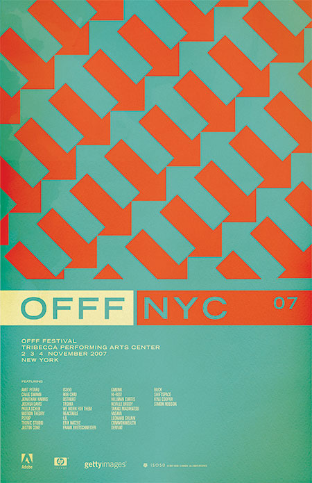
The poster (above) is based on a pattern I saw painted on an old, crumbling wall in Barcelona (the city where OFFF began). I always wanted to incorporate it into a print and thought this was the perfect time. I think they sort of play on the energy of New York, lot’s of people and things moving in different directions and they tie the concept back to the origin of the festival itself. I played with having the arrows running up and down (as the original painting I saw had) but the 45 degree angle seemed to translate the dynamic, energetic vibe I was going for a bit better. The colors are meant to confuse the eye a bit and enhance the double arrow effect going on. I chose classic, practical typography to balance the piece and hopefully give it a more timeless feel.
Incidentally, after posting this I was looking at it on the front page of the blog. I scrolled down and saw the recent post on the NFB and realized how similar the two images are. Perhaps a case of subliminal inspiration? Funny how things like that can happen as I definitely didn’t have that NFB poster on my mind as I was designing this, but the similarities and time frame seem to rule out coincidence. And on another aside; this is one of the, if not the first posters I’ve ever done without a border. As I look back at my collective works it’s sometimes surprising to see these common themes and elements crop up here and there. Some are intentional, but others, like the borders, just seem to be these dogmatic devices which aren’t always necessarily the best choice for the given project. Ha, I feel like going back and turning on and off the borders of all my older works to see which looks better.
