Undercurrent
Posted by Scott

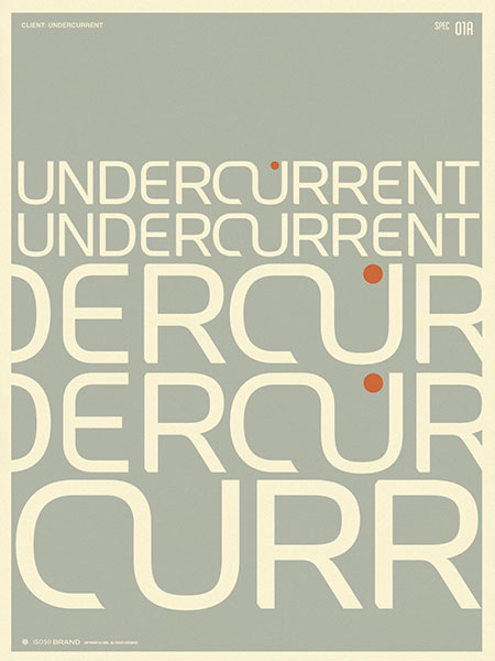
Branding I did for Undercurrent this summer. Just an example of how I typically present concepts to clients.


Branding I did for Undercurrent this summer. Just an example of how I typically present concepts to clients.

15 Comments Leave A Comment
michael j. says:
October 8, 2007 at 12:30 amreally nice, love all your work. this is helpful to see from the practical side of things, i appreciate that. like the new format also, i’ve been checkin’ up once a day. thanks!
michael j. says:
October 8, 2007 at 12:32 amone further thought…how do you present your work as a printed portfolio?
Scott says:
October 8, 2007 at 2:21 ammichael-
thanks… I have never created a physical portfolio. Just about every client I’ve ever worked with has found me through my website, so I’ve never had the need for a printed portfolio.
dani says:
October 8, 2007 at 3:27 ami love your work, your conception of colours and design, and i think your music is like colours that takes life.
absolutely amazing.
dani-italy
drew kora says:
October 8, 2007 at 4:48 amThis is really interesting. So when you doa logo for a client like this, rather than the typical white sheet of apepr with logo on it, you give it a more immersive approach? Making a poster out of it almost? That’s pretty cool.
Scott says:
October 8, 2007 at 2:15 pmI usually present this to them, and a sheet with the logo alone, but in this same style and it’s own color scheme. I don’t like to do the plain old black and white presentation for a couple reasons. It makes sense from our perspective because we understand that this breaks it down to the core concept and sheds all the surrounding pretense so you can focus on the form. But we’re professional designers, I don’t expect the client to understand how to evaluate the form as well based on that concept. So I like to sell it to them, present it well, put it into some context and help them visualize how it would work in a real world application.
digifruitella says:
October 8, 2007 at 3:43 pmjust wanted to say that i’ve been loopin “From Home” for the past few days and when I found out you were also doing design and photo – i was impressed and amazed all at the same time. I’ll be getting your “Byom” T-Shirt, love that design.
Scott says:
October 8, 2007 at 3:58 pmThanks digigruitella. which is the “Byom” shirt? not sure I know of one with that name.
drew kora says:
October 8, 2007 at 5:28 pmi have to chime in adn say that “from home” is indeed an entrancing song. I can listen to that non-stop. a calm comes over me when I listen to it…brilliant work music that helps me focus.
digifruitella says:
October 8, 2007 at 8:00 pmtsk tsk Scott! http://www.merchline.com/iso50/categorydisplay.2293.c.htm
http://www.merchline.com/storeimages/ISO50_workers.jpg (BPEM, the P is upside down, it’s a “soft sign” in Russian) it reads as “Byom” in Russian – roughly translated to “Striking down”
I’m Russian, thats why this design really impressed me.
and I’m listening to “From Home” right now, for the 23423th time.
are you going to be releasing any new music Scott? if so, definitely make more slow tracks like From Home.
dani says:
October 9, 2007 at 2:24 ami got ‘Past Is Prologue’ Tshirt, i love the choice of colours and the subject, very similar to some graphics that i’ve done…not great like yours, i’m just an amateur graphic :)
digifruitella says:
October 9, 2007 at 8:30 am“Byom” is how you pronounce http://www.merchline.com/storeimages/ISO50_workers.jpg the word on the top left corner. You put it up there, so I expected you to know this ;)
roughly translated it means: “Striking down” what do u know I’m Russian =)
Scott says:
October 9, 2007 at 7:35 pmdigigruitella:
sorry, your comments got snagged as spam for some reason. I reposted them. cool, thanks for the info! I had never heard it pronounced. I read that is meant “To Bang, to hit”. As in “Strike down lazy workers!” (the original text)
digifruitella says:
October 10, 2007 at 1:18 pmwell, either way – I really love what you’ve done with that design. When I get extra cash I’ll invest in it, even want that print poster too. I rarely buy any clothing online unless it peaks my interest and in this case I really fell in love with that design – plus it speaks home to me =)
are you releasing any new music? I have Past Is Prologue, it’s pretty Boards of Canada inspired, i’m assuming you’re a fan of them which explains why the music is so similar.
Joaquin Powers says:
April 17, 2008 at 12:44 pmoppositively upgather chloroacetophenone triphora ahsan cresylic dietotherapeutics aglimmer
Markku Klami
http://www.bouldercreekstone.com/