Shirt Re-Stocks
Posted by ISO50

Just a quick note to let you know that many of the shirt designs at the shop have just been restocked. Among many others, Vuela, 77 Black-Black-Tri and 1976 Tri-Blue are all back online.
Just a quick note to let you know that many of the shirt designs at the shop have just been restocked. Among many others, Vuela, 77 Black-Black-Tri and 1976 Tri-Blue are all back online.


The Spacetime Collection is a set of whimsy outer outer space-themed wall decals co-curated by Kitsune Noir and Poketo. They enlisted a talented group of artists to design the collection; Mike Perry, Cody Hudson, Damien Correll, and Andy Miller. Each set is different, but the idea is to combine them to make any kind of wall galaxy that you want.
I spent my morning pasting up the decals and my galaxy is displayed above. This was extremely fun; just pasting things every which way and creating something wacky on the spot. Compared to my normal, highly regimented routine on the computer, this was a refreshing change of pace. I find that I do less and less work “offline” so to speak, and it’s great to spend some time creating without a mouse and keyboard (or design brief and deadline for that matter). My roommates were surprised to find our whiteboard transformed into a very unusual (and exciting) combination of space diagrams and whimisical illustrations. ‘Wonderfully weird’ we determined.
Information regarding the project can be found over at Kitsune Noir or the Poketo website.


The heat is coming down hard out here in California so I decided to do a limited run of the 77 shirt on the new American Apparel Tri-Blend Black. It’s super soft and super light for those long summer days. You can check them out at the ISO50 Shop: Men’s Shirt | Women’s Shirt.
On a side note, these are the first product shots I’ve done with all strobe flash lighting. I picked up a Nikon SB-900 and SB-600 and have been loving them. I still have a lot to learn but I am really happy with the initial results (see above; used SB-900 w/ diffuser on camera and remote SB-600 on stand w/ umbrella). I’ll be posting more on the flashes this week.

Spring is finally creeping into town (although very slowly here in San Francisco) and I’ve been way into the AA tri-blend tees this year. So I printed up a modified version of the Vuela Print on Heather Grey tees for your sunny weather enjoyment. As always, you can get yours over at the ISO50 Shop. I’m also clearing out a lot of the older designs to get ready for summer so you’ll find lots of shirts marked down 20-30%. All marked down shirts are the final pressing of that particular design/colorway.
On a related note I’ve been spending a lot more time trying to learn the ins and outs of product photography. I’ve been shooting the products for years but I’ve never spent enough time worrying about the color accuracy of the output. After all this time working with cameras you’d think it would come easy, but I was surprised to find how difficult it was to get good shots when the goal is creating a color accurate representation of an inanimate object. With my creative photography I’m always trying my best to make things appear inaccurate and I guess old habits die hard. For the shots above I used a tungsten photo bulb/can light along with a Quad CF lamp from Calumet. I had been using 3 lights but it turned out that hitting the subject from the right side and front with lights and letting some natural light in from the left (there was a window there) made for better dynamics so I’ve been sticking with the 2 light setup.
The last couple product shoots were the first times I’ve used a Gretag card to calibrate the camera color temperature under the lights. That and shooting in NEF RAW really went a long way to getting a solid foundation, but there was still a lot of work done in post. Having the calibrated monitor definitely helped at that point, but the real key I found was changing my own perception of the image and training myself to see it in a different way than I’m used to. I always catch myself slipping and trying to make the shots look interesting or enhanced and then have to step back and realize that this needs to be a literal representation of the real object. At any rate, I’ve got a ways to go (can’t even imagine how they get all those high end fashion shots) but it’s been surprisingly interesting learning the subtitles and nuance of a new kind of photography. It certainly is it’s own art form. I’m sure a lot of you have some product photography chops, feel free to share any of your tricks of the trade in the comments.
Also, I know I’ve been promising it for a long time, and I assure you, a very detailed post about color calibration is on the way. The project has sort of taken on a life of it’s own and I’ve brought Alex on board to help with research and production. We’re going to be shooting an interview with a color expert in the next couple weeks and we should wrap the post soon after that so stay tuned!

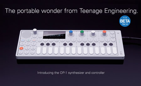
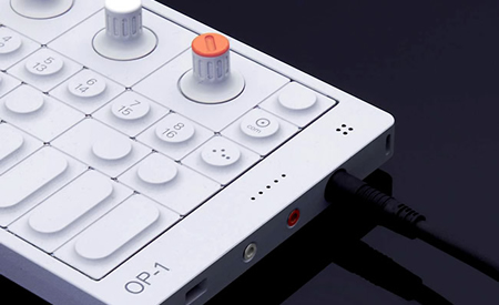
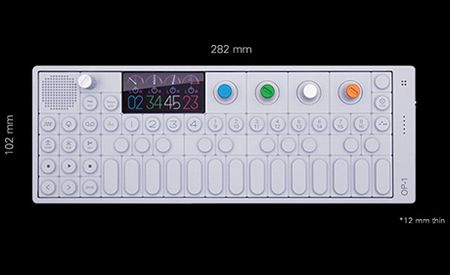
This thing’s gonna change everything. The new Operator 1 (OP-1) from Teenage Engineering truly shows how beautiful synthesis can be (though the Buchla 200e definitely has some chips in the pile).
A hybrid digital synthesizer and MIDI controller with enough features to question if this thing is even real.
8 synthesizer models (FM, Virtual Analog, String, +), 8 samplers, on board effects, OLED display, battery powered, built in microphone, FM radio, built in speaker, mp3 export, and a sequencer so cool – it’s still “secret”.
ETA: 10-12 months. Price TBA.
More info here: http://teenageengineering.com/products/op-1/


With spring all but here (at least in San Francisco) I thought it would be a good time to whip up some new tees using American Apparel’s summer-friendly Tri-Blend Heather shirts (50% Polyester / 25% Cotton / 25% Rayon). The result is this new 1976 on American Apparel Tri-Blend Heather Blue. When I first designed the original version of the 1976 tee, I had this sort of vintage track tee vibe in mind. At the time, AA didn’t offer a Tri-Blend shirt in blue so I ended up going with the cotton baby blue — which I think has it’s own thing going on — but once I saw the new tri-blend blue I knew it would be perfect for a subtle remix.
Shirts have always been a fun design challenge for me. Unless you’re a pretty big company, you’re pretty limited in your color choices when it comes to blank shirts. Sure, American Apparel (one of the blank shirt manufacturers with the best cuts and colors) has a great selection of colors, but most are pretty straight-forward, bright colors. For most of my designs I envision washed out, faded colors and there really aren’t that many companies offering that kind of blank these days. AA’s tri-blends come very close and the fit and feel are incredible, so I usually end up going with that combo. But it can be a rather daunting task to balance your Pantone ink choices with the dye colors to try and reproduce the style and look you’re going for. You can always mock it up in Photoshop, but you really never know what it’s going to look like until you print one up and see the real thing.
After all that comes the task of trying to get photos of the shirts that accurately reproduce the color and texture, which can be even harder than designing the shirts in the first place. This time around I had a Gretag card and some color-correct CF lights so it went a little more smoothly. I shot in NEF format RAW on the Nikon and got some pretty usable output this time. The process of brining the RAW shots in is always a bit tedious, but it definitely yields more accurate and flexible results. I usually try to get one shot that’s as color accurate as possible (first shot above) for the storefront, and then another, more effected version (second image above) to give another perspective on the shirt. I’m still planning to rent a better lens for a day or so and see if that helps any, although after this most recent session I am feeling a little more confident with my D80. Also, a quick thanks to my little brother Kirk for modeling the shirt! I usually have to hold the remote while taking the shots of myself and it’s a lot harder to frame up shots and get the settings down that way.
At any rate, the ISO50 1976 Tri-Blend Heather Blue is now available for your enjoyment, get them while they last!

Just a heads up that the ISO50 20% off sale ends today so get on it!


With all this talk of snowboards and all the new snow up in Tahoe, I thought it would be a good time to post about these Armada skis I did a couple years back that have just recently been released. In November of 2006, Armada asked me to design the 2009 AR6 line (there is a relatively long period that separates the design phase and end product in the production cycles of most snowboard / ski manufacturers). Based on the timeline and budget, we decided I’d deliver 2 reference designs which would be extrapolated by in-house designers to fill the 5 versions of the AR6 line. I believe Mackel Vaugn put together the final designs based on what I turned in. The top image (orange, very top) shows the early tests I showed Armada to illustrate what I was going for. Skis are an interesting form factor to design for; you have these two narrow canvases and you sort of have to choose whether to treat them as a whole or individually. Based on the very wide design of the AR6’s I decided to try and tie the two skis together to feel more like one large design across a canvas.
After some meetings with Armada about the tests I had sent in, we decided to stick with the basic forms for the final versions but bring up the overall color and variation of the designs. The results were the final two reference designs (directly above), I delivered the PSD files along with various image collateral and they worked those into final five ski designs. I’ve done a couple ski projects and all my snowboard projects this way. It’s an interesting process, handing off the design and later being surprised by what they end up looking like (the bottoms were a surprise too, only designed the tops). The whole thing reminds me of layer tennis, sort of like a design remix. You can see all the final versions of the AR6 at Armada’s site and you can see some in action in this video review. These are out now, you can check Armada’s dealer list if you want to pick up a pair. I did the 2010 AR6 line as well so you should start seeing those out next fall. Here’s Armada’s product video for the 2009 AR6: