Stockholm Doc
Posted by Scott
Joaquim has made a short documentary detailing his trip to Stockholm for the ISO50 Workshop there this past January. Above are parts 1 & 2. Part 2 has some brief footage of the workshop itself. Thanks Joaquim!
Joaquim has made a short documentary detailing his trip to Stockholm for the ISO50 Workshop there this past January. Above are parts 1 & 2. Part 2 has some brief footage of the workshop itself. Thanks Joaquim!
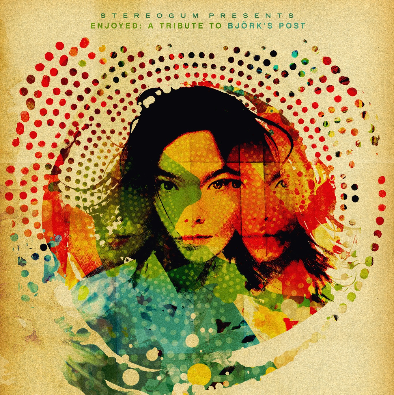
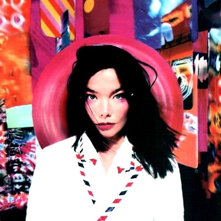
Stereogum asked me to design a cover for their latest tribute compilation. Entitled Enjoyed: A Tribute to Bjork’s Post, the collection features covers by the likes of Dirty Projectors, Xiu Xiu, and Atlas Sound to name a few. You may remember the post about Drive XV, the REM tribute, this is the follow up to that release.
In the spirit of the tribute album, they asked that I base my cover off the original. I really enjoy this sort of work as it’s a lot of fun to approach an existing composition and try to see it from another perspective.
Below is a taste of what’s in store. Check it out then download the full album for free from Stereogum!
[audio:hyper.mp3]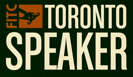
I’ll be speaking at the FITC Toronto Design & Technology Festival on Monday, April 21st, 2008 [view full schedule]. I’ve yet to attend an FITC event but I’ve heard great things so I’m very excited to check it out. I’ll be covering the method and theory behind my work in a talk entitled "ISO50: Blending Analogue & Digital". Hope to see you all out.
I’ll also be doing a live Tycho set with ISO50 visuals at the Drake Hotel in Toronto on April 20th. I’ll be posting more on that as details become available. There’s talk of a set during the FITC festival as well, more info will follow.

Thought I’d give the blog an early heads up: A new print called "Northern Lights" will be released tomorrow morning at The ISO50 Shop. You can get it early now, the first printing is only 200 and they’ll go fast once the newsletter comes out tomorrow. Get yours now!
All the Computer Arts readers may remember this was the illustration I did for the cover a couple years back. It also ended up as a line of snowboards for K2. I’ll post some pictures of the various formats it saw life as once I get home tonight.

VOTING IS NOW CLOSED!
Thanks to everyone who participated, I really appreciate all the great feedback. I will be going through and picking a winner over the weekend, you will be notified via email if you’ve won.
UPDATE: As per Damo’s request this is now a contest. The best analysis will receive a signed copy of this poster. You must enter a valid email address in the email field when placing your comment so you can be contacted if you win (the email address is not viewable by the public). If you’ve already entered a comment but did not enter an email address, just place another comment with the email and reference your original comment. I can see the IP address you post from to match them up. This contest ends this Friday, Feb. 15th.
UPDATE: After considering some of the early responses to this post (namely Jacob’s) I’ve added two more versions for your consideration.
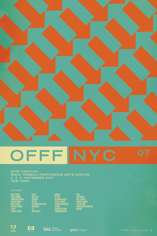
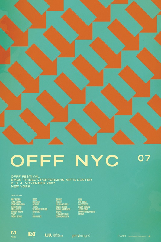
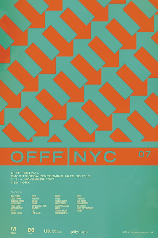
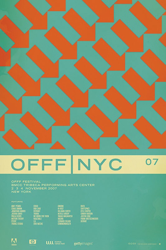
So I have been putting together a batch of prints that will be released over the next few months. Included is the poster from the OFFF 2007 festival in New York. There have always been multiple versions and I’ve really had a hard time deciding which I like best, and consequently, which will get printed. So I thought I would try a little experiment and let you guys choose your favorite. They are shown above in order: verions "A", "B", "C", and "D". Let me know which you like best by sounding off for A, B, C, or D in the comments. Or you could just say they are all terrible and to start over. Click the images above to view larger versions of each.
My 2 cents: At this point I think B, C, and D are the strongest. B has a cleanliness and reservation about it that I like. The type is able to stand on it’s own and given that it’s Trade Gothic Bold Extended, that’s a very good thing. But I think the solid bar in C and D really pulls things together. Right now I am really leaning towards C just because it feels so cohesive. The top portion is reserved for the red / orange color and the bottom, informational portion has the cream. I think this links the main title and the arrow design together nicely and makes the overall composition feel more like a single unit whereas some of the others seem a bit broken up.
Regular commenter on this blog, Joaquim Marquès Nielsen, came out from Denmark to attend the Workshop in Stockholm. He’s written a rather thorough post with a lot of quotes and a good overview of the workshop. You can check it out here.
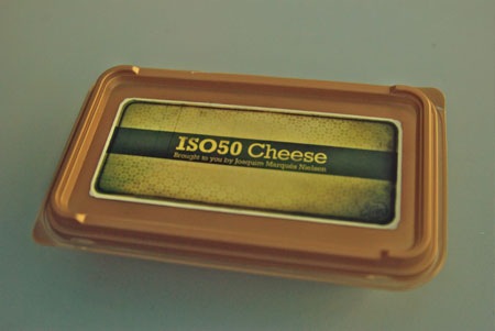
He was also kind enough to present me with a one of a kind package of genuine ISO50 Danish Cheese, which I was able to snap a shot of right before it was devoured after a long night at the Stockholm bars.
Just a quick update on the Stockholm Workshop. As you may already know, the seats for the workshop itself sold out but I’ve got word from the promoters that people who missed out on the tickets can still come to the hotel bar for the after-workshop mingle. I will be hanging out so stop by if you want to ask any questions or just have a drink with a bunch of other designers. The workshop should end at around 20:30 so around that time we’ll make our way to the bar. For location information go here.
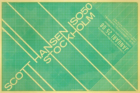
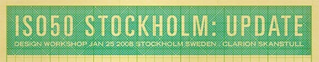
The official registration page for the ISO50 Workshop in Stockholm, Sweden on January 25th is now up. Go here to register!