I had no idea Braun ever produced a camera, but here it is. And of course, it’s incredibly well designed. Honestly, if Canon would just package a modern $800 HD camcorder in this sort of form factor I would gladly pay a premium. Then again — if you can put up with film — the Nizo probably destroys any modern camera in terms of output.
The slightly intense guy using the Nizo in the last shot is director Tad Fettig. Top two shots are from this (ended) eBay auction. The Advert is from mrfoxtalbot. Many more Nizo images can be found here.
Update:Vegard sent in a nice example of the Nizo’s output which he has posted on Vimeo:
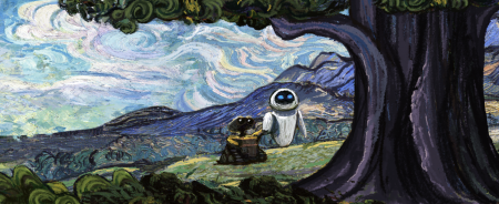
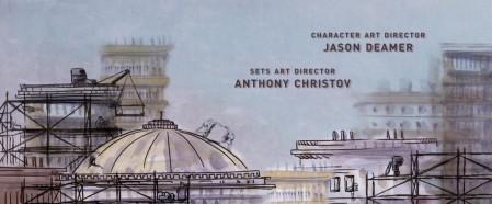
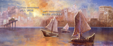
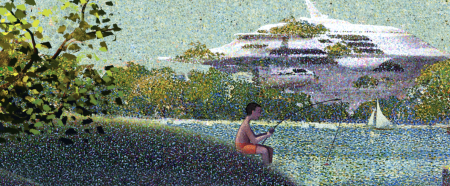
Art of the Title Sequence has a bunch of new material up, including an interview with the minds behind the Wall-E end credits. Looks like a staggering amount of research went into this. As usual, the results are terrific. A version is up on Youtube, but as they suggest on the site, much better to consult the Blu-Ray if you’ve got it.
It’s hard to believe, but somehow my spring semester is coming to a close this week. The film festival project, which I’ve written aboutpreviously, finally has all pieces completed and accounted for. The last element added into the mix was a festival trailer (shown above). Originally, I planned to create a few more ancillary products to flesh out the brand, but these fell through and I had to move on the trailer option late in the game. I teamed up with my friend Phil Mills, a local actor here in San Francisco, and we set about writing, shooting, and editing the film last Sunday afternoon.
We were allowed to base the trailer on just about anything we wanted, so long as it advertised our hypothetical film festival and carried through the visual style of our brand. There were a multitude of directions this could take; we thought the most fun way would be to shoot a Royal Tenenbaums-esque short, and then just throw as much craziness as we could at it. Phil plays T. Allen Fenway, a fictional character we made up to live in our Wes Anderson film festival world. We wanted it to remind you of Wes Anderson, make you laugh, and eventually turn you on to the festival. The 3rd person narrator, use of Futura Bold for all titles, extravagant setting, and full blown randomness were all utilized to aid in conjuring this look and feel.
The equipment for this project was sort of all over the place. I luckily had a video camera lying around (usually relegated to filming stationary Youtube videos) and I figured I might as well take it out for a real test drive on this project. I used the Panasonic PV-GS250; an older handheld consumer camcorder that doesn’t have much in the way of image quality, especially compared to the newer HD models. I considered renting a Panasonic HPX-170, but was deterred by the expensive daily rental rate. I figured I’d make it work with the little guy and try my best to fix things up in post. I had also recently purchased a continuous tungsten lighting kit and this helped with the indoor shots greatly. (I am planning to do a post on video lighting after some more tests.)
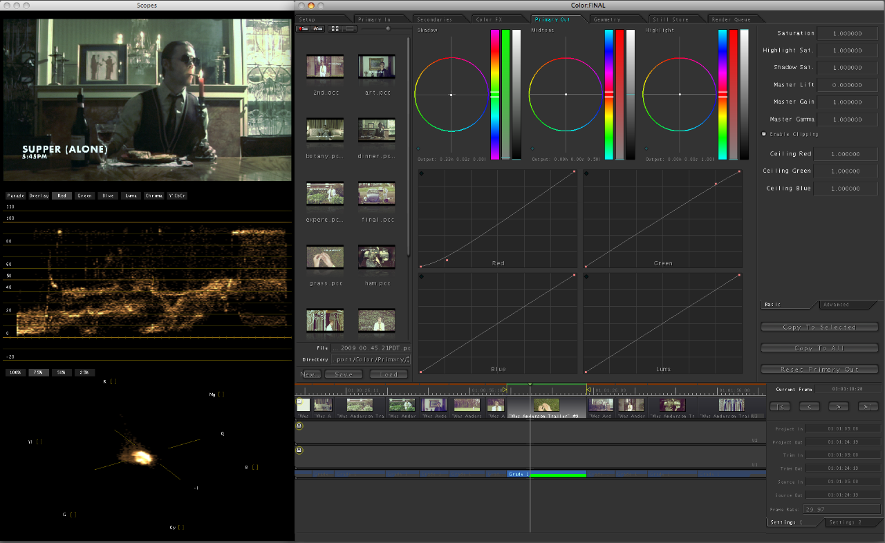
I edited this project using iMovie ’08, the disastrous upgrade to iMovie HD. I had never used the upgrade before and was very disappointed to find that the program had basically been downgraded into an almost unusable trainwreck. (No waveform mixing!?) I had to stick with it, for the increased flexibility with titles, but it was not a pretty sight. Once the project was edited and all cut together, I procured Final Cut Pro (sadly too late to edit with) and Color. I sent the final output through Color and it was a great help in getting the trailer to look the way it does. Color is an amazing application and I feel like I just scratched the surface of its capability. It basically provides the same color editing functionality you have in Photoshop for still images, but for video. I worked on each shot individually, and first tried to clean up the stale color the camcorder captured, and then tweak it just enough to provide that timelessness of Wes Anderson films. Of course, the program’s power is limited by the image quality of the camera, so some edits weren’t possible without destroying the integrity of the image. (Exposure or saturation edits for example looked terrible.) The basic color editing functions (below) were enough to give the final product the look I was hoping for.
I had done a few test shots and some basic story-boarding prior to the shoot, but we were pretty much shooting from the hip the whole time. Phil is a great actor and he knew exactly what I was going for with this project. As we are both avid Wes Anderson fans, we didn’t have to do too much in the way of research or planning prior to the shoot. The order in which we completed the trailer was probably completely backwards (we wrote it after we shot it) but it ended up working out and provided us with many a happy accident. Despite the fact that this part of the project was not “graphic” design in the traditional sense, it was definitely the most fun, and my favorite part of the semester.
Came across this today via @grainedit’s Twitter. The I <3 Hot Dogs Blog has some great stills from classic films up. I love how type renders when it’s hand set and transferred to celluloid. If someone could make a filter that lent that perfect edging effect to type in Photoshop I’d be the first in line for it. I once met a guy who printed out all his type first, then photocopied it with an old Xerox, then scanned it back in. He got great results, I need to find a way to do that with film.
I had the chance to go to the San Francisco premier of Objectifed last night. It was the first of four screenings here in the city, and part of the film’s journey as it makes its way around the world, showing in over 100 cities. After the screening, there was also a short Q&A with the filmmaker Gary Hustwit and a few designers from the film. It was sold out, as it is for the two showings tonight, but if you’re in the area, it’s definitely worth going to check out anyway. There were more than a few open seats and I think they release a few tickets at the door. If not, Gary mentioned it would return in June to the Yerba Buena Center, and possibly release on DVD later in the year (though this seems really soon).
I feel like it takes two viewings for me to really formulate my opinion on a film, but my initial reaction to Objectified is very positive. I really enjoyed it and came out a lot more inspired than I was going in. Hustwit has a very accessible style; he is able to quickly engage the viewer regardless of prior knowledge or experience. His subject choice is fantastic as well, and he captures some poignant and salient remarks from incredible minds working in the field. My favorite segment was probably the one on Marc Newsom (or maybe Rob Walker) but it’s hard for me to remember. I wish I could have taken more notes!
When I posted on the film a while back I didn’t really have any idea what the film was actually going to be about. I had heard it was about industrial design but that was about it. After the screening tonight, I’d say it’s really about everything; design in a general sense. (Interestingly, the term “industrial design” only occurs once or twice.) As with Helvetica, what is said about the chosen arena of (industrial) design can really apply to all design fields. Discussions of utility, objectivity, and efficiency come up regardless of whether or not you work on paper or in steel. The film is really about design thinking and the creativity designers bring to whatever problem they are solving. There was a mention, and I forget by whom, that designers are the philosophers and intellectuals of the future. For me, this sums up the film. Sure it focuses on industrial design, but the real takeaway is that designers are becoming increasingly valuable to society for their way of thinking and problem solving, not just for making pretty objects.
Comparisons with Helvetica are inevitable, and the one thing that Objectified was missing was an opposing perspective. Erik Spiekermann had an unforgettable segment in Helvetica that pretty much made the movie for me. His passionate hatred of the typeface was not only hilarious and entertaining, but also extremely valuable in that it provided a counter-argument to make the film more well rounded. Objectified is very optimistic and hopeful, and it stays this way throughout the entire film. As one of my classmates pointed out, there is no downer interview that provides an alternative perspective. Everyone is drinking the Kool-Aid so to speak. Regardless, it was fun to discuss this issue with my classmates after the film, and I would really recommend seeing it with fellow designers.
Seeing it in San Francisco was definitely a treat. The design community here feels very small, and I love it when there is an event which brings a lot of us together. After the film, everyone emptied out onto the street and hung around discussing the film and design in general. You could really feel the energy of so many people being creatively inspired all at once. I felt really excited and proud to call myself a Designer.
I finally took the time to check out Daft Punk’s latest film, Electroma, tonight and I must say it was pretty impressive. The cinematography and visuals are breathtaking and the sound design and music (which was, sort of ironically, not made by Daft Punk) is incredible. The plot is pretty much an afterthought though; your standard issue vague, arthouse storyline that didn’t really move me in any way. But I didn’t want that out of it, nor was I expecting it, so I can’t knock the film for it. The substance is in the imagery and it’s simply beautiful. When paired with the excellent sound design it achieves a 2001-esque vibe, a sort of retro-future as imagined in the 80’s. You can watch a Vimeo clip from the film below featuring the superb laboratory scene (from which the stills above were taken). It’s out now on DVD and I would have included the cover and title graphics, but they’re pretty bad, which is a shame because a film with imagery like this just begs to be wrapped in quality design.
We’ve definitely been talking a lot about the upcoming Spike Jonze-directed Where The Wild Things Are film and now the trailer is here to assure us that all the anticipation was well worth it. Above is the HQ Youtube version but high quality QT versions can be found over at Apple Trailers.
Jakub posted some stills from the upcoming Where The Wild Things Are movie a while back and now we have a very nice movie poster to go with them. This thing is looking better and better with each new development.