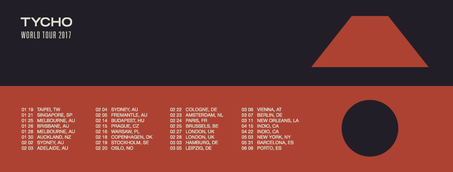
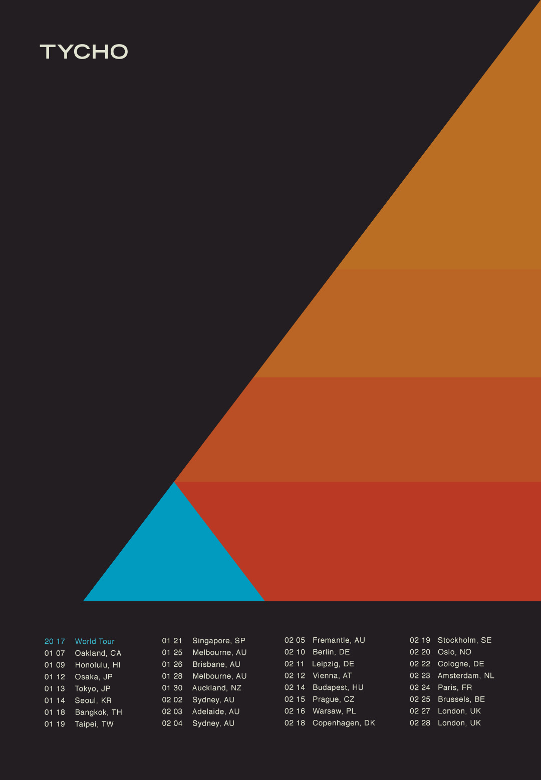
12 01 – Osaka, Japan – Big Cat
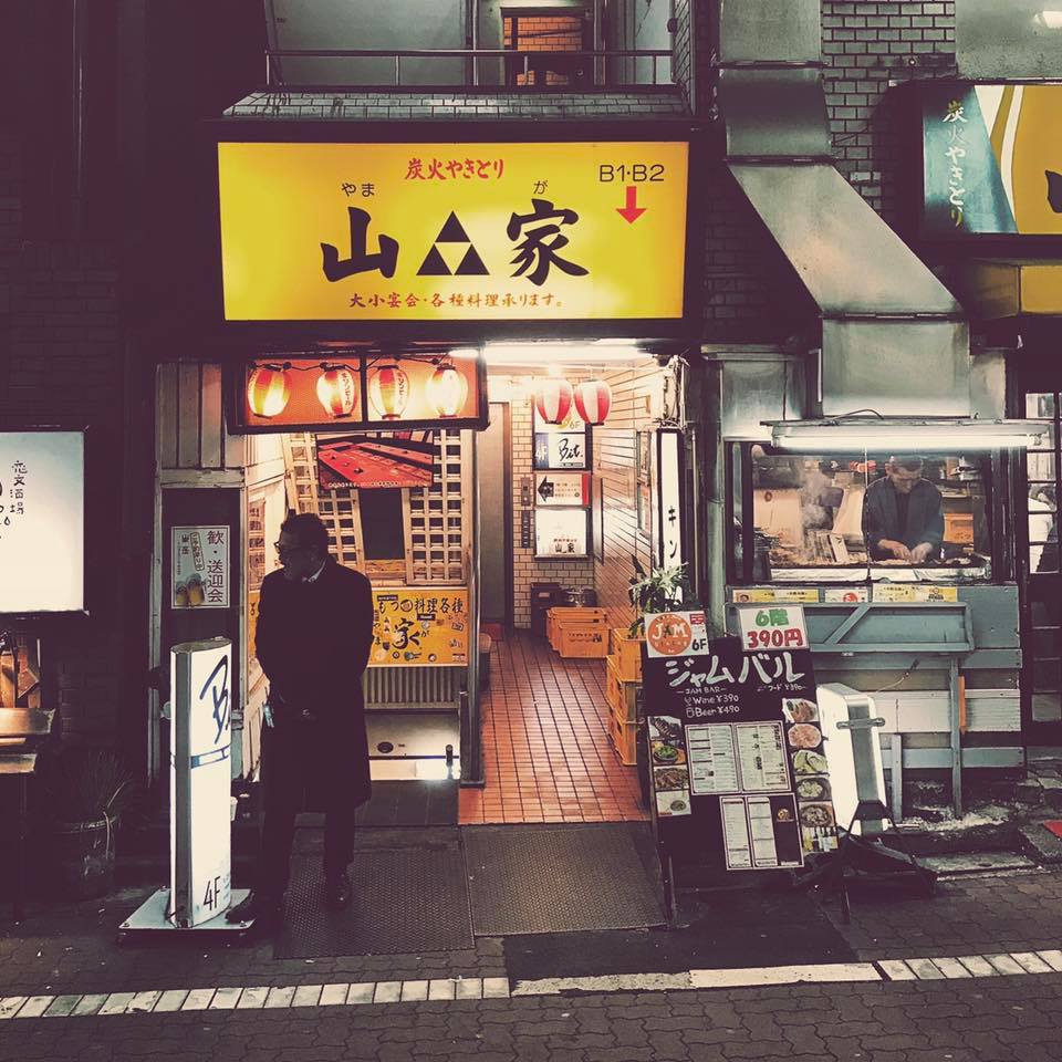
13 01 – Tokyo, Japan – Stellar Ball
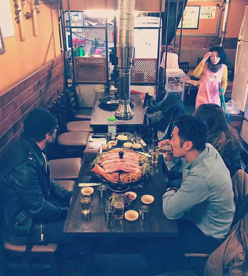
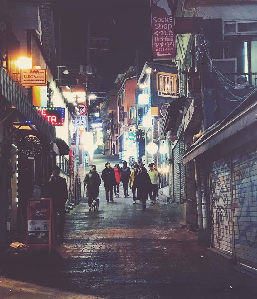
14 01 – Seoul, South Korea – Understage
19 01 – Taipei, Taiwan – Legacy
21 01 – Singapore, Singapore – Laneway Festival
Are all in the books, off to Australia and Europe next.
01 25 – Melbourne, AU – 170 Russell – SOLD OUT
01 26 – Brisbane, AU – Laneway Festival
01 28 – Melbourne, AU – Laneway Festival
01 30 – Auckland, NZ – Laneway Festival
02 02 – Sydney, AU – Metro Theatre
02 03 – Adelaide, AU – Laneway Festival
02 04 – Sydney, AU – Laneway Festival
02 05 – Fremantle, AU – Laneway Festival
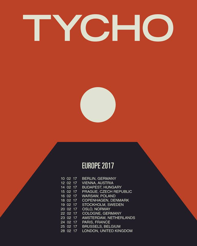
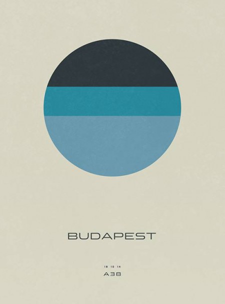
02 14 – Budapest, HU – Akvarium Klub
02 15 – Prague, CZ – Meetfactory
02 16 – Warsaw, PL – Worldwide Festival at Niebo
02 18 – Copenhagen, DK – Pumpehuset – SOLD OUT
02 19 – Stockholm, SE – Kagelbanan – SOLD OUT
02 20 – Oslo, NO – Parkteatret – SOLD OUT
02 22 – Cologne, DE – Gloria Theatre
02 23 – Amsterdam, NL – Melkweg
02 24 – Paris, FR – La Gaite Lyrique – SOLD OUT
02 25 – Brussels, BE – Botanique – Orangerie – SOLD OUT
02 27 – London, UK – Electric Brixton
02 28 – London, UK – Electric Brixton – SOLD OUT
03 03 – Hamburg, DE – Uebel & Gefahrlich
03 05 – Leipzig, DE – UT Connewitz (rescheduled from 2/11)
03 06 – Vienna, AT – Flex (rescheduled from 2/12)
03 07 – Berlin, DE – Astra Kulturhaus (rescheduled from 2/10)
03 10 – New Orleans, LA – Buku Music + Art Project
04 15 – Indio, CA – Coachella
04 22 – Indio, CA – Coachella
05 03 – New York, NY – Brooklyn Steel
05 31 – Barcelona, ES – Primavera Sound
06 08 – Porto, PT – Primavera Sound
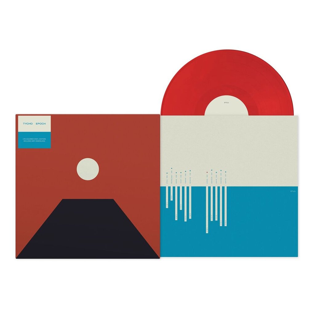
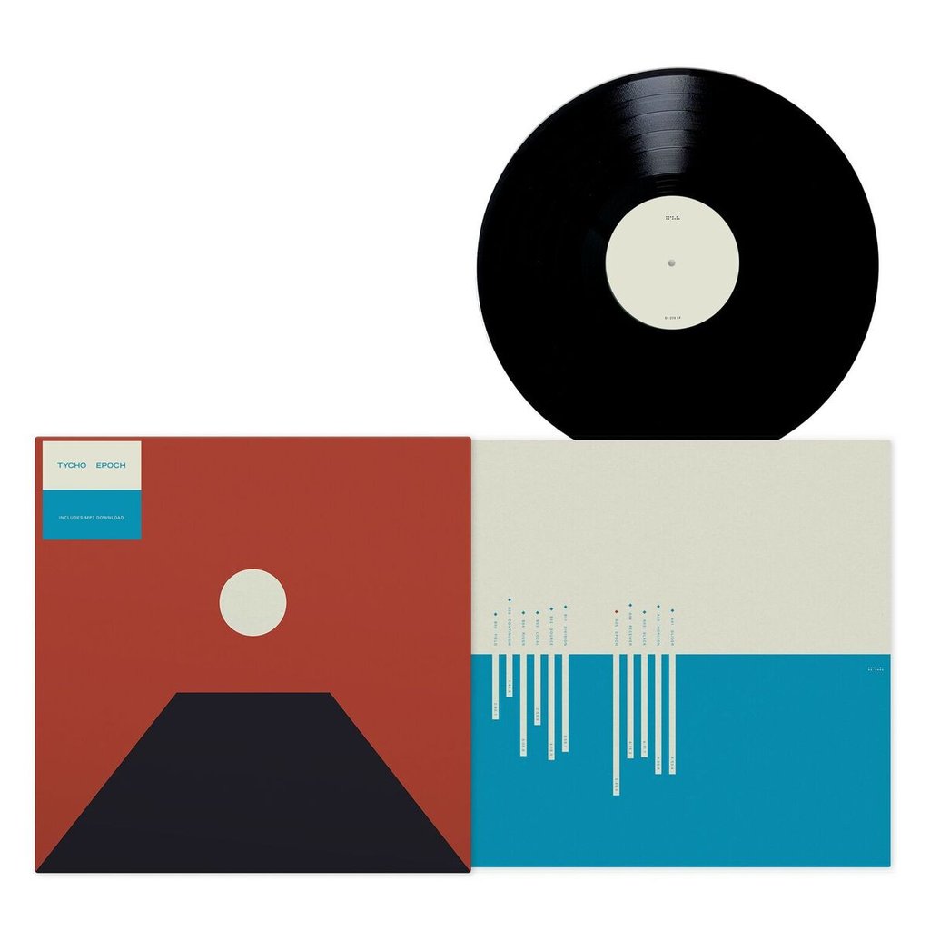
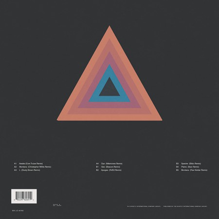
Limited Edition Red Vinyl or Black Vinyl
Jacket is a 2-panel printed matte finish jacket with a 3mm spine;
LP inserted into uncoated art sleeve
Artwork by ISO50
Tycho’s Epoch is the final album in the trilogy beginning with 2011’s Dive, then 2014’s Awake and culminating with the new album. This period between Dive and Epoch marks a significant maturation for Scott Hansen’s continually expanding project, one that has taken him from a solo performer and bedroom artist to fronting a live 4-piece band on large stages across the world.
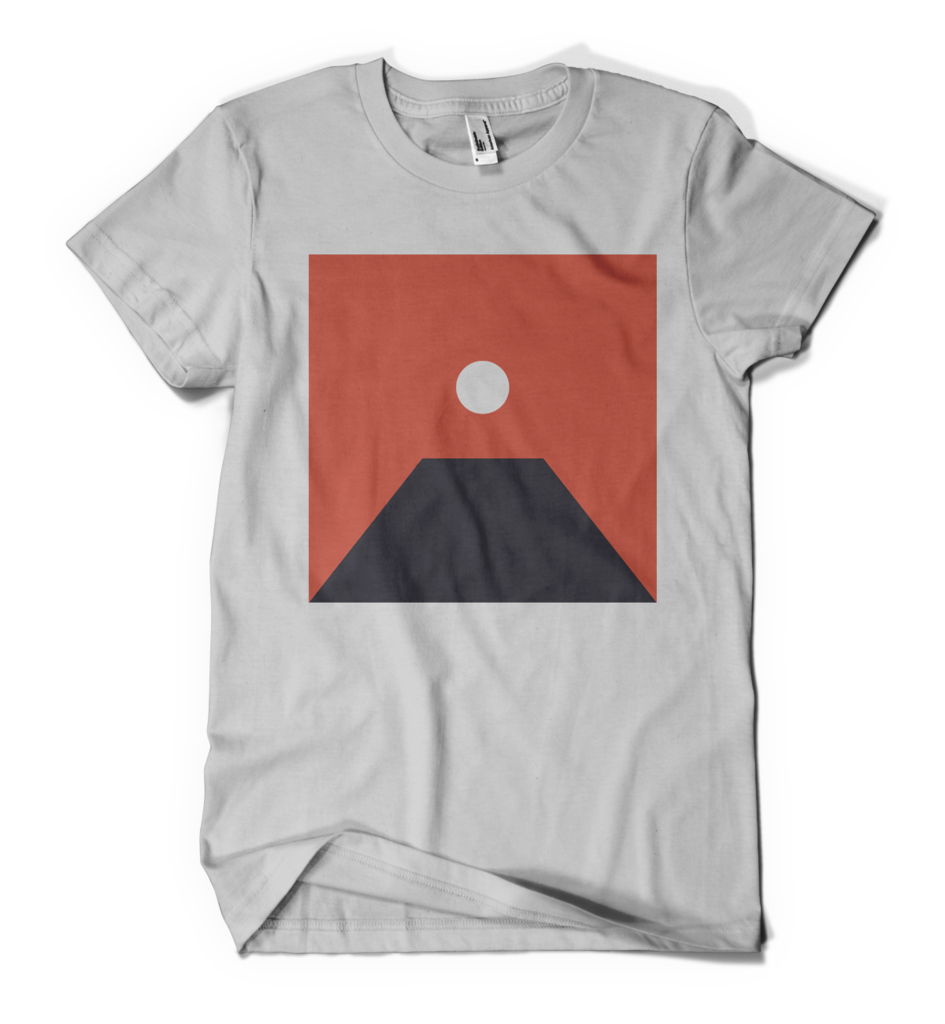
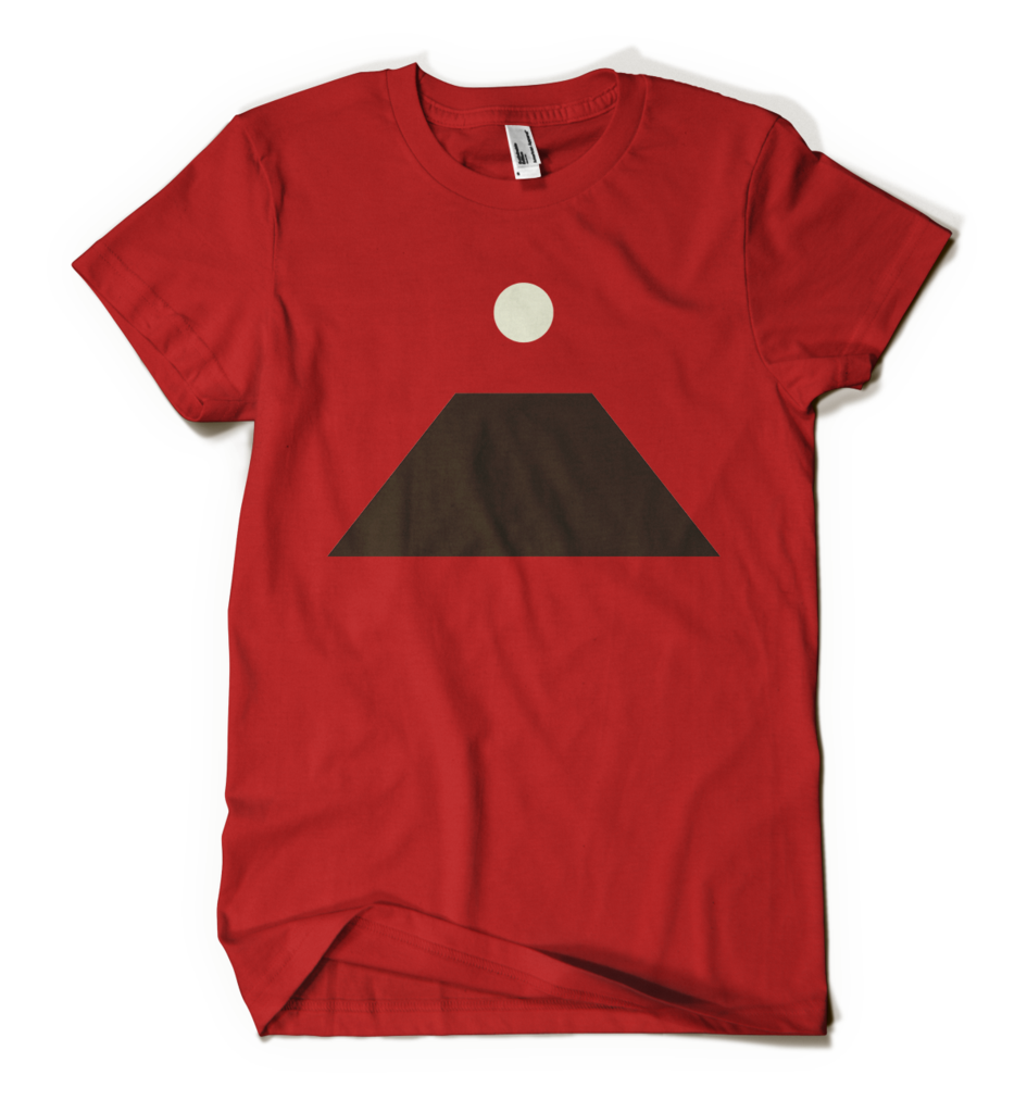
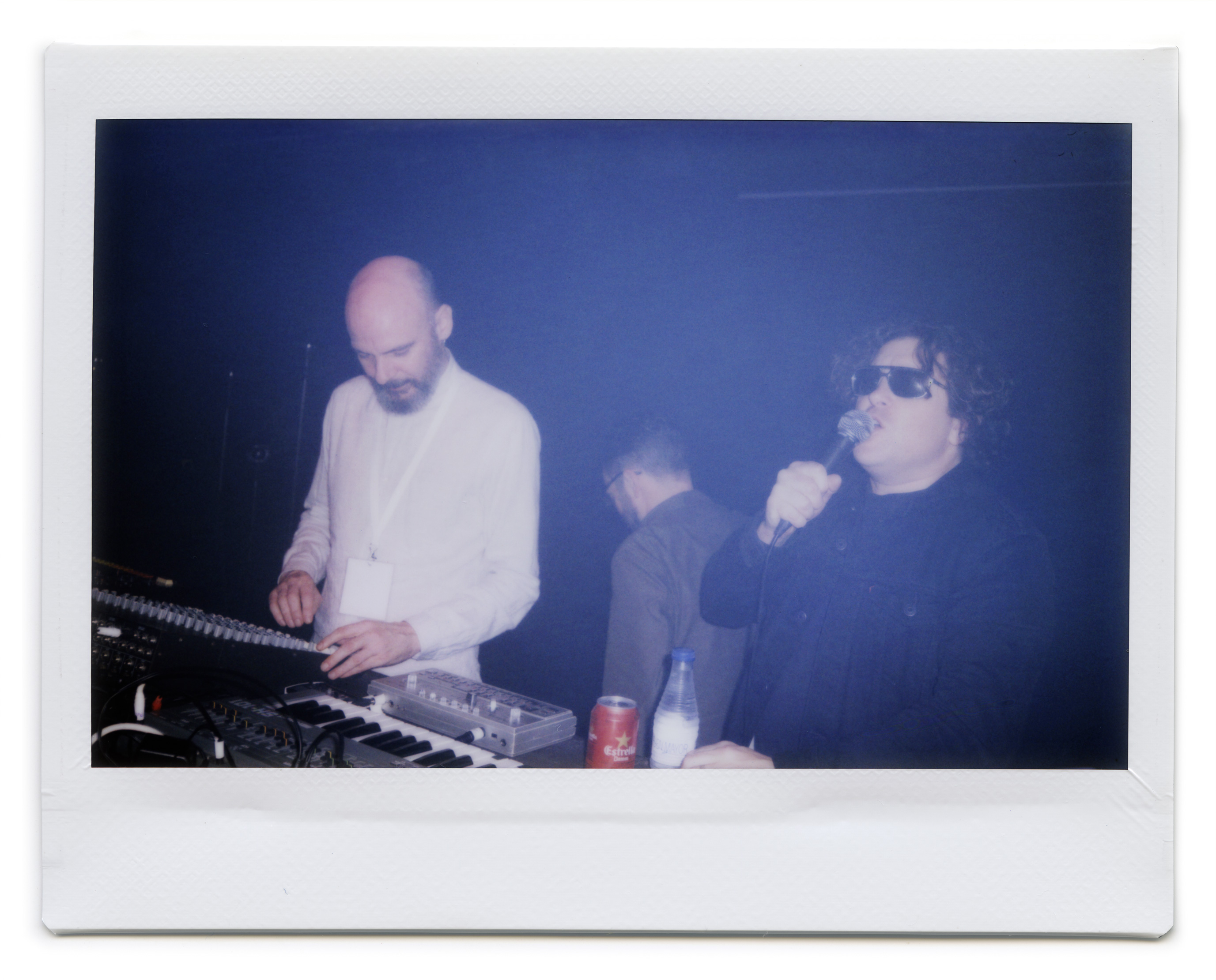
Epoch hones the sonic aesthetic of Dive while drawing on the kinetic energy of Awake, it explores darker themes and new musical territory. Epoch was produced and recorded by Hansen predominantly in his home studio in Berkeley, California. The album was arranged alongside long time collaborator and partner in the project, Zac Brown. Brown contributed bass and guitar parts to the songwriting process while Rory O’Connor performed drums on the album. Hansen sees Epoch as a multi-dimensional artistic vision at the confluence of his graphic design work via ISO50 and music with Tycho. The graphic presentation of album artwork is as important as the music itself. The keystone is the central image of Epoch and the colors scheme red and black. This is a stark contrast to the almost rainbow palette of Awake.
When discussing the surprise element of this release Hansen said, “I’ve never been fond of the ‘hand in the album then wait 4 months for it to come out’ release schedule. I wanted to be more connected to the people consuming the music.” He continues, “There is a kind of visceral fulfillment you get from sharing something that you’ve just created with other people. We just finished mastering the album in late august so it will barely be a month old when people hear it. That’s a very satisfying feeling as an artist.“
01 19 – Taipei, TW – Legacy
01 21 – Singapore, SP – Laneway Festival
01 25 – Melbourne, AU – 170 Russell – SOLD OUT
01 26 – Brisbane, AU – Laneway Festival
01 28 – Melbourne, AU – Laneway Festival
01 30 – Auckland, NZ – Laneway Festival
02 02 – Sydney, AU – Metro Theatre
02 03 – Adelaide, AU – Laneway Festival
02 04 – Sydney, AU – Laneway Festival
02 05 – Fremantle, AU – Laneway Festival
02 14 – Budapest, HU – Akvarium Klub
02 15 – Prague, CZ – Meetfactory
02 16 – Warsaw, PL – Worldwide Festival at Niebo
02 18 – Copenhagen, DK – Pumpehuset – SOLD OUT
02 19 – Stockholm, SE – Kagelbanan – SOLD OUT
02 20 – Oslo, NO – Parkteatret – SOLD OUT
02 22 – Cologne, DE – Gloria Theatre
02 23 – Amsterdam, NL – Melkweg
02 24 – Paris, FR – La Gaite Lyrique – SOLD OUT
02 25 – Brussels, BE – Botanique – Orangerie – SOLD OUT
02 27 – London, UK – Electric Brixton
02 28 – London, UK – Electric Brixton – SOLD OUT
03 03 – Hamburg, DE – Uebel & Gefahrlich
03 05 – Leipzig, DE – UT Connewitz (rescheduled from 2/11)
03 06 – Vienna, AT – Flex (rescheduled from 2/12)
03 07 – Berlin, DE – Astra Kulturhaus (rescheduled from 2/10)
03 10 – New Orleans, LA – Buku Music + Art Project
04 15 – Indio, CA – Coachella
04 22 – Indio, CA – Coachella
05 03 – New York, NY – Brooklyn Steel
05 31 – Barcelona, ES – Primavera Sound
06 08 – Porto, PT – Primavera Sound
Like last year lists this year are all over the place, a lot of main stream rap again, really solid techno and again VERY happy to see a lot less of the soft boy beat stuff that clogged up the festivals, which makes me overwhelmingly happy. Here’s a few musicians that most of you know but made my year very enjoyable because of a DJ set, live set, a diverse DJ Kicks or a keeping an alias alive and well, enjoy!
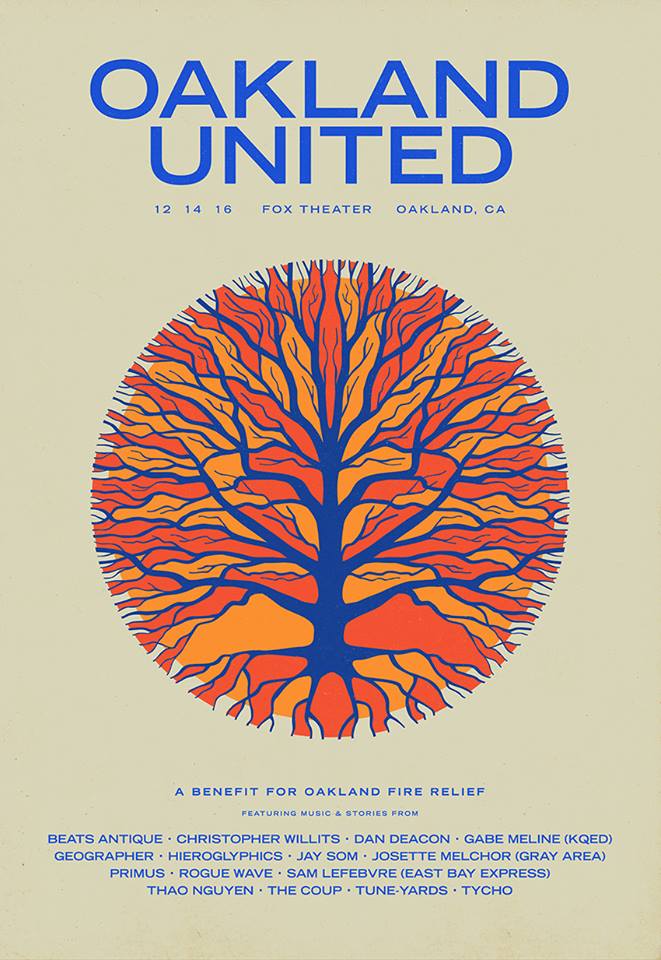
The fire last week in Oakland has been a huge shock to the artist community here in the Bay Area with ripples far beyond. Sadly, as is often the case, it took a tragedy of this magnitude to start a dialogue about the issues and conditions that precipitated it.
I first discovered electronic music in the ‘90s through the Bay Area warehouse party scene. Later I moved back to Sacramento where I started making music myself and playing my first shows at underground parties. I owe a lot to the community and history of this area and it’s disheartening to know that fewer and fewer artists have the opportunity to benefit from this richly diverse community.
This Wednesday I’ll be participating in the Oakland United event at the Fox Theater. 100% of the proceeds will go directly to Gray Area Foundation For The Arts Oakland Fire Relief Fund. Christopher Willits, whose Overlap Studio is based in Oakland, and I will be collaborating on a short DJ set and a lot of other local artists will be playing as well.
I’ve created this poster to promote the event and as a tribute to the victims of the fire. We will be selling prints at the show and online afterwards, proceeds of which will go to the Fire Relief Fund.
I hope you can support in whatever way you are able; more information about the event and the relief fund can be found at Oakland United.
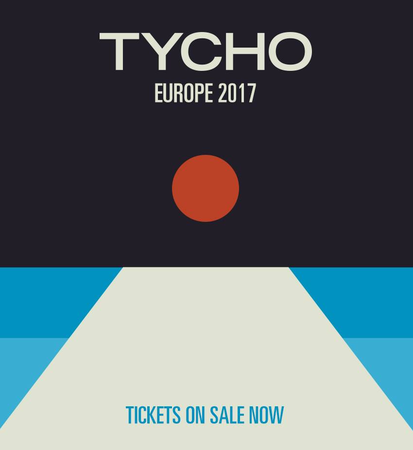
“Division,” the first single from Tycho’s Epoch, gets the ethereal synthesizer treatment from California’s Kaitlyn Aurelia Smith and Berlin-via-Detroit’s ambient techno artist Heathered Pearls.
The Epoch is a hinge. We tend to follow a linear trajectory until a point at which we realize that through free will the path can be bent and redirected.
I’ve been very busy for the past year or so working on a new album so it’s been a while since I’ve posted. Now that the new Tycho album — Epoch — is out I wanted to write a little about the meaning and origin of the artwork. I worked as a graphic designer for 14 years until I decided to pursue music full time so the visual element of Tycho has always been at the core of the project for me. I think the imagery tells a story that the music can’t fully articulate, and vice versa.
Past is Prologue (2006), Daydream (2007), Dive (2011), Awake (2014)
The sun disc, both literally and as an icon, has always been at the center of the artwork. From Sunrise Projector and on I’ve used the sun and circle as a metaphor for life; the sun being the life giver and the circle symbolizing the closed loop, the interconnectedness of the human experience with the physical world.
· The Trilogy Begins
Dive (2011)
While I had explored a lot of these themes previously, I feel that Dive was the beginning of a trilogy of albums and so was the starting point for a narrative and symbology which have become central to the Tycho identity.
The cover for Dive was a foray into maximalism combining photography and design. I wanted to evoke the sense of being on an unavoidable path, one from which deviation was impossible. I wanted the viewer to be pulled into the image and be drawn toward the sun. I think this design speaks to the music in that it felt like the beginning of a journey and the multi-layered composition echoed the sonic aesthetic of the music. I spent quite a bit of the next couple years refining this style and creating various collage type images.
Dive Single (2012) – Another cover in the style of the Dive full length cover
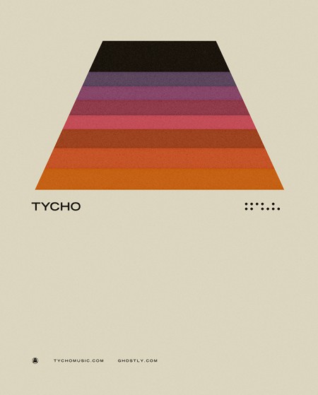
· Enter Minimalism and The Trapezoid
Concert Poster (2012)
As a graphic designer I have always had a deep appreciation for minimalism and the simplified, efficient expression of ideas through form and color. But as a visual artist working within the context of Tycho my output had typically trended toward almost painterly styles, multilayered collages which were anything but minimal. But at some point after the release of Dive I decided that I wanted to get back to my design roots and bring a more simplified, refined style to the project. The beginning of this shift was around 2012 when we played The Independent in San Francisco. This was meant to be a simplification of the same path seen on the cover of Dive, the colors a reflection of the sun into that path. This was also one of my first uses of the trapezoid shape which would become core to the symbology of Tycho.
· The Awake Era
Awake (2014)
Dive was in many ways a breakthrough record for Tycho: it was when I first formed the live band and we began touring extensively. It also marked the period when I was finally able to quit doing freelance design and focus solely on the music and the imagery surrounding Tycho. After a couple years of touring it came time to make a new album and I knew this would be a pivotal release, quite literally a make-or-break record. I wrestled with the art direction for months before finally deciding to go in an entirely new direction from Dive and earlier works and create a minimalist direction for the release. I had always felt strongly about the spectrum and trapezoid from the 2012 poster and so I revisited the concept and incorporated the sun imagery to bring it into storyline.
Both the circle and the trapezoid symbols featured heavily in the videos and visuals for Tycho during the Awake tours (2014-2015)
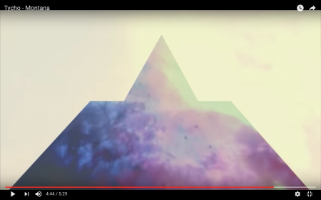
Montana Visuals (2014)
Montana Video (2014)
During the Awake album cycle I continued down this path and lots of imagery followed for show posters and releases.
Concert Poster (2014)
Montana Single (2014) – the trapezoid combined with the triangle
· The Darkness
The overall direction for Awake was very light and halfway through the cycle I started shifting things into a darker space for contrast and to foreshadow the next album.
Awake Deluxe Edition (2014)
Concert Poster (2014)
Awake Remixes (2015)
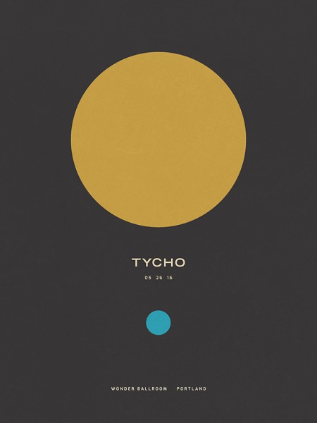
Concert Poster (2016)
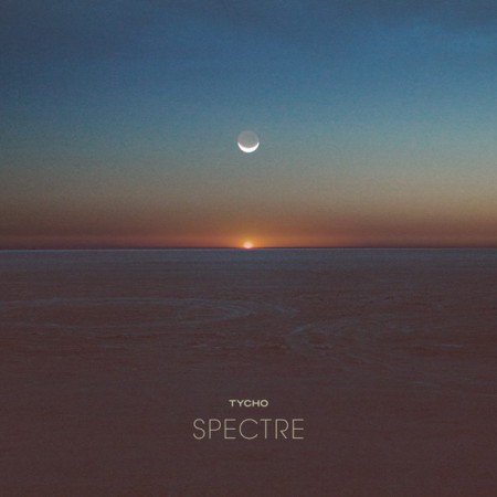
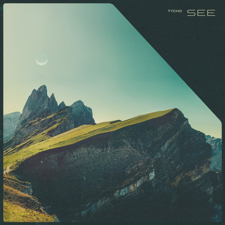
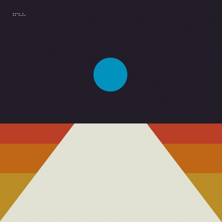
To compliment the darker themes for the Spectre and See singles I introduced the moon as the central element in place of the sun.
Spectre Single (2014)
Spectre – Bibio Remix (2014)
Tycho – See (2014)
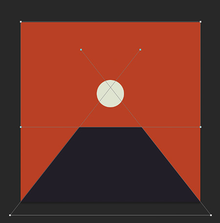
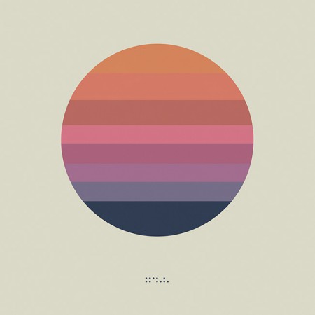
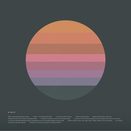
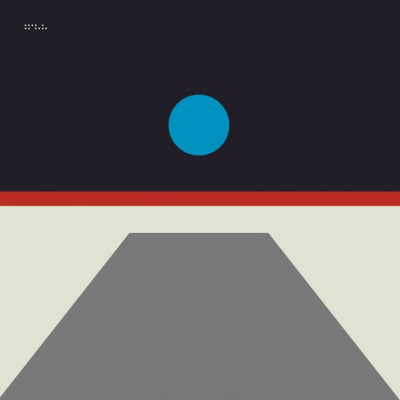
· The Epoch
Awake had been out for over two years and it was time to start thinking about the next release. Up until this point, when doing minimal compositions I had been using textures and distressing to give some depth to the images and break up solid fields of color. For the next phase I wanted to further simplify and remove any extraneous elements. I wanted to cut to the core of the message and try to distill things into a language of basic symbols.
Artwork for the first single from Epoch: Division (2016). This was designed after the album artwork and was meant as a transition which would introduce the elements and colors that would follow in the full length release.
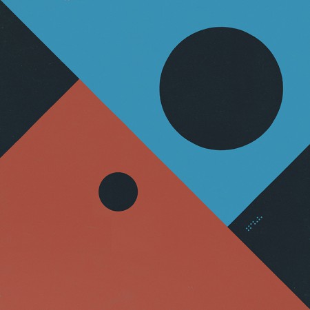
Musically, this album was about circling back while maintaining forward motion; revisiting and refining the concepts of earlier albums with a view to the future. My primary goal was to incorporate the color scheme of the very first Tycho release: The Science of Patterns EP (2002). I also wanted to revisit the simplicity of that artwork as Epoch was all about focus and efficiency, chiseling away anything which was not absolutely necessary.
The Science of Patterns EP (2002)
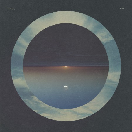
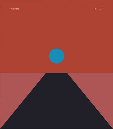
I also wanted to draw upon the two core symbols of the project: the circle and the trapezoid. But this time I wanted the circle to represent the moon, a body reflecting the light of the sun. In this way it was a metaphor for this album, a reflection of the previous works presented in a new form.
The following are selected iterations of the Epoch cover design which led to the final version.
The initial concept (2015)
An early concept incorporating a more three dimensional look. I ended up leaving this in favor of a more simplified form
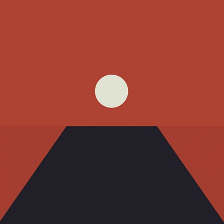
The first simplification, the horizon line is still subtly implied
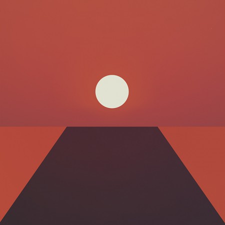
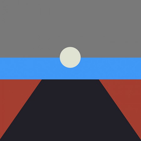
A tangental concept exploring the incorporation of more color. This ended up being the impetus for creating the alternate cover series for the countdown (discussed later)
Another alternate with more color and a defined horizon line
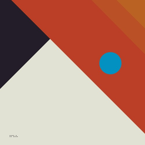
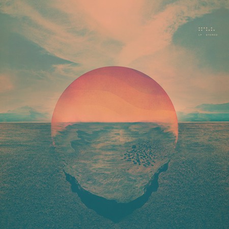
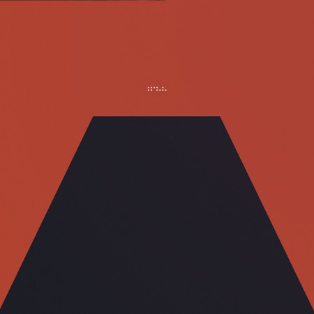
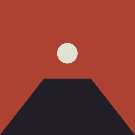
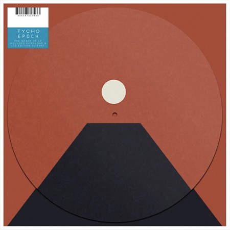
The final form: Tycho – Epoch (2016)
In the end I decided to keep the image ambiguous, the viewer should decide exactly what it was they were looking at and ascribe their own meaning to it. This meant stripping the image down to the essential elements, leaving a simple icon.
I felt that the power of this image would be in its simplicity and also in its portability. It could adapt to many form factors with ease and felt more like a modular system than a singular image. At this point you have to take into account that the vast majority of people will experience album artwork at a tiny square on a smartphone. At this scale a lot of nuance and detail will be lost. This is not to say that I intended to oversimplify purely for this reason, but it is a consideration.
· Release
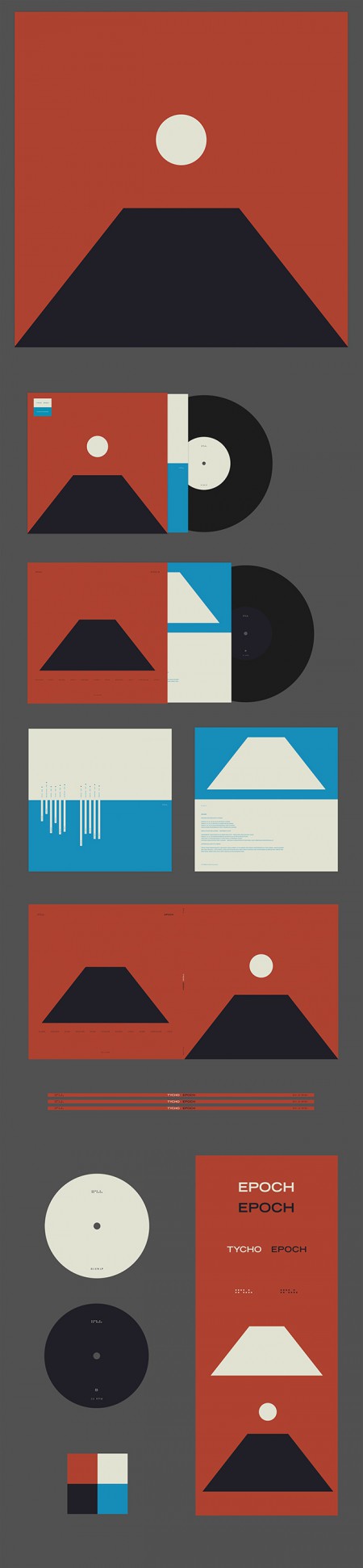
Epoch Vinyl Packaging
Epoch was released 30 days after completion as a surprise, as such there wasn’t enough time to have vinyl and CDs produced; only digital versions were available on release day. As a stopgap until the vinyl arrived, we decided to offer a custom slipmat with pre-order purchase at retail outlets. More about the release strategy in The New York Times piece With Vinyl, the Musician Tycho Establishes a Physical Presence
Epoch Slipmat
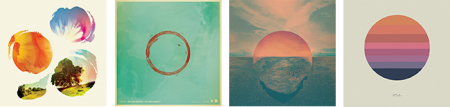
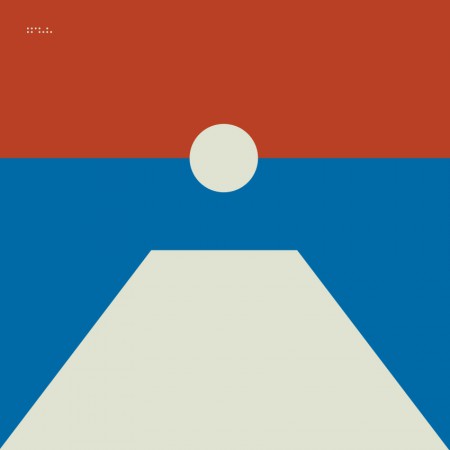
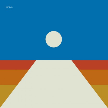
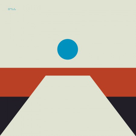
For the Awake release I cut up a print of the cover art into squares and released it as nine panels as a way to count down to the release. For Epoch I wanted to create several alternate versions of the cover art to use for build up. This release was not announced ahead of time so it was fun to slowly release elements of the design without people fully understanding what was coming. Here are a few examples of the alternate versions.
Tycho Descent Burning Man Sunrise Set Cover
06-division
08-local
02-horizon
04-receiver
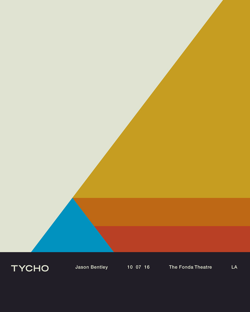
All in all this was an enjoyable and fulfilling process for me as a designer. I’m looking forward to the next couple years, creating future permutations and working with this design/color system. The first example of this is below, the poster for the show at The Fonda in LA.
Tycho Fonda LA Concert Poster
Thanks for reading, if you have any questions leave a comment and I’ll do my best to reply.