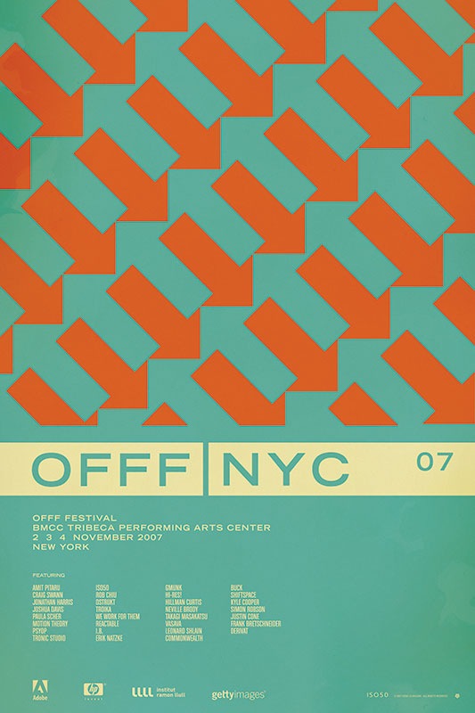
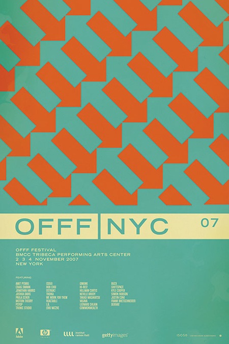
So after going through all the comments on the contest post for the OFFF NYC 07 print, it looks like the general consensus has swung in favor of version D (pictured above). After all of that, I’m still not 100% convinced which I like best. So I will be eventually printing a few versions, but the first to go out will be version D.
As for the winner of the contest; there were a lot of great analysis and it was hard to pick just one that said it best, so I picked two. And the winners are…..
Jacob Rubin (hrubinj)
Stephen Lynch
They will each receive a signed edition of the print along with some other stuff from the shop. I’ve also picked a few runners up who will be getting some Tycho MP3s for their efforts. Thanks to everyone who weighed in on this, so many great comments and good advice. This was definitely a good learning experience.
VOTING IS NOW CLOSED!
Thanks to everyone who participated, I really appreciate all the great feedback. I will be going through and picking a winner over the weekend, you will be notified via email if you’ve won.
UPDATE: As per Damo’s request this is now a contest. The best analysis will receive a signed copy of this poster. You must enter a valid email address in the email field when placing your comment so you can be contacted if you win (the email address is not viewable by the public). If you’ve already entered a comment but did not enter an email address, just place another comment with the email and reference your original comment. I can see the IP address you post from to match them up. This contest ends this Friday, Feb. 15th.
UPDATE: After considering some of the early responses to this post (namely Jacob’s) I’ve added two more versions for your consideration.
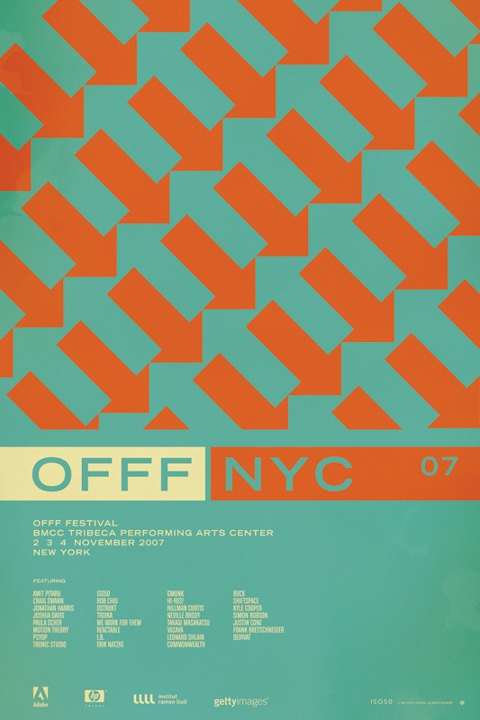
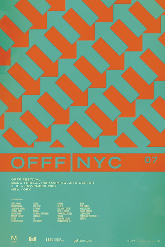
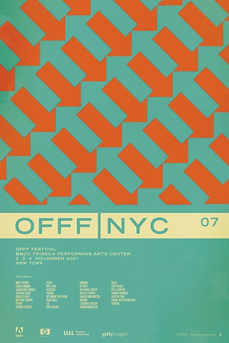
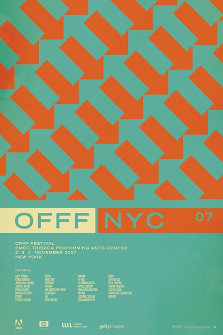
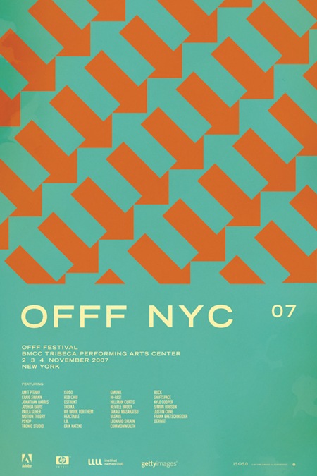
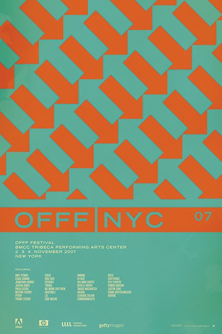
So I have been putting together a batch of prints that will be released over the next few months. Included is the poster from the OFFF 2007 festival in New York. There have always been multiple versions and I’ve really had a hard time deciding which I like best, and consequently, which will get printed. So I thought I would try a little experiment and let you guys choose your favorite. They are shown above in order: verions "A", "B", "C", and "D". Let me know which you like best by sounding off for A, B, C, or D in the comments. Or you could just say they are all terrible and to start over. Click the images above to view larger versions of each.
My 2 cents: At this point I think B, C, and D are the strongest. B has a cleanliness and reservation about it that I like. The type is able to stand on it’s own and given that it’s Trade Gothic Bold Extended, that’s a very good thing. But I think the solid bar in C and D really pulls things together. Right now I am really leaning towards C just because it feels so cohesive. The top portion is reserved for the red / orange color and the bottom, informational portion has the cream. I think this links the main title and the arrow design together nicely and makes the overall composition feel more like a single unit whereas some of the others seem a bit broken up.
Click here to cast your vote in the comments