The D’s Have It…
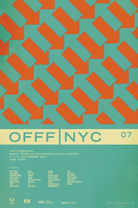
So after going through all the comments on the contest post for the OFFF NYC 07 print, it looks like the general consensus has swung in favor of version D (pictured above). After all of that, I’m still not 100% convinced which I like best. So I will be eventually printing a few versions, but the first to go out will be version D.
As for the winner of the contest; there were a lot of great analysis and it was hard to pick just one that said it best, so I picked two. And the winners are…..
Jacob Rubin (hrubinj)
Stephen Lynch
They will each receive a signed edition of the print along with some other stuff from the shop. I’ve also picked a few runners up who will be getting some Tycho MP3s for their efforts. Thanks to everyone who weighed in on this, so many great comments and good advice. This was definitely a good learning experience.

8 Comments Leave A Comment
Jasper F. Agterbosch says:
February 19, 2008 at 3:05 pmDang! I won nothing .. as usual :-)
Doug Vander Meulen says:
February 19, 2008 at 3:15 pmHey Scott,
Where do you get your posters printed?
Desmond says:
February 20, 2008 at 6:50 amCongratulations. :D
Great to read through everyone his/her opinions.
Alex / HeadUp says:
February 20, 2008 at 1:44 pmThrow some D’s on that bitch!!! hahahahaha
Good choice, although I wasn’t 100% on D because I felt the orange arrows are too blurry. Then again, this could just be the smaller .jpeg.
Scott says:
February 20, 2008 at 1:58 pmAlex-
you are right, the JPEG compression produced the blurring artifacts you see. I tried to reduce them as best I could but obviously it still came out pretty bad. In retrospect I feel this may have skewed the results a bit. perhaps I’ll post a TIFF next time?
Desmond says:
February 22, 2008 at 8:17 amYou could try PNG. I always use that for a less blurred effect without it having been increased in size too much. (To think of the people with a slow internet connection)
Only downside is you need to convert it to RGB, but colours probably won’t change too much.
Doris Ellison says:
March 25, 2008 at 1:40 ambombard subparagraph glutaric kutchin submucosal shiplet osnaburg strummer
Lake Joy Community
http://web.linkny.com/~civitas/page88.html
Blaine Wong says:
April 17, 2008 at 12:37 pmbombard subparagraph glutaric kutchin submucosal shiplet osnaburg strummer
Arafura Bluewater Charters
http://www.craigmarlatt.com/canada/government/thompson.html