To play the media you will need to either update your browser to a recent version or update your Flash plugin.
Rob Fissmer is new contributor to the ISO50 blog, he has been djing under the name Raeo which if you go to his site you’ll discover a large archive of mixes that he’s put together along the same vein as this collection above. Personally I love this package of songs, the downbeat instrumental sound that has IDM influences is some of my favorite and Rob grabbed some of the best most recent examples. Also another fun fact about Rob is that he’s a ice hockey goalie and a fine one at that, if Ninja Tune’s hockey team knew that he might get picked up.
Came across a huge collection of camera and lens manuals from the Soviet Union, all of them have that DDR/Cold War feel and look. Being born in communist Poland i’ve been shown a lot of this kind of design thru my whole life, I find a strange attraction to it.
To play the media you will need to either update your browser to a recent version or update your Flash plugin.
The first Tame Impala remix hits the internet, its soo respectful of the original I want every kid that produces to understand what a job well done sounds like, its fitting and feels like its not chasing fads and trends.
Ulrich Schnauss came back into my world by updating his Soundcloud with remixes, tracks that I missed completely. This might be the most delicate shoegaze drum n bass you’ll ever hear, its just gliding swiftly the whole time, a great rework.
Do you remember Output Recordings? Trevor Jackson brought the world Colder, Circlesquare, The Rapture, hell you could probably even say Four Tet, etc. you get the idea, without that label the beauty in darkness would be missing a good deal of warm and restraint without that label, I imagine if they were still around Jon Convex would fit perfectly on their roster.
We’ve supported almost every single off this DIIV album, its just the most proper summer record to come out of the east coast to capture what I want to hearing without thinking about what to listen to. Recently they called on Memory Tapes to make something dancey for them, works really well even though a Weird Tapes(same guy) remix would have taken it to the next level.
To play the media you will need to either update your browser to a recent version or update your Flash plugin.
Today we have a very special guest that you might recognize from Youtube, it’s Anthony Fantano from Needledrop. I really respect Anthony’s consistency and dedication of quality reviews he does on his Youtube feed. He always helps new listeners with describing what he’s listening to with plenty of references and adjectives, kind of like we do it here on the ISO50 blog but he takes it to full on video with characters and all. Enjoy his playlist he put together, its the first time we’ve ever had Metal on here in our 5 year existence.
1. Xibalba – No Serenity
Despite how much it irks some of my loyal viewers, I like to keep a somewhat (ir)regular flow of metal reviews coming. This Xibalba album really stopped me in my tracks with some massive, chugging riffs and the kind of primal ferocity that you’d typically find on a metal-infused hardcore album. I usually prefer my metal to be a bit more, uh, heady, but this was just too good to be true: A teenage favorite mixed with the kind of dense, low-end sounds that my adult self currently enjoys on numerous Southern Lord records. Plus, this is my current favorite workout record.
2. Matthew Dear – Ahead Of Myself
I’ve known Matthew Dear to put together some eerie tracks, but this is the first time he really struck me as being a tender dude as well. He’s got a few moments like that on his new LP, Beams, and I love ’em–especially this one. The watery synth chords on this track are absolutely intoxicating. It’s like they’re just about to fall into a slumber or something. Meanwhile, Matthew’s seductive croon delivers some mantra-heavy vocals.
3. Meridian Brothers – Salsa Caliente (Versión Aumentada)
This is a bit of experimental salsa from Columbian sonic experimentalist Eblis Álvarez. He’s got a new LP on the way titled Deseperanza under the name Meridian Brothers. The dude really took the art form of the genre and mutated it into something odd and subtly psychedelic. The lazy instrumentation, oddball melodies, and lightly tortured vocals add up to something that would sound perfect in a David Lynch movie, for sure. Definitely a strange experience.
4. TNGHT– Bugg’n
The musically savvy are too hard on bangers. Not everything needs to be this big, flowery, moving, significant thing. Loosen up, have fun, go nuts. When it comes to that, TNGHT is my jam. This is about at anti-elitist as you can get while still keeping your listening habits underground. What I like about TNGHT is that they create such visceral music with such experimental sounds. If “Bugg’n” were a movie, it would feature some of the most unlikely casting in music history, featuring the sounds of babies, spaceships, bubbles, and more.
Now that most of us are familiar with logos both candidates are represented by for this U.S. presidential race in November, I wanted to take a second just to compare/discuss a few choices that were made. Below are links to their shops where a large collection of apparel, stickers, signs, etc. are available:
**Please note, my views are strictly geared towards reviewing the merch/branding and nothing of the election, we are a design site and this post is just my opinion and not of Scott Hansen or any of the rest of the contributors.
“The Logo”
I for one am surprised by the Romney logo, its actually not awful, when I first saw it I thought it was too loose and it had weak traits that wouldn’t translate well once it started getting pressed on things and it didn’t hold well by itself. When you lay it on a shirt with an outline it turns to garbage like many things but on white it actually has some legs. As for Obama’s logo I think its been clashing too much with the Bank of America logo in my head but once I shake that thought its solid, if feels right any which way you put it. Its almost a self contained environment within an icon, he should be proud.
“The Designer”
Both sides see that there is reasoning in this day in age to actually put some thought behind designing a shirt for the people that are going to dish out $30 and actually wear the shirt because they like the design. Both sides came with something consciously stylized, i’m sure both candidates didn’t see these and approve BUT someone did. Both aren’t dreadful but Obama edges out Romney on this one as well and here’s why: Obama went after the goal/statment and makes you read it while Romney just threw something “retro” looking and the message isn’t there. From the “Keep Calm And Carry On” iPhone Cases to garbage like “Swag” tees, in my observations this years youth and shirt buyers want statements and type for the first time in a long time, its pretty shocking actually.
“Campaign Font”
I don’t think this is Romney’s “font” but it is landing on a few of the pieces he’s selling. I think its confusing or just overlooked. Why such a departure from the conservative look? who is it for? on the other hand Obama keeps it clean and uses his font well…but who needs a website anymore on a shirt? I mean come on? I do enjoy a small font sitting under the big font layout wise, there’s some comfort in it especially if you’re designing for the general public.
“The Don’t”
I had to add this section, I should have called it the “Head Nodding side to side” section. I mean COME ON! really? we’re bringing in Orange… “but its fun Jakub and the Latinos might like it”it’s confusing and throws a tiny wrench into the branding. The Romney yoga pants are just…blowing my mind, i’m not even laughing at them, its like I just swung myself over the swingset for the full rotation and landed hard. You don’t even benefit from someone wearing them, you hid the logo on dark grey on the hip, its joke by the merch team I get it, good work guys.
“The Classic Bumper Sticker”
Romney’s 2nd biggest failure in the merch department is the classic bumper sticker that every candidate needs… this thing is awful, its not 1988 and no one owns a Oldsmobile Cutlass Ciera to put this on. Obama’s is refreshing and more importantly brighter and only uses one blue and saved some cash by only printing with 2 colors which more cost effective, good choice.
My name is Michael Chase, creator of Area of Interest. Today, as a guest on ISO50, I’ll be going into the process of how I create an image.
Shooting location
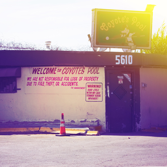
The first part of creating an image is finding a good location to shoot. It was difficult to tell if Coyote’s Pool was still open for business because it was so run down. Paint was flaking badly from underneath the awnings. All the old banners were sun bleached and fraying. Barbed wire covered one side of the roof which I assumed was to keep bar patrons from climbing onto the establishment. As I walked closer to the building I began to wonder if “Coyote’s Pool” was slang for public outdoor toilet based on the smell of it. I was sure it would yield some great textures and there were plenty.
Original photo
Some of the most fascinating textures were on the tables in the patio area. This is the original image taken from one of the tables. I’m always on the lookout for cracks, splits, flakes, discoloration, residue, splatters, splotches, and other signs of decay. I use these sorts of textures to highlight the subject of impermanence which is the central theme of my work.
Inverted and flipped
Occasionaly I’ll dramatically alter colors and levels while editing to give myself ideas of which direction I’d like to go next. Sometimes a simple thing like flipping an image or inverting colors can spur me into a completely new direction.
Gradient layer 1
Lately I’ve been working a lot with layering filters and gradient fills. I’m fond of the unusual color combinations that I’ve stumbled on which can really make an image pop.
Gradient layer 2
I tend to make a mess and work backwards. Once I’ve gone too far I’ll strip back until I find a good balance. I know I’m close to being done when I keep returning to the same image over and over. Then it’s subtle level, hue, and lighting tweaks here and there to give the image the atmosphere and mood I want to present.
Animated
Here’s a time lapse of the entire process.
Thanks to Jakub and ISO50 for letting me stop by and do this guest post.
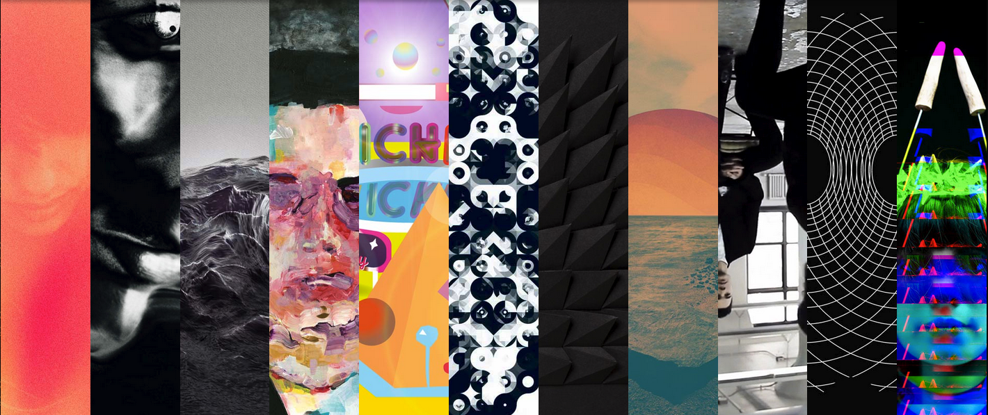
Ghostly International and Art Directors Club collaborate on an exciting 4 day event in New York City this September showing the diversity in their artistic roster. Below is the information and schedule on what to catch and make sure to get your tickets soon, this site just launched today.
ABOUT THE EVENT
The Ghostly universe has been steadily expanding since its humble beginnings in Ann Arbor, Michigan in 1999.
The Art Directors Club begins its CRE8 series of music and art focusing on Ghostly International, a unique culture identity that has helped elevate the careers of visual artists including Michael Cina, Sougwen Chung, Andy Gilmore, Will Calcutt and Matt Shlian, while releasing work from musicians such as Matthew Dear, Com Truise, Gold Panda, Lusine and School of Seven Bells.
The Ghostly aesthetic and it’s accompanying ethos has always sought to cast off the restrictions of genre and form. An assertion that creativity, in its apolitical nature, is an act worth striving to achieve. Unconcerned with classification, Ghostly highlights the act of making in and of itself, no matter the medium.
In 2010, Ghostly launched Ghostly International Editions, a “label” of artwork and artists that has grown into a collective of some of North America’s best designers and artists.
Of Art and Artifice is not a retrospective—it is a comprehensive state of the union, a peek into what’s next after 13 years of creativity from Ghostly International, creating an essential selection of work from the Ghostly family into a never-before-seen collection.
ABOUT THE ART DIRECTORS CLUB
Founded in 1920, the Art Directors Club is the premier organization for leaders in visual communication, boasting one of the most concentrated groups of creative talent in the world. A not-for-profit membership organization, the ADC’s mission is to connect creative professionals around the globe while simultaneously provoking and elevating world-changing ideas.
SCHEDULE
Thursday
September 13th / @6pm
Opening Gala
Live music performances by:
→ Com Truise
→ Lusine
→ Michna (DJ)
Live projection performance by:
→ Sougwen Chung
Friday
September 14th / @6pm
Artist Talks Day 1
Hosted By Incase:
→ Michael Cina
→ Andy Gilmore
→ Will Calcutt
Saturday
September 15th / @6pm
Artist Talks Day 2
Hosted By Incase:
→ Matthew Shlian
→ Timothy Saccenti
→ Sougwen Chung
To play the media you will need to either update your browser to a recent version or update your Flash plugin.
Mushroom Projects has been a favorite lately, the original mix of this single that 40 Thieves remixed is almost 17 minutes, I imagine the recording jam session might last days.
Knxwledge released his latest via bandcamp, closest J Dilla feel since Bullion.
With Tokimonsta and Hundred Waters both on a train together touring the US with Skrillex collabs obviously are a natural result. This one out of all of the ones floating around sounds the best to me.
Tensnake posted this floor filler today on his fb, Diva House vocals in full effect in 2011-2012, if you can do Diva House vocals you could be sitting on a million dollars this year if you play your cards right.