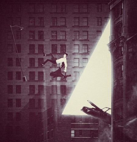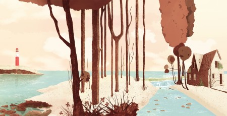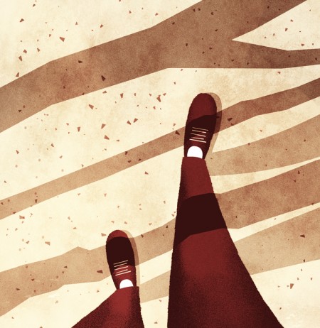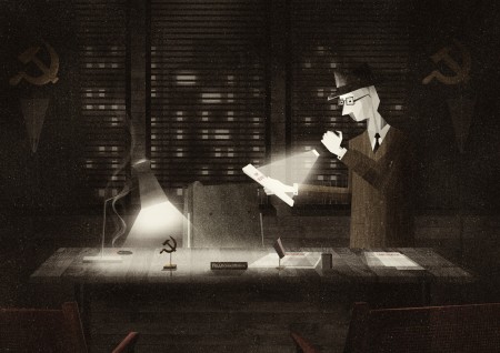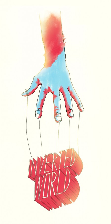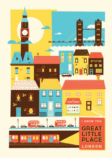


We have featured some amazing illustrators on ISO50 such as Matthew Lyons and many others, but it wouldn’t be right if we didn’t include the amazing work of Glenn Thomas. Glenn is an illustrator and designer know as “The Fox and King”. I am constantly amazed by his use of texture and light as well as his brush techniques. He is also a top notch animator. Very quality stuff. If you get a minute, make sure to check his work out, you won’t be dissapointed.
Posted by Tav Calico


I’ve just returned returned from a trip to both Munich and London, where I spent time with colleagues in both locations. Cosmic timing really, considering the London 2012 Olympics are on the horizon, and I’ve had Otl Aicher on the mind recently.
Much has been said in recent years about the shortcomings of the London 2012 graphic identity, but I hadn’t really been paying close attention to all the outrage, and had all but forgotten the design work – so I wasn’t prepared for the onslaught of Olympic schwag that greeted me at the official London 2012 shop at the St. Pancras Station in London. It’s borderline seizure inducing. Having just stepped off the train from Munich, where I spent time in Olympiapark and was exposed to Aichers work throughout the city, this London 2012 noise was especially jarring. And that mascot! Sigh. I took quite a few pictures, and had originally thought I’d post about Waldi vs Wenlock, but I decided I wouldn’t subject you to any of that madness. After all, this blog is here to celebrate beautiful things.
Scott has extensively covered Aicher’s work for Munich ’72 here before (in fact it’s where I was first exposed to it), but I thought the timing was right for us to be reminded just how amazing a coherent Olympic graphic identity and subsequent merchandising campaign can be.
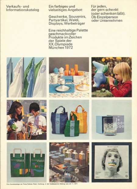
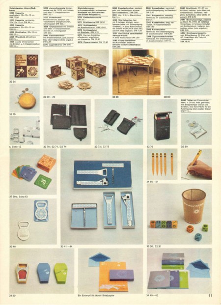
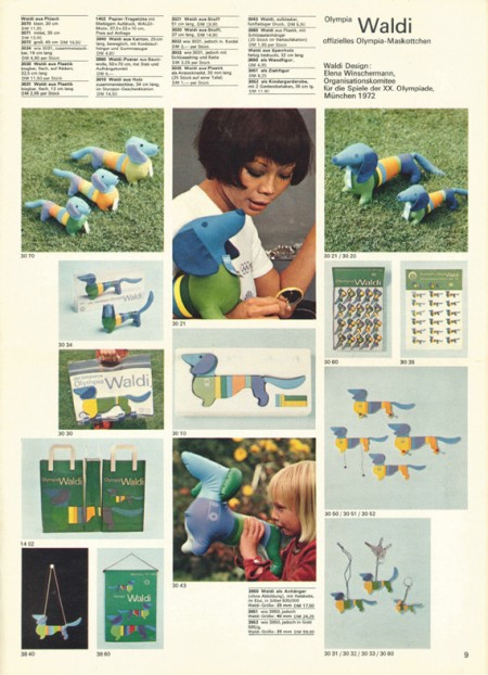
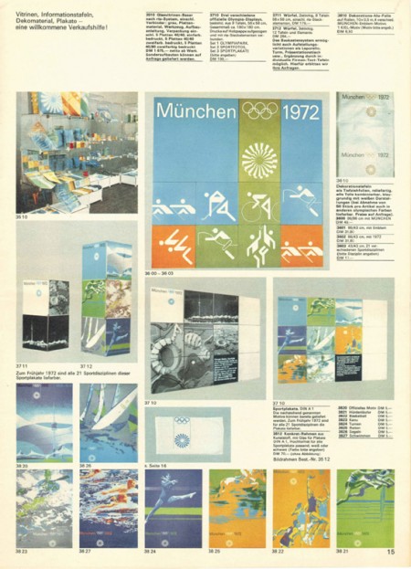
Creative Review recently posted the above scans of the official Munich ’72 merchandise catalogue, and there are a few images of what look to be the official gift shops as well. While Waldi was the only souvenir that was actually designed by Aichlers studio directly, I find it really impressive how cohesive the entire output of the “Olympic Souvenir” department was. This is most likely due to the fact that Aicher dictated a very strict set of rules as to how the logotype and symbols could be used.
It’s easy to pick apart London 2012 when stacked up against the extremely high bar set by Aicher’s work for Munich, but let’s be real here, remember Izzy from Atlanta? NOTHING is as bad as that. What. Is. That. Thing.
I’m not sure if they entered the competition, but if they did I’d be real curious to see what Bibliotheque came up with for the London 2012 graphic identity. After all, they know a thing or two about Aicher’s legacy, having put together an exhibition of his Munich ’72 work over at the Vitsoe shop in 2007, comprised entirely of posters and print from their their own collection. This unofficial Olympic torch poster they did is pretty amazing as well.
Bonus link: While googling around, I found this site that offers up the official Olympic report books as PDFs. The Munich 72′ books span 3 Volumes, upwards of 1200 pages. For the true Munich ’72 geeks.
Posted by: Rob Fissmer


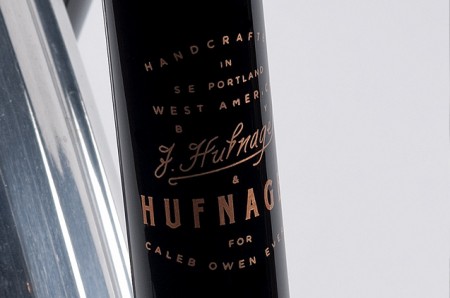
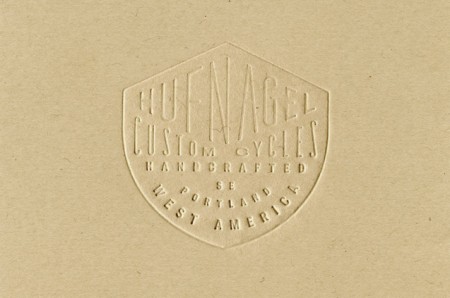
Caleb Owen Everitt is one of those designers who has such a dialed in style, you can almost instantly recognize his work when you see it. Not to mention, he has some of the coolest clients in the game from Hufnagel to Deus Ex Machina and many more. His work is always a great source of inspiration for me.
Posted by Tav Calico


Its hard not to notice the growing popularity of geometric shapes in design these days. A quick search on Behance and you really cant deny it. My laundry detergent even has a pattern of colored triangles on it (which is probably why I bought it). So at the risk of flooding the design community a little more, I have to share an iPad app I stumbled on the other day. Its called Poly.
Some before and after examples of what the app can do above.
All images by Seth Hardie
Instagram: @hallwood
Poly app Here


Update Required
To play the media you will need to either update your browser to a recent version or update your Flash plugin.
I’ve been an ISO50 reader for a long time—long before Jakub and I put on Ghostly International Roller Hockey Team jerseys and took to a rink in rural New Jersey to embarrass the label—and so when Jakub invited me to take a whack at a guest post, I naturally jumped at the chance. (Meanwhile, does anyone want my (priceless) jersey?)
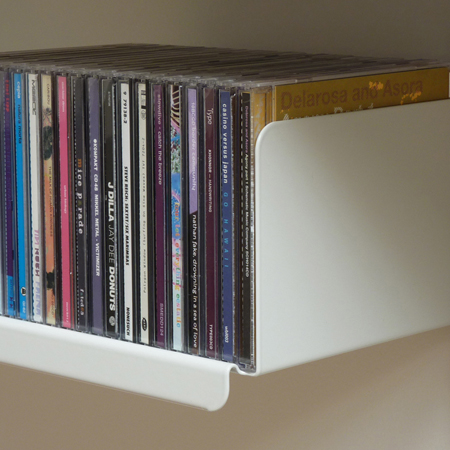
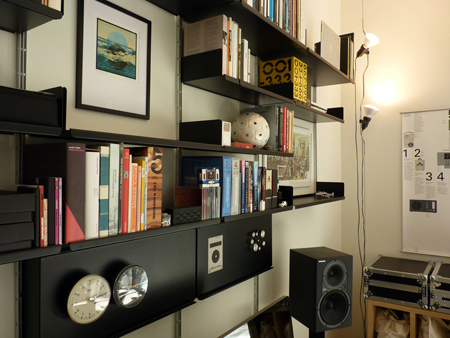
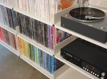
I’ve since moved to California, where I work out of the Los Angeles “Vitsoe apartment,” which is both the home I share with my wife, and a unique space where we show Dieter Rams’ 606 Universal Shelving system deployed in all ways. From straightforward bookshelves, to workstations, to room dividers, kitchen shelving, and closets, it’s pretty much all represented here (we specifically chose an apartment without any built-in storage).. As a former dj and avid collector of music, my favorite use of the system is for media storage. After all these years of collecting vinyl, I’m finally able to put it all on shelves that will not bow under the weight. Vinyl collectors: contact me, it’s more affordable than you’d think!
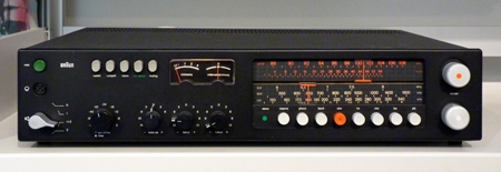
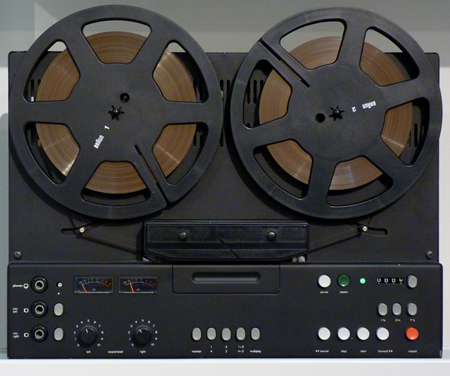
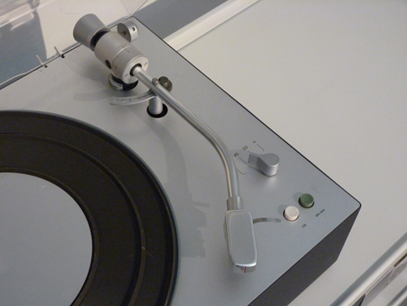
I thought it might make sense to do a first post about some of the songs that have been keeping me going while working out of the apartment—and since it’s a Vitsoe apartment, share some images of the shelving put to use for various media, plus the beautiful Dieter Rams equipment we listen to it all on.
Lorn – Weigh Me Down (Illum Sphere Remix).
Unbelievably beautiful reworking of one of my favorite tracks on Lorn’s new album “Ask the Dust.” I’m huge fan of his heavy hitting beats, but this is a nice change of pace, skillfully re-tooled by Illum Sphere. For a taste of Lorn’s own softer side, check out ‘Pause’ from his ‘Self Confidence Vol.2’ unfinished / unreleased / demo tracks over at the Brainfeeder site. A strange anomaly in a very dark oeuvre.
Yppah – Blue Schwinn.
I’m a huge fan of Joe Corrales’ work as Yppah, it’s sort of a shoegazy version of Bonobo, a combo that is pure win in my book. This track is from his third and most recent release on Ninja Tune, “Eighty One.” Anomie Belle’s vocals are a great addition in an instrumental sense, I love how she’s just swirling around in the background and I’m unable to make out the words.
Lost Twin – Soothing Words.
There’s no shortage of great producers in Brighton these days. I can’t remember exactly how, but I found him via Bandcamp, and to my pleasant surprise, he’s offering the whole ‘Birds’ album for free. I would have no problem paying full price (and then some) for his work. Although obviously entirely different in tone, there’s something a little Burialesque about the auto-tuned quick vocal snippets.
Dextro – Ring Cycle.
I’m not sure exactly why Dextro has stayed off most people’s radars for so long: He deserves far more exposure in my opinion. His first release was on Border Community, then the subsequent releases were through his own imprint, 16K Records. Maybe that’s why. I don’t know. What I do know is that his sound manages to successfully bring together elements of Ulrich Schnauss, Slowdive, and dare I say it, BOC. His last album, Winded, from 2009, is a real gem. I’m hoping he follows it up soon, it’s been too long.
A Sol Mechanic – [Almst(Touching)].
I’ll never tire of a good “Everything in Its Right Place” sample. In his own words “it’s less of a remix and more of a branch off. N E Ways.” That’s a good way of describing it, because after that amazing initial drop, the sample gets filtered into the background and the minimal stutter beat takes over.
Geskia! – Melamine.
Geskia’s sound is unabashedly Scoott Herren influenced, and most of his work occupies a space dead center between Prefuse and the long gone DeLarosa & Asora projects. This is a compliment, as he pulls off what so many other fail to do successfully.
Jai Paul – BTSTU.
There’s been a lot of buzz about this kid from London, and deservedly so. I saw a tweet from Four Tet that said simply: “that Jai Paul track,” which of course sent me into a Google frenzy. What I discovered is that there are literally only two tracks under his belt to date. It sounds like he’s in good hands over at XL, in a recent NPR spot I heard them describe how they are giving him loads of space and time to do what he needs to do, because that’s just how he rolls. He really has a grasp on the “Less, but better” approach.
Autechre – See On See (Pixelord Remix).
The thing I like about this unofficial Pixelord remix of ‘See on See’ from 2010’s Oversteps is that it brings me back to the Tri-Repetae days, when the tracks were grounded in dark emotion, and they would hit you in the gut with crisp, hard beats. They lost me long ago, but it’s nice to be brought back if even for a few minutes.
Rob Fissmer


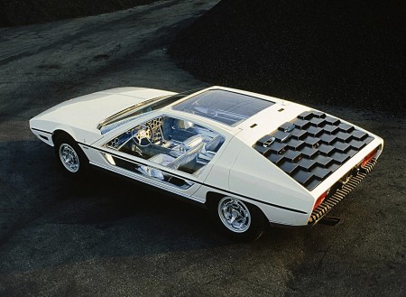
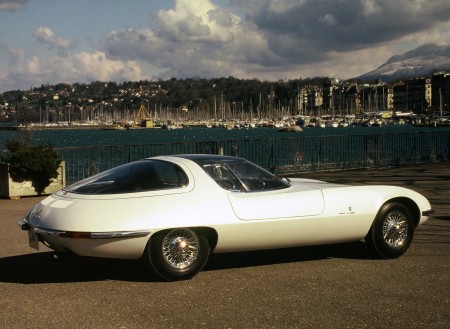
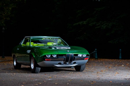
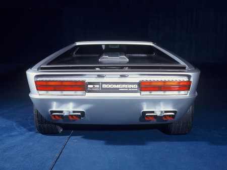
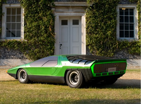
Originally an Italian coach builder and manufacturer, Gruppo Bertone ultimately became renowned for their progressive automotive design. Starting with the legendary Lamborghini Miura in the late 1960’s, Bertone’s designers were commissioned by many Italian carmakers of the day for both concept and production based cars. The late 70’s and early 80’s brought critical success and some of what I feel were their best designs, known for their distinct wedge profile and futuristic accents. Pictured above are some examples of work they did for Lancia, Fiat, Ferrari, Lamborghini, Volvo, Alfa Romeo, Maserati, and BMW.
-Rory


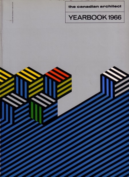
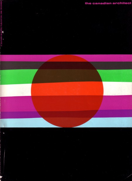
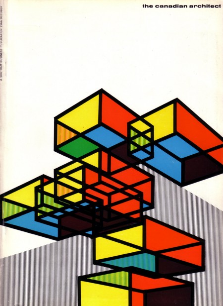
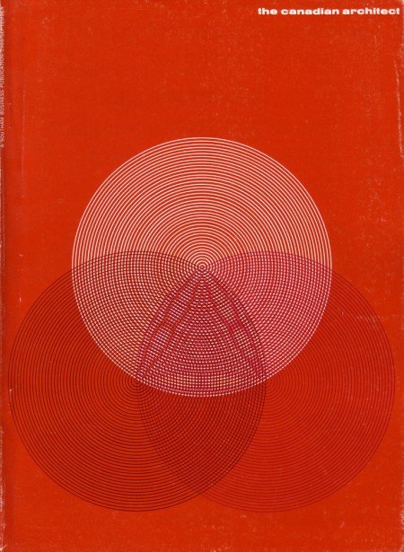
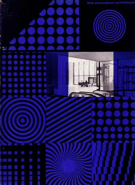
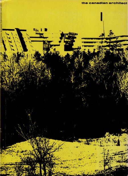
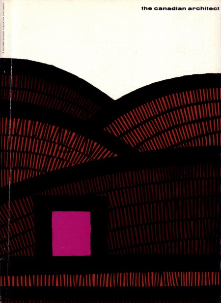
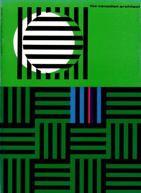
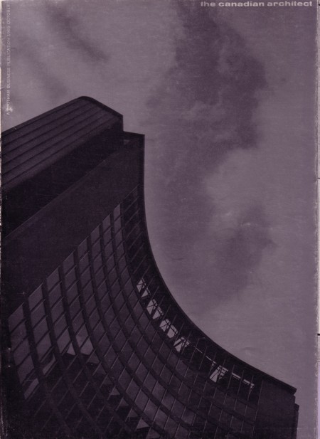
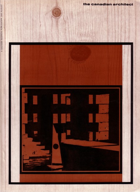
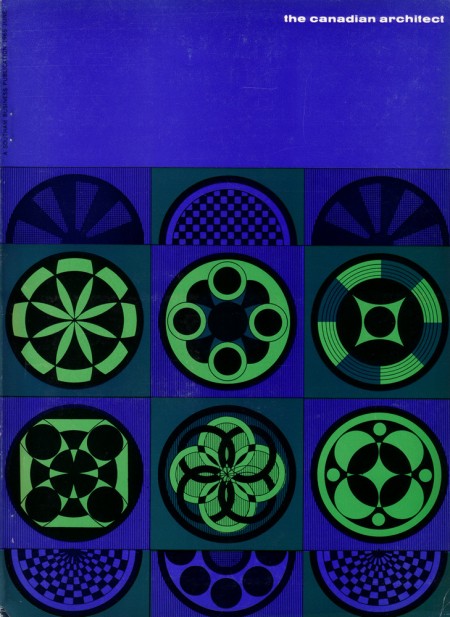
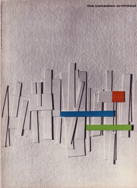
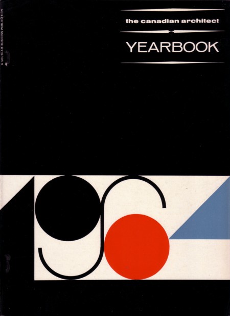
Just came across this great Flickr set of The Canadian Architect covers from 1964-67, designed by Laszlo Buday.
Also, sorry for the abscence of this weeks’s Weekend Inspiration post. I’ve been helping out Tycho with the first leg of this summer tour dates, so haven’t had much time to post, but next Friday it’s back to business as usual.
Posted by Jonathan (B3PO)
