Hurlebath+Co
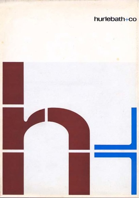
Found this one at NAGO (Nederlands Archief Grafisch Ontwerpers). Some other very nice images there.

Found this one at NAGO (Nederlands Archief Grafisch Ontwerpers). Some other very nice images there.
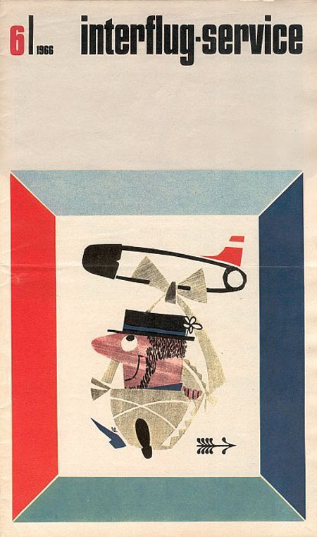
Not sure what this is exactly… In flight brochure? Not too keen on the illustration but the header/type is spot on.
Image via Anthony Mark
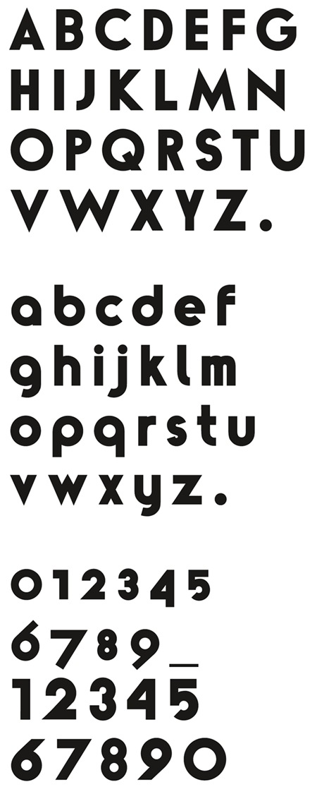
"Number 9" by Ian Brown as featured in the Lost + Found print. Wonderful; can we buy it?
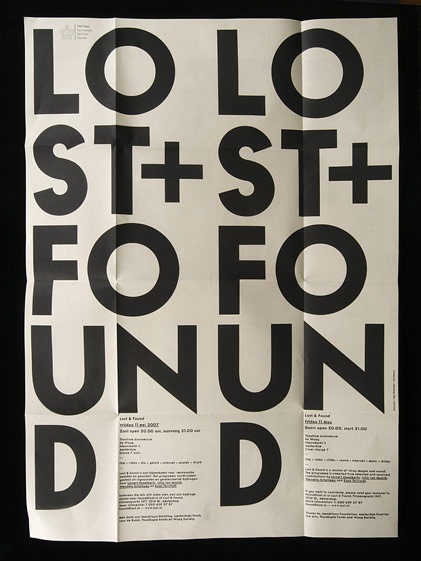
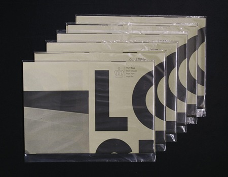
Another great example of some well used typography. I found this online a while back and forgot to to write down the source. If anyone knows where it’s from or anything about it please post in the comments. Also, name that font.
UPDATE via Sam Mallett in the comments:
"the piece was designed by Timo Hofmeijer / New Folder from Amsterdam and it was a collaboration with Ian Brown"

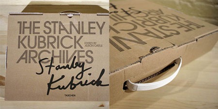
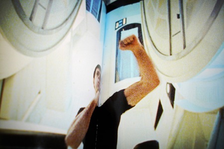
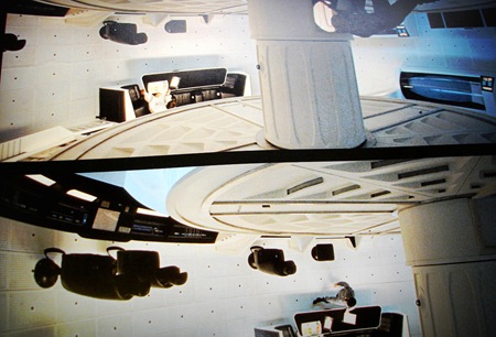
Some random shots of the Stanley Kubrick Archive book. The cover is set in ITC Avant Garde Gothic Alternates.

Interesting Cretive Review piece about Olympic Logos:
"With the enormous barrel of nastines currently being dumped all over the London 2012 logo, we wondered what the reception might have been for some of its predecessors had they been released today. What comments, for example, might the Herr in the strasse have come out with when confronted with design’s holiest of holies, the Munich 1972 logo?"
Read the rest of this article >
If you read down to the bottom you’ll find this surprising bit of info:
"As we revealed here, the final 72 logo is not solely Otl Aicher’s design. Aicher had wanted to use a radiating sun (which was later put to good use by the German lottery) but it was deemed impossible to copyright. His design was put out to competition, the winning entry, as judged by a panel including Aicher, being Coordt von Mannstein’s (literal) twist on the original."
And on a side note the type is set in Univers, so nice.
Image via FFFFOUND!
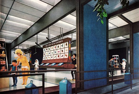

Your Mom is Big Bird and you eat tons and tons of pills. Also your cell phone is woefully lacking in features.
Images via Joyrex
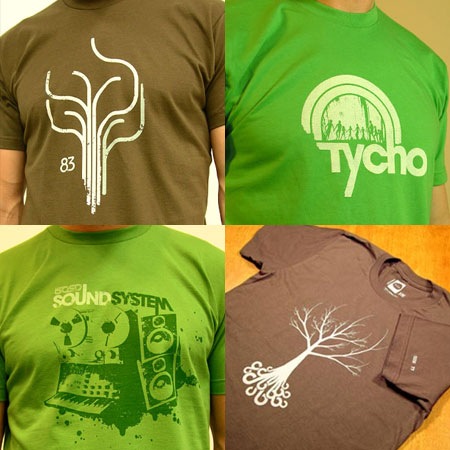
The shirts keep rolling in, this time Paths, Tycho Arc Green, Sound System, and Roots have all been restocked and are now available again. All are of course part of the Holiday Sale going on now at The ISO50 Shop >