LOST + FOUND
Posted by Scott


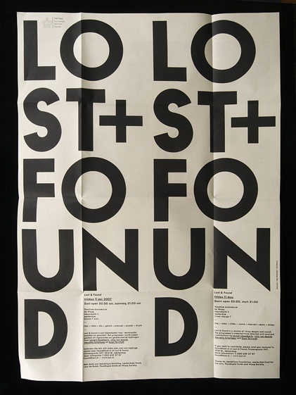
Another great example of some well used typography. I found this online a while back and forgot to to write down the source. If anyone knows where it’s from or anything about it please post in the comments. Also, name that font.
UPDATE via Sam Mallett in the comments:
"the piece was designed by Timo Hofmeijer / New Folder from Amsterdam and it was a collaboration with Ian Brown"

8 Comments Leave A Comment
Dan says:
December 6, 2007 at 6:12 pmit looks like futura bolded
its pretty nice where ever its from
Matt Davis says:
December 6, 2007 at 6:31 pmi think he meant to say futura bold. there also looks to be a pretty sweet vector crown in the top left as well.
Sam Mallett says:
December 6, 2007 at 6:47 pmHi Scott, the piece was designed by Timo Hofmeijer / New Folder from Amsterdam (http://www.newfolder.nl/) and it was a collaboration with Ian Brown (http://www.ianswork.net/).
And I believe the typeface is Number 9, also designed by Ian Brown.
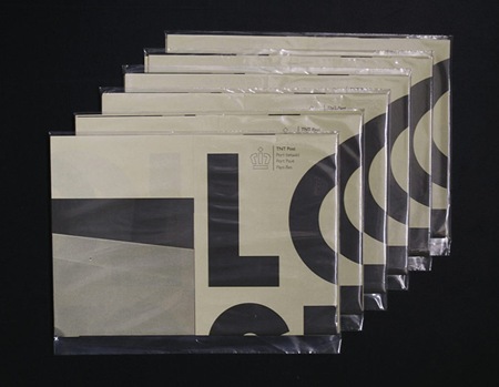
I am a big fan of the piece, and there are more images in its folded state on the two websites above.
Hope this helps! Have a good day,
Sam
Matt Davis says:
December 7, 2007 at 3:39 pmthought it was futura until i saw the lowercase letters.
vik says:
April 25, 2008 at 9:23 pmI have found a related page!
http://megauploadfiles.com/
Prolan says:
August 5, 2008 at 5:40 ama3mlLz re re re
GAV GAV
prolan5 says:
August 5, 2008 at 7:43 amfCx88E eeeerrrffddgggggggccccc