The New Propaganda

Very nice contemporary propaganda-esque Adidas billboard for the Beijing Games. Not sure who did this campaign, anyone got some info?
Photo via Ack-Online

Very nice contemporary propaganda-esque Adidas billboard for the Beijing Games. Not sure who did this campaign, anyone got some info?
Photo via Ack-Online

The 1976 shirt and thermal are both back in stock along with the Past is Prologue shirt. These are the final days of the Holiday Sale so get over to The ISO50 Shop while it’s still on!
The "Diana +": even lower-fi alternative to the Holga? Sent in by Damo.
"Back in the 1960’s, a small firm in Hong Kong — the Great Wall Plastics Factory — created a dirt-cheap 120 camera called the “Diana.” Crafted entirely of plastic, each camera cost about a dollar. As a mainstream product, the Diana was pretty much a failure — and was discontinued in the 1970’s. But like any superstar cut down in their prime, the Diana’s posthumous appeal skyrocketed. As a cult artistic tool of avant-garde and lo-fi photographers, it was a rousing success! They loved its soft & dreamy images, super-saturated colors, unpredictable blurring, and random contrast. Diana shots are raw & gritty, with a character all their own. They simply cannot be duplicated by any other camera on Earth! In short order, the Diana rose to prominence as one of the most treasured and sought-after cult analog cameras from the late 70’s onward. The Diana is now available again at Lomo Stockists around the world."
Anyone have any experience with these?

Paddy Duke sent in this great video about Fractals.
"Arthur C. Clarke presents this unusual documentary on the mathematical discovery of the Mandelbrot Set (M-Set) in the visually spectacular world of fractal geometry. This show relates the science of the M-Set to nature in a way that seems to identify the hand of God in the design of the universe itself. Dr. Mandelbrot in 1980 discovered the infinitely complex geometrical shape called the Mandelbrot Set using a very simple equation with computers and graphics."


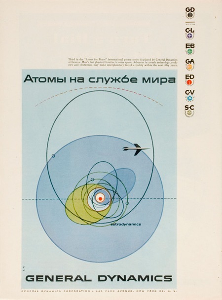
I was having a conversation the other night with some designer friends and we were trying to come up with a name to encapsulate this style (example by Erik Nitsche). I have heard it generally referred to as "modernism" but we wanted something a bit more specific. In particular it should refer to this sort of subject matter; mid-century technical manuals, industry literature, signage, World’s Fair campaigns, Olympics campaigns; basically any design commissioned by an institution or by a company, like General Dyanmics, who doesn’t market directly to the public. I suggested "Institutional Modernism" and I think "Industrial Modernism" was thrown around.
So is there an established term for this sort of design? This seemed like a very unique time in history when a large amount of money and talent were directed at projects which weren’t corporate ad campaigns directly targeted at the general public. I think this fact alone shaped the output and resulted in some of the best graphic design the world may ever see. Whatever the case may be it’s designs like these, more than anything else, that have influenced and informed my own application of typography. It seems that no one has done it better before or since.
FYI: As Vytis quickly pointed out, the headline reads "Atomy na sluzhbi myra" – Translated: “Atoms – serving the world” In a servant-master way…"

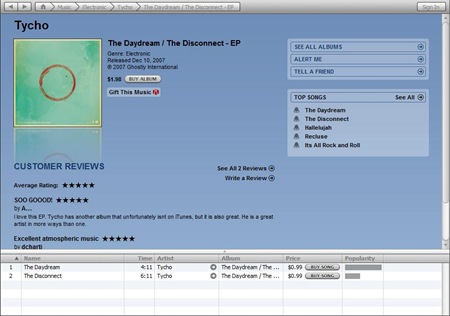
As many of you noted, iTunes originally only posted "The Daydream" as a single; "The Disconnect" was supposed to be included as the B-side. The error has been fixed; the single now shows up as a new item with both songs included. Unfortunately it is now missing all the original comments and ratings. At any rate you can now get the full version of the single here.
Others have asked whether there is currently any alternative to iTunes for purchasing the songs. Ghostly released the single as a 2 month exclusive on iTunes, so when that time is up it will be available everywhere, including right here for direct purchase.

The Marina Green, Marina Asphalt, London, and Command shirts have all been reprinted and are now in stock at The ISO50 Shop.
Found this on Youtube. By Joaquim who, if I’m not mistaken, comments on this blog now and then.