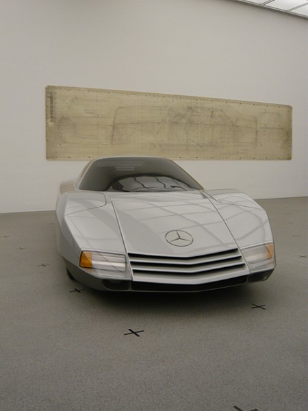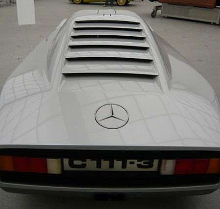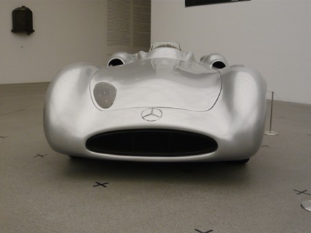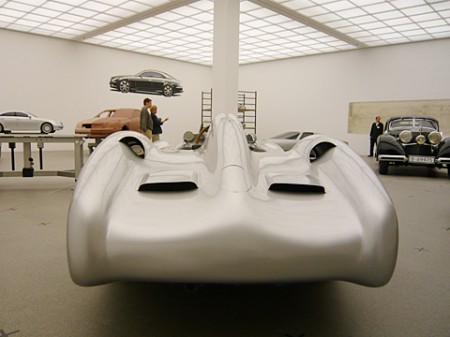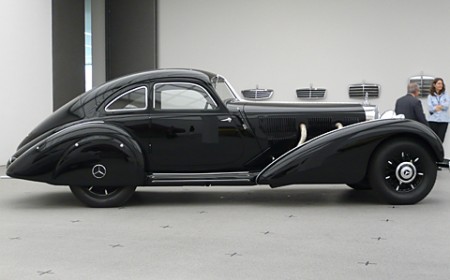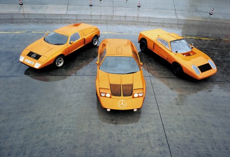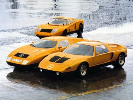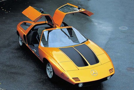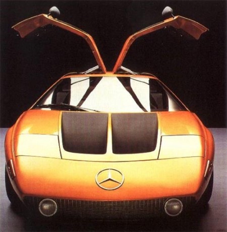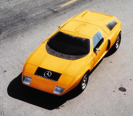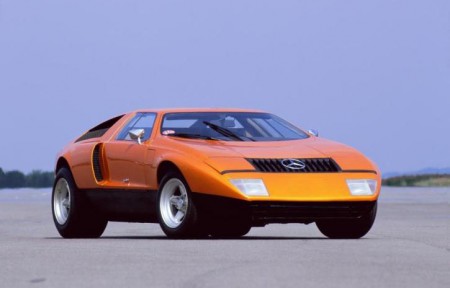


Stylepark has some beautiful photos (shot by Thomas Wagner) from the Mercedes collection at Pinakothek der Moderne, Munich. The show goes until Sep. 14 and features some incredible examples of the German auto maker’s inspiring creations.
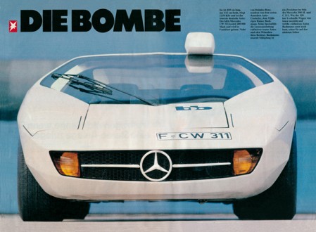
I love the wall treatments, and the license plate in that second shot is incredible. Now compare that to this, and you start to understand why so many great designers come from Germany. It’s like those stupid faucet commercials (which I hate simply because of how the piano starts playing when she pulls a faucet out of her purse all dramatically and slams it down on the guy’s desk like it’s the most profound thing he’s ever seen when somebody starts throwing plumbing components around his office. What the hell does it even mean. Did you see how confused her husband looked? I felt the same way. She damaged the finish of that desk and I bet it wasn’t cheap considering how pretentious successful architects are.), I could seriously design a car around that license plate. I bet if you told the Mercedes designers they had to design the car for the US style plates they would just quit and throw a wrench or some molding clay or something. Also, if I moved to the states from Germany and had to do this, I would just drive the car of a cliff because the whole thing is ruined. I have a feeling the “California” font only looks like that because the state couldn’t afford to license Papyrus.
Also check out these posts for some more vintage Mercedes action
Stylepark via Simon Smith


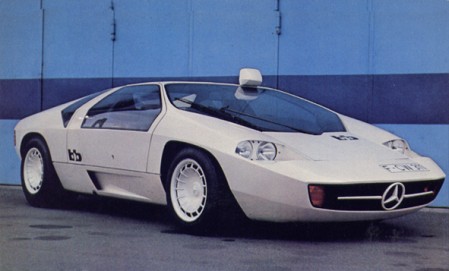
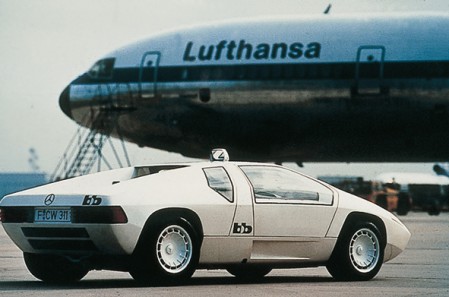
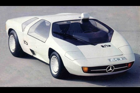
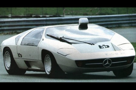
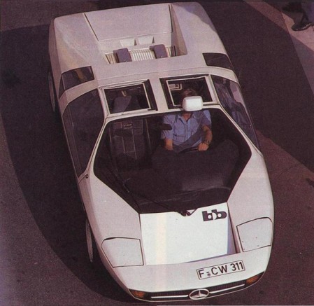
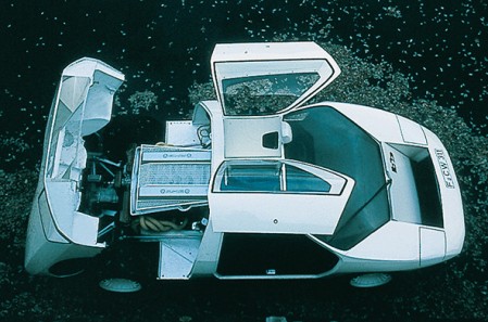
I’ve been on a car kick lately. Not only are they excellent examples of functional design, there’s something about the quality of 60s-70s concept car photography that always gets me. This latest entry is the 1978 Mercedes-Benz Study CW311. Designed solely as a concept by Eberhard Schulz Isdera for Mercedes Benz, it was later put into production as the Isdera Imperator 108i. You may recall the post on the Mercedes Benz C111, a concept which Shulz also developed.
I feel like this was the era right before everything started looking like alien technology or some sort of bird. It seems like in high end conceptual situations like with supercars, the designers are always trying to envision some object from the near future. I guess I prefer the near future imagined in the 1970’s over that of today.
I love the lines, really aggressive but the overall vibe is softened by the sort of roundness of the thing. I’m definitely getting an Italdesign/DeLorean vibe off the windows. Also, picture kicking it with a Lufthansa airliner? Classy. And I’m loving the roof mounted rear-view; something very utilitarian about that. On a side-note, I feel like if a car could be a typeface, the CW311 would be Trade-Gothic Bold Extended.
And to top it off, a very VHS-ish video featuring the CW311 (with poor choice of substitute wheels):
Special thanks to AJJB for turning me on to Shulz’s work back in the C111 post. AJJB also pointed out that Shulz is now “selling cheesy oil paintings out of a small town in Germany”. Interesting and sort of sad too…
Images via Carstyling.ru


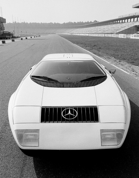
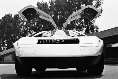
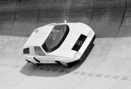
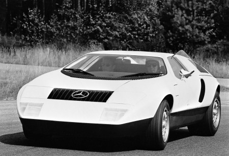
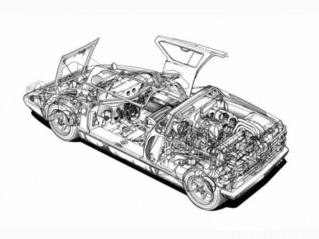
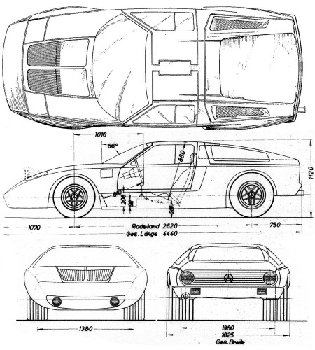
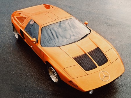
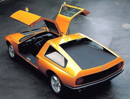
Found these beautiful B&W images of the 1969 Mercedes C111 that I posted last month. These might just be big enough to make some prints out of (click for high res)
More images here


Was reminded of Mercedes’ beautiful 1969 C111 gullwing design after their recent concept unveiling. Beautiful Pictures; I’ll go ahead and file this under “things you can’t have, ever”. I’ve always loved cars; I used to collect die-cast models when I was a kid. I guess I picked the wrong thing to be obsessed with though because it’s becoming increasingly apparent that a 1959 Testa Rossa just isn’t in the cards for me.
I suppose it’s for the best though; nice cars are so impractical and besides, this is the sort of thing that has me dreaming these days. ($8700 MSRP!!! why do you torture us?) I feel like we as designers sort of got a raw deal; we’ll never be able to afford what our taste dictates as acceptable to us (except for that one guy who redesigned the Louis Vuitton monogram maybe? He could probably buy the car and the guy driving it). And then you see MTV Cribs and these people’s houses look like they hired Scarface and the set designer from Full House to do their interiors.
More images here


Wired has an interesting article about the new F1 rules and the resultant car designs (McLaren MP4-24 pictured above). It details how new rules for the sport — which many expected to create a significant design challenge — have actually served to beautified the new models. These things are starting to look like they can fly and if it weren’t for the fact that your work would be ruined by about 800 ads, designing the paint for one would be a lot of fun. Check out the Wired article here.
