The Verge has posted an interview with Apple product photographer Peter Belanger. Amazing how much work goes into the process. As evidenced by this video, there’s a lot more than straight up photography going on, which is to be expected. Was a little surprised they went as far as to accentuate the chrome on the bezel but I supposed it’s par for the course with this sort of thing.
Overall I was a little underwhelmed with the process. I would have assumed Apple did this all in-house in some space that looked like a set from 2001 with airlocks and cleanroom suits.
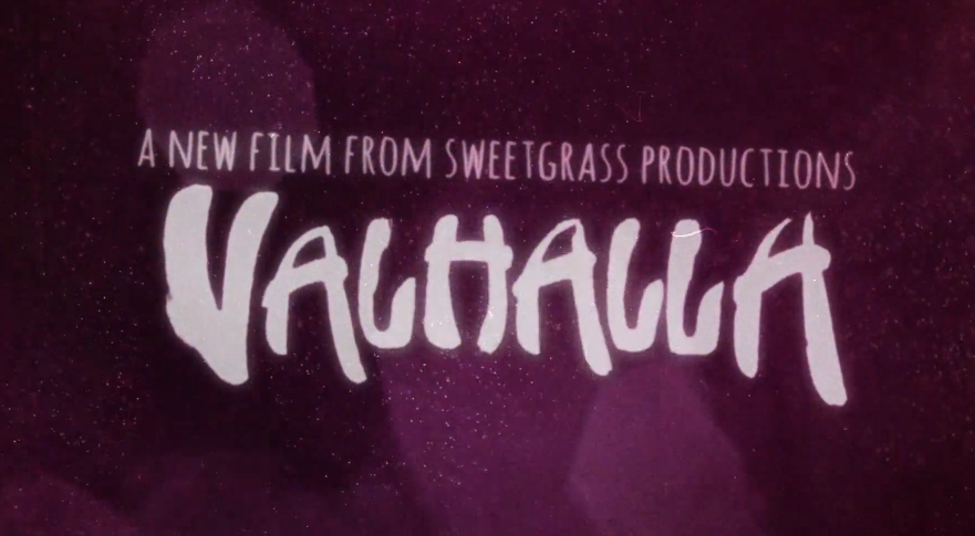
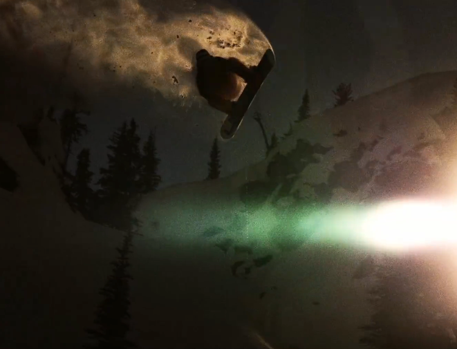
Over the past few years the creativity and aesthetic of the ski movie has reached exciting new levels. Whether you’re remised about it or not, the days of the Warren Miller lifestyle film are quickly fading, if not already gone. Studios like Sweetgrass Productions, Sherpas Cinema, Teton Gravity Research, and Solomon Freeski TV – among others – have redefined the genre with next level editing, production and storytelling.
Presented here is the teaser for Valhalla, a Sweetgrass Productions film set to be released in Fall of this year. I love the aesthetic they’ve created, and can’t wait to see the full movie if this is any indication of how it might turn out.
So apparently there is this guy in Switzerland who either owns or has access to many of the most iconic product designs from the 60’s and 70’s. He also takes amazing pictures of them, and posts them in high resolution for us to enjoy / print. This man is a hero.
I always wonder though, would having these artifacts make me happy? Would being surrounded by the objects of my desire actually fulfill my need for order and beauty? Or would I obsess; constantly dusting and arranging them symmetrically on walnut desks made by George Nelson? Probably all of the above, but for now one can only dream.
Whenever I get to lusting over design like this I start thinking about the nature of appreciation. What abstract facet of the human condition allows us to seek and covet objects which may not necessarily provide any meaningful function or benefit our daily lives? I can’t tell you how many fellow designer’s homes I have visited to see various defunct or otherwise unused products neatly displayed on shelves, never again to serve their intended purpose. Why do we surround ourselves with these relics? Devices which through some perverse twist of fascination have been stripped of their intrinsic usefulness and rendered as some fetishized monument to our personal design sensibilities, gathering dust on a mantle.
That’s probably reading way to deep into things so I’m going to take the easy answer and say it’s simply the act of art appreciation. There is just something about the fact that these were originally designed as functional objects that throws a wrench into the whole concept of approaching them purely as works of art. At any rate, I want every single thing up there, in my house, now.
Shelby picked out some really nice shots from Das Programm, which features beautiful images of various classic Braun design icons. Can never get enough of the old Braun / Rams stuff. Alex got me Less and More and I’ve been meaning to scan some of the shots in there and blow them up on the Epson 9900. Soon!
My rebranding Playboy project came to a close last week with the end of our fall semester. If you read the last article, you are familiar with the first part of this project, which was the new logo for Playboy. While it is absolutely the flag bearer of the entire project, the logo development represented a small amount of the work we were required to do for the overall project. The final deliverable for the class was a book in which we the explain history of the brand, walk through our rationale for the new identity, explore the process of the logo development, present brand standards and guidelines, and show example brand implementations and extensions. Other than this required content, there was no specific criteria for the book. Each student also gave a short final presentation explaining their rebranding and the choices they made along the way. Everything was created for the Nature of Identity class at the Academy of Art, as part of the graduate graphic design program.
I really enjoyed the conversation the first post on this project generated. I was excited to see that the new logo was as polarizing as it was — I feel like these types of solutions are the most exciting and rewarding for me. I noticed that many people were up in arms about the idea of Playboy removing nudity and becoming an all article magazine. While I would like to note that the new strategy was purely a conceptual exploration constructed in an educational environment, I actually do think they might be well served to switch things up this drastically. Playboy was once irreverent and boundary shattering. They are no longer. I can think of no better way to recapture this audacious spirit than by doing something this extreme…
Taken from ‘Gravity Pairs’ LP by Beacon out November 2, 2018
Order ‘Gravity Pairs’ LP at: The Ghostly Store
Directed By: Jacob Gossett & Danny Scales
Director of Photography: Jacob Gossett
Production Company: VOIID Studio
Editing & Color: VOIID Studio
Produced by: Beacon & VOIID Studio
Lyrics:
Be My Organ
Be my organ now, and play for me
Be my witness now, and set me free
Be the alter, I’m falling to my knees
In my wicked hour, bring me peace
Be my holy wine and let me drink
Be my wandering mind, teach me to think
Be the silent voice inside of me
In my wicked hour I hear you speak
No one owes you anything,
But their keeping tabs on you and don’t know where to begin.
No one owes you anything,
But I’m keeping tabs on you and don’t know where to begin.