Erik Nitsche is a favorite at ISO50 (see posts here, here, and here), and I was disappointed when the Flickr stream compiling his work went down (mainly because I missed the chance to check it out). Luckily, Matthew Lyons and Galerie 123 (where you can purchase some of his original prints) are here to lend a helping hand.
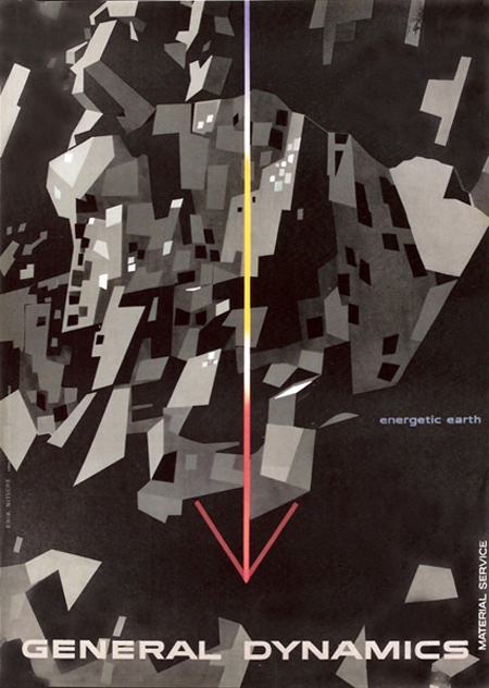
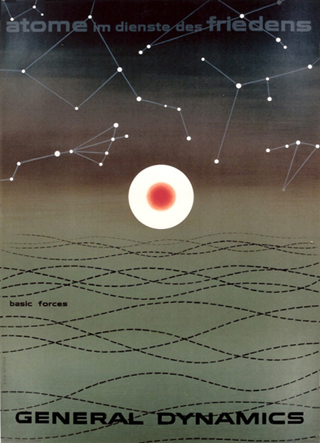
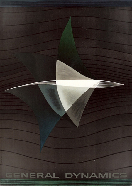
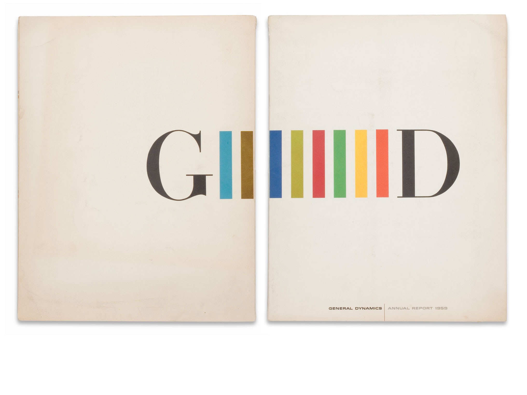
Clearly we’re fans of Erik Nitsche as we’ve posted a number of times about his work in the past. These three pieces are some of my favorites. The first and second were annual reports completed in 1955 and 1959; the third is a cover that was designed in 1956.
It’s really a shame the Flickr stream that held Nitsche’s work is now down. These images were found here.
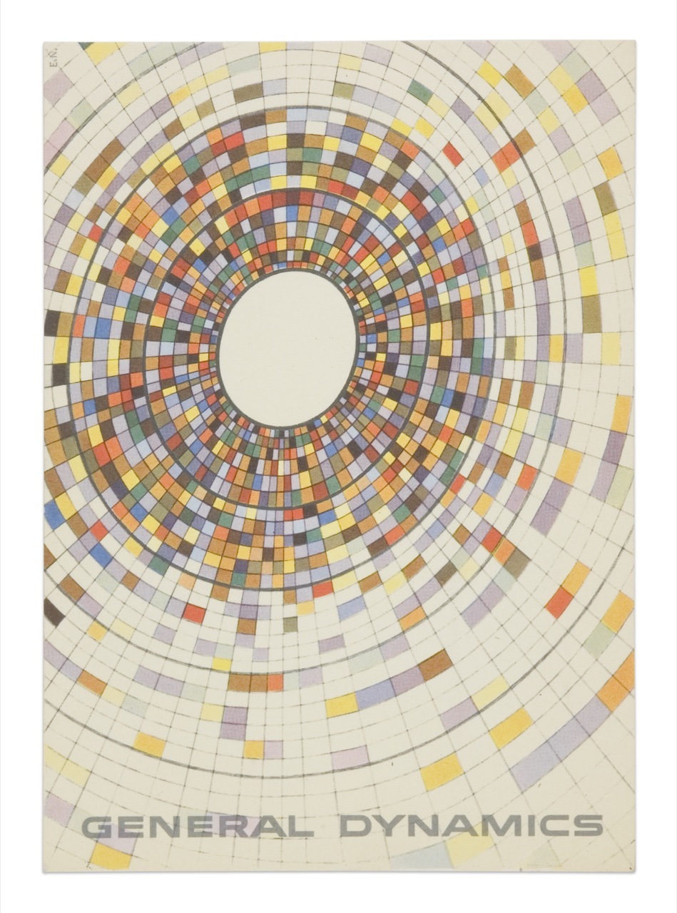
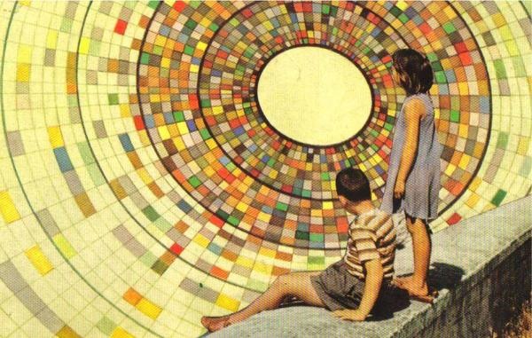
The top image is a General Dynamics postcard by Erik Nitsche. The lower is from Joel Johnson’s flickr page. The background illustrations in each appear to be essentially identical save for some rotation. If you look closely at the children in the lower one you can see they are superimposed rather poorly (note the black outline from the sloppy clipping path). I wonder if this was someone appropriating the artwork or if this was some General Dynamics-sanctioned variation of the original (doubt it). Interesting either way; I think I like the yellowed, saturated version on the bottom best. The composition of the top example, of course, is superb.
John Coulter sent me a bunch of wonderful Erik Nitsche images. This is the first of many to come, so amazing. I think this sort of illustrative design style is something that our generation has lost. You rarely see anything quite like this anymore. Most of the true illustrators these days stick to the sort of fanciful, handmade-looking things that you would expect and most pure designers stick with the computer producing things that sometimes feel a little too perfect. This is an example of how great things can be when you create graphic design by hand, in the real world. I know it’s not really practical in most commercial settings, you would hardly be competitive with other designers if you were trying to make everything by hand. But still, it would be nice to see a little bit more of this around. What’s really amazing is that this work of art was commissioned by a defense contractor, my how times have changed. I wonder if companies are just placing less emphasis on the printed form as they migrate to newer media, or if people simply don’t see the value in quality design like this anymore. Either way, it’s images like this that make me lament the passing of the golden age of design and the fact that I was born too late to be a part of it. I suppose that’s why I’ve always put so much emphasis on selling my work directly, by circumventing the world of client-driven design it’s still possible to create images with these ethics intact.
A few Decca record covers done by ISO50 favorite, Erik Nitsche. I was browsing Flickr for some or Nitsche’s work and I came across the massive assortment of images here, compiled by BustBright. I am in love with the type on these, especially the “Schlusnus sings” typeface. I’m not sure what it is but it amazing. And I always love Didot — if you browse the rest of the archive, you’ll see a lot of that.
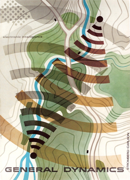
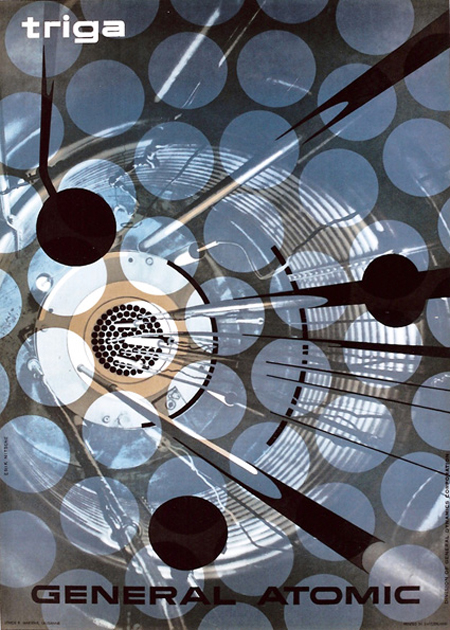
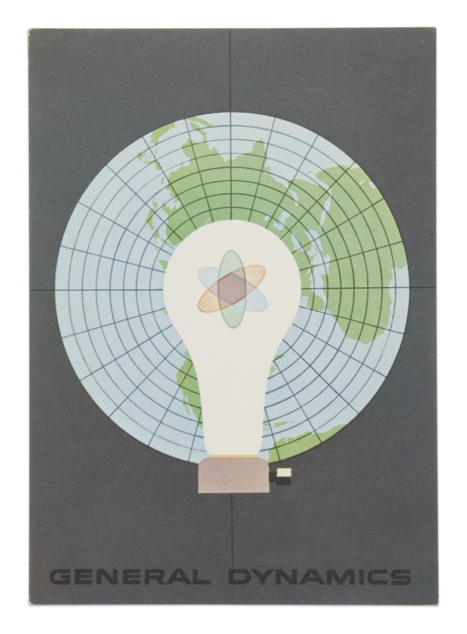
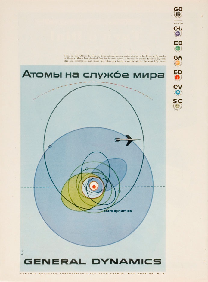
I was having a conversation the other night with some designer friends and we were trying to come up with a name to encapsulate this style (example by Erik Nitsche). I have heard it generally referred to as "modernism" but we wanted something a bit more specific. In particular it should refer to this sort of subject matter; mid-century technical manuals, industry literature, signage, World’s Fair campaigns, Olympics campaigns; basically any design commissioned by an institution or by a company, like General Dyanmics, who doesn’t market directly to the public. I suggested "Institutional Modernism" and I think "Industrial Modernism" was thrown around.
So is there an established term for this sort of design? This seemed like a very unique time in history when a large amount of money and talent were directed at projects which weren’t corporate ad campaigns directly targeted at the general public. I think this fact alone shaped the output and resulted in some of the best graphic design the world may ever see. Whatever the case may be it’s designs like these, more than anything else, that have influenced and informed my own application of typography. It seems that no one has done it better before or since.
FYI: As Vytis quickly pointed out, the headline reads "Atomy na sluzhbi myra" – Translated: “Atoms – serving the world” In a servant-master way…"