Erik Nitsche – God’s Eye
Posted by Scott
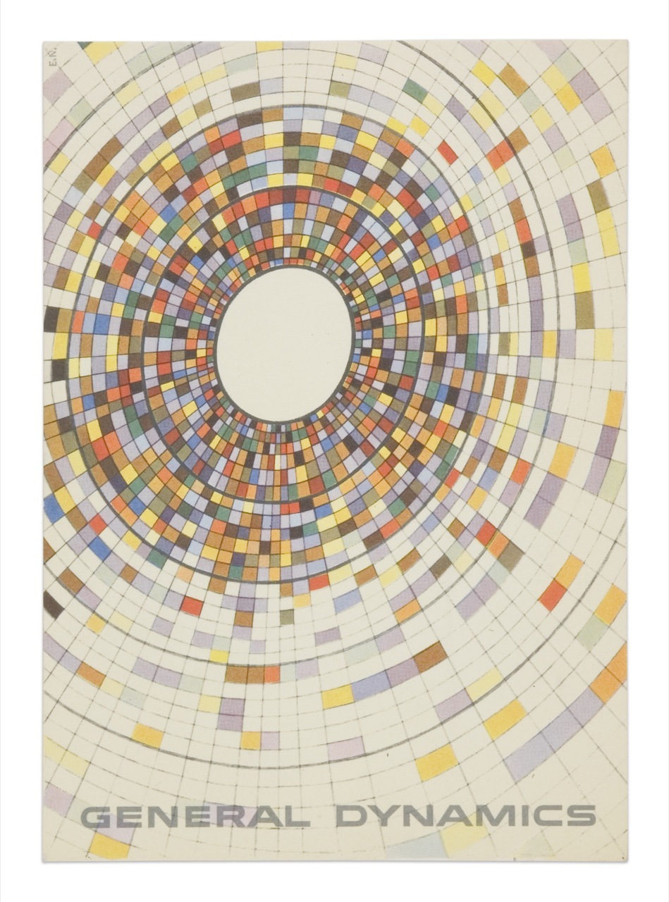
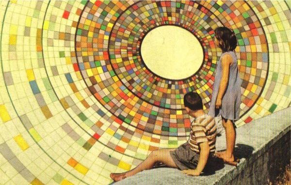
The top image is a General Dynamics postcard by Erik Nitsche. The lower is from Joel Johnson’s flickr page. The background illustrations in each appear to be essentially identical save for some rotation. If you look closely at the children in the lower one you can see they are superimposed rather poorly (note the black outline from the sloppy clipping path). I wonder if this was someone appropriating the artwork or if this was some General Dynamics-sanctioned variation of the original (doubt it). Interesting either way; I think I like the yellowed, saturated version on the bottom best. The composition of the top example, of course, is superb.

8 Comments Leave A Comment
Jazz says:
December 4, 2007 at 1:46 amThe kids in the second picture does not make the image stronger imo.
I agree on the colors though.
Speaking about Nitzsche, he made the design for a C.Jung book my parents had on one of those great bookshelf’s.
Can’t find that work online, but I guess I’m a lousy searcher.
Alex / HeadUp says:
December 4, 2007 at 11:01 amI think the kids in the second only works to compliment and contrast the first…I agree tho– the yellow, weathered effect looks great…the sheer design itself is also pretty captivating. Great use of color, although I think the pallette might vary a little too much.
The text looks remotely reminiscent of a font called Bitsumishi I used a lot for Airsoft-related branding…link is here:
http://www.dafont.com/bitsumishi.font
A similar font is 911-Porscha:
http://www.dafont.com/911porscha.font
Of course, they aren’t dead on at all, the differences in curve radius and shape of letters like “A” are obvious, but I think it conveys the same idea.
Scott says:
December 4, 2007 at 11:10 amYeah, not sure that was ever developed into a complete typeface…. If it were it would certainly be interesting.
chase says:
December 8, 2007 at 11:47 amthe halftone screen appears to be continuous on the full-size version of the lower image… could be artifacts from something else or just composited before 4-colour output.
Derrick Schultz says:
December 17, 2007 at 1:19 amHi,
The image below is definitely not a GD approved piece (I don’t think they would ever allow anyone to use that piece of art). I recall seeing it a year or two ago as a flyer on myspace.
Jazz, I believe this is the book to which you’re referring.
brandon says:
January 24, 2008 at 3:11 pmthis was also used for Tacks, the boy disaster’s album cover…
http://www.tackstheboydisaster.com/
nithunfanug says:
October 20, 2008 at 12:34 pmHello,
My Name is, David
great posts on here
my site:
http://CrTqyS.spaces.live.com/
NO ONE says:
April 2, 2009 at 10:01 amYOU GUYS ARE CRAZY…. THE IMAGE IS A 100 HUNDRED TIMES MORE INTERESTING WITH THE CHILDREN INCLUDED. AND THE PART ABOUT SLOPPY CUTTING ( WHAT, WHERE ????? ARE YOU REALLY TRYING TO LOOK FOR FLAWS THAT DON’T EXIST ??? PERHAPS IF I HAD A MAXIMIZED VERSION OF THE IMAGE THEN I WOULD HAVE SOMETHING TO CRITISIZE REGARDING THE CUTTING, BUT NOT THE CURRENT IMAGE SIZE).
OVER-ALL — THE PICTURE IS WONDERFUL — EYE CATCHING AND MUCH IMPROVED OVER THE FIRST VERSION, WHICH DOES NOT CONTAIN ANY HUMAN ELEMENT TO IDENTIFY WITH.