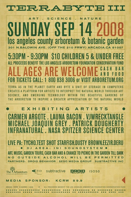
Terrabyte Poster: Back

Above is the back side of the Terrabyte 3 poster from last week. Since this is only going to be on the small format hand flyer it was sort of a tight squeeze given all the info they wanted to include. I wanted to carry over the 60’s programming punch-card concept from the front, and considering the amount of text, I decided to use it as the central design element. Most of the type is set in Berthold Akzidenz Grotesk (at various weights) and is all grid aligned with a piece of graph paper I scanned in and set on Color Burn overlay mode.
Incidentally, a couple people had mentioned an alignment issue with the left arrow on the front side. Thanks for the heads up, it’s been fixed and the finalized version is now up on the original post. There’s also more info on Terrabyte 3 now available at the Arboretum site.

10 Comments Leave A Comment
Louie says:
August 25, 2008 at 12:57 amI like how you have taken so much text and still made this poster awesome!!
RepSeven says:
August 25, 2008 at 10:52 amYou keep blowing me away…Where do you come from?? When are you coming to MTL!?
Horacio says:
August 25, 2008 at 10:55 amit’s just great… nice typography work. So simple.
Rent says:
August 25, 2008 at 11:45 amalways amazed when people can cram a lot of text and info into such a small space, while keeping it visually appealing…bravo.
and I’ll officially be heading down to L.A. for this, so I’ll be eagerly awaiting the performance and visuals!
Jayden says:
August 25, 2008 at 3:32 pmIt’s seems a crime that this poster has to be turned over! Both sides demands to be shown! :) Scott is there any chance of seeing at least some video highlights of the show? Would love to check out the sound + visuals. Would even buy it….. is an iTunes video a possibility?
Jayden says:
August 25, 2008 at 3:37 pmP.s. I too noticed the arrow alignment issue, but thought it was intentional! I was thinking you were wanting to break up the symmetry or something. It’s good that you fixed it, but it’s interesting that sometimes mistakes can turn out to have a positive impact!
Brian says:
August 25, 2008 at 4:35 pmSweet typeface….too bad it’s not in my library….it has some nice display characteristics. Where did you acquire your typeface library from? Do you know if Adobe Font Folio 11 is worth the upgrade?
Thanks.
Bijan says:
August 25, 2008 at 10:30 pmI think I will be making it down for this as well.
Also good question Brian, I’m definitely interested in where you find your fonts.