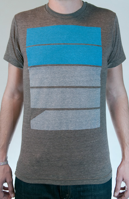
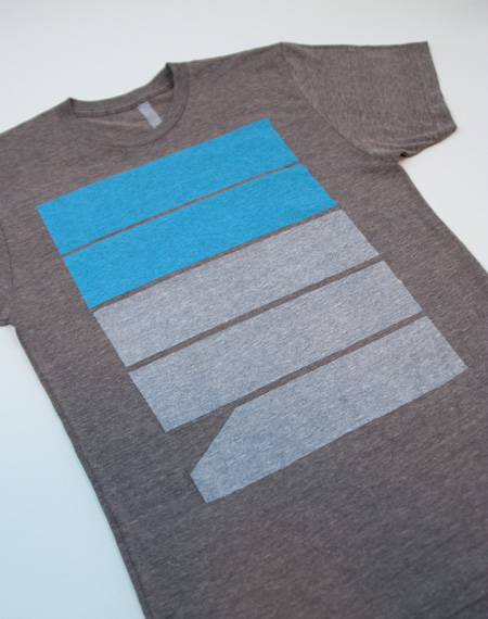
ISO50 Fives Tee
Posted by ISO50


A new shirt design is now available at the shop. Five’s is printed on American Apparel Coffee Tri-blend and available in Men’s and Women’s sizes.


A new shirt design is now available at the shop. Five’s is printed on American Apparel Coffee Tri-blend and available in Men’s and Women’s sizes.

23 Comments Leave A Comment
Jonathan Mutch says:
October 25, 2010 at 7:31 amLooks Beautiful, Scott. Nice job.
JimmyViola says:
October 25, 2010 at 8:20 amGreat design! Check out my “Modern” tee. http://www.obscuritees.bigcartel.com/product/modern
Dude says:
October 25, 2010 at 8:34 amThanks for the new shirt Scott! Unfortunately it’s your weakest design yet. But I suck overall as a person and can’t make up my mind about anything.
JimmyViola says:
October 25, 2010 at 8:35 amDisagree with Dude, it’s simple and bold.
chris says:
October 25, 2010 at 8:58 amDude probably wears Ed Hardy T’s
Jakub says:
October 25, 2010 at 9:00 am@Chris ha!
I saw it @ Merchline, looks even better in person, loving that blue
NEOkeitaro says:
October 25, 2010 at 9:16 amI don’t get it :(
It looks nice, but I don’t get it. Anybody care to explain?
Landon says:
October 25, 2010 at 9:31 amNot to sound obsessed, but I’ve been waiting for this day. Only request: please make a long-sleeve version! Winter’s a comin’ baby!
Jakub says:
October 25, 2010 at 10:04 am@Landon we have something in the pipeline.
@NEOKEITARO the point of alot of the shirts designed by many people is usually to make something the designer would want to wear, so yeah I guess thats the point
NEOkeitaro says:
October 25, 2010 at 10:23 am@JAKUB
Well, I love the design and I sure wouldn’t mind wearing it (postage fees kill me though…), I was just wondering if the design meant to be completely abstract or if there was anything behind the shape else than an aesthetic consideration.
Landon says:
October 25, 2010 at 10:38 amSweet! Thanks for the update, Jakub. These shirts are literally the only thing I wear these days – haha!
rent says:
October 25, 2010 at 11:27 amI’m also curious behind the design of this one…
Scott says:
October 25, 2010 at 12:34 pmJakub’s right, I usually just try to make a shirt I would wear. This particular design says “57”, but the meaning doesn’t really go beyond that. I like to play with letters and numbers in a sort of arbitrary way, just relying solely on their aesthetic value.
DUDE (jon?)-
Thanks for the critique….but it’s always interesting to me when people who normally comment on this blog as themselves decide to go anonymous for critiques. I enjoy your work, so would have made the criticism all the more valid knowing the reference point that it came from.
Wietse says:
October 25, 2010 at 12:57 pmI like it, it is very subtile. Also I think design is really all about accuracy and detail, which in this case you see in the colour choice and the placing.
It’s nice, playfull and suggestive.
I might buy one, but the shippingcosts make it pretty expensive.
Dude says:
October 25, 2010 at 1:16 pmStill waiting for the 79 shirt..
Ryan says:
October 25, 2010 at 1:30 pmDig the chunky color block, purchased… picked up ol’ 77 too.
Juan Miguel Marin says:
October 25, 2010 at 1:44 pm@JAKUB I second @Landon’s request. A thermal version of this design will be the best for the cold weather approaching.
@Scott way to take the high road… I applaud your commitment to your design style and vision
KEVIN A says:
October 25, 2010 at 6:04 pmdude, somebody feed that kid a sang’which. I don’t think he’s had a full meal in 6 years…
Brad says:
October 26, 2010 at 12:07 pm“SYV” in coffee is without a question my favorite shirt in my wardrobe and I have gotten countless compliments on it. Something that is somewhat rare for a non-“graphic” for lack of a better word, tee.
I’m sorta torn on this one.
I like the design on this, however the transfer to apparel is somewhat awkward looking. I don’t know if it’s just placed too high up on the shirt or what but it’s almost claustrophobic.
I hope to see more additions (not just shirt type/color, but new designs).
Joshua says:
October 26, 2010 at 12:48 pmThe blue on grey is vibrant, and that’s nice. But come on guys, you’re designers. This isn’t much better than Illustrator 101: How to make a rectangle, and you’ve already covered that with your “SYV” shirt. Seriously. Sorry, but it had to be said.
Suzan says:
October 26, 2010 at 4:28 pmi like it, especially the blue.. i’m waiting for 81 or 87.. curious what you would make of those
s. juliano says:
October 27, 2010 at 6:07 amloving this. i like it it carries the theme of syv over to another shirt. will there be more like this? if so, i’d like a 75 or an 11. thanks! haha. excellent work.
Cameron Ballensky says:
October 28, 2010 at 5:37 pmwhooohoooooooo FREE CANDY TOO!