Anatoly Zenkov’s Persistent Pyramids
Posted by Jakub


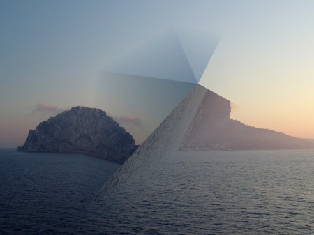
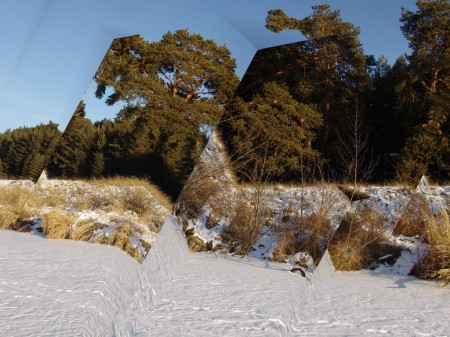
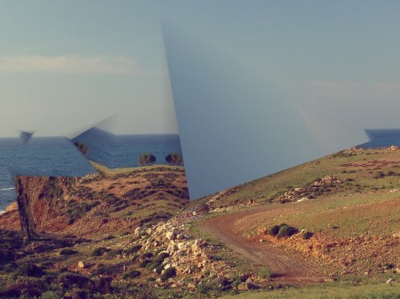
Found these simply edited photos by Anatoly Zenkov pretty appealing to my eye, reminds of some album cover that I can’t remember but that might not be the case, it could be just a good idea for an album cover that hasn’t been done before.

22 Comments Leave A Comment
nick robinson says:
February 25, 2010 at 10:11 pmIt’s great what a simple idea can do.
The last two definitely look like they could be Autechre album covers
Abbie says:
February 25, 2010 at 11:13 pmI don’t know why but every time I look at your artwork my mind is blown. It’s so—out of body for me. Tycho is the same way. I love it.
Kimuji says:
February 26, 2010 at 5:42 amStrange But Nice!
bleep01 says:
February 26, 2010 at 7:03 amyeah, abstract and simple. These are my rotating desktop images as of yesterday! This guy apparently designed a program to do this- seems like photoshop could produce similar effects. Any thoughts/ideas on this iso50 folks?
WAcreative says:
February 26, 2010 at 7:46 amPst, Pink Floyd anyone? :P Not that this is a bad thing. I actually really enjoyed this post. Some good simple work is always great to see.
Alex / HeadUp says:
February 26, 2010 at 8:33 amReminds me of what Kiln does to their covers, I dont know if I really find this all that visually pleasing tho. I feel like this sort of editing can be hit or miss, or completely subjective to the viewer.
Jarson says:
February 26, 2010 at 9:53 amThese are some of my favorite photos I’ve seen in a while. He really goes against typical aesthetics of photographs, I can also see why a lot of people wouldn’t really like them but I find them really interesting.
Jakub says:
February 26, 2010 at 10:08 amI really enjoy the difference usage in each one, he stuck with an idea yet expanded on it each time.
Alex Key says:
February 26, 2010 at 12:32 pmI love the first one. I think it’s a cool idea to have the obvious and abrupt lines between the mirrored images but they blend seamlessly on the other side.
This reminds me of an experimental project I did a while back. Here are a few examples:
http://human-chassis.deviantart.com/art/Kaleidoscope2-155506199
http://human-chassis.deviantart.com/art/Kaleidoscope2-155506199
These were created just by cutting out segments of a photo and mirroring/rotating them to fit together.
Alex Key says:
February 26, 2010 at 12:33 pmJust realized I posted the same link twice… Here is the second one:
http://human-chassis.deviantart.com/art/Kaleidoscope1-155506046
Tyler says:
February 26, 2010 at 2:32 pmexcellent, I expect these and others like them are going to gain a lot of traction as album artwork.
sad and awesome seeing good ideas before they’re a hit
Ryan says:
February 26, 2010 at 3:24 pmfor whatever reason the album that popped in my mind when i first looked at these was alpinisms
Hank says:
February 26, 2010 at 10:41 pmReminds me a bit of the images included in the Boards of Canada ‘Geogaddi’ CD artwork.
Nick says:
February 27, 2010 at 12:28 amNice one, looks like a very simple but effective style.
Thanks for sharing
bayrak says:
February 27, 2010 at 1:51 amMerci pour le partage. un site a été conçu félicitations très belle ;)
otrebla says:
February 27, 2010 at 6:37 pmreminds me of those warp 20 covers
LUKE MORGAN says:
February 28, 2010 at 3:51 pmWow, an amazing project. Anatoly has taken something that we are all familiar with, landscape photography – something which is inherently organic and natural – and distorted the imagery using geometric shapes, angles and straight lines, which feel quite alien and add a nice touch of tension. I can easily see these residing on an Autechre album. Great post.
Nate says:
February 28, 2010 at 9:56 pmKind of reminds me of Fuck Buttons. Great stuff.
Ryan says:
March 1, 2010 at 5:47 amthe aesthetics are similar to the last several GROWING records.
JTB says:
March 1, 2010 at 8:08 amReminds me of Kiln’s album cover for Dusker
http://airplaneshadows.files.wordpress.com/2008/04/dusker_1000x1000.jpg
JTB says:
March 1, 2010 at 8:10 amWhoops. That link didnt work. Heres another
http://nightmonsters.com/uploads/posts/1196278237_f20a65ccab42fbc4ff674560d16ab11f_full.jpg
derekb says:
March 2, 2010 at 7:55 amthese pictures scare me. It is what I see when I get migraine, this is what my head does to my vision then.