1972 BMW Turbo & The Munich Olympics
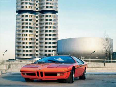
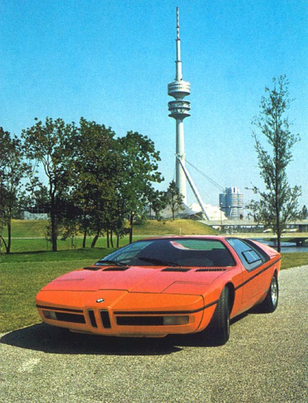
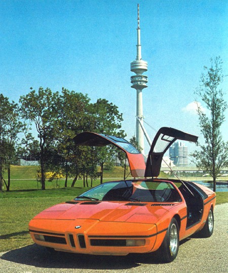
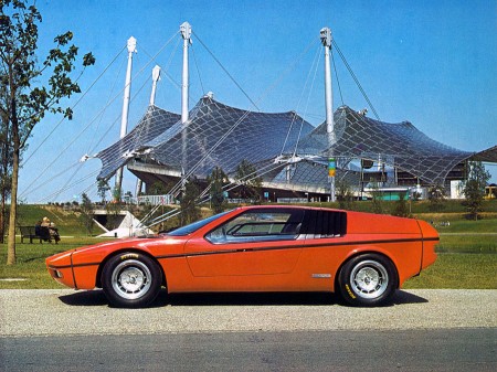
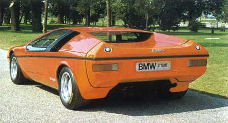
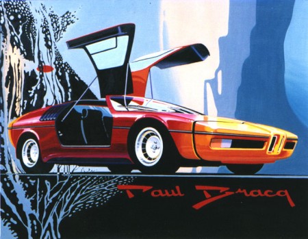
I’ve been geeking out on ’70s supercars lately and came across these gems depicting a BMW concept from 1972. The “E25 BMW Turbo” was commissioned to celebrate the 1972 Munich Olympics. BMW tasked famed automotive designer Paul Bracq to create the concept of which only two were ever built. Honestly, I love the front angles, but not really feeling that rear end. It feels very hatchback/kit-car-ish and the doulbe logos are killing me. Thankfully some of the finer points made it into production in the form of the M1 and some others.
That first shot is just off the charts; in the background you can see BMW’s Munich headquarters which was designed by architect Prof. Karl Schwanzer shortly before his death in 1975. In the other shots you can catch the games tent and the communications tower providing apt backdrops for the Turbo.

15 Comments Leave A Comment
Horacio says:
December 28, 2009 at 6:02 amWell that’s a beautiful car.
The 2008 homage to the original M1, looks even better http://www.ausmotive.com/images/BMW-M1-homage-01.jpg
sean patrick says:
December 28, 2009 at 6:13 ami got to shoot the racing version of the m1 about a year ago. it was so neat to see one in person. it was at the “zentrum”, at their new plant in south carolina. if you ever are by there (probably not (i never thought i would be…) you should check it out.
Chris says:
December 28, 2009 at 7:13 amCan’t remember if you guys posted this or not, but here is more old super car porn:
http://www.benedictredgrove.com/FOLIO-1/BERTONE/01-BERTONE-3
Jesse says:
December 28, 2009 at 7:46 amI love the first shot! I have stumbled upon cars I love (see link below)
http://www.flickr.com/photos/28194468@N03/2634083153/in/set-72157611331163767/
but they are always parked in front of a horrible background, like someones garage or something. Why doesnt anyone ever park their cars like these in front of the seattle public library or the Kunstal or something? Dont they realize it would make our day as photographers haha?
I also enjoy the marker concept sketches and seeing them always reminds me i need to draw more…
Thanks!
Brennan says:
December 28, 2009 at 9:30 amOh, I was beat to it. The 2008 homage was already posted. They sport the double backend logo as well (hence the homage, I guess) which kills me too.
Living in a smaller town, I only dream of seeing anything other than Civics and minivans driving around.
I drive an ’88 Nissan Pulsar NX, so it’s close in the body style, for a cheap car.
John Helmuth says:
December 28, 2009 at 10:07 amThat car looks way ahead of its time. The front end styling influenced some of the cars BMW sold in the late 80’s/90’s. I’ve been sweating the Delorean lately…not the BTTF one lol…http://www.carpictures.com/media/images/640/07DBL352900816C.jpeg
RA_OUL says:
December 28, 2009 at 11:25 amI absolutely love this car concept! I am totally on those ’70s supercars too! I’ve started a collection of images of my dream cars and this is now in it.
Robert says:
December 28, 2009 at 4:29 pmThat car design is way ahead of its time.
Kevin MacNutt says:
December 28, 2009 at 9:24 pmI believe that car was built on a heavily modified BMW 2002 chassis. I really liked what Peter Bracq did for BMW. I believe he designed the first 3 series, 5 series, 6 series and 7 series cars and maybe had some input on the second generation 3’s and 5’s. I am not sure, but I think he also did the big six sedans (2500, 2800, 3.0s, 3.0si, Bavaria, etc.) although the big six coupes, which started life as a four cylinder car (the funky nosed 2000cs namely) was designed by Karmann. I don’t think the 2002 was Bracq’s, although I could be wrong.
ichi.one says:
December 29, 2009 at 4:01 amthe local bmw dealer drives around in a white version of this M1
which looks totally 2001: A Space Odyssey, very cool
IMHO one of the best looking vintage cars IMHO
Jefta Varwijk says:
December 31, 2009 at 2:00 ami wonder how to fake a phototreatment like that in photoshop. anyone?
igl says:
January 2, 2010 at 1:19 pmIt’s a beautiful car, but it also was a commercial failure when it hit the market.
The olympic “tent” made me laugh :) It’s actually a huuuuge construction covering a big area of the Munich Olympia-Park. Would be worth an article of its own. http://maps.google.com/maps?q=otto%20frei%20olympic%20stadium
It’s a nice place to eat ice cream, go indoor-ice-skating or to just lay in the green under the sun =) Cant wait for next summer.