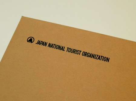
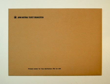
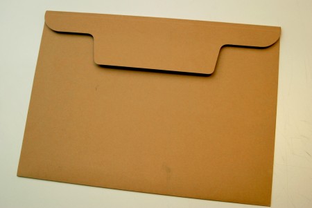
JNTO Envelope
Posted by Scott


I love simple things like this; you really can’t beat one color on a kraft envelope. Found it at a friend’s house and it reminded me that I really need to get some ISO50 envelopes made up, or at least a stamp.

14 Comments Leave A Comment
Matt says:
April 29, 2009 at 12:28 amI love the flap! That really makes that envelope stand out.
NAVIS says:
April 29, 2009 at 12:40 amI think I’ve been sitting in front of the computer too much as of late… for a second the logo in the corner looked like the logo for Ghostly. Which I saw a sticker for at Wahoo’s Fish Tacos the other day. Unfortunately, Wahoo’s plays the worst music ever. Nothin’ like a tasty fish taco and some Taylor Swift or Simple Plan.
Scott says:
April 29, 2009 at 1:17 am@navis
ha, you’re right, I just glanced at it and it looks a lot like that little guy.
Adrian says:
April 29, 2009 at 2:39 amHey Navis,
I just had the same experience with the logo. But what font are they using? I just love those 60’s modernist geometric Grotesque fonts.
Brian says:
April 29, 2009 at 7:47 amI have the same feelings towards 1 color print on craft.
J.P says:
April 29, 2009 at 8:12 ami would LOVE to get some ISO50 stamps!!!!
NAVIS says:
April 29, 2009 at 11:48 amKinda looks like a font I’ve been using lately: SF Atarian. Basically the Atari font. I highly doubt it’s that but kinda looks similar.
Ali says:
April 29, 2009 at 1:34 pmWow, what a great find! Thanks for posting!
Oz (ffs) says:
April 29, 2009 at 6:01 pmget a stamp! It adds so much to your postage bits n pieces, i hammer mine all over anything and everything :
http://www.flickr.com/photos/forcefeed_swede/2920261381/
I also did some custom parcel tape. I think when people get your parcel, it really makes the difference when it’s branded.
Adam says:
April 30, 2009 at 7:48 amVery simple and very nice
Johnny Quach says:
May 18, 2009 at 4:20 pmHey bud,
I just wanted to say it’s great to know you appreciate things like this. You’re awesome man. Thanks for the inspiration.
best,
JQ
Travel Insurance News says:
May 2, 2010 at 11:17 pmJapan National Tourist Organization Envelope it’s great to know you appreciate things like this. You’re awesome man
Travel Insurance News
Holidays says:
May 3, 2010 at 2:13 amThe people are loosing their moral while becoming modern. The
society needs to be attentive that moral value.
Cynthia
——————
Holidays