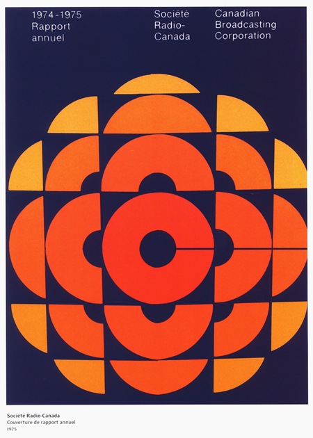
CBC 1975 Redux
Posted by Scott

Here’s another version of the CBC Annual Report that I posted on a while back. I like the colors of this one more and the nice border and info panel add to the poster vibe. Not sure which is more loyal to the original, but as I said in the original post, I thought a more muted palette would serve it well, and here it is.

5 Comments Leave A Comment
RKG says:
November 22, 2007 at 9:27 amDo you think that, at one point, the client said: “make my logo bigger” ?
glenroy says:
November 22, 2007 at 11:28 ammy goodness. i grew up in canada. that icon stirs up a lot of things. mostly because when all you have is rabbit ears, all you got was the CBC. we’re all brainwashed with it. and hockey announcers, with their big icon patch on baby blue blazers…
kindofserious says:
November 22, 2007 at 1:29 pmthis doesn’t have anything to do with the poster but what font is Scott using that looks like Blair on his site? It’s gorgeous If anyone knows will you let me know? Thanks!
Alex / HeadUp says:
November 24, 2007 at 10:07 amInteresting, this just got me thinking, one of my clients at work is responsible for reports about the city of Phila., I’m wondering what some of those older reports look like……definately going to look into that!
Jesse Woodward says:
November 24, 2007 at 4:46 pmGod… I love that logo.
I might pick up a shirt from the cbc for my brother for Chrismas.
Maybe grab one for myself too.