74 Soundsystem
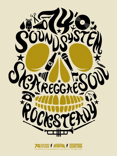
Found this gem by Halftone Def Studios on Gigposters. I’m pretty much over the whole "skulls craze of ’06/07", I think there was a law in L.A. for a while that stated all shirts produced within city limits had to include a skull on it. Jakub and I went to the Pool clothing show in Vegas and my actual skull exploded due to the amount of skulls on everything. Skulls.
Doesn’t matter, this poster is still badass. I guess that’s the paradox of ubiquitous design trends: Do it right and you’re a genius; do it wrong and you’re a lowly imitator. Or just use ITC Avant Garde; you can’t go wrong with that one.
Now that the skull-rush of ought seven is over, can anyone guess what the next big trend in design is going to be? I vote for rainbows and deer antlers. Oh woops, that already happened.

26 Comments Leave A Comment
Daniel Carvalho says:
September 19, 2008 at 5:24 am“Or just use ITC Avant Garde; you can’t go wrong with that one.”
Someones logo portfolio I know uses a lot of that typeface, can’t remember his name though.
Suprised you like that poster, must say, not my tastes.
Scott says:
September 19, 2008 at 5:35 amdaniel-
that’s the point, I also have a lot of deer antlers and rainbows in my portfolio…just poking fun at myself.
Jan says:
September 19, 2008 at 5:46 amThere were some more misunderstandings in the last couple of posts. Seems the irony is lost an some parts of the readership. In the future, you should include some [irony] tags. Or smilies (hey, maybe that’s the next trend…?).
Glenford says:
September 19, 2008 at 6:36 amskulls are fun, but i hear ya. i wouldn’t necessarily say it was a craze in just 06/07..it’s been going for years and probably seems more omnipresent thanks to the explosion of affliction style tshirts, not to mention josh at hydro74 is busier pumping skulls out than a 1 legged cat covering shit on a hardwood floor.
Scott Strickland says:
September 19, 2008 at 6:53 amHard to tell.
Not that it ever wasn’t “around” or used in some form or another, but it seems like really clean type without counters is becoming more and more of a widespread design trend. This kind of almost “controlled abstraction” of using type without counters or type that is right at the edge of being legible-but as clean type – not “grunge” or distorted type.
Blake Barton says:
September 19, 2008 at 7:50 amGo to ffffound.com….are either
1.) Showcasing a large triangle
2.) Very metallic, Sega-esque, Tron-esque
3.) Both
…But it looks cool.
Blake Barton says:
September 19, 2008 at 7:52 amTYPOS!!!
Go to ffffound.com….many things are either
1.) Showcasing a large triangle
2.) Very metallic, Sega-esque, Tron-esque
3.) Both
…But it all looks cool
Nicholas says:
September 19, 2008 at 8:02 am– hot air balloons
– UFO’s
– wood nymphs
dani says:
September 19, 2008 at 8:37 amhey scott, maybe this could interest you!
http://www.corriere.it/gallery/Motori/vuoto.shtml?2008/09_Settembre/auto_futuro/1&1
Matt says:
September 19, 2008 at 8:41 amI definitely think we’ll see more gradients and more outer-space before we see more straight to the point minimalism, although design overall is so diverse there are always pockets of similarities popping up.
Daniel Carvalho says:
September 19, 2008 at 8:48 amHeh, yeah I know you were, I guess I was kind of poking fun of you poking fun of yourself… I think that makes sense. Although I didn’t realize the Avante Garde part was poking fun at yourself.
Crap, I’m so misunderstood. I think I need to revise my written self.
But as far as trends go, I’d have to totally go with Scott Strickland’s submission, as it’s something I pretty much use in every design I do now days. The whole invisible grid / lines approach. Which I’ve mentioned before somewhere in this blog. Seems like “justify” is not just for type anymore.
While there are a few “logo trends” websites I’ve seen, one of them mentioned a particular one that I think has been taken totally a level beyond practicality. And that’s “underground” logos / typography.
Daniel Carvalho says:
September 19, 2008 at 8:52 amSorry, just read my comment above, Seems like “justify” is not just for type anymore., and I do realize that this in many cases has been design practice for ages and is nothing new, I am just acknowledging it’s somewhat taken further and practiced more often today.
harald b says:
September 19, 2008 at 11:25 am#1. Paislies with lots and lots of swirly curlies like Si Scott on bad acid
http://www.mervyns.com says it all..
NAVIS says:
September 19, 2008 at 12:14 pmAre you trying to tell me that my Affliction shirt and Ed Hardy trucker hat are no longer cool?
Ugh.
I need to hit the gym and rethink my life.
My guess is that trends from the early 60’s with a twist of early 90’s will be a trend. Whatever that might consist of. But I think the super tapered, tight, neon jeans sold at AA should be outlawed. Seriously.
Hey Scott – have you seen the show Mad Men? It’s quite amazing and I think it’d be right up your alley.
Scott says:
September 19, 2008 at 2:23 pmJan-
agreed…I usually try to keep things somewhat straightforward, guess I lost some people when I lightened it up.
Glenford-
Josh is a perfect example of someone doing it right, his work is incredible. He could tattoo a skull on his face and it would still be cool.
danny says:
September 19, 2008 at 5:20 pmhaha yes, skulls continue to be the big double-edged-sword over at gigposters, even in ’08. while i can’t include myself in the gang of skull-makers, i think all of us are guilty of some sort of over-fascination at one point or another: antlers (+/- the deer head), octopi, owls, anatomical hearts, you name it. i think it really comes down to living in an age where ideas are so quickly shared and inspiration hits so many people at once. i think it’s good because it makes us all want to be even more original, even though that seems almost impossible these days!
Jose Espinoza says:
September 20, 2008 at 11:13 pmI so understand that LA Skull thing, seriously they took it a little too far over here.
Daniel Carvalho says:
September 21, 2008 at 4:16 pmDamn it, I did get some of the irony! Don’t include me on that…
lost some people when I lightened it up.
…or there will be more skulls.
Jayden says:
September 21, 2008 at 7:05 pmGood riddance, and PLEASE – no more surface reflections!!
Norik says:
September 22, 2008 at 11:39 amone word, triangles!
Norik says:
September 22, 2008 at 11:42 amby the way scott, you should check out this article on AIGA’s site about how the skull trend will never die, was that a pun? :P
http://www.aiga.org/content.cfm/forever-skull
jeffdoe says:
September 22, 2008 at 3:27 pmOne word.
Skullfucked.
Levi "TRON" Ratliff says:
September 23, 2008 at 9:42 pmAhoy Scott, Thanks for checking out my poster. I appreciate the compliments. It means a lot coming from you man, Im a big fan of yours as well. As far as the skull thing goes, I didn’t even realize I was about to put myself up in the middle of that skull trend. I did that illustration for the 74 Soundsystem in late ’07 one night while listening to them spin and eating burritos down here in the dirty dirty south. I pretty much used the icons that Fred has tattooed on his body and then hand lettered the type around the icons and inside the skull. Hand-done type is my fav. But yes right after I did this, I then noticed the elevated rise in skull stuff. Or maybe I didn’t notice it because living this close to Daytona and all the Bikers, I see skulls all the time. But this poster is one of my favs too, I think I sketched it that night, illustrated it the next day, and screen printed it the next week. quickest turn-a-round ever! I still have a couple left, If you want one hit me up with the email attached to this post and Ill send one over! And thanks again for the post, Levi “TRON” Ratliff
http://www.halftonedefstudios.com
Erik says:
September 25, 2008 at 8:24 pmthe pyramid trend seems to be dying out but still favoured in the grainy b&w space scenes still seen everywhere. my bet is that abstract 3d renders will make a huge come back and pixel fonts gets another breakthrough in web type. or not
Heather says:
September 30, 2008 at 3:33 amtriangles, and lots of electro colours. pink purple and turquoise on black. Yay for anything remotely daft punk themed!!