Klas Ernflo and My Favorite Letters


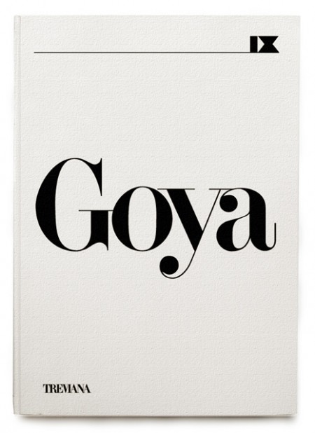
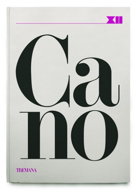
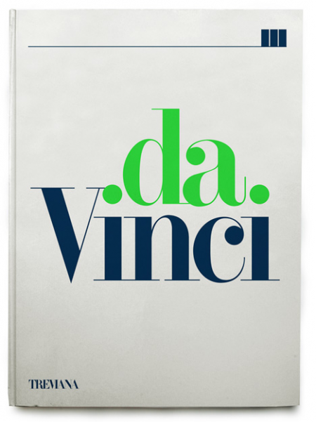
A few rejected book covers by Klas Ernflo. Beautiful typography at work here — I especially can’t get over how amazing the uppercase G is in the top image (looks like Didot, but I’m not positive). Surprising (and not at the same time) that these were rejected by the publisher. I would have bought them on the spot, regardless of their contents!
Recently I’ve been trying to determine my favorite occurrence of each letter of the alphabet. I’ve picked a few, like the “G” seen above, but most letters remain up in the air. The eventual goal will be to have a list of 52 shapes; representing my absolute favorite renderings of each letterform, upper and lowercase. After that I guess I’ll move onto symbols and numbers (I already know my favorite “7” — Clarendon). A few other examples might be the “W” from the Westinghouse logo, the lowercase Avant Garde “a”, and maybe the “H” from Scott’s recent post.
Would love to hear everyone else’s favorites! It’s hard I know, to narrow it down outside of the context of application, but I’m sure there are some standout letters for each of you. Let us know!

11 Comments Leave A Comment
rent says:
September 15, 2009 at 12:58 amThose are some great covers, I especially like the last one.
That “G” really is gorgeous too, I always seem to struggle with g’s in writing. When I think of my favorite letter forms I tend to consider how I scribe it cause I’ve always been a fan of nice/clean handwriting. Some of my favorites though are definitely capital “A’s” and “T’s”. I know that wasn’t the exact kind of response you were looking for, but I always seem to prefer those letters in most typefaces.
Mathias says:
September 15, 2009 at 2:36 amI really admire the “g” of the VIA font developed for the danish railways. Its very hard to find on the internet. It looks like “Signa Pro” but is a bit more… ehhh… “hard/smooth”. I will try to find an example…
quotes:
“In 1997 Danish design agency Kontrapunkt designed the new typeface ‘Via’ for the Danish State Railways to replace the previous ‘British Rail’ typeface who looks like Helvetica Bold.” — Claus Eggers Sørensen: Danish Humanist Modernism at forthehearts.net
“Bo Linnemann [of Kontrapunkt] professed being influenced by Knud Engelhardt, the famous Danish architect who lived about 100 years ago. The guiding principle in all of Linnemann’s work, accordingly, is legibility. Engelhardt used to open up glyphs such as A, M and N. Linnemann’s face VIA for the Danish Railways (DSB) has inner spaces bigger than those of Helvetica, which was the face used previously by DSB. VIA’s identity is in the lower case g, a neat feature found in more and more corporate typefaces these days.” — Luc Devroye: Report of ATypI 2001
For-W-Art says:
September 15, 2009 at 3:22 amI’ve always loved the numbers in the Georgia (bold) font. Especially the round endings give them a sensual retro touch imho.
And the simplicity in the Eurostile and Helvetica letters is usually a good choice too although more used.
jarred says:
September 15, 2009 at 5:14 amClarendon “2”, Avenir “Q” Akzidenz Grotesque “a” Bodoni Italic “y”…those are classics (maybe not so much the Avenir yet), but still kicking ass.
I can’t believe those covers were rejected either!
Andrew S. says:
September 15, 2009 at 6:14 amThe “R” in Nuetraface Semibold/Bold really caught my eye the first time I saw it. So Nice.
Antonio says:
September 15, 2009 at 8:08 amScott, the G above seems like it’s Modern No. 20. Lovely face.
I personally love the uppercase K in Helvetica.
Ethan says:
September 15, 2009 at 10:06 amHelvetica Bold, lower case a is definitely one of my favorite things ever.
Ryan Strong says:
September 16, 2009 at 9:28 amI think that G is used in the VOGUE magazine typeface.
RA_OUL says:
September 17, 2009 at 12:54 amThese are all stunning! It is not often that I see serif typefaces enlarged to this degree. I usually prefer using san serifs but this has really given me second thoughts about my preferences. Great post. I can’t really think of any particular typeface letters that I love besides the leaning A in Avant Garde and especially the AVA combination.
Andy Chung says:
September 18, 2009 at 12:08 amI believe that typeface is Didi by Herb Lubalin.
http://e-daylight.jp/design/fonts/type/d/didi.html