No Fear of Missing Out // Process Post
Before jumping into this process post I want to define my terms: This project revolves around the concept of ‘FOMO’, which if you haven’t come across, stands for “Fear of Missing Out”. Fomo is a very real and worrysome condition that can affect anyone at anytime. It describes that feeling of jealousy and helplessness when you miss out on something great. Typically the condition becomes more prevalent during the weekends, summer, and nighttime. For example, “When I was looking at John’s pictures from the submarine party last night, I had a really bad case of fomo.” If you are stuck at work right now and your friends just went skydiving, you have fomo.
Nofomo by contrast refers to the state of being in which you have cured your fomo. You do not have a fear of missing out because you are always the one doing something awesome. You actually cause fomo, rather than experience it yourself. If you are living your life to the fullest and saying yes to everything, you have probably achieved such a state.
This is a project about NOFOMO. (And while it may not seem like it, yes this was for school.)
Brief
Last semester was a tough one. My project assignment was basically to “make something cool”. I learned a long time ago that an open brief like this is not preferable despite what I always think at first. I set off trying to make something awesome and basically drove myself insane again (at one point I found myself out of breath, standing over three spilled cans of paint and duct tape on a canvas, with Juanes blasting on repeat). The class was called “Design Outside the Box” and the project duration was from January through May.
I started out just kind of shooting in the dark. My initial idea for “something awesome” was met with a fair amount of skepticism. I wanted to sell bottles of air online for $1599 (with the goal being to sell just one SOMEtime over the course of four months). The idea was to brand the shit out of these bottles of air and basically use design to sell this inherently useless item. Conceptually, you go crazy and interpret the project with things like design’s place in the world, or maybe some metaphor about how we are all being tricked into buying expensive “bottles of air” every day etc. I was not interested in these concepts. I really just wanted to see if it was possible to sell a bottle of air for $1599. I will still do this.
Conceptual Development
Concurrent with my ill-fated air bottle venture, my friends and I were having fun incorporating the term fomo into our daily lexicon. It is such a useful term! We began exploring the possibility of starting a company and met weekly kicking around ideas for startups. The parent company was to be dubbed NOFOMO; the idea being that the company’s offerings would be products intended to cure or aid in the alleviation of the disease that is fomo.
So using our company as an inspiration, I decided to set off exploring various art projects around the concept of NOFOMO. One thing to note is that each offering was completed in one week’s time. The way the class (and instructor) worked was basically that each week we had to have a final product. If we brought in something and said “eventually it will look like this” he would say “well why doesn’t it look like that now?” and move on to the next person. It was awesome. I actually really enjoyed this crazy fast and honest critique style. While designing “final” products each week was stressful, it was great practice in efficient execution.
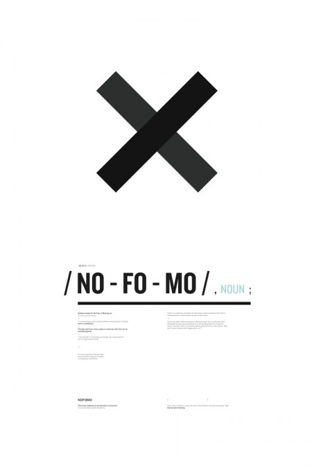
After a number of ridiculous deliverables that left most people (me too) more confused than anything else, I designed a poster (BIG, 30″ x 44″). The purpose of the poster was mainly just to explain what Nofomo meant. For months I was working on this project and I didn’t really feel like anyone had any idea what on earth I was talking about. This poster was largely designed to hammer home what I was working on. It was also constructed mainly to show the teacher that I could work with type, at least in some capacity. Everything I had been bringing in to this point frankly, sucked, and I was worried that I was going to get typecast (pun intended OH SNAP) as a scrub designer. The poster was me just trying to show him that I vaguely knew what I was doing with type. It was kind of a stall, but I liked the way it looked and it was a necessary step while I thought about what to do next.
As seems to happen rather cyclically, I became bored with design. After the poster was done I was literally avoiding my computer because I did not want to design anything anymore. Opening Illustrator sounded like punishment. This was terrible timing — middle of the semester — and I needed to think of something quickly. This was around the time I started painting. Hanging on my wall now is an absolutely terrible painting which I made at what I have come to call my creative rock bottom. I have no idea how to oil paint, but I went to FLAX and bought white and black paint, a giant canvas, and as many paintbrushes as I could. Also some duct tape. I was very frustrated during this time and was pretty much forcing myself to create which is no good. Time to get out of the house and bring the Mark II!
Film Phase
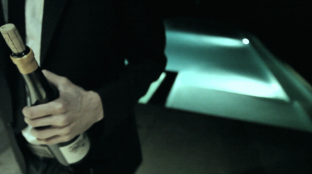
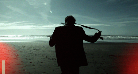
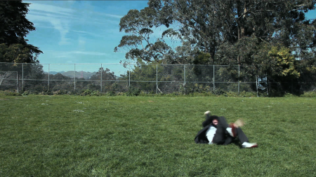
With the new found plan being to “film something awesome” I left in search things that would look good on camera. I cared not for concept. I was hell bent on making something that just looked cool each week that I threw concept to the wind. For example: a guitar being thrown out of a window. What does this mean for me? At the time it was because I had always wanted to do it and wanted to get it in HD. After the fact I described it as representing restless youth! This conceptual retrofitting was largely caused by the pressure I felt to deliver something polished and amazing each and every week. I decided to focus on the visual and think of the meaning behind it all later. This lasted a period of about 3 weeks and the videos I created during this time are compiled in the process video above. You’ll notice a tiny piece of the stop motion video I made (process article) and have since hidden away in the “never show anyone” archive.
During the film blitz I came upon a few things that intrigued me. One was a shot of a couple embracing, silhouetted against the city lights of San Francisco. I really liked this image and looked forward to setting it to music. The other element I started working with further was my edited version of Hunter S Thompson’s wave speech. You might recognize bits of it from Fear and Loathing Las Vegas. I had edited it to represent kind of a manifesto for Nofomo; I eliminated some of the more specific references and cut parts of it together for a more focused portrayal of restlessness. His reading of the speech struck me as a cool possibility for overlaying with one of my videos (similar to the Go Forth Walt Whitman integrations). The cadence of his speech is perfect.
The original shot of the couple was good and I set the video with the speech in the file above. The problem was that the shot was captured by luck and didn’t look as I would have preferred had I been able to plan every element. I scheduled a reshoot with two friends of mine as the actors. We took a ton of footage, most of which was cool, but my favorite shot ended up being the test shot I did to show the actors what to do. A group of kids were just kicking it when we arrived on location and I filmed them so the actors could see through the camera what I was going for.
I finished the video well before it was due and felt like I owed it to myself to try and add a little bit more to the final. I experimented with 3D modeling for a week (Cinema 4D) but decided it would be too tough to learn the program and integrate it to the existing footage in a short period of time. The video I created during this process is above.
Final Deliverables
Instead of adding in some wacky 3D cube, I used Final Cut to incorporate a coordinated type treatment to go along with the wave speech. Using Final Cut to do this is certainly not the easiest way to do this (you should see my timeline), but it was the only way I knew how. Adding the type helped make it a little more interesting and was the extra boost I was looking for. (Yes I am aware that the symbol at the end looks like the CD cover from the XX. It’s an X.)
Using the edited speech I had prepared for the last iteration, I overlaid this with the new footage. I used I Guess I’m Floating by M83 as the song the first time around, which I liked, but felt a little too precious for what I wanted to be a more optimistic/exciting video. This footage seemed to want something a little more driving to convey that things “are happening”. People are going places. Moving and shaking. I made a giant playlist of possibilities (which has come in handy since) and eventually decided on “Talismanic” by ATB. Between the new footage, the type, new song, and the speech, I felt like I had a solid final deliverable.
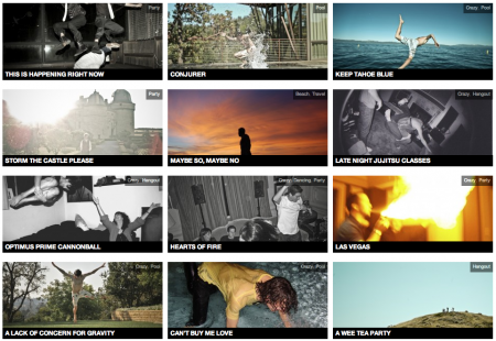
I also prepared a website, nofomo.com, during the last week of the project which was meant to be the forward facing element of the project. On it was a stream of user (me initially) generated photography — no specific theme to the collection, other than that in each case, the photographer has proven their lust for life. It is a gallery of craziness, a closely curated collection of awesome. The photographs were meant to encourage everyone to live their lives with NO fear of missing out. The site has been on hold for a month or two now, but I am meaning to get back on it and posting once a day. I’m not super into the way the site is built — I’m talking to a developer this week to give it a once over and make it a bit sexier and functional. (It has also been overrun by spammer comments and etc. Ugh. At the moment you get a malware warning if you try to visit it, so I’ve taken the link down.)
My final collection for the class was the main video, the process video, a storyboard, the website, and the poster I created early on. All together it was a cool set of work surrounding the concept of Nofomo. The way the whole process unfolded was pretty unusual for me. I didn’t really sit down at the beginning and decide exactly what I wanted to do along the way. I was pretty much just working week by week on something cool and unusual, determined each time by a half witted brainstorm right after class. I was actually very surprised to be excited about my final work. There were times during the semester where I was worried I wasn’t going to come out with anything. As it is now, I am excited to be working on the brand Nofomo, trying our best to get fomo into the hearts and minds of the general population.

22 Comments Leave A Comment
liz says:
August 8, 2010 at 10:41 pmthis is well-timed as i’m reading this article while finishing another test render for a final project to be turned in tomorrow. i haven’t left the apartment much at all in weeks except for class, but i’m satisfied with my output despite all parties + music + events + friends i missed. nofomo!
i enjoyed your process journal and seeing a little of how much crazy happens that doesn’t ultimately end up in the product.
Cameron Ballensky says:
August 8, 2010 at 11:15 pm:/ i have the worst case of fomo right now.
jerry says:
August 9, 2010 at 12:34 amwhy be jealous?
Andy says:
August 9, 2010 at 2:24 amA+
Risingson says:
August 9, 2010 at 4:31 amSeems amazing! :) well done!
Kyle says:
August 9, 2010 at 7:28 am“It should make us jealous we weren’t there with you.”
I will get a picture on your site. Summer goal.
rent says:
August 9, 2010 at 10:09 amGreat work, Alex. Really enjoyed all of the videos and the non-conceptual approach.
NAVIS says:
August 9, 2010 at 11:04 amLooks great Alex. What’s the song you used for the final video?
Ida says:
August 9, 2010 at 12:23 pmThat website of yours is not accessible due to it being reported as an attack page. Please do something about that. Would like to visit it.
And yea, I like the word. Fomo. It’s great.
Mikael says:
August 9, 2010 at 1:47 pmAs somebody who’s thinking of switching their studies completely, from economics in Switzerland to something art & design related elsewhere, I read your posts with great interest. They’re not only fun to read and interesting from an artistic point of view, they also offer some guidance by showing what a design student is up to, what assignments they’re given and how they’re approached.
Basically, thanks, I seriously appreciate it. Keep up the fine work.
@NAVIS: The song is Talismanic by ATB, as mentioned in the post. =)
NAVIS says:
August 9, 2010 at 1:56 pm@Mikael. Thanks! Totally missed that part obviously haha.
Dusty says:
August 9, 2010 at 3:14 pmGreat post. Mark Morford had a piece on SFGate about FOMO a few days ago.
michael says:
August 9, 2010 at 7:48 pmthe look + feel of your videos is freakin awesome. why not use Motion for the type treatment? have you experimented with After Effects? Was all the video post processing done in Final Cut?
Justin says:
August 10, 2010 at 12:06 pmAlex. Who is doing the narrative in the first piece? Or, where did you get it from? Just curious.
jpea says:
August 13, 2010 at 2:25 pmHoly moly, that’s some seriously gorgeous stuff. Also, love NOFOMO. With this incessant over-sharing (I’m lookin’ at you, Facebook), FOMO happens to the best of us. But never again! NOFOMO from now on.
Tim says:
August 15, 2010 at 7:03 pm@ mikael
Don’t be scared to stay in Switzerland for design school!
Paul Anthony Webb says:
August 19, 2010 at 1:54 pmI loved the process video a lot! =D
Nick Robinson says:
August 25, 2010 at 11:58 amBoy this really hits the inspirational nail on the head… I could go out and hav a night on the town with nothing to show for it but a hangover and an empty wallet, but at least i wouldnt be “missing out”. OR I could stay home and paint all night.
But other than the subject matter, I’m loving the consistency of the film editing and clean design. I enjoy putting different background music to this.
Eric says:
August 28, 2010 at 10:46 pmWhat is the song from the :51 second video?
Chester says:
September 13, 2010 at 5:18 pmOh fuck yes Randall Hill for the win.
Marcus says:
December 30, 2010 at 4:00 pmMan you are so much more talented than I am. This is great work, I can not wait to see what big projects you put out in the future.