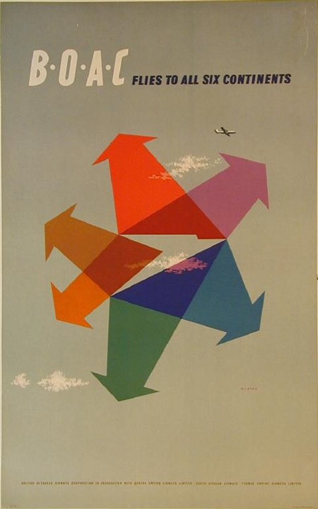
BOAC Poster
Posted by Scott

Very nice colors from an old BOAC campaign. Could do without the clouds and the airplane but I suppose a concept like that would never make it past the marketing people without some of the obvious thrown in for good measure. Note the BOAC logo that is formed in the middle by the arrows, love it. Great fine print line at the bottom, perfect kerning. Unfortunately no info on the designer, anyone?
Via FFFFOUND

3 Comments Leave A Comment
Marc M. says:
March 7, 2008 at 12:51 amDone by Abram Games in 1956. Has some amazing work… Check it out.
http://www.abramgames.com/
Etienne L. says:
March 7, 2008 at 10:14 amNice poster. I’m falling in love with this sort design. Thanks for your works !
John Parks says:
March 9, 2008 at 1:45 amThe concept on this is absolutely beautiful.
Minimalist and simplistic.