Black Mountain: In The Future

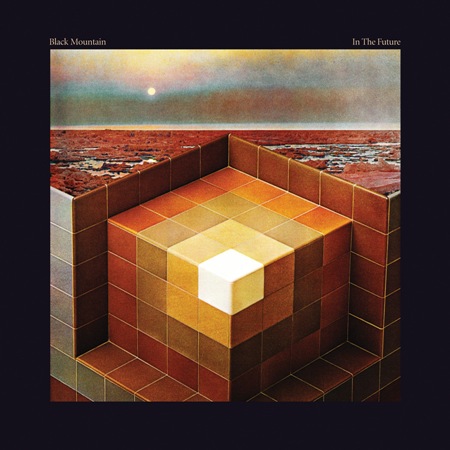
This is infinitely rad. It’s like my dream shower / bath on acid in another solar system. When I first saw this I thought it was some 70’s cover, but it’s brand new, came out this year. Nice work whoever did this, anyone know the designer / photographer? It looks to me like a collage of old photos, but not quite sure. I don’t know how they made bathroom tile and some random landscape look so sinister, but way to go, something really dark going on here. The type choice is perfect too; I always try to hate on serif fonts and then I see one used well like in this example and realize I need to use them more often.
Update via James in the comments:
"It was designed by Jeremy Schmidt, the keyboardist for Black Mountain. Here is an excerpt from an article in Exclaim magazine:
Schmidt has a long history in visual art and previously designed covers for Black Mountain singles, as well as those for his own projects. “For Black Mountain, the cover was intrinsic to making the record,” says Schmidt, who through cutting and pasting images, eventually came up with the design of a Rubik’s-type cube embedded into chilly, rust-coloured terrain. “It’s meant to very much look and feel like a classic album cover, in the sense of a gatefold LP. I wanted to make something that was kind of epic but not typically psych looking — something a bit more austere than that, a little more modern, but a little old looking as well. So that’s how I arrived at that geometric alien landscape sort of thing.”

5 Comments Leave A Comment
james says:
February 21, 2008 at 6:29 amGreat post! A friend sent this album to me a few weeks back and it was the cover that really grabbed me. Extremely epic and atmospheric. It was designed by Jeremy Schmidt, the keyboardist for Black Mountain. Here is an excerpt from an article in Exclaim magazine:
Schmidt has a long history in visual art and previously designed covers for Black Mountain singles, as well as those for his own projects. “For Black Mountain, the cover was intrinsic to making the record,” says Schmidt, who through cutting and pasting images, eventually came up with the design of a Rubik’s-type cube embedded into chilly, rust-coloured terrain. “It’s meant to very much look and feel like a classic album cover, in the sense of a gatefold LP. I wanted to make something that was kind of epic but not typically psych looking — something a bit more austere than that, a little more modern, but a little old looking as well. So that’s how I arrived at that geometric alien landscape sort of thing.”
It’s a great album too.
mg33 says:
February 21, 2008 at 8:18 amNice to see the artwork posted here – really enjoy your blog and was hoping to catch you here in Chicago on Saturday but the event is sold out!
Anyhow, that Black Mountain album is really great, and it goes well with the artwork. Actually got tickets to see them in March.
Dave says:
February 21, 2008 at 3:02 pmKind of a new thing but BCVCO is new synth ensemble with Jeremy from Black Mountain among other Vancouver musicians. Think if Neu and Vangelis had children but with varying degrees of bearded-ness.
Some sample jams:
http://www.castexotic.com/bcvco.htm
Dan says:
March 13, 2008 at 5:36 pmIndeed, I love this art (as well as the album). The artist has released a record as the Sinoia Caves. The art has a similar vibe.
http://brahrecords.com/release.php?brah=13
ynvevtqybr says:
April 23, 2008 at 6:46 pmWow, cool man, big thanks! http://kswaompwui.com