Hey ya’ll!
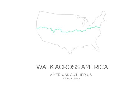
I wanted to do a little shameless plug here for my new project/adventure I’m attempting. In March 2013, I’ll be heading to the east coast where I will dip my feet in the Atlantic and keep walking westward until my feet soak in the Pacific.
That’s right, I’m walking across America and I’m inviting people to follow my new blog as I journal, photograph and record my journey. And no, I’m not Forest Gump’ing.
I’ll also be doing exclusive posts here at ISO50 when I get the chance. One of my objectives is to interview local American artists and photograph them and their works. So if anyone who reads this blog knows an awesome artist of any discipline that’s along my route please contact me!
Check it out:
AMERICAN OUTLIER.US

United by House Industries has been my go-to typeface over the last few semesters. It is a massive family — 105 total fonts (three styles, seven weights and five widths). This variety makes it an incredibly versatile collection. I really hate it when I find a typeface that I love, but find it missing a crucial weight or style. (DIN for example — would love to be able to wield more styles). United does not have this problem. I’ve used it on many projects (a few you know; ISO50 EP, Mega Cities book) and in each case the variety allowed it to be implemented in a unique and effective way.
I discovered it a long time ago while searching for the typeface used in a Nike ad (can’t recall which one, but it was amazing). I don’t actually remember if United was employed in the advert, but if you spend any amount of time searching around the typography of the sports world, you are bound to come across United at some point (Fox, I’m pretty sure, uses it for in game football graphics). There is an obvious resemblance of a few of the weights to a very collegiate look, which might be a turn off for some people, but the rest of the styles make up for this ten fold.
The most exciting part for me has always been the fact that each style has five different widths. I love condensed or extended widths and it’s nice to find a worthy competitor to the standards (Univers, Trade Gothic etc). When you need an extra touch of personality, especially if the project skews toward the technical or urban, United does the job nicely.
I don’t know many other designers (at least at school) that use it regularly and I thought I’d spread the word a little. Finding a new typeface is always pretty exciting, so hopefully if you haven’t tried United before, you can give it a shot and experience the sweetness. Anyone else have any hidden gems? I haven’t come across a new super typeface in a while — would love to hear about what people are unexpectedly enjoying these days.

