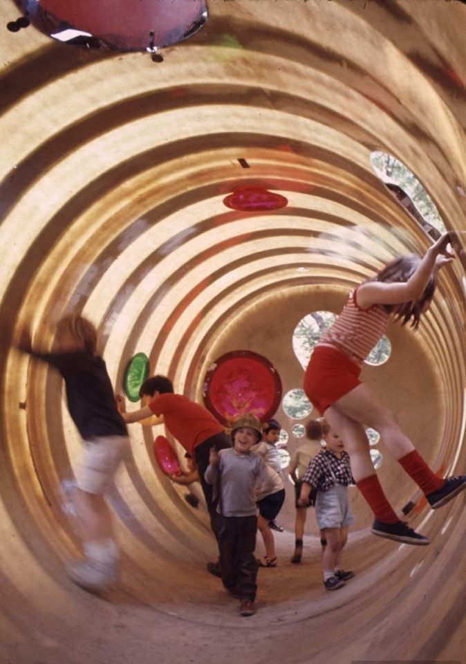
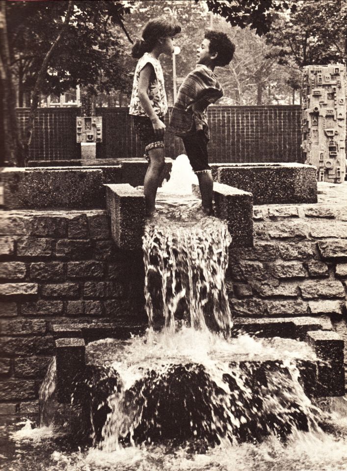
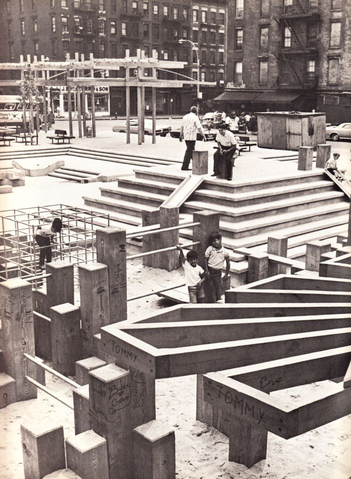
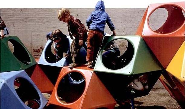
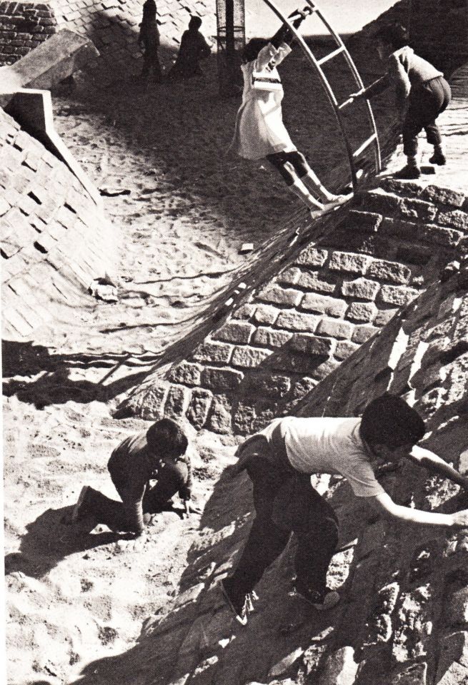
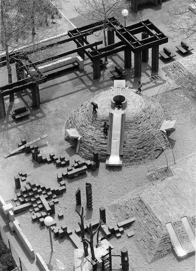
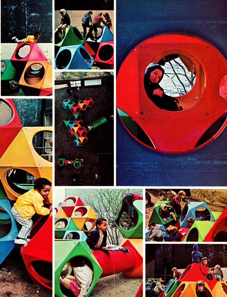
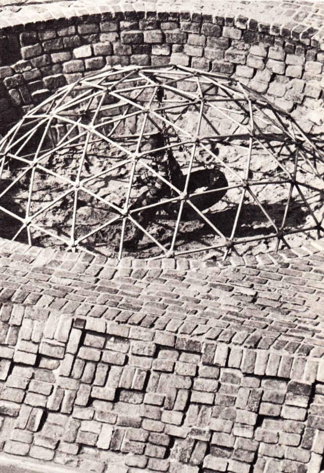
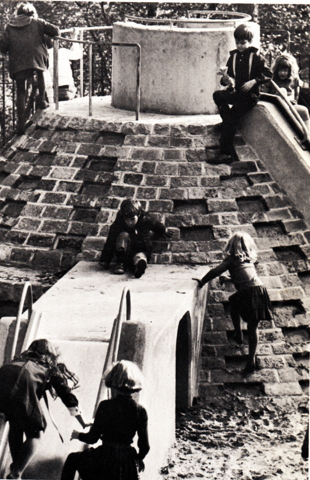
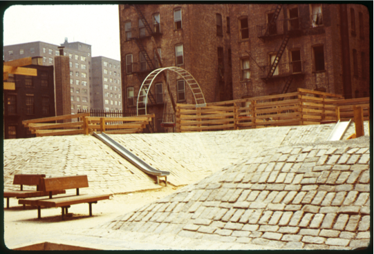
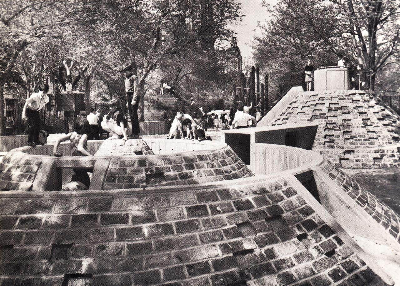
A nostalgic collection of New York playgrounds that have disappeared. From Jacob Riis and all the way to Central Park, here’s is just a small glimpse back into how carefree the 1960’s were for a child’s playplace.
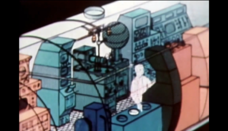
This is like the archetype for every retro-styled with the synth-soundtracked logo build in and the crackly PBS voice over. Can’t believe this was made in 1980, would have guessed earlier from the quality.
I was really taken by this poster by Jason Hill. All of the elements are appealing to me; the type, the illustration style, and even the words chosen. I would imagine anything held at the “MonOrchid gallery” must be kind of awesome to live up to such a sexy name. I wasn’t familiar with Jason’s work previously, but he has some really interesting pieces in his portfolio. His Dreamscape series is pretty rad.
In part 2 of the Vintage Ski Ads Series I chose some that focused in on the skis themselves. When I see skis these days they either look like pop culture threw up all over them or they were designed by the same guy who makes the info graphics at the bottom of the ESPN screen. Looking at the examples above it’s plain to see they had a little more appreciation for subtlety and a sense for classic design back in the day. Either that or the printing methods were such that they were limited to simple shapes and colors and the designer in me is just picking up on that.
When I think about it, this could be the case with a lot of older stuff. I think we as designers often appreciate unintended aesthetic elements; things that were a function of necessity or limitation rather than deliberate design decisions. A good example would be vintage audio equipment. I think the Neve Sidecar is one of the most beautiful inanimate objects ever created. But when you really look at it you realize it was designed by engineers; pretty much every design decision was dictated by necessity and function. So I must be reinterpreting that as physical beauty creating a connection between the idea of an object’s functionality and it’s aesthetic beauty. In other words, maybe I only like how it looks because I appreciate how it works (or in this case, sounds). Then again, I have some gear around the studio that I love the sound and functionality of but is just downright ugly to look at.
Anyways, all those Rossi’s are incredible. This whole style needs to make a comeback, but it seems these days people need to be beaten over the head with design instead of left to appreciate its finer points on their own. I’m not saying there’s not a place for busy, crazy graphics on skis — I myself have designed several busy, crazy skis — I just wish there were more like these to choose from. I guess it’s a different industry, no longer do guys in mock turtlenecks with comb-overs get all scientific and wear collared dress shirts while developing new skis in the lab, now it’s just this guy and a Nintendo DS in a dark room.
I got my first couple days of skiing for the season in last week right after some nice snow up at Heavenly. Skiing always reminds me of being really young and going up with my parents, Sacramento is only an hour from the Sierras so we’d get up a few times a year. I loved all the design associated with ski equipment and I found that when I first started out in design I was always trying to emulate that style in my work.
My latest trip got me thinking about vintage ski graphics so I set out to track down some good examples. Most of what I found were from magazine ads, this first set focuses on racing imagery. I’ll be posting some more in the days to come, hope you enjoy this first batch.
Every year around this time I like to pretend I have a rich uncle or something and then think about what they would get me for Christmas. This year rich uncle would get me a Linn Sondek Limited Edition Retro LP12 with the walnut finish. I’ve been thinking a lot about home stereos lately, I really want to build a solid system for listening. For a long time I’ve lived by a rule that I’d only spend money on things related to making music or graphic design. This means I have a great set of monitors in the studio, but in my living room I listen to music on a $200 set of Logitech speakers. For some reason I never really thought about how ridiculous this was, especially considering how much enjoyment I get out of listening to music.
So I was walking down Market street the other day and stumbled in to San Francisco Stereo & Theater Systems where they had a pair of B&W 683’s on the floor. I plugged in my iPhone (I know, MP3 is not worthy of a hi-fi system, but it’s all I had), cued up Beyond the Wizard’s Sleeve’s rendition of Midlake’s Roscoe and proceeded to melt into the seat. I’ve never heard sound like this. Yes, I have Adam’s in the studio, but that’s a near-field system designed for professional use. They’re meant to sound very flat and honest, they’re not necessarily supposed to sound pretty and warm and they’re certainly not designed to fill up a large room.
So this all got me thinking, I need to build a proper hi-fi. I have an old (but powerful) Denon hand-me-down amp in storage that I could dust off, just add some B&W’s and I’m set. But then I started thinking that I couldn’t bring myself to play MP3’s through a system like that so I would have to start rebuilding my music collection based on FLAC and WAV, which could take some time. Finally I realized this would still involve D/A conversion at some stage (which I was thinking could be handled by a spare MOTU 828MKII) so it still wouldn’t be ideal. This is when it finally occurred to me that I need to get a proper turntable and expand my vinyl collection.
Enter the Linn Sondek LP12, which apparently sounds incredible and — as you can see from the photos above — is absolutely gorgeous. Unfortunately it’s about $2500 so it’s never going to happen. There’s got to be some less expensive alternatives out there, guess I’ll have to dig around a little. At any rate, if my long-lost, wealthy second cousin is reading this, you can ship it all direct or I’ll take a personal check.
I found a number of cool sites as I explored the Cargo network this last weekend. One such site was the portfolio of Chad Hagen. I love how each of his projects unfolds as a series; within every section there are a number of interesting images tied together by similar visual stylings. I enjoyed clicking through the slideshows and determining my favorites of each, some of which are above.
His beautifully designed illustrations look like they could be out of an instruction manual for some amazing (albeit nonexistent) product or device. As his title “Nonsense Infographics” indicates, there is actually no “information” being conveyed per se — but when the graphics look this good, I don’t really care.
I’ve been buried down in the studio working on this new album for so long I almost forgot how much I love design. But when I see work like this I can’t help but be reminded; Tavis Coburn’s style is very inspiring to say the least. It’s always nice to see an illustrator who has a good design sense, the combination can be quite powerful. And loving the way he uses that moire pattern effect.