Ira Glass describes the importance of producing a lot of work to endeavor through the frustrating early stages of a creative career. The first two minutes of this video should be required viewing for anyone and everyone getting into a creative field. In his case, he’s talking about video production, but his points are easily applied to any other realm. Definitely one of the most inspiring (or illuminating) pieces of advice I’ve come across.
The first couple years that you’re making stuff, what you’re making isn’t so good — it’s not that great. It’s trying to be good, it has ambition to be good, but it’s not quite that good. But your taste, the thing that got you into the game, your taste is still killer and your taste is good enough that you can tell that what you’re making is kind of a disappointment to you. A lot of people never get past that phase and a lot of people at that point quit.
And the thing I would just like say to you with all my heart is that most everybody I know who does interesting creative work, they went through a phase of years where they had really good taste and they could tell what they were making wasn’t as good as they wanted it to be. We knew that it didn’t have the special thing that we wanted it to have and the thing to do is — everybody goes through that. And for you to go through it, if you’re going through it right now, if you’re just getting out of that phase or if you’re just starting off and you’re entering into that phase, you’ve got to know it’s totally normal and the most important possible thing you can do is do a lot of work. Do a huge volume of work.
If you’re like me, you have piles and piles of notebooks filled with half-baked name ideas for firms, bands, and the like. When I was in college, I think I went through about 30 pages of (truly) terrible names before settling on something for my former band*. Basically I’ve never really perfected this technique. Whether it’s for a new band, new client, or my own (eventual) design studio, it is always a long and arduous process to think of the perfect name. (Herein lies the problem — looking for the “perfect” name is often the creativity killer for me.)
My process generally starts with a pencil, thesaurus, dictionary, and my iTunes playlist (pieces of song titles have served me well). It’s worked in the past, but for a recent project, I decided to try something new. I based my exploration off of Josh Levine’s useful chart that divides naming styles into six categories. You can see the chart above for examples and read the full descriptions here. I tried to go through the list three times, thinking of a potential name for each category on every rotation. What ended up happening was I thought of about 30 names in the metaphorical category, avoided the descriptive, and thought of one or two for each of the others. After about two hours I had my name, at the bottom of my metaphorical category list.
Of course, my normal process is not unlike this most recent one — but the added structure and formulaic approach really seemed to help me in this case. I just hope to be able to replicate it in the future. I would recommend giving this chart a try if you are looking for new brainstorming techniques. Just switching things up is really all you need to spark something cool. I’m sure everyone has their own strategies and I’d love to hear some if you’ve got them!
*Crazy story actually — the name I eventually decided on (Running Lights) was the same name my Mom had sent me in response to my plea for suggestions. We had thought of the exact same name, on the same day, without any direction or communication. I told this story to my band mates and that was that — how could we go with anything else!
Note: I wrote this process post a while ago about a project I completed last November. There has been so much going on these days that I forgot about it in the depths of my terribly cluttered hard drive. As I have transitioned to thesis mode now, there are less of these sorts of projects in the pipeline. This is one of my favorites I have completed at the Academy thus far and it was interesting to revisit. This is the article in its original form, as I wrote it last December.
Assignment
This semester we were asked to immerse ourselves in one topic and research it through a series of week long projects. The content of each project would be the result of our extensive research, and we were expected to pick a topic robust enough to be worthy of 15 weeks of study. Each project encouraged us to explore different design solutions and helped us hone in on a visual style that we could use for the final project, which would synthesize all of our work into one deliverable.
For the last month of the semester, we were tasked with compiling all of our research into a book that we would write, design, and bind ourselves. It was to have a minimum of 48 pages (6″ x 9″), a hardcover, and provide some meaningful insights about our topic which we uncovered during our semester of research. In addition to providing a worthy and refreshing commentary, it was to be a covetable piece of graphic design that felt visually appropriate for our topic.
The topic I chose for the semester was Mega Cities (urban areas with a population over 10 million people). The original focus of the project was an examination of what makes a city successful — what it is about a massive city that makes it unique. It eventually dovetailed into an exploration of the ways these cities are confronting the problems they face and how increasing populations make solving these problems more complicated and time sensitive. These problems are becoming increasingly relevant as the world’s urban population continues to grow at an unprecedented rate. I flirted with numerous other topics, some of which I thought were quite interesting, but I found that Mega Cities would provide me with the most interesting and engaging material.
I have 39,447 fonts on my computer. Or at least I did, up until about 30 minutes ago when I cleansed my machine of all the typographic nonsense that was polluting my list. I had thought about doing this font purge for some time, but hesitated, just in case I might one day need to design a document using the official Jedi Knight font, or something similarly ridiculous.
I remember hearing Massimo Vignelli say in the Helvetica documentary that he only uses about three typefaces. I was embarrassed at the time, thinking of my infinite list compiled over many years of dafont downloads and “BEST FONTS!!!” torrents. I guess I considered myself a typeface collector and I worked hard to “get them all”, even if I had no idea of what use some of them would ever be.
As I progressed through school, I noticed that just about everything I had ever designed used the same 5-10 typefaces. Every time I opened Illustrator I scrolled endlessly past hundreds of handwriting fonts, “distressed” fonts, you name it; always searching for the same go-to options. When I did deviate, the work usually suffered.
After much deliberation, I widdled my list down and trimmed the fat as it were. No longer will I be tempted to use weird knockoffs of Gotham or Helvetica clones. I consider myself much better off because of this — not just because it’s easier to manage a smaller list — but because the typefaces I kept are good typefaces. They’ve stood the test of time, and are the result of a tremendous amount of hard work and development by expert typographers. I know something about each one; who designed it, where it came from etc. In this way it’s a bit like my iTunes library; I probably have about 60,000 songs, but mainly listen to a few selected playlists. I have thousands of songs with a play count of “zero”. Why I keep them around I have no idea.
The book pictured above is 30 Essential Typefaces for a Lifetime by Imin Pao and Joshua Berger. It’s a good place to start if you are considering a font purge of your own. (Though I disagree in a few places; for example I would not include Trajan on my list). My final count is now about 50 typefaces; a much more manageable number I’d say. It’s not Massimo’s magic number — I don’t think I could survive on three alone — but scrolling through 50 sure beats scrolling through 39,447.
note: I, and and many designers I know, tend to use the terms “font” and “typeface” interchangeably. Technically this is incorrect as they are not the same thing. Both this and this article do a good job illustrating the difference. Old habits die hard for me; I didn’t actually know there was a difference until about a year ago, so it’s taken some time for me to change my language.
It’s done! The semester came to a close last week and my hypothetical Wes Anderson Film Festival went off without a hitch. On the final day, the project consisted of a presentation box, DVD set, poster (30″ x 44″), fold out schedule, identity system, catalog book (63 pages), website, soundtrack packaging, tickets, billboards and outdoor signage, iPod/iPhone skins, a trailer, and a few other assorted doodads. It was crazy to see it all in one place. I was very happy with the way it all turned out and am relieved to have made it through successfully. This semester was a particularly intense one (as we were also presenting our thesis proposals), and it’s exciting to have made it halfway through the graduate program. Next up will be thesis development over the summer.
This semester’s project really helped us develop our conceptual and technical skills, as we were challenged to create a integrated brand system across a variety of mediums. Everyone had to work with a number of vendors (easily my least favorite part) and be able to coordinate a massive design effort on a strict schedule. My process was not without its speed bumps; color calibration issues at the printer, boxes delayed by weather for weeks, and unfortunate stylistic meanderings early on, all contributed to periodic frustration along the way. Thankfully, once I knew how I wanted everything to look, the implementation of the brand became systematic. The last couple weeks were just a matter of hammering things out.
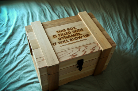
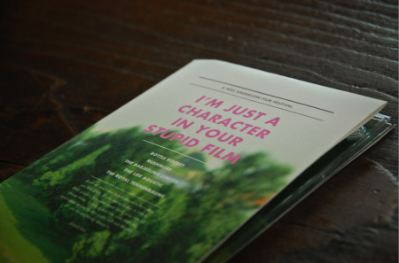
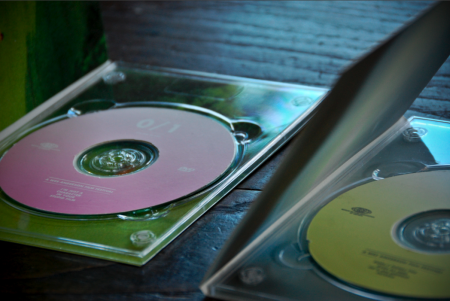
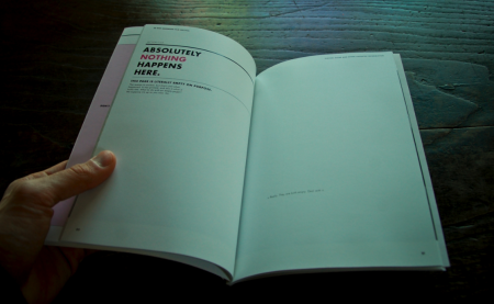
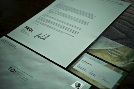
Above I’ve included some of the pieces that I have not written about previously. First is the presentation box which housed all of the other materials for the festival. It was constructed by Wood Box Supply and is branded with an irreverent slogan. I liked this, but still wish I would have thought of something a little funnier. Next is the DVD set which came in a similar wooden box. These were created out of paper folds and a plastic DVD tray. You’ll also see the catalog, which was one of my favorite things to design, as it allowed for the most copy to be written. As usual, no one will probably ever read most of what is contained within, but it was still fun to put together. Next you’ll see the identity system for sending things to and fro, and which classified my rank as ‘marginally important person.” The rest of the project, in its entirety, can be seen here.
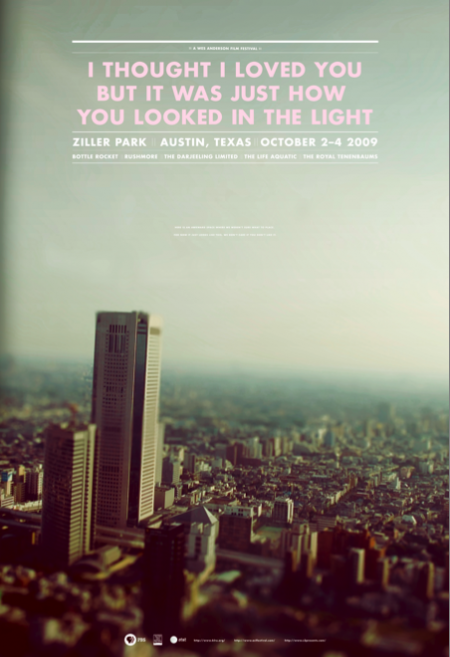
The last image is one of the final versions of the poster (there were many color variations). This was one of the first things I designed for the project. After I completed the rest of the system, I really didn’t feel like the poster fit as well with the other elements. The photograph, especially the dominant color palette, didn’t mesh very well with the warmer tones at work elsewhere. I was aware of this as I worked through the rest of the system, but had unfortunately already printed the poster very early on. It can be a real nightmare printing at the end of the semester (due to the student rush at the vendor), and I always try to finish early and get the printing out of the way if possible. In this case, I would have liked to switch out the photo for something more consistent with the rest of the project. I really had a hard time seeing my picture of a Tokyo skyline (tilt shifted as it may be) conjuring Wes Anderson.
Given that the photograph didn’t really feel like the festival, I tried to at least bring it a little more on brand with the language used. The original title of the poster was “I love you too but I’m going to mace you in the face”, a line from The Darjeeling Limited, but this was determined to be “too violent” and I changed it to a Fall Out Boy lyric that possessed the same dry wit. This title fit with the rest of the identity marks and I was happy with the tone it set. The last issue was finding an appropriate text lock up to fit in the sky section. Eventually I settled on one that didn’t fill out the whole space. In the empty area below I wrote “Here is an awkward space where we weren’t sure what to place. For now it just looks like this, we don’t care if you don’t like it.” That made me laugh and I figured it was as “Wes Anderson” a solution as I could muster. It was that or leave it blank, but on a 30″ x 44″ poster, there needed to be something there. I like the poster as a stand alone piece, but as part of the system, I feel like it is the weakest link.
So that’s it, all done! As I’ve mentioned, the project is for a hypothetical Wes Anderson Film Festival and there is no actual event. I got more than a few confused emails after the trailer was posted. So just to be clear, this doesn’t actually exist. If Mr. Anderson is reading this, and would like to actually hold the festival, that would be fantastic for all involved.
It’s hard to believe, but somehow my spring semester is coming to a close this week. The film festival project, which I’ve written aboutpreviously, finally has all pieces completed and accounted for. The last element added into the mix was a festival trailer (shown above). Originally, I planned to create a few more ancillary products to flesh out the brand, but these fell through and I had to move on the trailer option late in the game. I teamed up with my friend Phil Mills, a local actor here in San Francisco, and we set about writing, shooting, and editing the film last Sunday afternoon.
We were allowed to base the trailer on just about anything we wanted, so long as it advertised our hypothetical film festival and carried through the visual style of our brand. There were a multitude of directions this could take; we thought the most fun way would be to shoot a Royal Tenenbaums-esque short, and then just throw as much craziness as we could at it. Phil plays T. Allen Fenway, a fictional character we made up to live in our Wes Anderson film festival world. We wanted it to remind you of Wes Anderson, make you laugh, and eventually turn you on to the festival. The 3rd person narrator, use of Futura Bold for all titles, extravagant setting, and full blown randomness were all utilized to aid in conjuring this look and feel.
The equipment for this project was sort of all over the place. I luckily had a video camera lying around (usually relegated to filming stationary Youtube videos) and I figured I might as well take it out for a real test drive on this project. I used the Panasonic PV-GS250; an older handheld consumer camcorder that doesn’t have much in the way of image quality, especially compared to the newer HD models. I considered renting a Panasonic HPX-170, but was deterred by the expensive daily rental rate. I figured I’d make it work with the little guy and try my best to fix things up in post. I had also recently purchased a continuous tungsten lighting kit and this helped with the indoor shots greatly. (I am planning to do a post on video lighting after some more tests.)
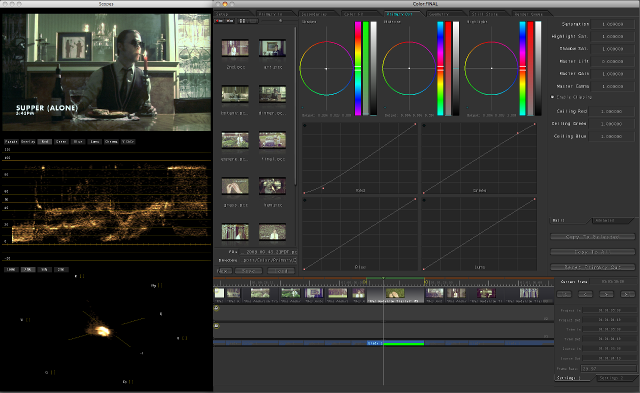
I edited this project using iMovie ’08, the disastrous upgrade to iMovie HD. I had never used the upgrade before and was very disappointed to find that the program had basically been downgraded into an almost unusable trainwreck. (No waveform mixing!?) I had to stick with it, for the increased flexibility with titles, but it was not a pretty sight. Once the project was edited and all cut together, I procured Final Cut Pro (sadly too late to edit with) and Color. I sent the final output through Color and it was a great help in getting the trailer to look the way it does. Color is an amazing application and I feel like I just scratched the surface of its capability. It basically provides the same color editing functionality you have in Photoshop for still images, but for video. I worked on each shot individually, and first tried to clean up the stale color the camcorder captured, and then tweak it just enough to provide that timelessness of Wes Anderson films. Of course, the program’s power is limited by the image quality of the camera, so some edits weren’t possible without destroying the integrity of the image. (Exposure or saturation edits for example looked terrible.) The basic color editing functions (below) were enough to give the final product the look I was hoping for.
I had done a few test shots and some basic story-boarding prior to the shoot, but we were pretty much shooting from the hip the whole time. Phil is a great actor and he knew exactly what I was going for with this project. As we are both avid Wes Anderson fans, we didn’t have to do too much in the way of research or planning prior to the shoot. The order in which we completed the trailer was probably completely backwards (we wrote it after we shot it) but it ended up working out and provided us with many a happy accident. Despite the fact that this part of the project was not “graphic” design in the traditional sense, it was definitely the most fun, and my favorite part of the semester.
A while ago I mentioned a project I was working on for class regarding a film festival. The project is about halfway done at this point and I thought I’d post a little (tiny) bit of what I’ve been working on. The project is to create a hypothetical film festival centered around a director of our choice. We are to design all of the collateral that would support the festival; posters, catalogs, tickets, schedules, signage, products, a website, trailer, and DVD packaging to name a few. The style is to be reminiscent of the director, but we are not meant to copy the existing visual branding that surround the films.
As Wes Anderson is my favorite director, I decided to create my fictional film festival surrounding his work. His films are packed with beautiful imagery and all adhere to his very distinctive visual tendencies and style. Of all the directors I was considering (Gondry, Allen, Fincher) his work seemed to have the most exciting/appealing visual possibilities. I started out with a much different approach than what you see above, and was mainly just taking pictures of random objects and curiosities and slapping type over the whole thing. My first directions were really bad, fantastically terrible even. I was pretty much just poorly recreating shots from some of the films and not inserting any additional concept to the look and feel. (I’ll post some of these earlier directions in later process posts).
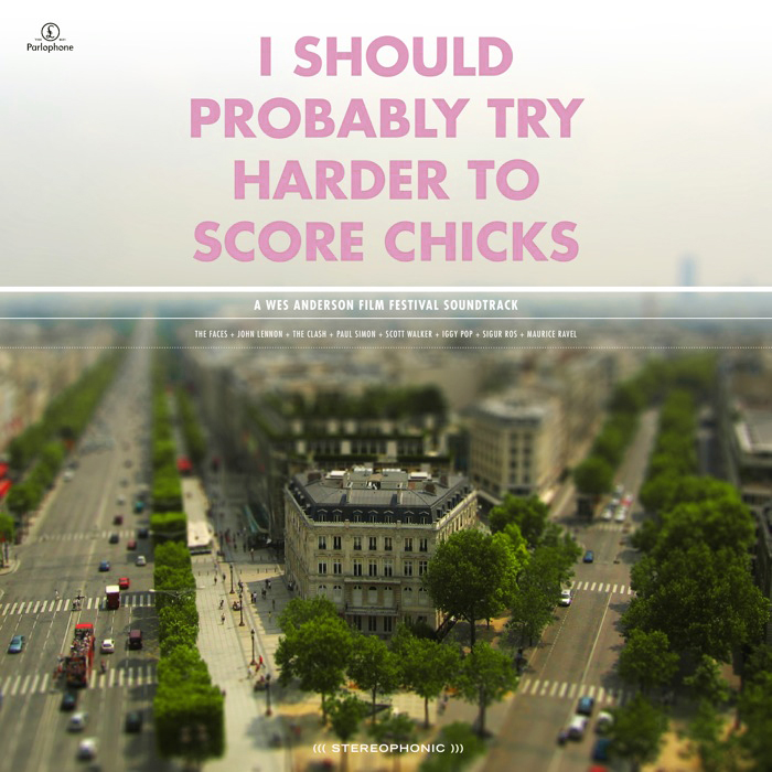
The direction I eventually landed on, and what you see a piece of above, was a combination of tilt-shift photography and Anderson’s typeface of choice. The use of Futura Bold is a direct tip of the hat to his style. I figured I needed to have at least one direct visual link, given that my image style was much more divergent, and Futura Bold would be immediately recognizable to anyone familiar with his work. The concept behind the tilt-shift choice was based on the observation that all of Anderson’s films seem to take place in a parallel social universe where people say what’s on their mind and things unfold in most peculiar ways. Anderson, being the auteur that he is, sort of curates this whole crazy universe. The tilt shift look, in addition to being visually captivating enough to grab attention, is meant to conjure this image of Anderson overseeing this unusual world that exists in his films. I have been tilt-shifting my own photography so far, with fairly successful results, and it’s been a fun technique to learn. I try to use my own photography whenever possible, and find the “Flickr look” (as in people sourcing images on Flickr) that pervades most projects at school exceptionally irritating. It’s hard to generate your own imagery for a project this big, especially if the concept is unusual, but I feel much more proud of the end result when everything is of my own creation.
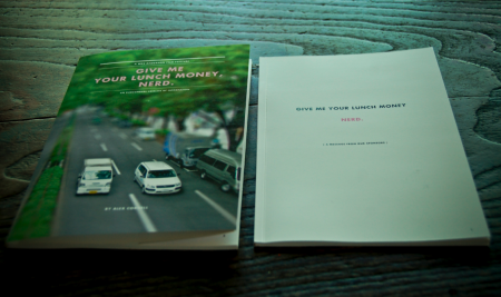
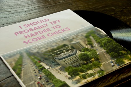
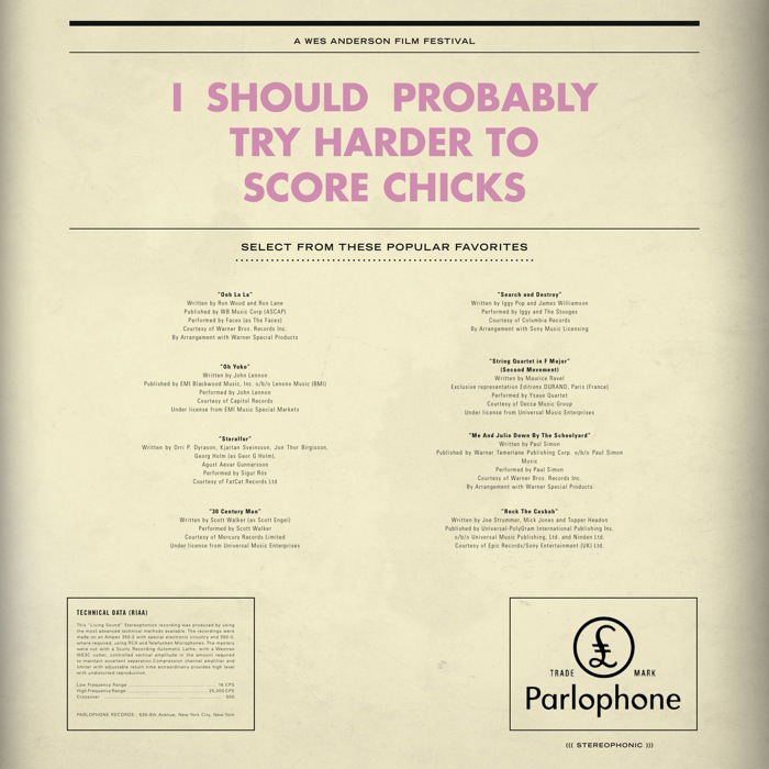
The centerpiece of the project is meant to be the logo. We spent the first couple weeks coming up with logo treatments and titles for our film festival (Just calling it the “Wes Anderson Film Festival” was not allowed). For my project, I have neither a title or a consistent logo mark. The logo and title unfold throughout my project, and are consistent in their type treatment and ridiculousness of the language. For example, the title of the LP above is “I Should Probably Try Harder to Score Chicks,” a line from Rushmore. The “logo” that appears at the top of the main film poster is “They Were Giving Each Other Handjobs While You Were Taking a Nap by the Pool.” When you see a lot of pieces of the puzzle, the lack one mark is not evident because the consistent type treatment and language tie everything together. It’s also fun to have super random sentences gracing the front of all of the work; makes for a much more humorous project.
Above is just one piece of the massive project that I am attempting to put together. It is a soundtrack of songs that are either in some of the films, or feel like they might be, and is still very much a work in progress. Having landed on a image/type style, with about a month to go, my motivation has trickled to a crawl. The hardest thing for me is conceptualizing what the project will look/feel like, and once I have this locked down (and it’s just a matter of applying it to all the different formats), I lose a lot of interest in what I’m doing. I’ll kick back into gear soon, and hopefully will have more pieces to show in the weeks to come.