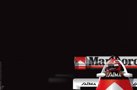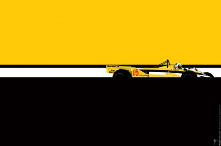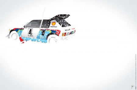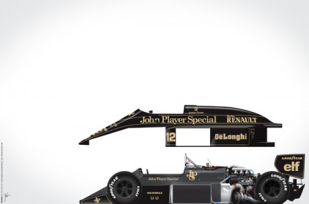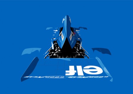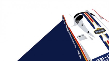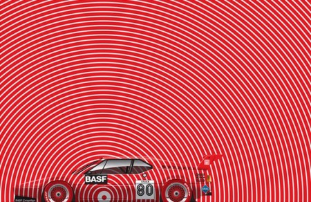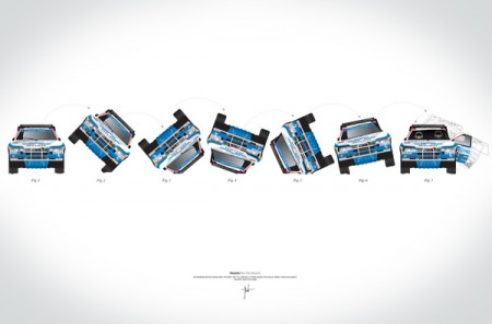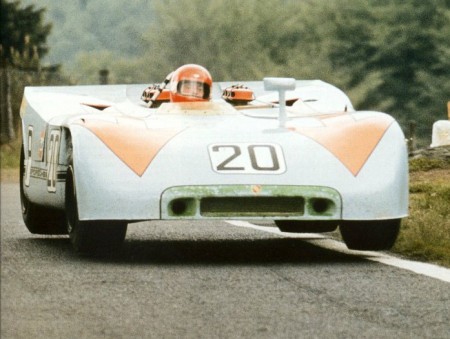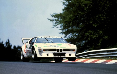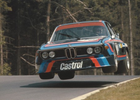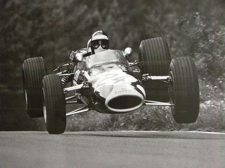


“Car art” is always a contentious subject for me, there’s alot of cartoonish colored pencil stuff out there that Road & Track likes to pass off as “fine art”. If there’s one thing i’ve tried to showcase in my livery posts, it’s that the geometric body of the car itself makes for a great canvas.
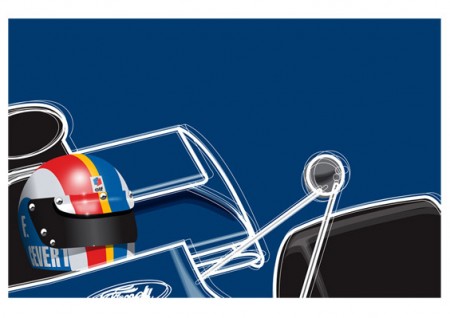
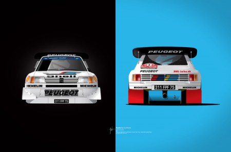
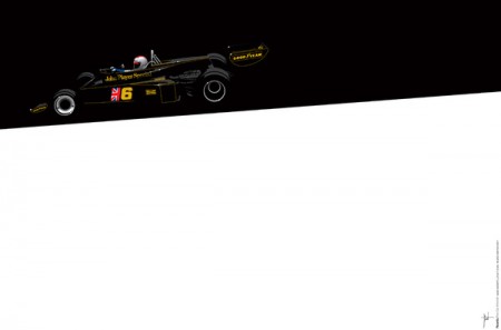
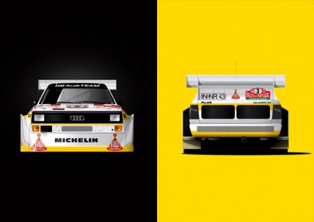
Earlier last week, fellow car porn addict (although he gets paid for his addiction) Jim Lau sent me the innocuous “you’ve seen this, right?” message. Above are some examples of Ricardo Santos’ work, and I think they’re absolutely fantastic. You’ll notice some farmilar ‘faces’ from alot of the car posts I’ve done here on the blog, needless to say I’ve solved the problem of hanging up pictures of cars on my wall without looking pubescent.
These prints all come in a variety of sizes & formats, the stretched canvas is barking at me and the moths futzing outside my window will soon find a nice warm home in my wallet. You can find all of Ricardo’s works seen above over on his Society 6 page.


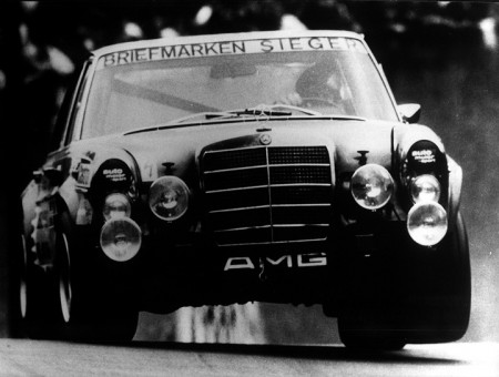
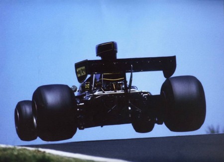
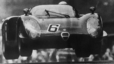
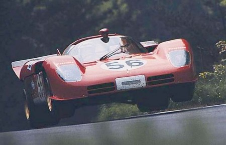
There was once a time in motorsports when race tracks were not hermetically sealed 3.5 mile circles. Many of them were run on complex strings of open roads including the likes of Spa, the Targa Florio, Le Mans, & Hockenheim. The word “run off area” hadn’t been invented yet, the cars were insanely powerful, had very little grip, crashed often (usually going 150+mph) and drivers died frequently along with spectators.
For over 50 years, the pinnacle of viewing this ludicrous display of carnage was a track hidden away in Germany called the Nurburgring Nordschleife. It is a 14 mile, 160 turn beast of a road built as a test track in the late 20’s by German auto manufacturers in order to test the extremes of their vehicles. And oddly enough, it’s open to the public.
Trying to describe the experience is fairly pointless, to drive around it quickly is to wrestle for your life at every corner. Most of the turns are blind, off camber, and the radius decreases as you get further in, with all three of these characteristics having uphill and downhill variants on constantly changing surfaces. The track is so large that it is often raining on one sector and completely dry on the rest, making tire choice that much more of a gamble. Most drivers who have set lap records seem to agree: it was the scariest 7-10 minutes of their lives.
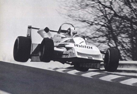
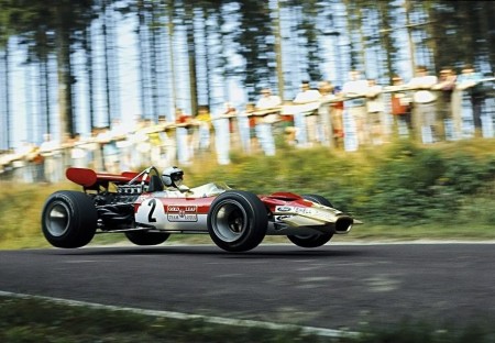
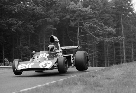
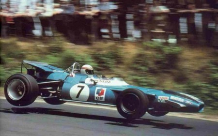
Two particular sectors within the circuit [pictured above] used to produce a fair amount of drama, Quiddlebacher Hohe and Pflanzgarten. The first is a short downhill/uphill straightaway that used to crest so abruptly, most cars would get all 4 wheels off of the ground (especially in qualifying) in an effort to maintain speed through the long sweepers ahead. The latter is a truly frightening downhill heart-stopper with a steep dip that drops the car about 6 feet in less than a second, if you’re not careful you’ll damage your suspension and body work. Both were gradually leveled off over the years, and since Formula 1 moved across the fence it has been less of an issue. Needless to say, I still laid up the rental a bit approaching both.
-Rory


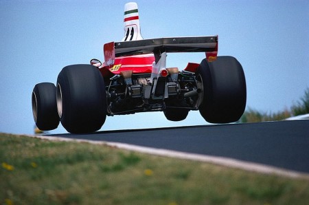
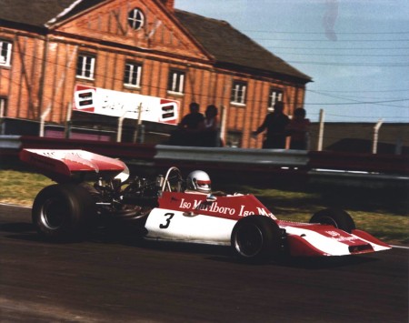
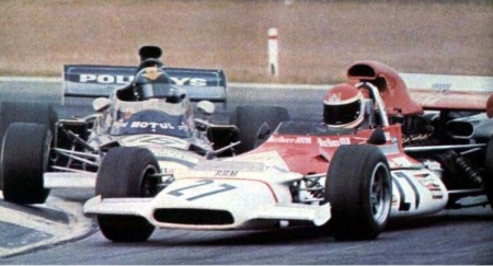
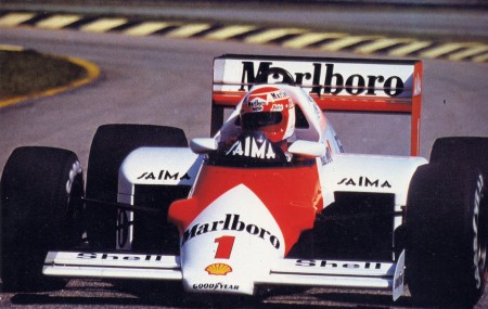
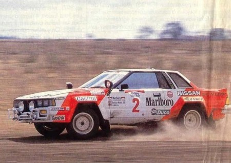
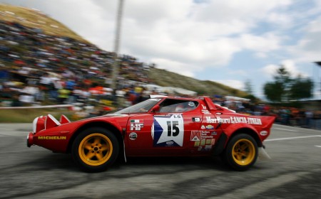
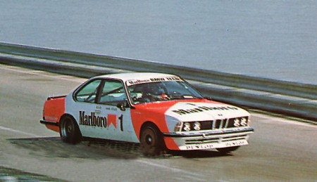
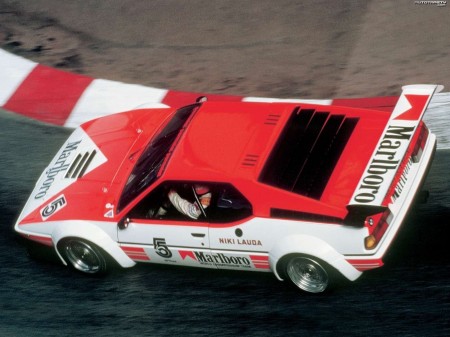
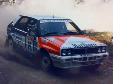
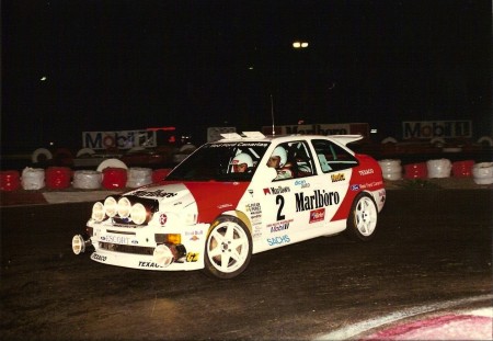
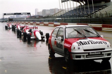
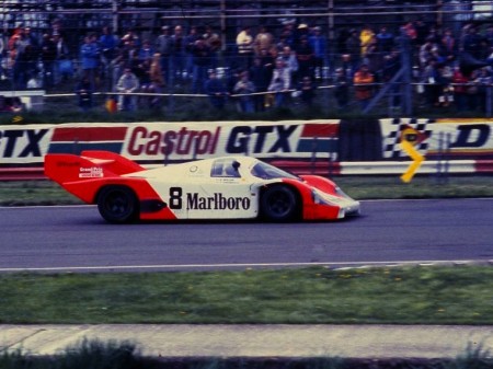
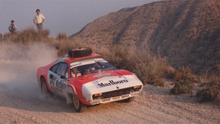
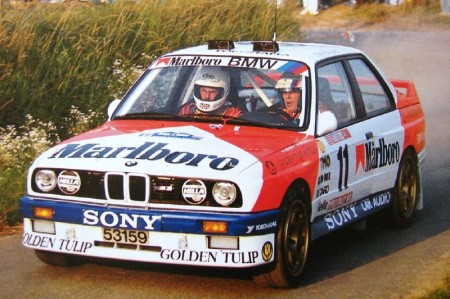
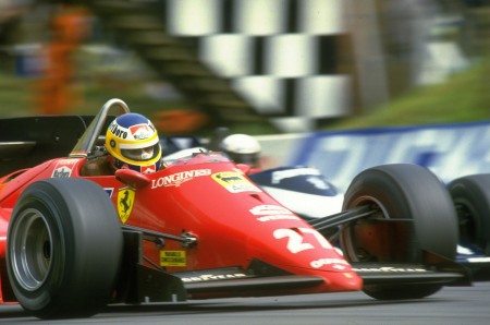
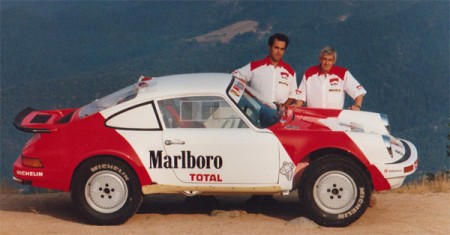
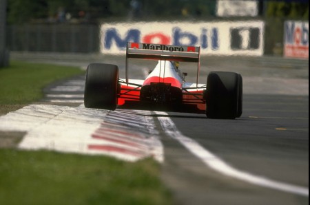
Until the semi-recent ban of alcohol & tobacco advertising in motorsports, cigarette manufacturers spent heavily in racing sponsorships. Marlboro was no exception, in fact they probably spent more than every other brand combined.
They are probably best known for their involvement in Formula 1, starting with BRM in the early 70’s, moving to Mclaren in the 80’s, and finding an eventual home with Ferrari, whom they still sponsor today (some say subliminally…). Phillip Morris is a hugely profitable company and it is no coincidence that their endorsement of a team has historically resulted in a winning car.
Their bold red, white, and black branding is visually synonymous with many iconic race cars, and as evidenced in the pictures, they had their hands in nearly every reach of the sport. I understand the need to limit mass advertising of a deadly product, but I do miss their colors in racing. I’ve always loved the Marlboro logo, the type is perfectly balanced with the simple geometry above it and it always looks great on the front of a badass car.
-Rory

