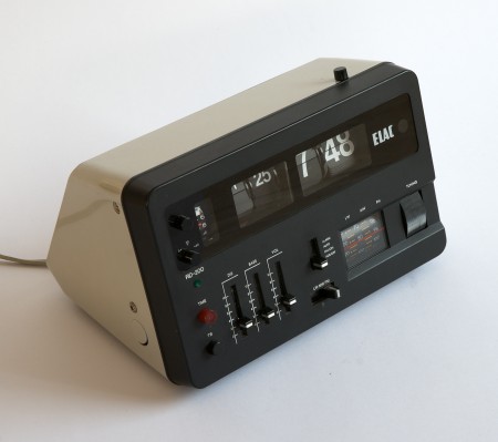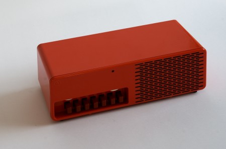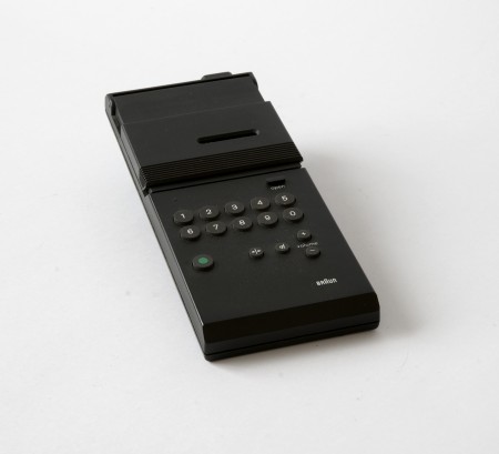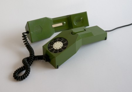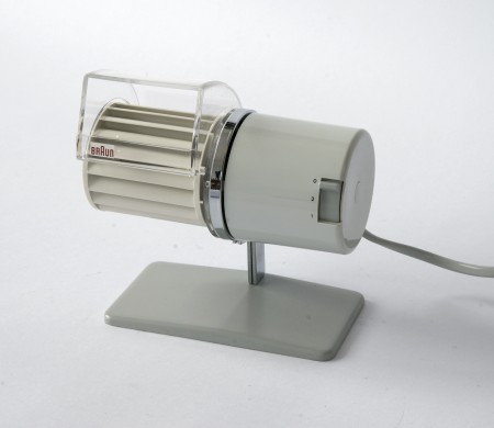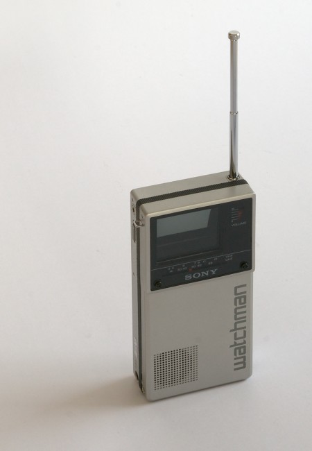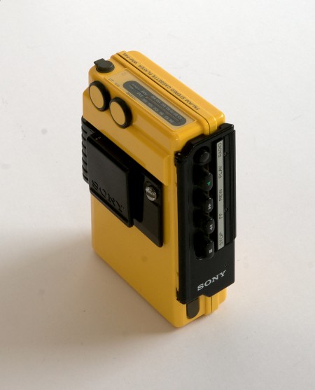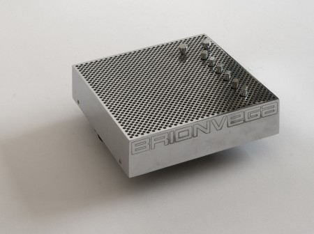


So apparently there is this guy in Switzerland who either owns or has access to many of the most iconic product designs from the 60’s and 70’s. He also takes amazing pictures of them, and posts them in high resolution for us to enjoy / print. This man is a hero.
I always wonder though, would having these artifacts make me happy? Would being surrounded by the objects of my desire actually fulfill my need for order and beauty? Or would I obsess; constantly dusting and arranging them symmetrically on walnut desks made by George Nelson? Probably all of the above, but for now one can only dream.
Whenever I get to lusting over design like this I start thinking about the nature of appreciation. What abstract facet of the human condition allows us to seek and covet objects which may not necessarily provide any meaningful function or benefit our daily lives? I can’t tell you how many fellow designer’s homes I have visited to see various defunct or otherwise unused products neatly displayed on shelves, never again to serve their intended purpose. Why do we surround ourselves with these relics? Devices which through some perverse twist of fascination have been stripped of their intrinsic usefulness and rendered as some fetishized monument to our personal design sensibilities, gathering dust on a mantle.
That’s probably reading way to deep into things so I’m going to take the easy answer and say it’s simply the act of art appreciation. There is just something about the fact that these were originally designed as functional objects that throws a wrench into the whole concept of approaching them purely as works of art. At any rate, I want every single thing up there, in my house, now.
Design Icons by Afghtiga


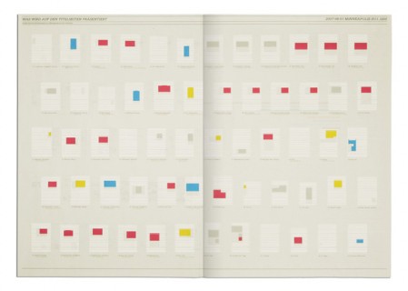
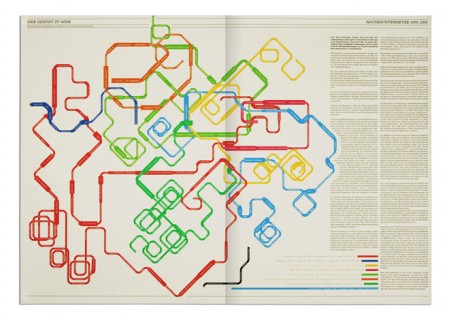
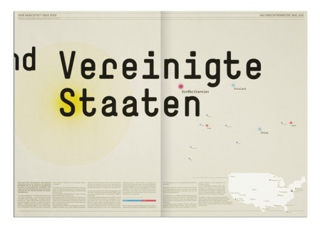
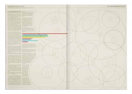
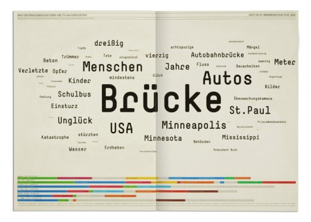
Overnewsed but Uninformed is a collection of infographics and by Stefan Bräutigam. When I first saw the title, I misread it thinking it said Overnewsed and Uniformed, which could also have made sense strangely enough. As it is, Stefan point is something we all can relate to: feeling overwhelmed with incoming “news” while actually learning nothing at all. At least that’s what I can gather, some may be lost in translation. Either way, the design is pretty brilliant.
via information aesthetics

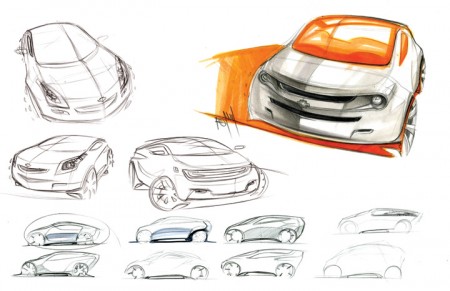
Spencer Nugent posted an interesting article on the Levels of Sketching over on IDSketching (that’s his image above). I don’t know a lot about industrial design, or the complex role sketching appears to have in the field, but I was really interested to read a little more about it. What came to mind immediately was the sketching process we are constantly encouraged to go through at graphic design school. I am always terrified of this part and try my best to avoid it (which is impossible). Of course, though the role of the sketch is different in this case — as it serves as a rough internal mock up rather than a deliverable for a client — it’s importance remains of a high level (for a number of reasons, many of which Milton Glaser explains in this video that’s been floating around the last couple weeks).
The sketching process for the project I mentioned a while back has been pretty intense. Recently I’ve been working through countless concepts and designs, sketching my hands off. I was lucky to figure out my direction/concept early on, but it’s taken me forever to figure out the right way to render it. This has meant ENDLESS amounts of sketches and crappy little mock ups. I guess I lack the patience to sketch well, and my process book looks like I was drawing blindfolded, drunk, and with my off hand.
Seeing the way industrial designers sketch, I am truly envious. To be able to render something that detailed and precise, without a computer sometimes, I can’t imagine. Of course, I am reacting this way because I grew up designing with the computer. “Process” to me has always meant keyboard and mouse, not pencil and paper. I recognize this as a potential weakness in my workflow, and have been trying really hard to incorporate sketching into this project. Results have been here and there so far, and I wonder if I will ever be able to develop my sketching ability to where it’s consistently worthwhile.
I know David Airey for one is a big proponent of sketching, and has written many interesting articles on the subject. How do the rest of you feel about sketching when it comes to the graphic design process? When starting a project (especially a logo design for example), do you start with pencil or mouse (or the hybrid, Wacom Tablet)?


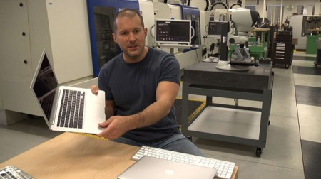
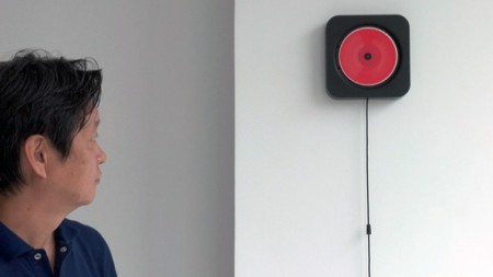
Objectified, the upcoming documentary on industrial design by Gary Hustwit, will be premiering soon at the South by Southwest Festival in March. It will take an in-depth look at the designers and creative processes behind some of today’s most popular objects, and should provide a great introduction into the field of industrial design.
I enjoyed Hustwit’s last film, Helvetica, and I thought it was a great way to give the general public some perspective on the world of graphic design. I am constantly asked what graphic design “is” by friends and family, and it was nice to have a film I could show them that pretty much summed it up. It was also interesting to see how the film’s release affected the use of Helvetica at school. Despite the fact that it was ubiquitous already, students suddenly became afraid of using it at all, for fear of further saturating the design community with more Helvetica, or doing something predictable.
I’m sure a lot of you will have heard of the release by now, but be sure to keep an eye out for a screening in your area. The fantastic Sundance Kabuki Theater, here in San Francisco, will be showing it on April 21st, with a Q&A with Hustwit to follow. More dates and screening information can be found on the Objectified site.


Wired has an interesting article about the new F1 rules and the resultant car designs (McLaren MP4-24 pictured above). It details how new rules for the sport — which many expected to create a significant design challenge — have actually served to beautified the new models. These things are starting to look like they can fly and if it weren’t for the fact that your work would be ruined by about 800 ads, designing the paint for one would be a lot of fun. Check out the Wired article here.
