Capa in Color
Posted by Scott

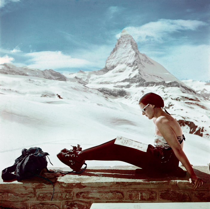
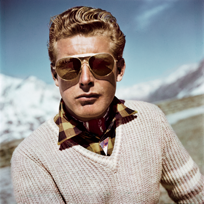
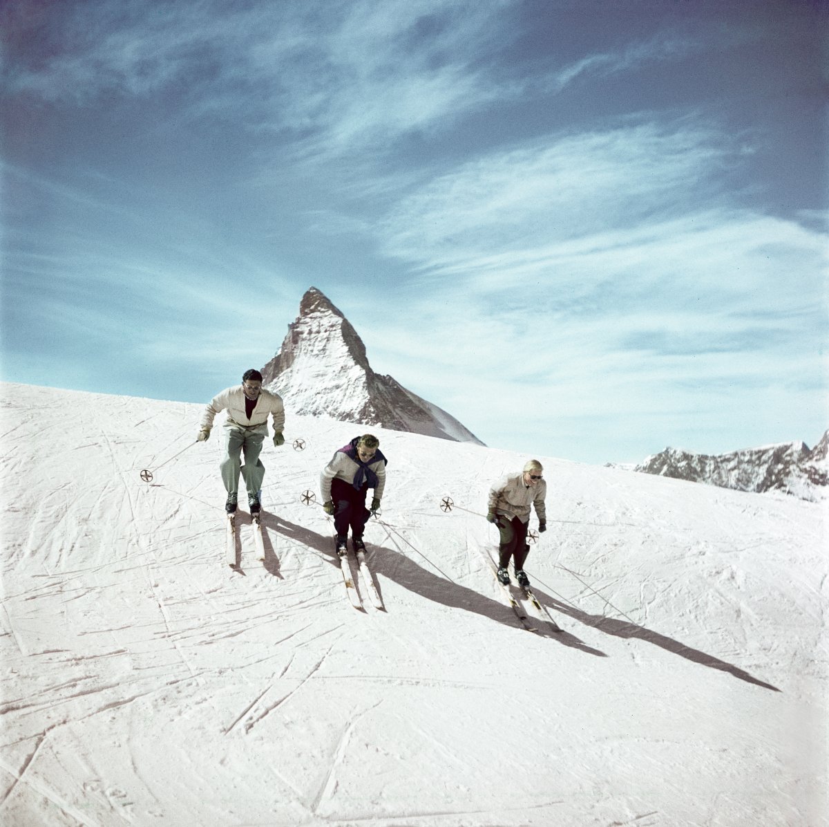
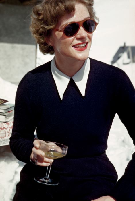
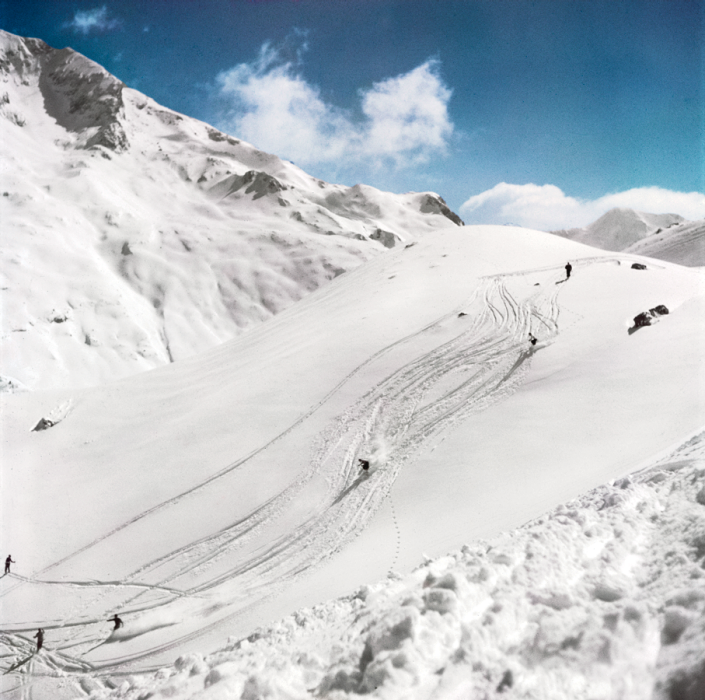
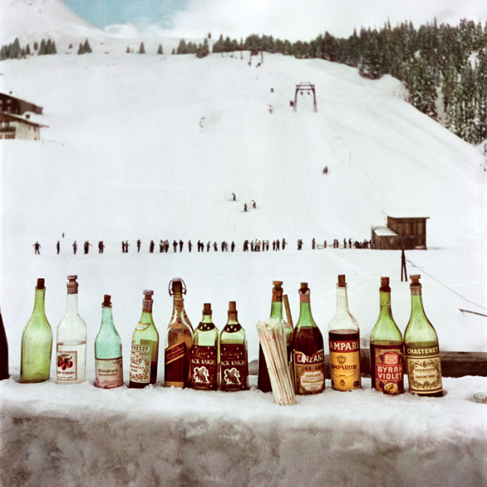
Just in time to remind you there’s no snow in Tahoe this year, it’s Capa in Color. Above are some selections from Robert Capa’s postwar photography of Europena alpine resorts.
Just in time to remind you there’s no snow in Tahoe this year, it’s Capa in Color. Above are some selections from Robert Capa’s postwar photography of Europena alpine resorts.
“The birth of a new color exists”. Well I’m intrigued; I’ve always wanted to see a new color. This video gives you a little behind the scenes look at the Pantone color factory. Be prepared for a number of tasty shots of ink and paper. The video is “to celebrate the release of The Plus Series, the next generation of the classic Pantone Matching System” and was produced by Base.
What would be really cool is if a color was invented that actually *looked* new. Sure they have ‘invented’ lots of new colors, but to the average person, it’s all the same stuffs: green, blue, pink, etc. You show 99/100 people a new Pantone color and they will look puzzled if you tell them it didn’t exist before. What I want to see is a new color that literally doesn’t exist yet. The kind of thing that is so new your mind cannot even comprehend what it would look like because by definition it is impossible. Something outside the spectrum of visible light. Until then, I don’t want to hear about these “new” colors. A little trippy I know, but when the Pantone guy said they invented new colors I got excited.
via Quipsologies.


I’m headed to Tokyo again in May and I’m getting all psyched for bouncing around the city with my camera. I’ve been via-linking my way around photography blogs for inspiration and found Color Berlin, a cool photo set by Matthias Heiderich. They feel like paintings to me — probably due to the heavy saturation, and flat compositional style. I’ve only been to Berlin once, but I don’t remember seeing colors like this! Best keep my eyes open next time. More on his Flickr page.

I only post one image by itself when I think it’s worth it. This one, advertising the Hvass&Hannibal show at the Kemistry Gallery, is such an image. I like the layout, sure, but the main reason I found this so captivating is the color combinations. Each little circle has a different (and often bizarre but terrific) color combination. Each could easily jump off this poster and onto whatever project you happen to be working on (assuming the word “fun” might describe your client…) Pink and green? Why not. Lime and red? Let’s do this. My favorite is 6th row down, 4th across. Reminds me of a Deth P Sun type palette.
Now I’m inclined to think that H&H had everything to do with the design of this poster, but I cannot find the credit information anywhere. It looks like something they would drum up, but if not, let me know and I’ll be sure to link out. If you’re in London, be sure to check out the exhibit! Here is the invitation.


Assorted works by Dutch graphic designer Louis Reith. I really love the texture and the color of the paper he’s working on. I’ve spent hours in Photoshop trying to replicate that same off-white mix; can’t beat the real thing. Even more exciting is the color at work in the shapes — each hue is dialed in exactly where it should be. Some of the forms in the bottom image remind of the typographic stylings of Non-Format.
More info about Louis, including upcoming gallery showings, can be found on his Myspace.