80s VHS Tribute Posters
Posted by Shelby White
Stumbled upon these cool posters by Ahmed Youness. They aren’t actually 80’s vintage but they do look the part.
Via Designspiration
Stumbled upon these cool posters by Ahmed Youness. They aren’t actually 80’s vintage but they do look the part.
Via Designspiration
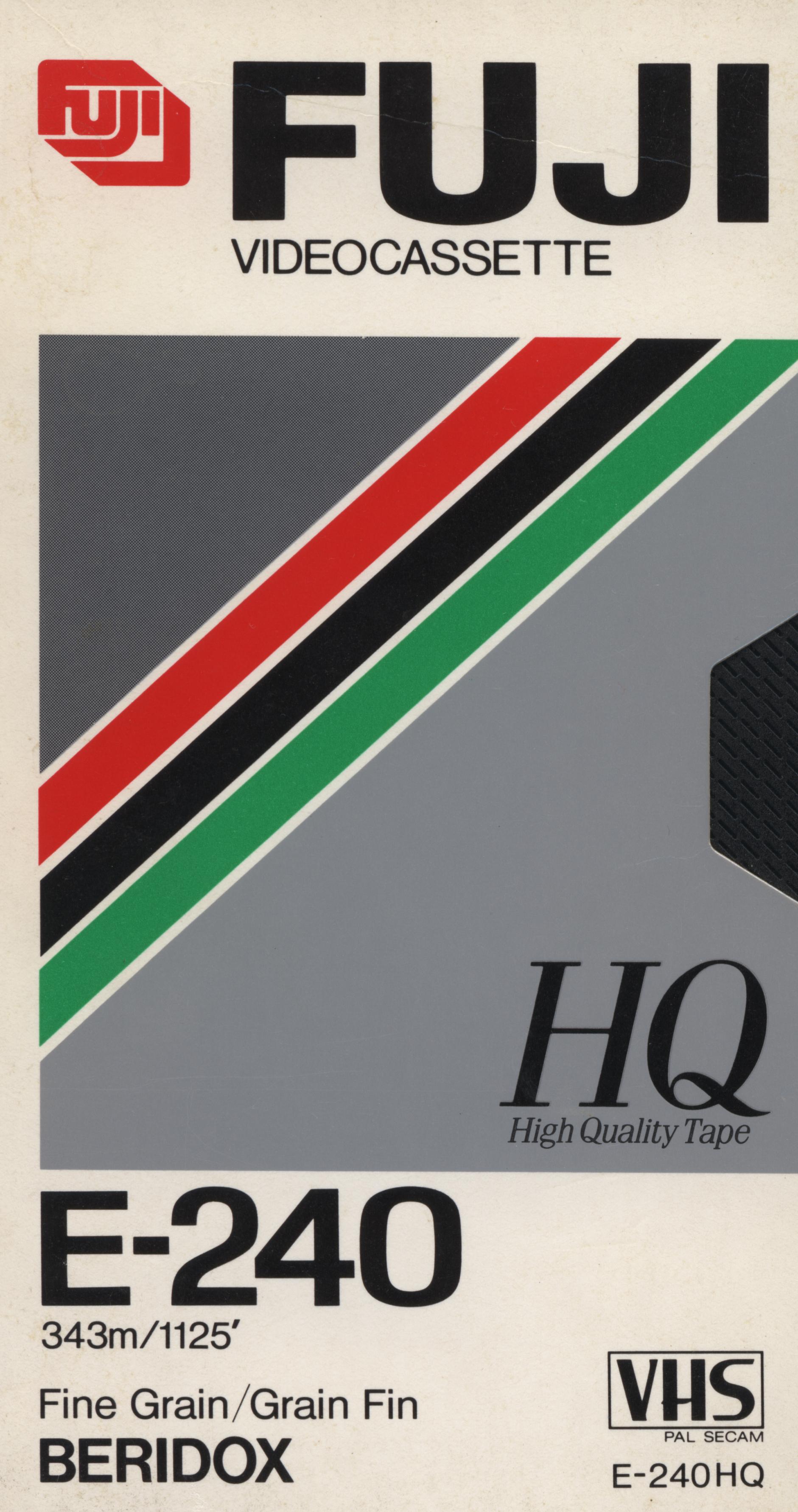
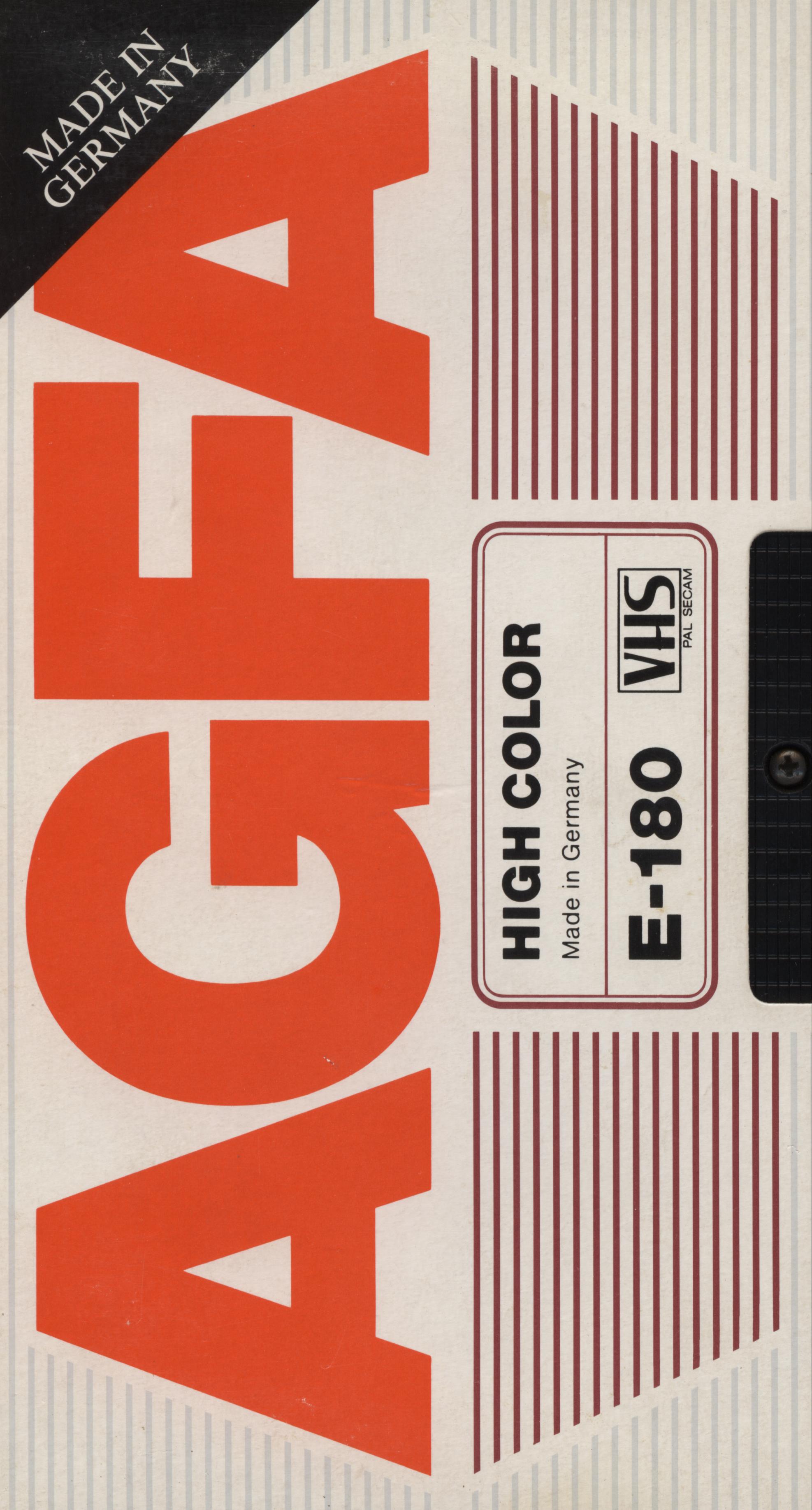
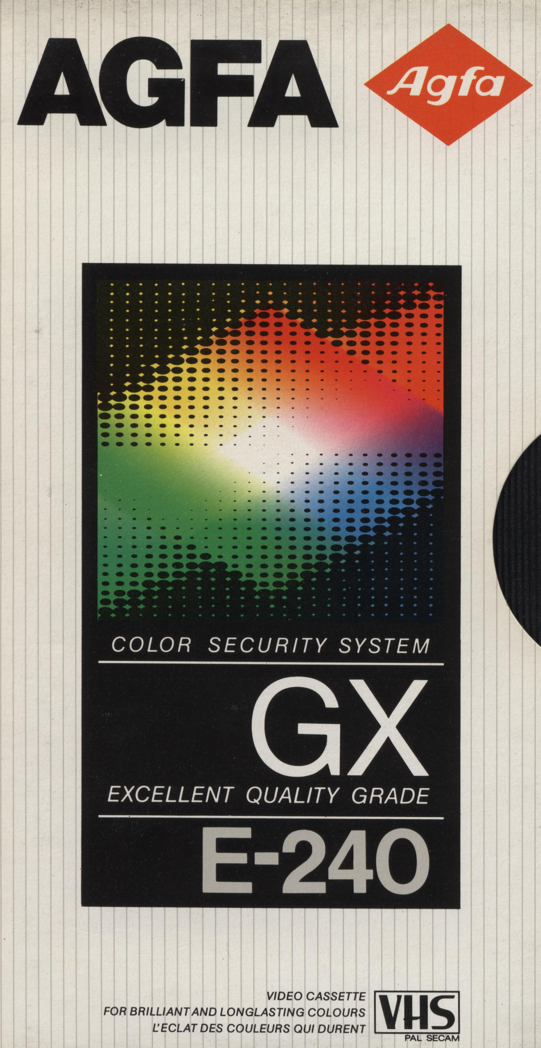
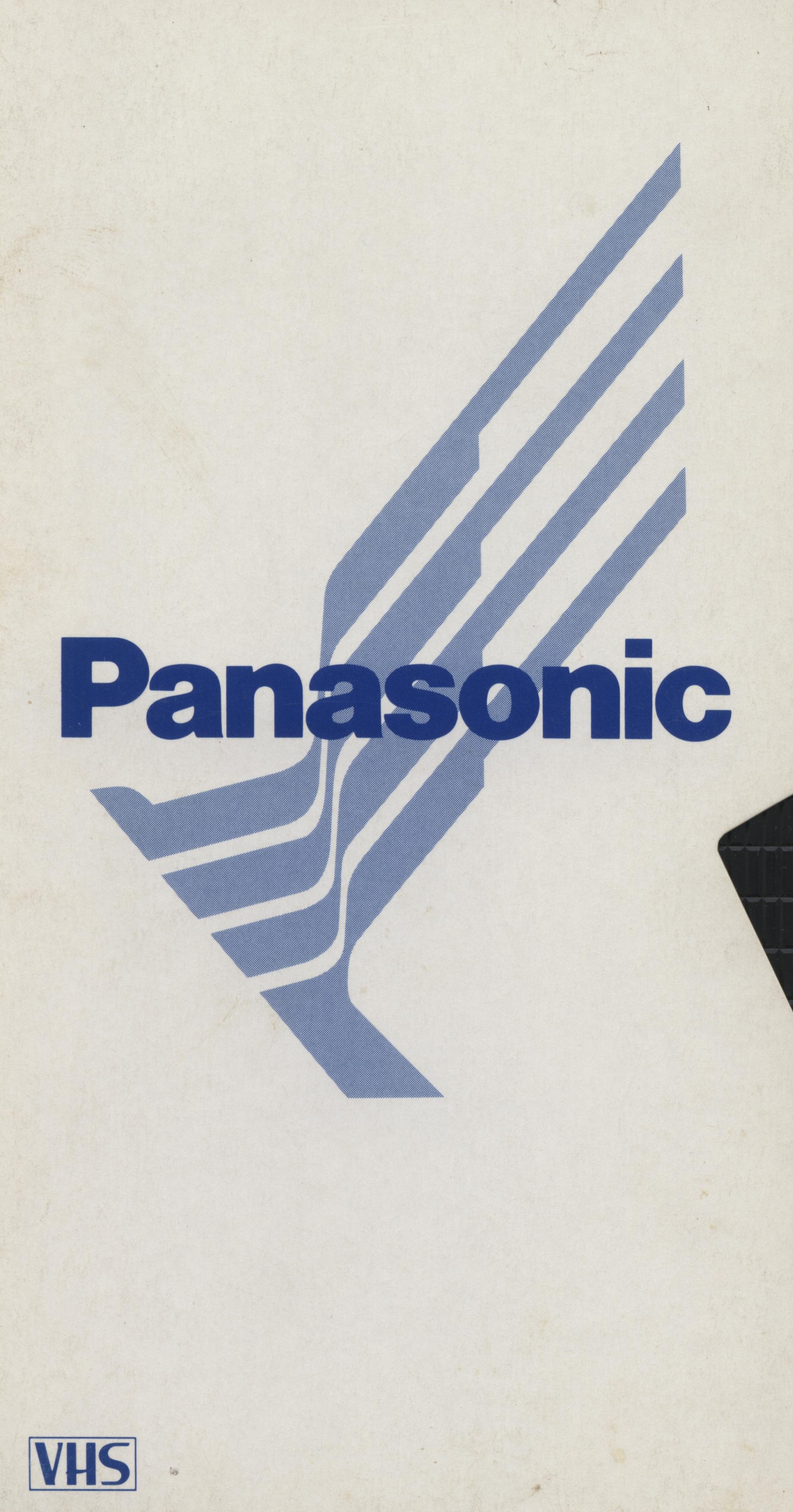
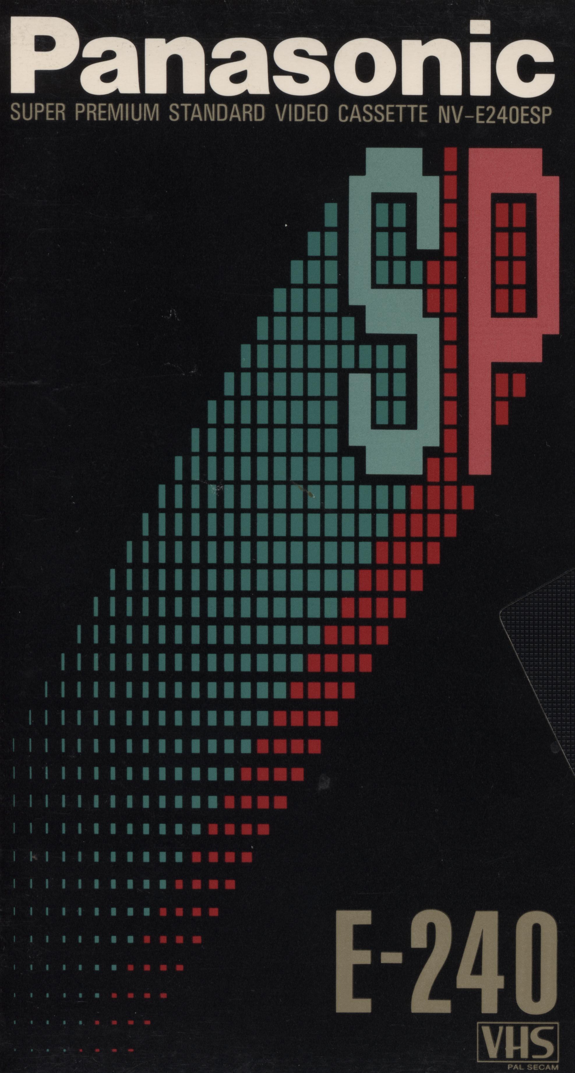
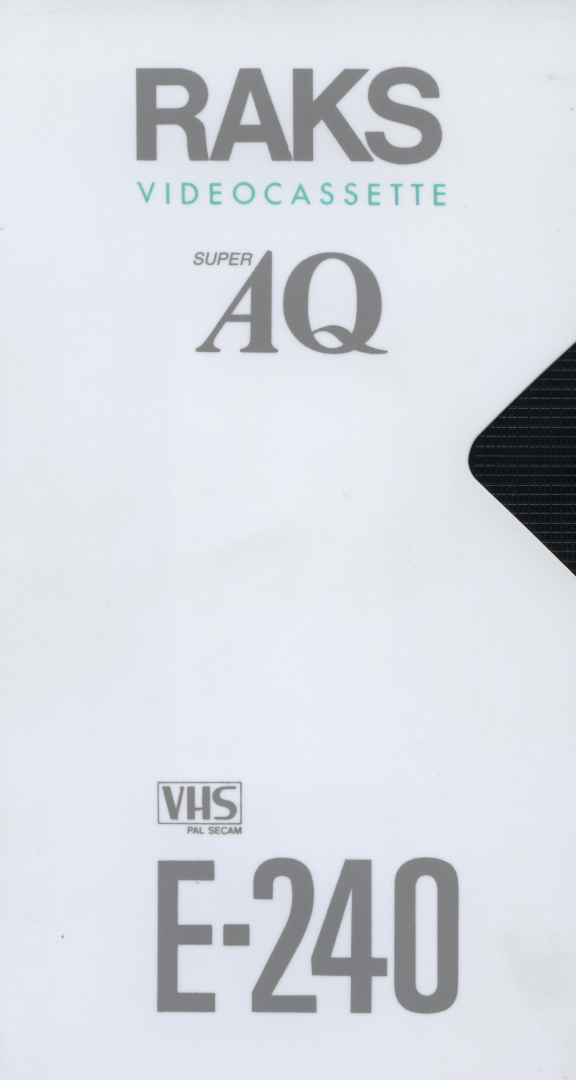

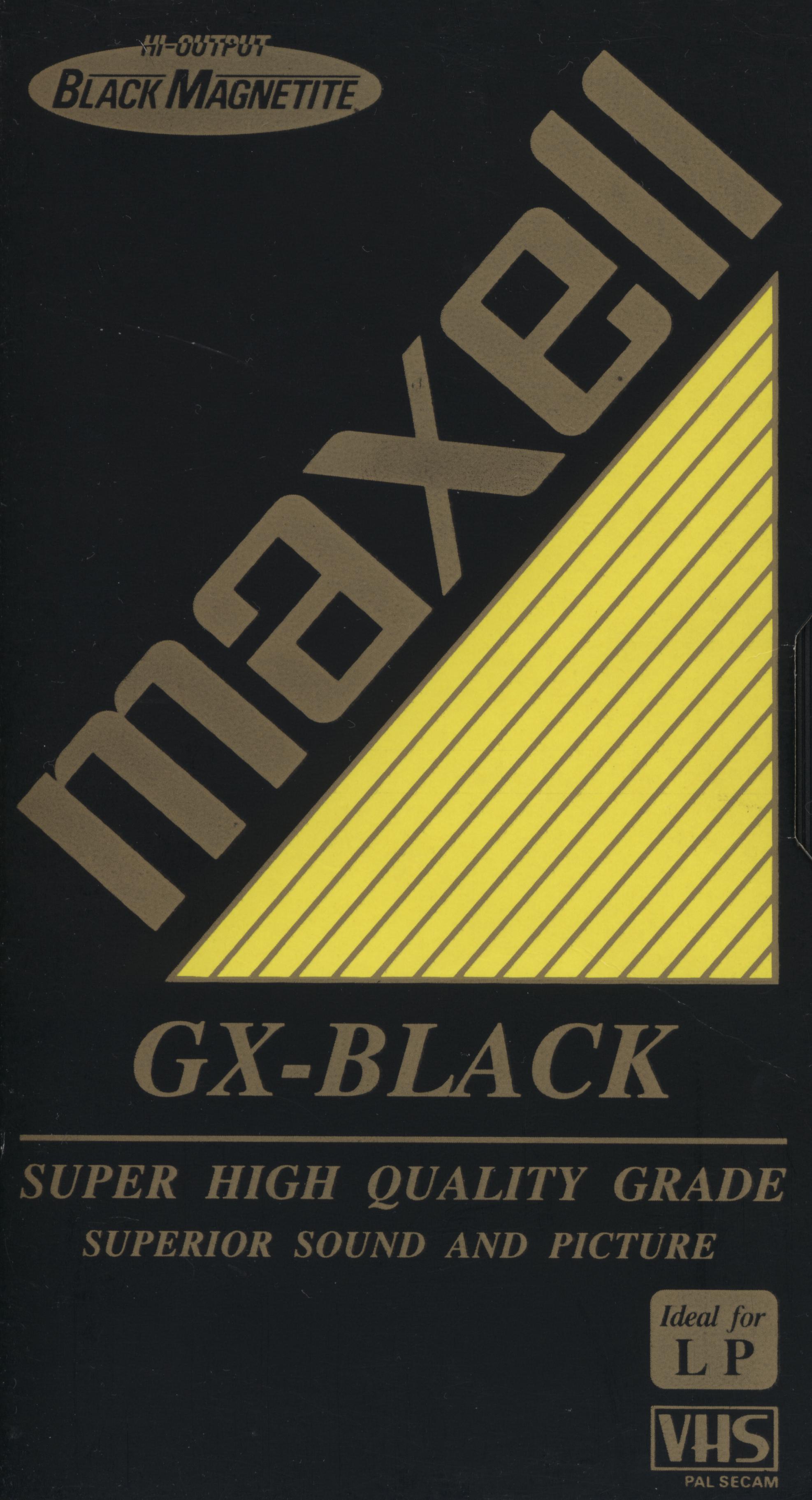
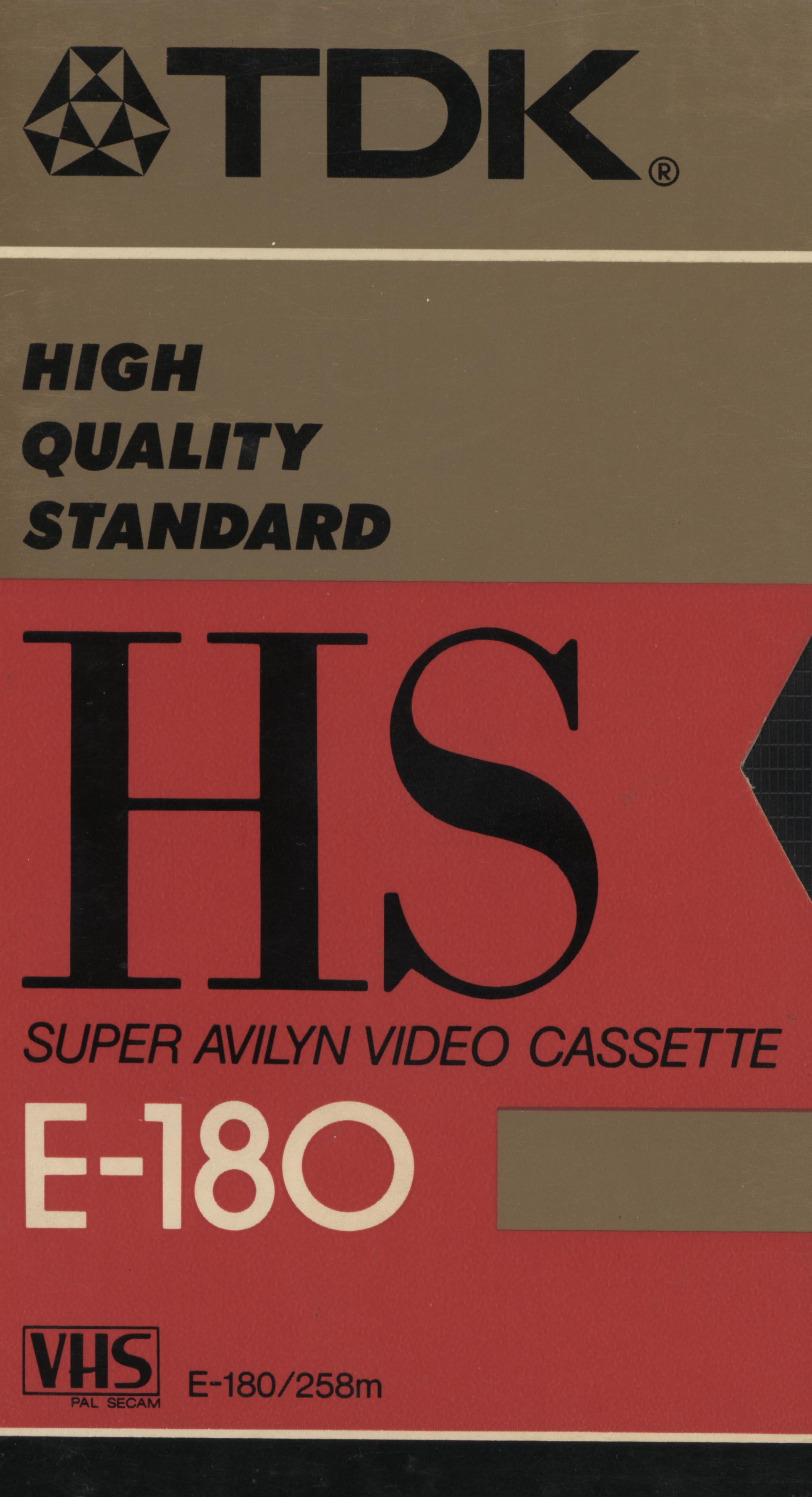
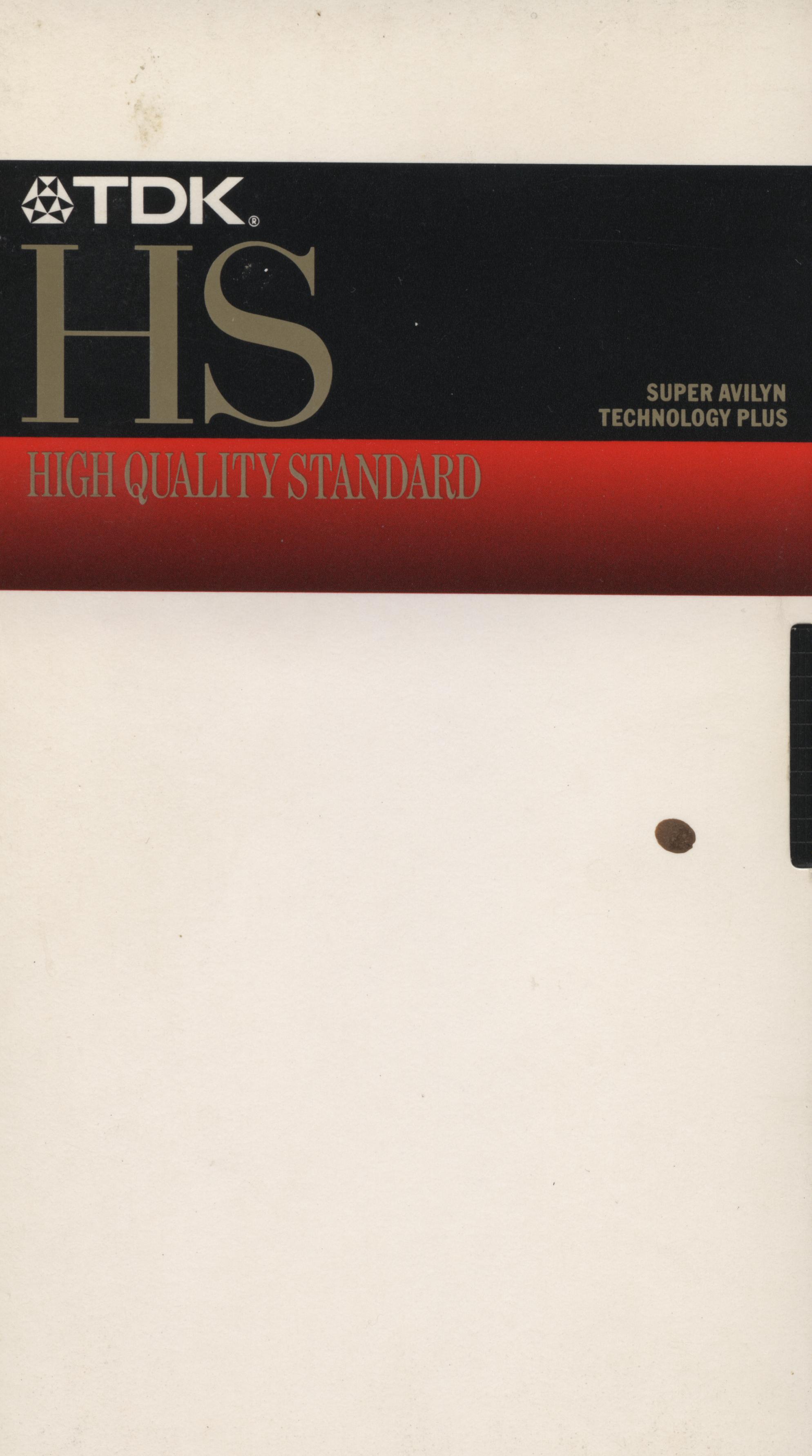
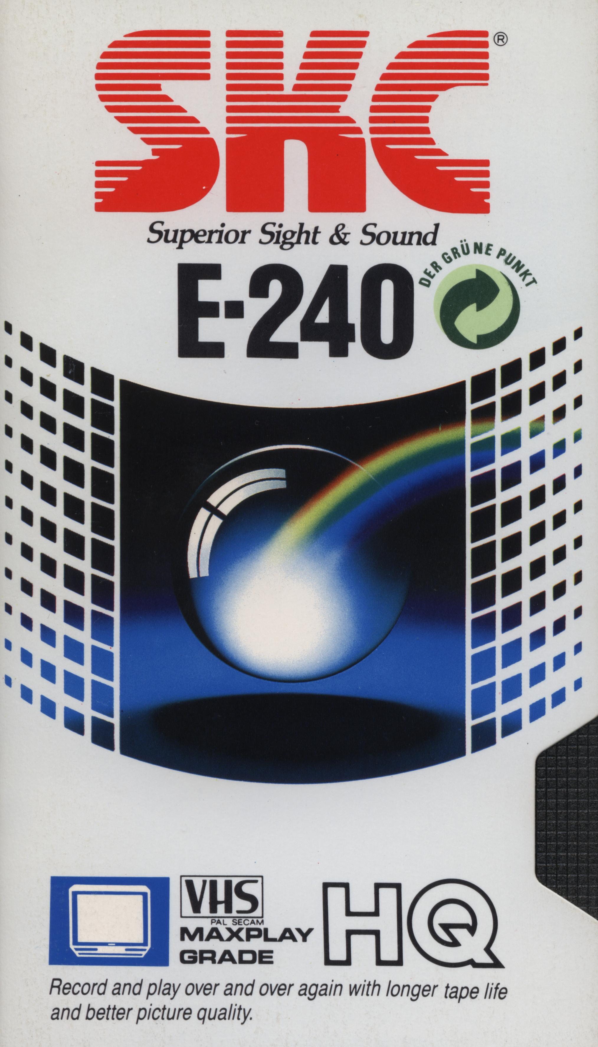
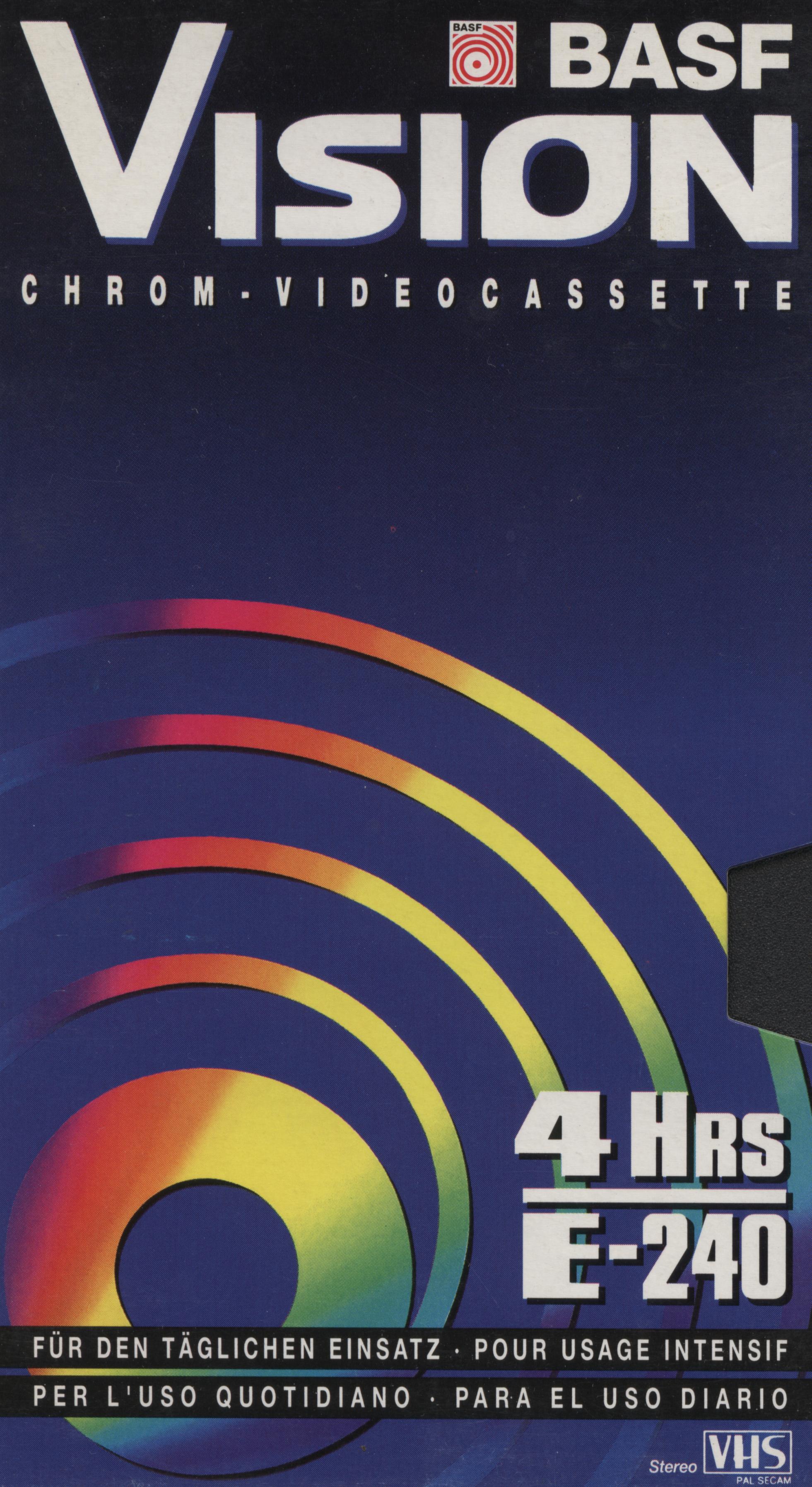
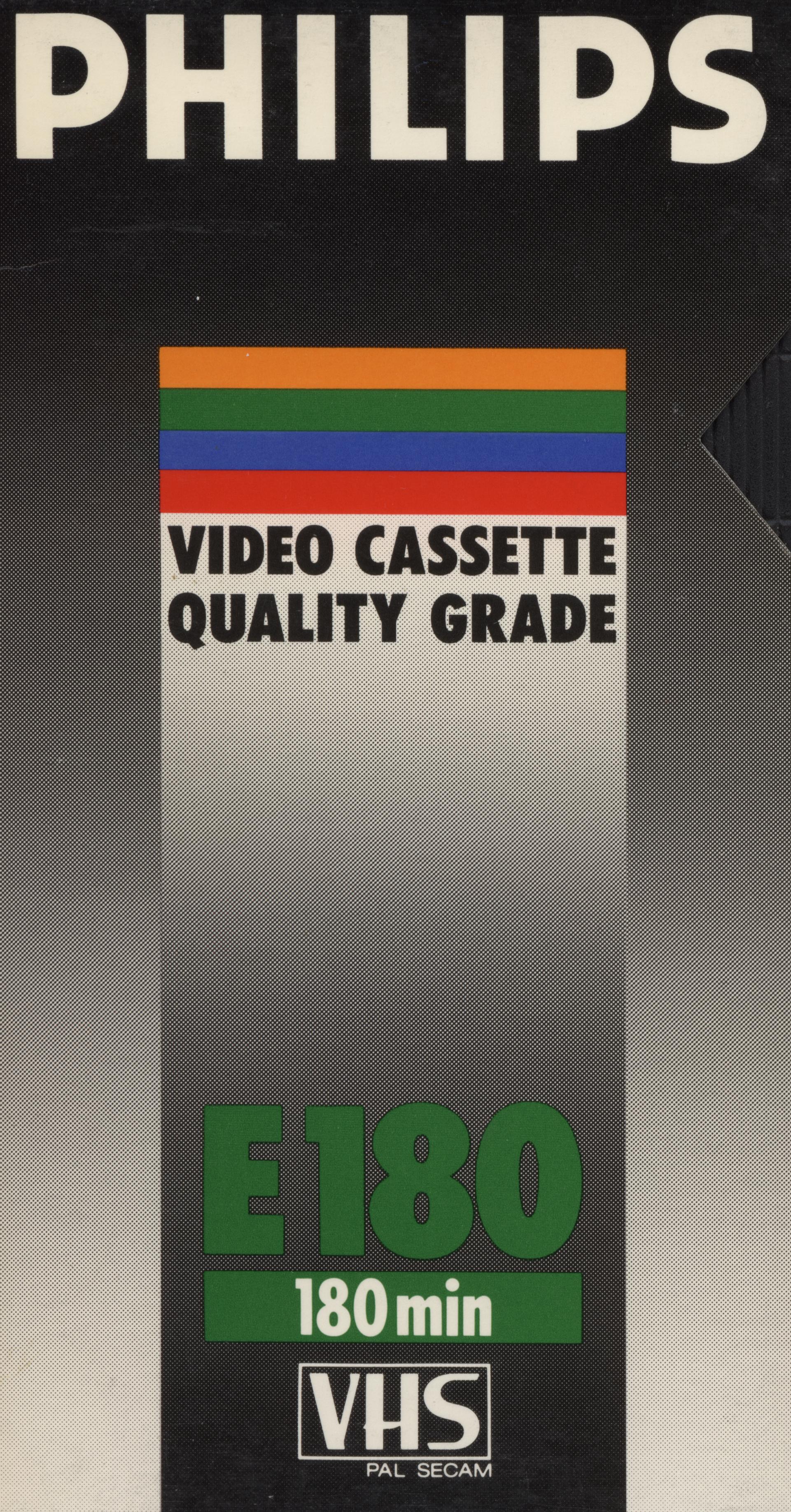
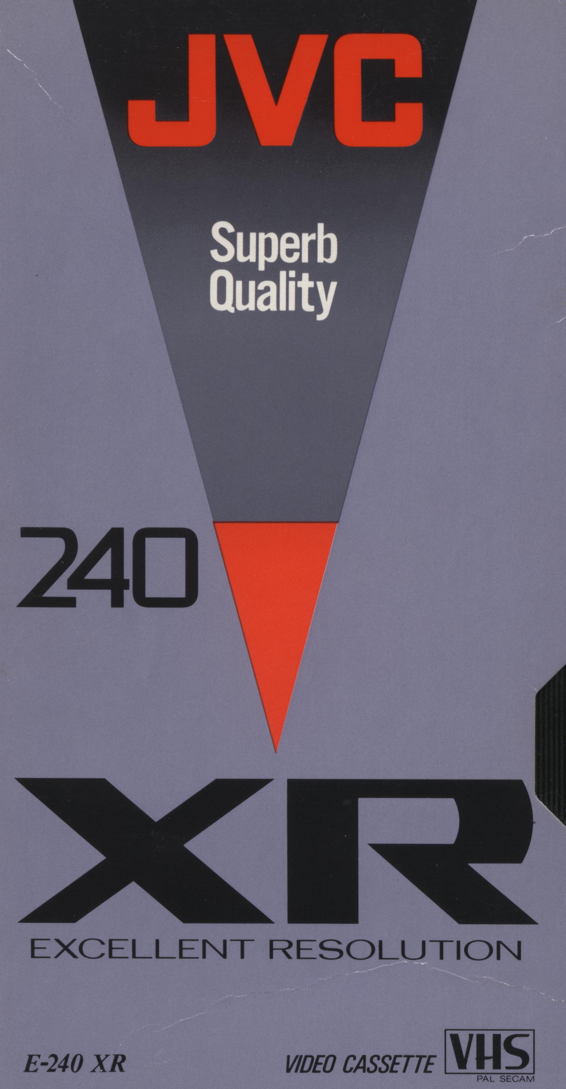

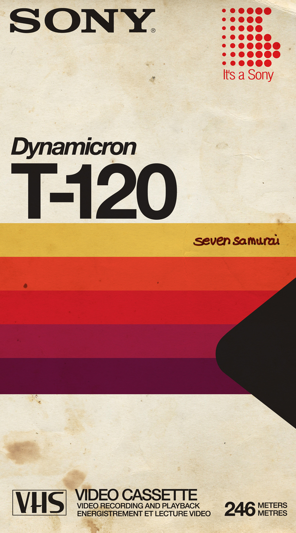
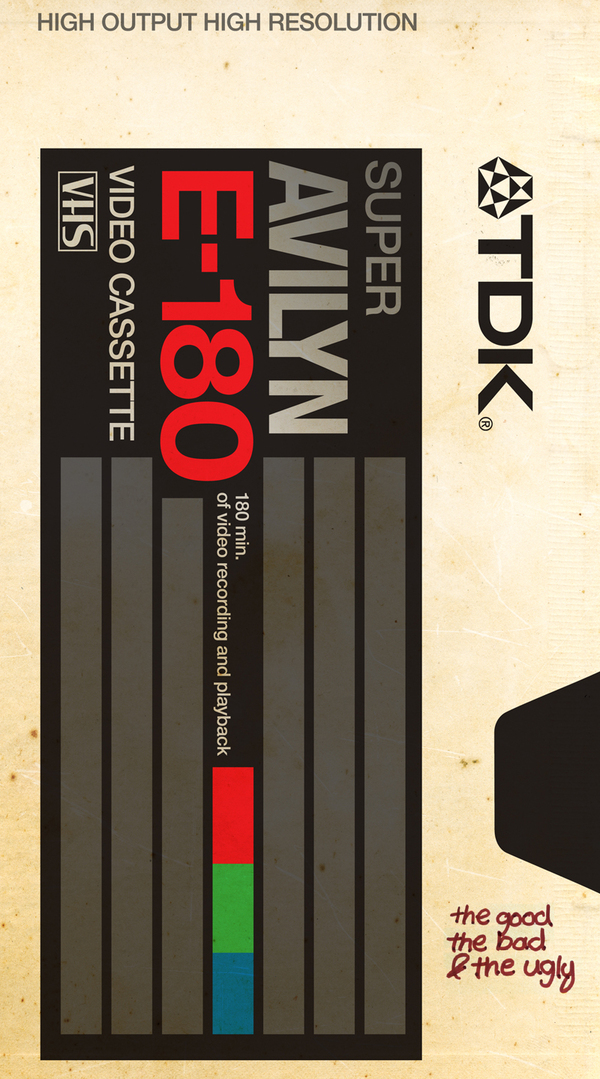
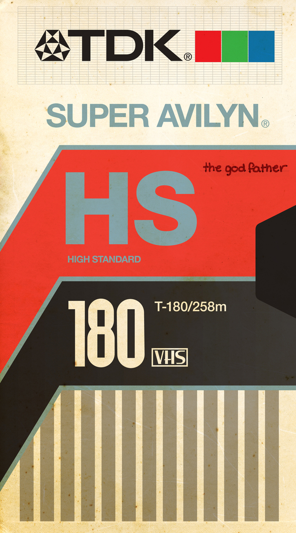
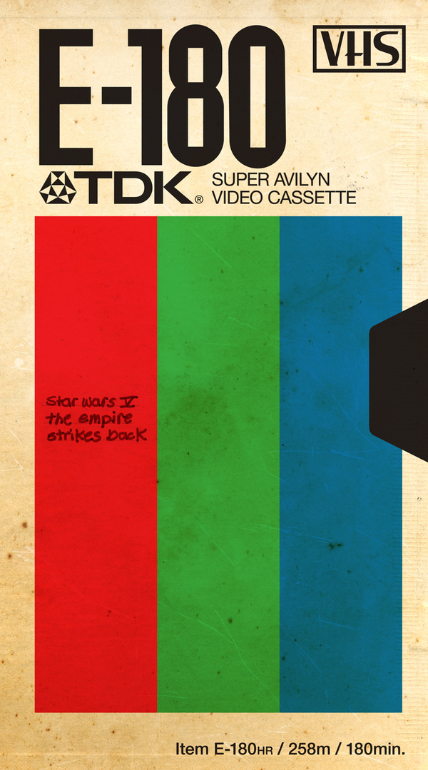
Sadly, VHS box design never reached the heights achieved by audio cassettes, but looking back they weren’t as bad as I remembered. This set comes courtesy of Hauk Sven
Via Flyer Goodness


Various shots of the late 80’s incarnation of Braun’s Atelier system in the wild. I don’t have much info on this, which seems to be the series 4, as all of the google results are in German. Perhaps someone can shed more light, translated page here. Absolutely love the TV monitor; that’s a work of art in itself.
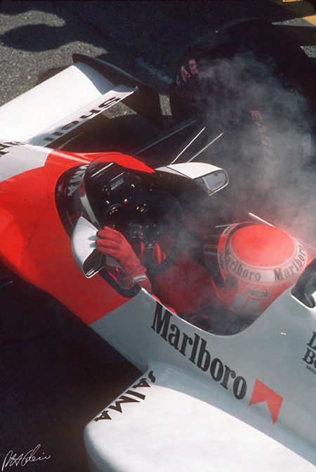
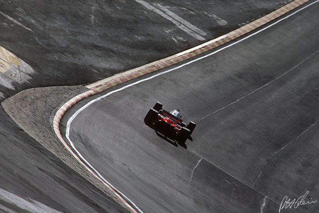
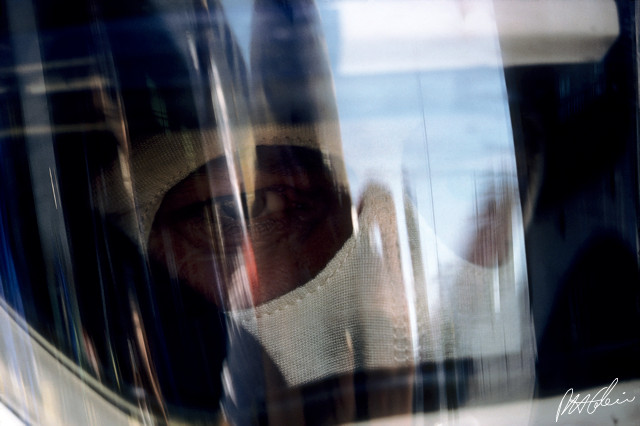
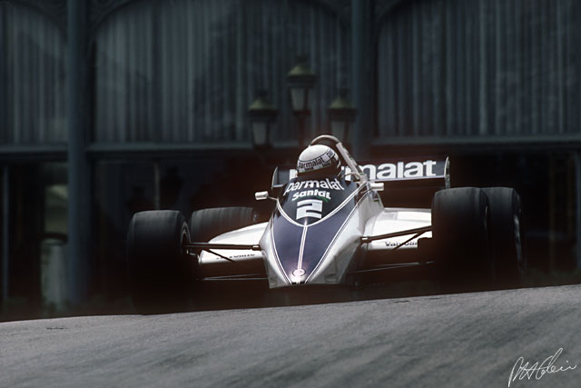
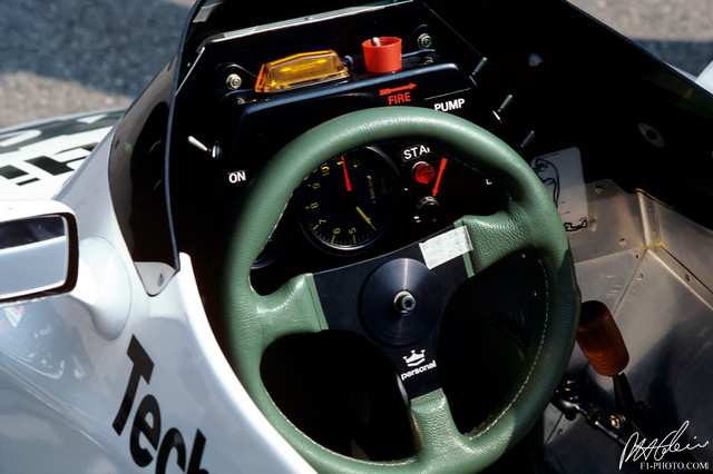
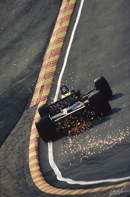
Just watched the documentary on Ayrton Senna (great film) and I’m really digging the whole F1 aesthetic. These images are from The Cahier Archive, a father and son team that has covered the Formula One Championship from the 1950s to the present.
It’s interesting to see how the sport has changed over the years but my favorite decade has to be the 80s. Check out the previous post on the Porsche 917 for more vintage racing goodness.


These book covers are part of the Infamous Press book cover concept collection. Designed by Morton Iveland.
via Minimalissimo.


In part 2 of the Vintage Ski Ads Series I chose some that focused in on the skis themselves. When I see skis these days they either look like pop culture threw up all over them or they were designed by the same guy who makes the info graphics at the bottom of the ESPN screen. Looking at the examples above it’s plain to see they had a little more appreciation for subtlety and a sense for classic design back in the day. Either that or the printing methods were such that they were limited to simple shapes and colors and the designer in me is just picking up on that.
When I think about it, this could be the case with a lot of older stuff. I think we as designers often appreciate unintended aesthetic elements; things that were a function of necessity or limitation rather than deliberate design decisions. A good example would be vintage audio equipment. I think the Neve Sidecar is one of the most beautiful inanimate objects ever created. But when you really look at it you realize it was designed by engineers; pretty much every design decision was dictated by necessity and function. So I must be reinterpreting that as physical beauty creating a connection between the idea of an object’s functionality and it’s aesthetic beauty. In other words, maybe I only like how it looks because I appreciate how it works (or in this case, sounds). Then again, I have some gear around the studio that I love the sound and functionality of but is just downright ugly to look at.
Anyways, all those Rossi’s are incredible. This whole style needs to make a comeback, but it seems these days people need to be beaten over the head with design instead of left to appreciate its finer points on their own. I’m not saying there’s not a place for busy, crazy graphics on skis — I myself have designed several busy, crazy skis — I just wish there were more like these to choose from. I guess it’s a different industry, no longer do guys in mock turtlenecks with comb-overs get all scientific and wear collared dress shirts while developing new skis in the lab, now it’s just this guy and a Nintendo DS in a dark room.