Vintage Heuer
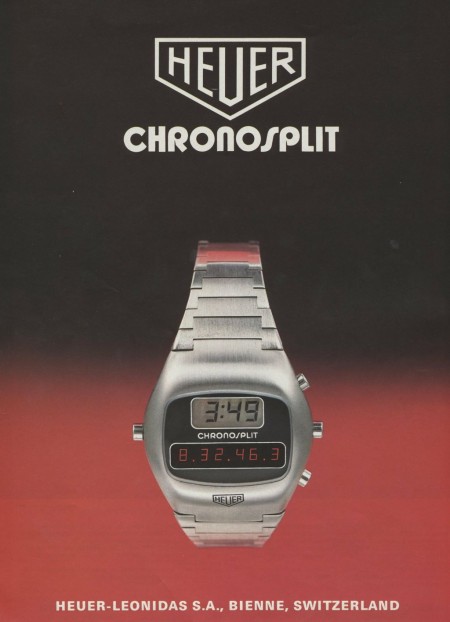
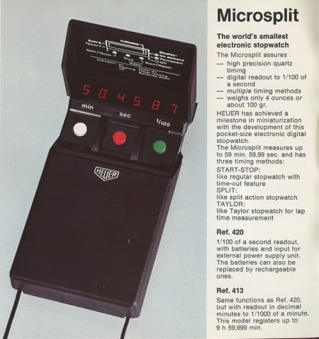
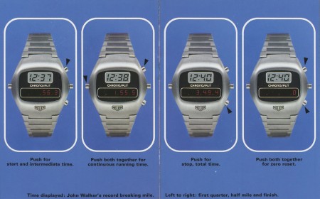
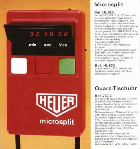
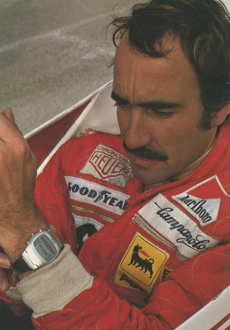
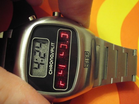
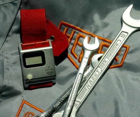
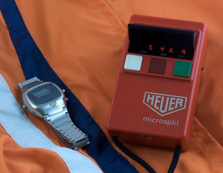
Came across these great images of some vintage Heuer timepieces. Love that old LED style number readout, particularly on the Microsplit box.
Last two images via Døgen (who has an insane watch collection)


Came across these great images of some vintage Heuer timepieces. Love that old LED style number readout, particularly on the Microsplit box.
Last two images via Døgen (who has an insane watch collection)
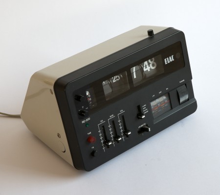
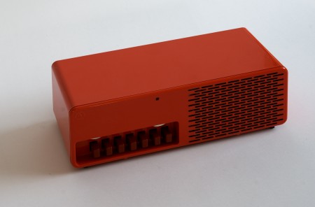
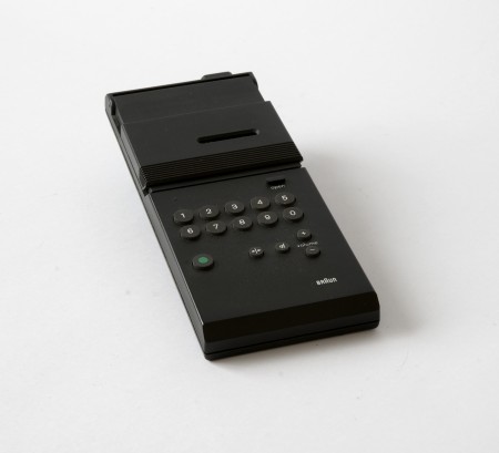
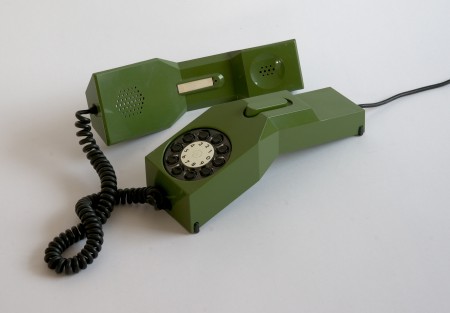
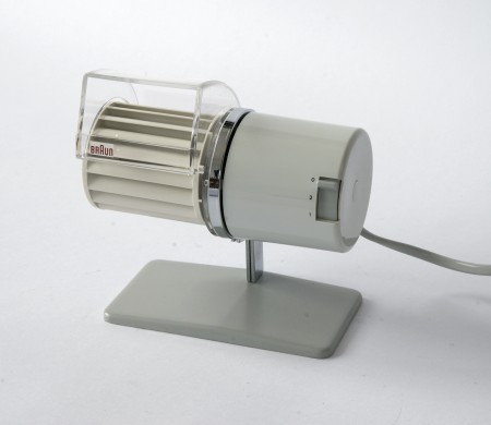
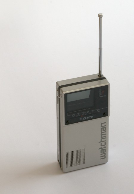
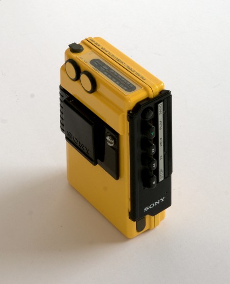

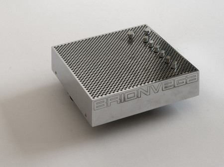
So apparently there is this guy in Switzerland who either owns or has access to many of the most iconic product designs from the 60’s and 70’s. He also takes amazing pictures of them, and posts them in high resolution for us to enjoy / print. This man is a hero.
I always wonder though, would having these artifacts make me happy? Would being surrounded by the objects of my desire actually fulfill my need for order and beauty? Or would I obsess; constantly dusting and arranging them symmetrically on walnut desks made by George Nelson? Probably all of the above, but for now one can only dream.
Whenever I get to lusting over design like this I start thinking about the nature of appreciation. What abstract facet of the human condition allows us to seek and covet objects which may not necessarily provide any meaningful function or benefit our daily lives? I can’t tell you how many fellow designer’s homes I have visited to see various defunct or otherwise unused products neatly displayed on shelves, never again to serve their intended purpose. Why do we surround ourselves with these relics? Devices which through some perverse twist of fascination have been stripped of their intrinsic usefulness and rendered as some fetishized monument to our personal design sensibilities, gathering dust on a mantle.
That’s probably reading way to deep into things so I’m going to take the easy answer and say it’s simply the act of art appreciation. There is just something about the fact that these were originally designed as functional objects that throws a wrench into the whole concept of approaching them purely as works of art. At any rate, I want every single thing up there, in my house, now.
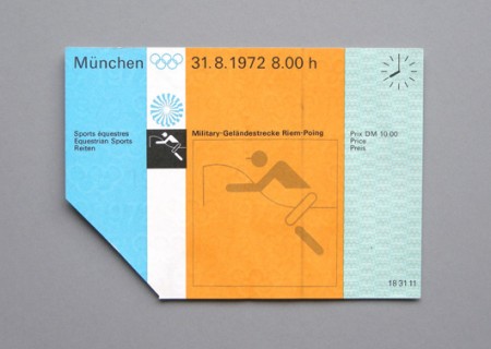
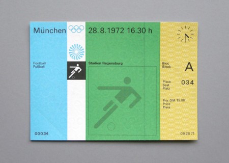
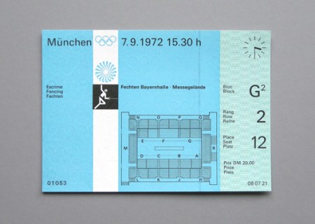
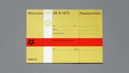
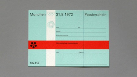
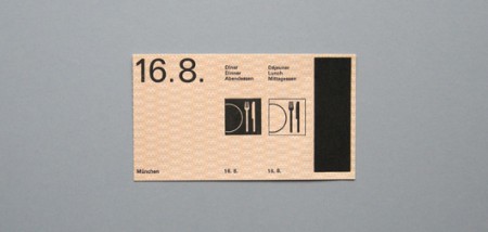

Shelby’s Blog is running A Week of the 1972 Munich Olympic Games feature and the second installment is pretty epic. This collection of ticket passes from the ’72 games were designed by the legendary Otl Aicher and feature the classic pictograms for which the Munich games are known.
I’m not sure why, but tickets of all kinds have always piqued my interest and this set may be the best I’ve ever laid eyes on. But forget the tickets, would just love some high-res copies of these photos for framing.
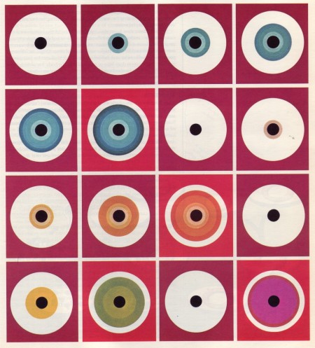
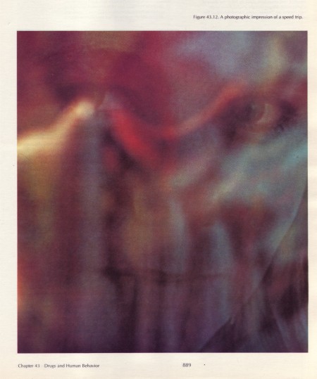
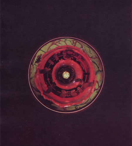
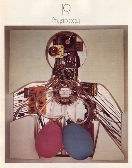
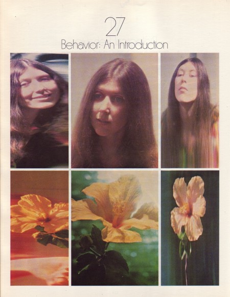
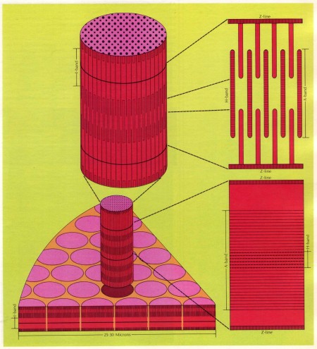
Biology Today was a college biology text book in the 70’s and early 80’s. A Journey Round My Skull has posted some high res scans from the 1972 edition. Beautiful stuff, suitable for textures or printing at these resolutions.
Biology Today via on A Journey Round My Skull

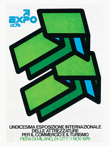
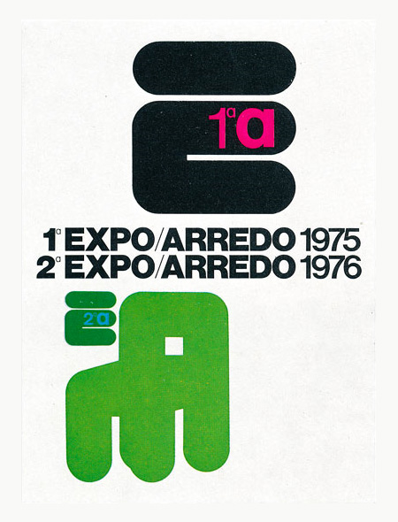
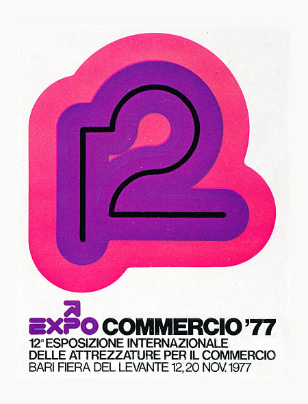
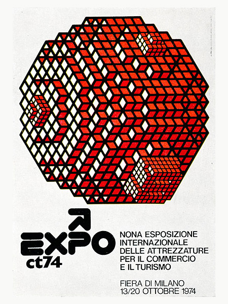
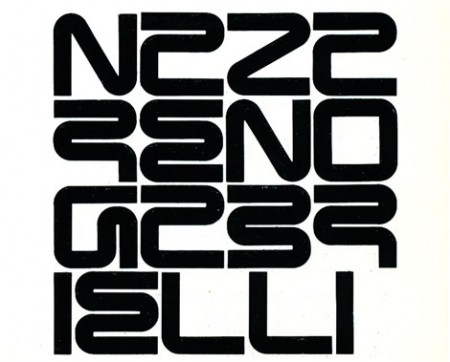
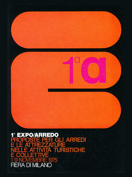
After years of digging around for interesting posters it’s easy to foolishly assume I’ve seen everything good there is to see. Then I come across work like that of Italian designer Mimmo Castellano and am once again reminded that you’ve never really seen it all. The images are from this GrainEdit post where, unfortunately, they do not mention the source. I would love to find which book they got these scans from, or better yet, where I can get my hands on some full size prints. If anyone has any suggestions, let me know.
via GrainEdit
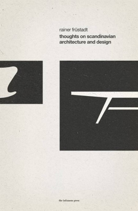
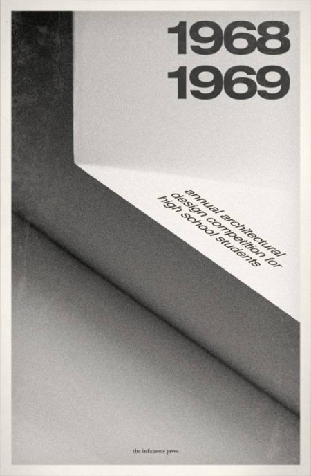
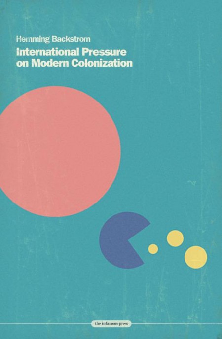
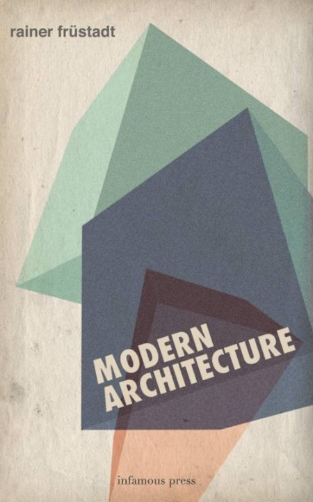
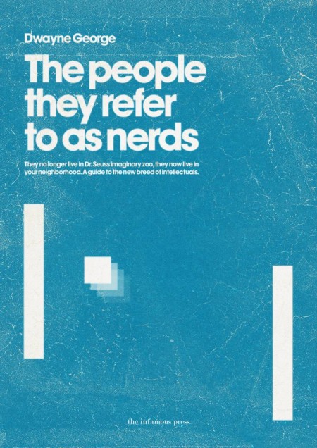
These book covers are part of the Infamous Press book cover concept collection. Designed by Morton Iveland.
via Minimalissimo.

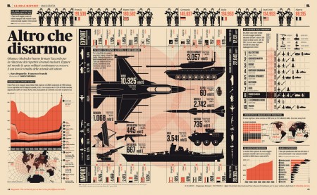
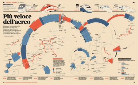
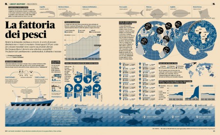

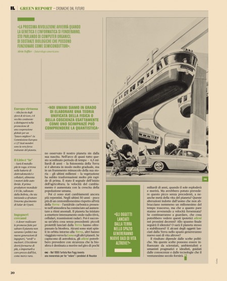
Intelligence in Lifestyle magazine is the new holy grail of infographic greatness. It is a high-end Italian magazine aimed at men. The magazine is equipped with a beautiful design by the art director Francesco Franchi and the creative director Luca Pitoni.
For some of us, getting ahold of the magazine could be difficult. However, several several of the layouts from the interiors spreads and covers are archived on Flickr. Check out the larger sizes, they may compliment your desktop nicely. If in case you’re wondering, the magazine utilizes Publico, a serif face that fits perfectly into the design is much less ubiquitous than say Helvetica or Archer.
On another note prior to being introduced to this magazine via Colorcubic, I was starting to become overwhelmed by the amount of infographics being pumped into the designosphere. Infographics about infographics were being designed for crying out loud. It just seems like it has become trendy very quickly. It’s not to say its a bad thing, but it sure makes me appreciate great design like in this magazine or Nicholas Felton’s works more than ever before.
I’m curious to hear what your thoughts are on this topic.
Do you feel there is an influx of infographics and is it a good or bad thing?

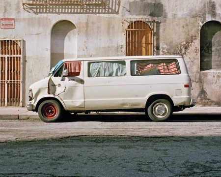
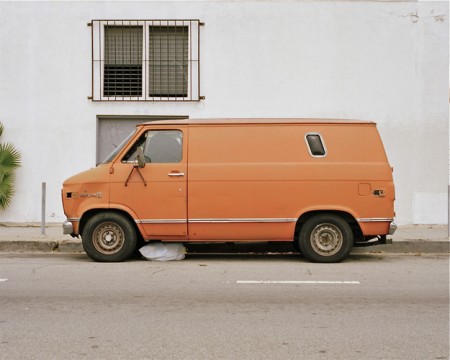
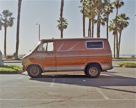
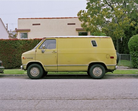
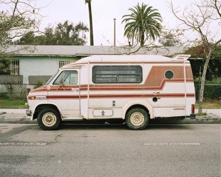
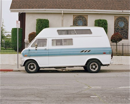
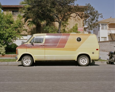
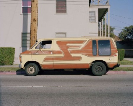
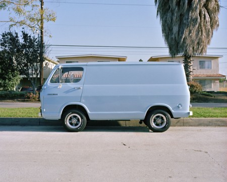
At first glance you might expect Joe Stevens’ collection of van photos — Vans and the places they were — to be another nostalgic overdose of 70’s camp, but on closer inspection you’ll find some beautiful photos that transcend the limited scope of the series. I love the color composition and processing; I almost feel like I’m looking at some hyperrealist version of a Kevin Cyr painting. This is probably also the only other time you could get away with hanging a picture of a van conversion on your wall and convincing all your friends that it’s art. The best part of it all is that they don’t seem to be staged at all; they all seem to be random finds which makes the quality of the shots all the more incredible.
Sidenote: Looks like Joe’s site was built on Arlo Sites, a portfolio platform that looks pretty interesting. Not sure how it stacks up to Cargo or Squarespace though, this is the first I’ve seen of it.