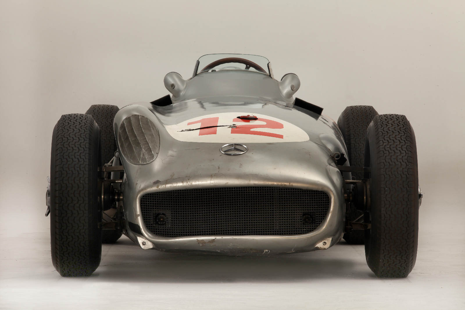
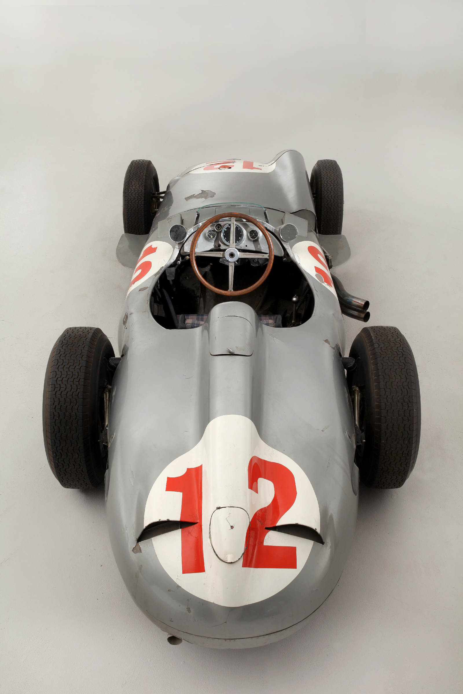
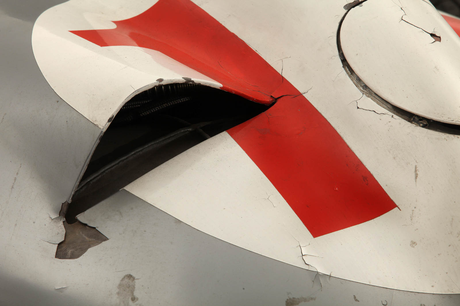
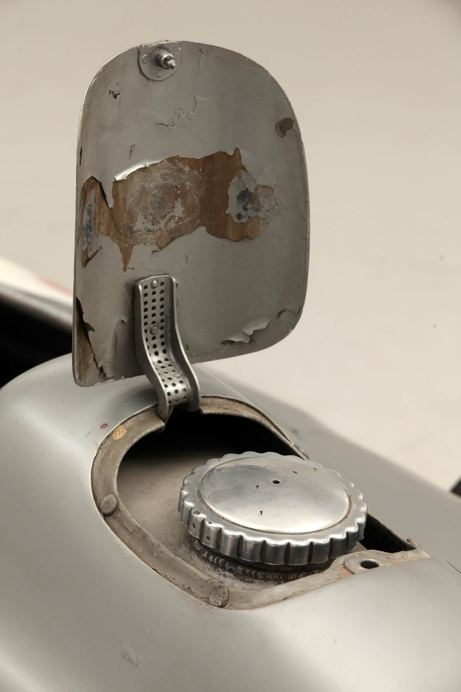
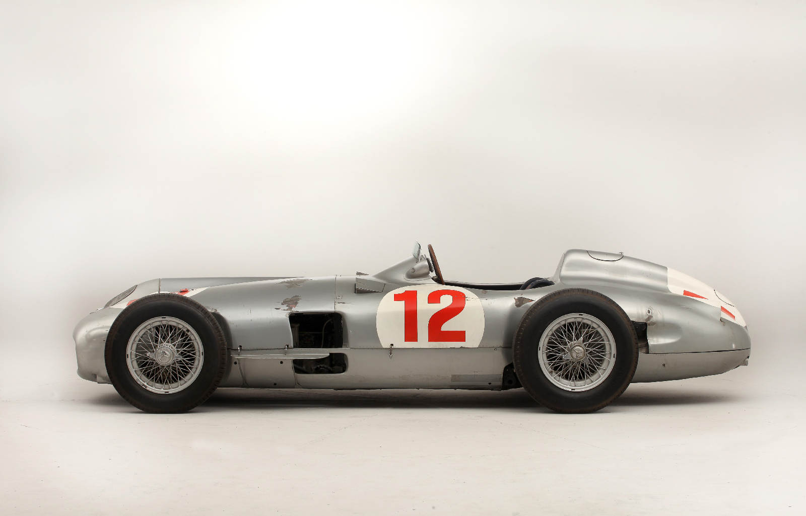
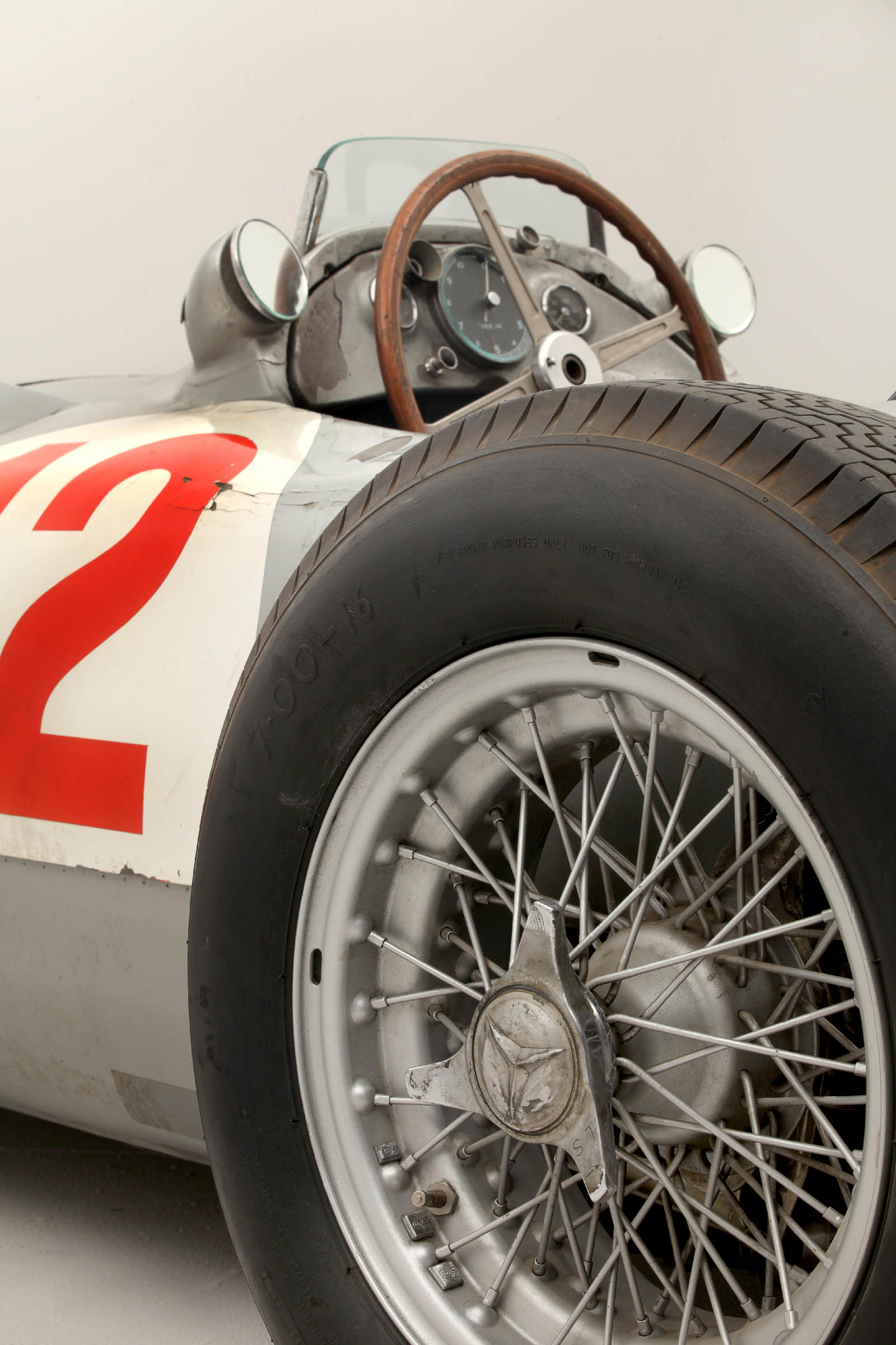
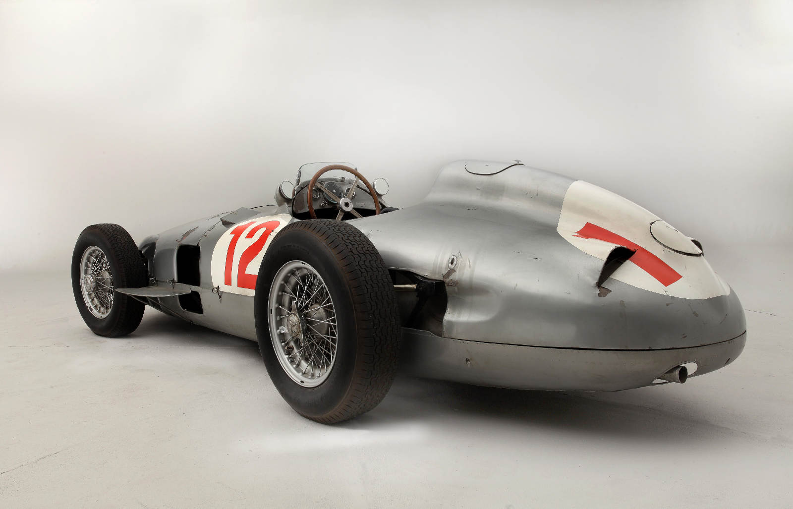
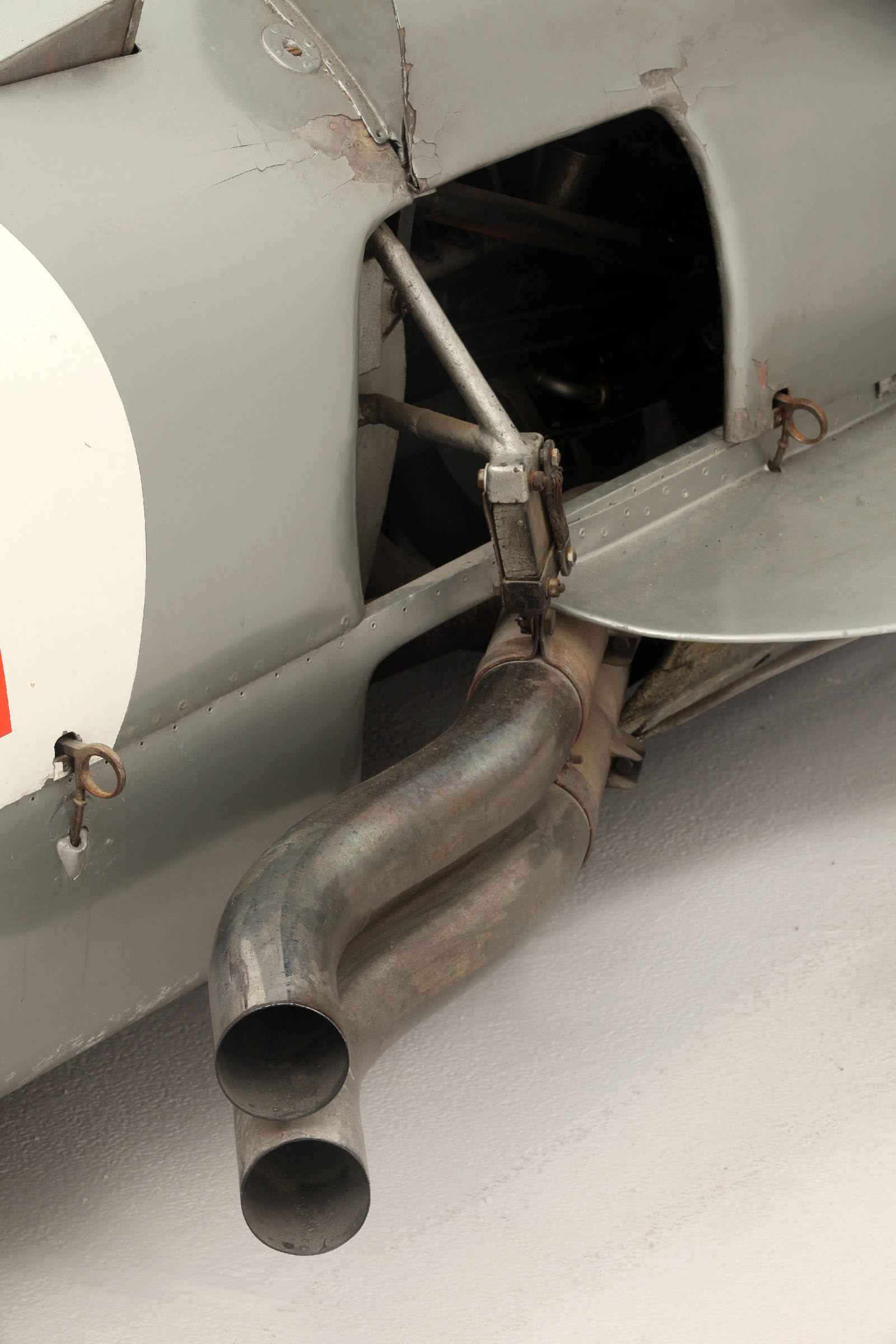
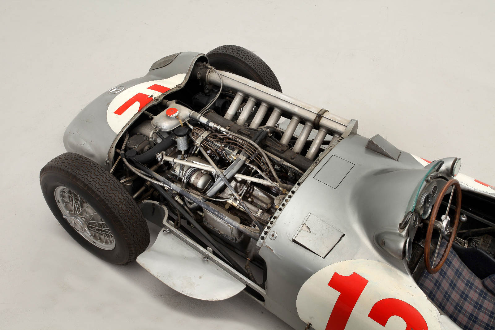
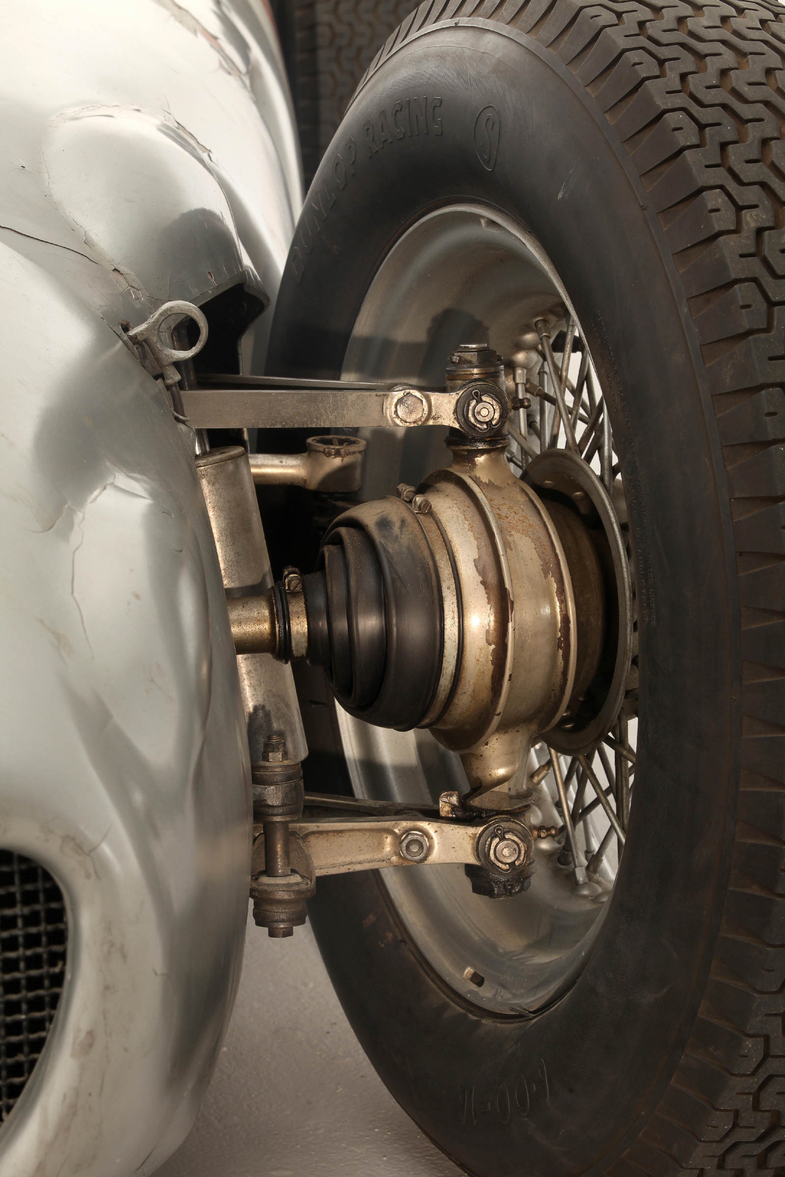
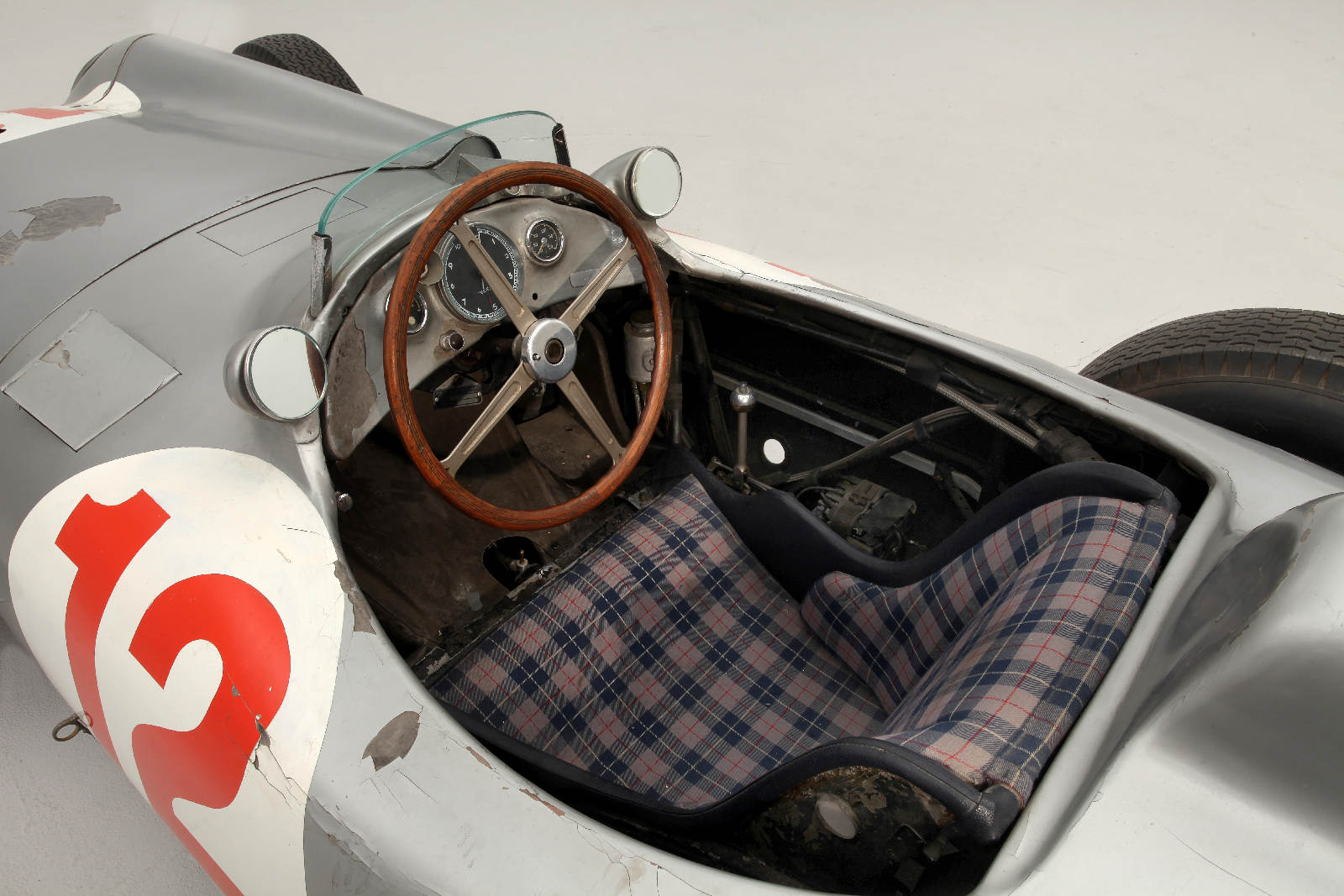
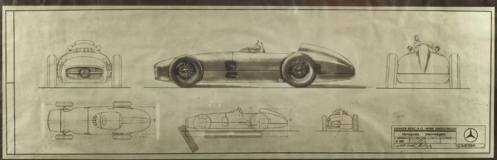
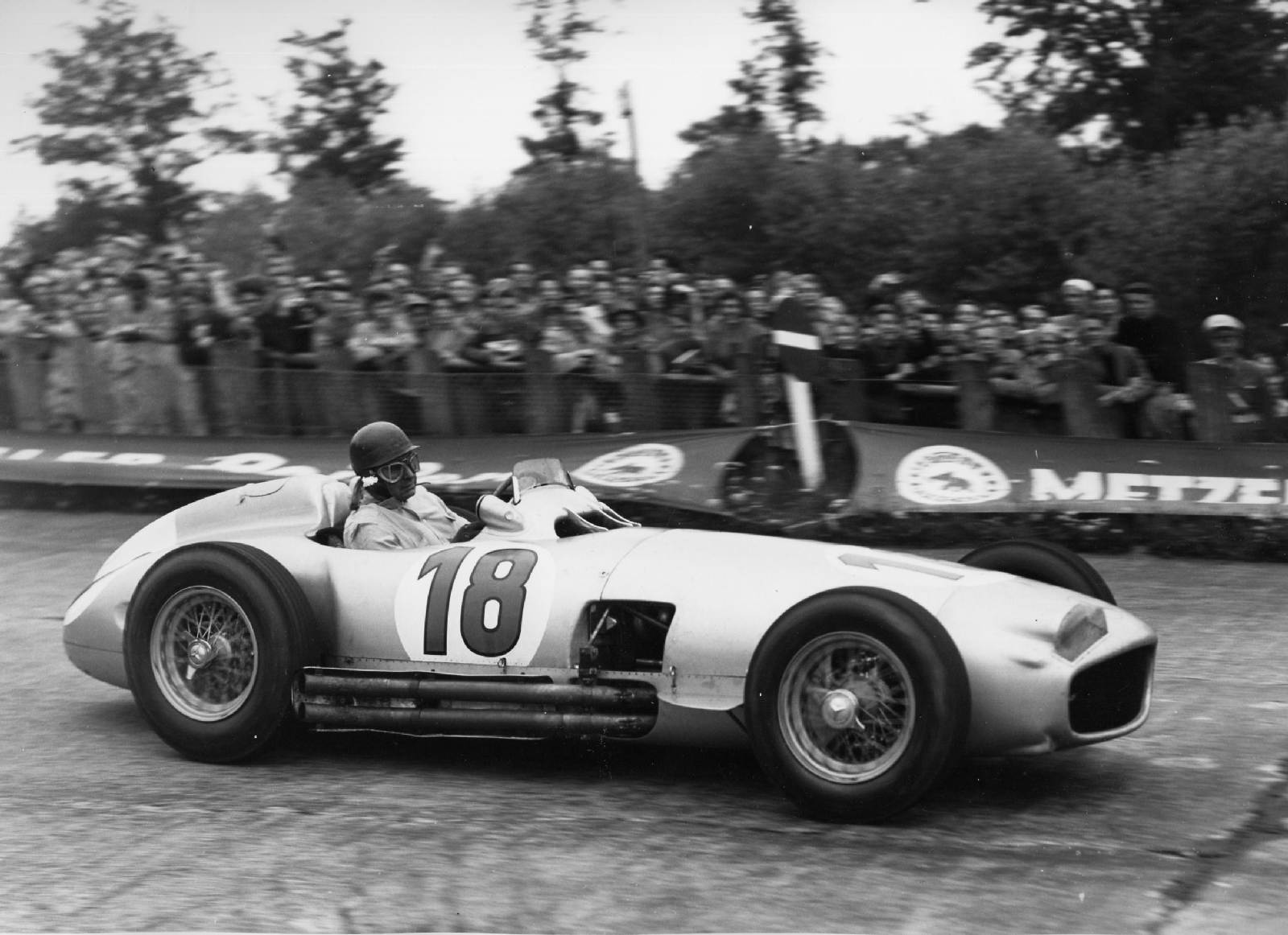
This Mercedes-Benz W196R won the 1954 German and Swiss Grands Prix with Juan Manuel Fangio behind the wheel. It sold at auction this year for an astounding $29,619,826. Love how it hasn’t been restored; the wear lends an authentic feel.
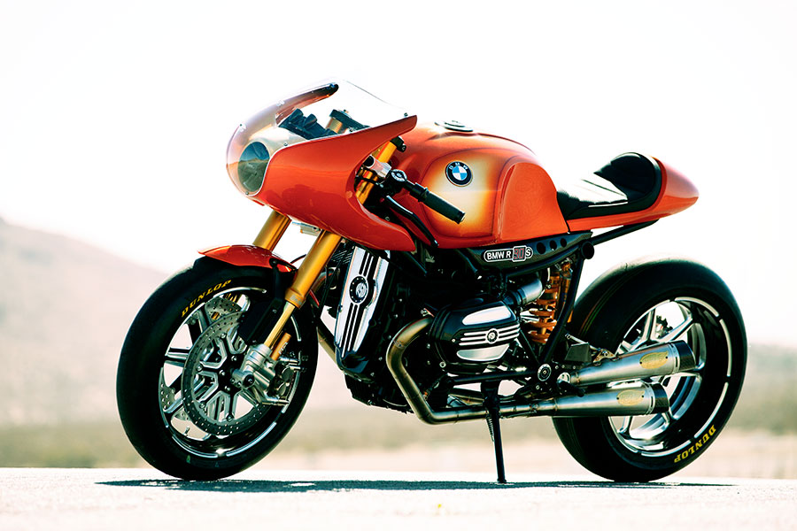
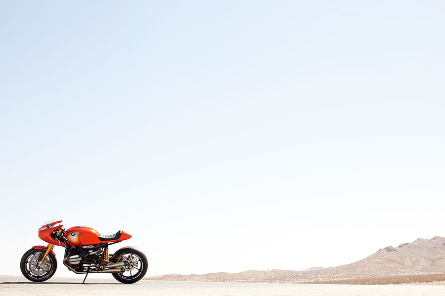
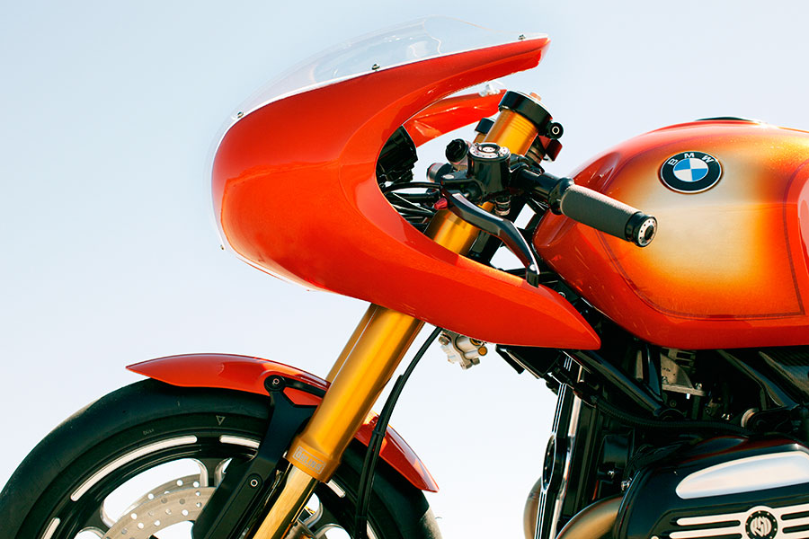
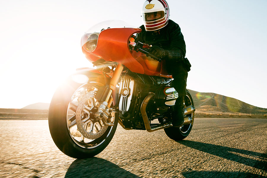
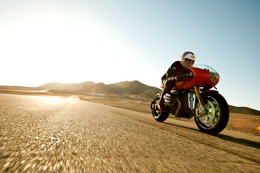
Roland Sands and BMW Motorad recently teamed up to re-imagine the original BMW R90S It’s a near perfect marriage of old styling, modern engineering and hand made craftsmanship. It combines custom work (like a hand hammered fairing and many other custom parts) and years of larger scale motorcycle engineering, the result is a modern race bike that looks AND performs. It’s so good to see a resurgence of classic motorcycle styling amongst modern day motorcycles.
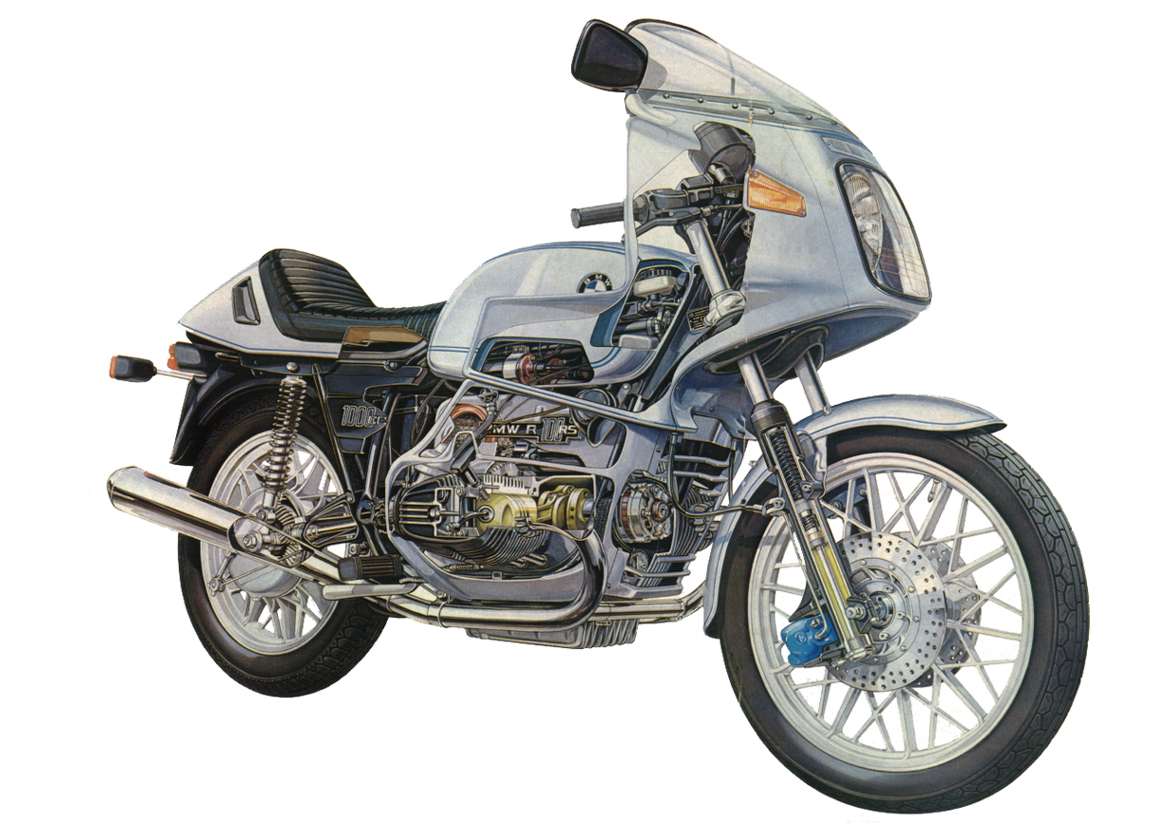
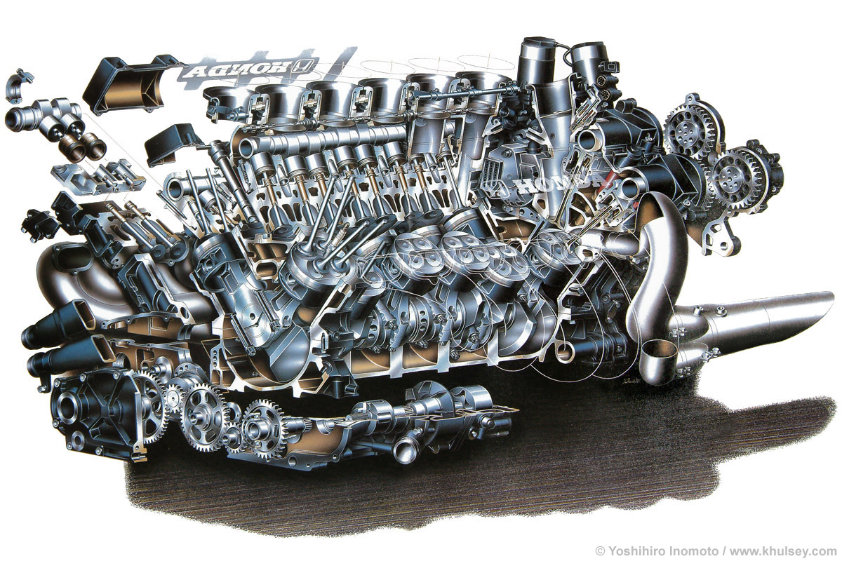
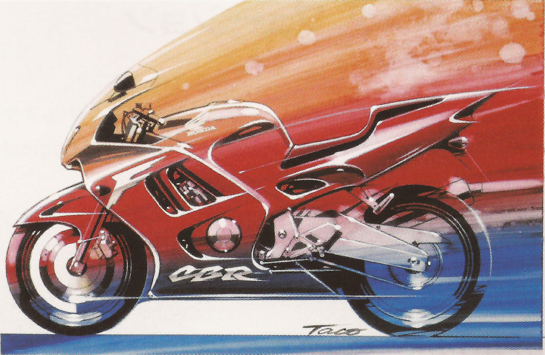
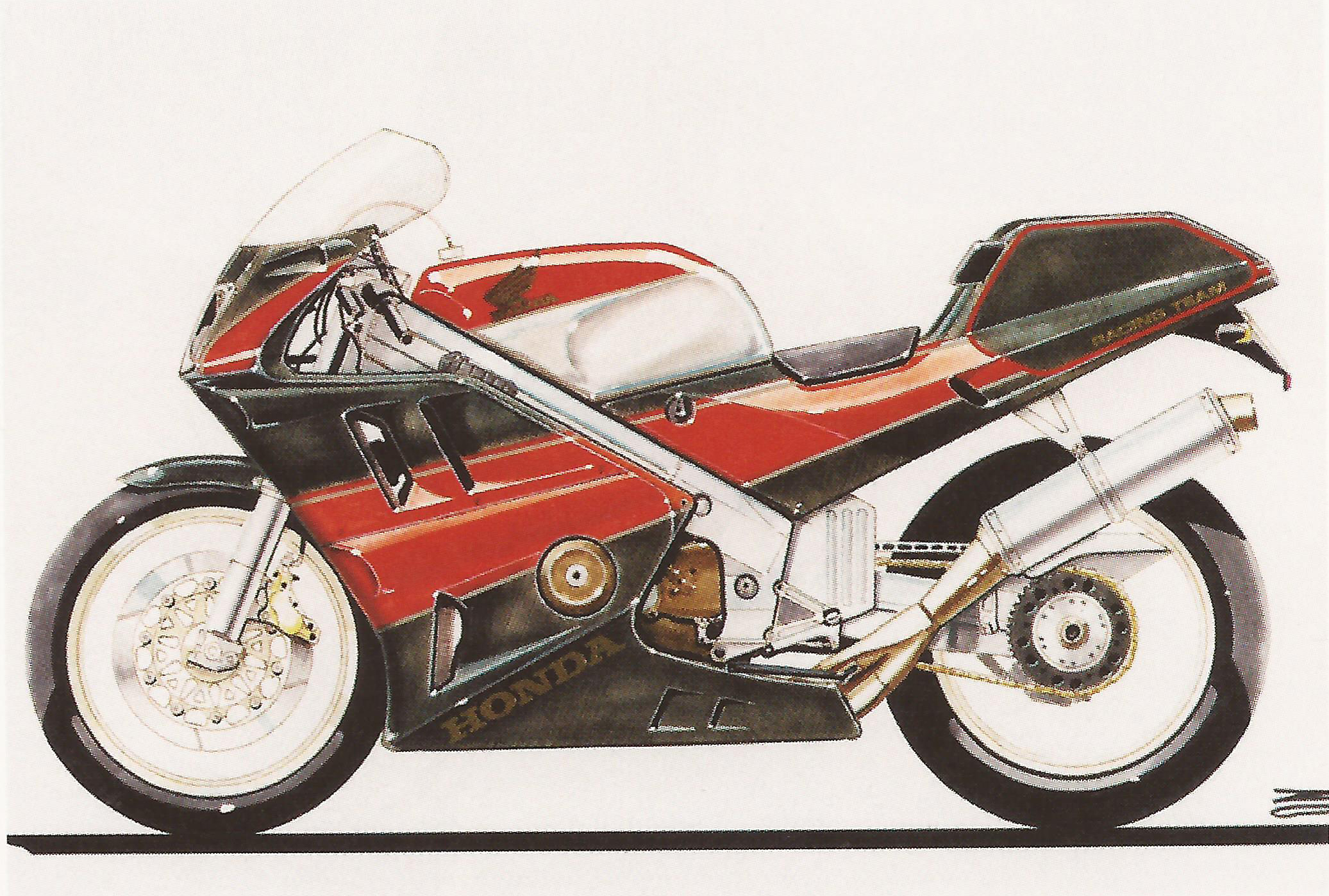
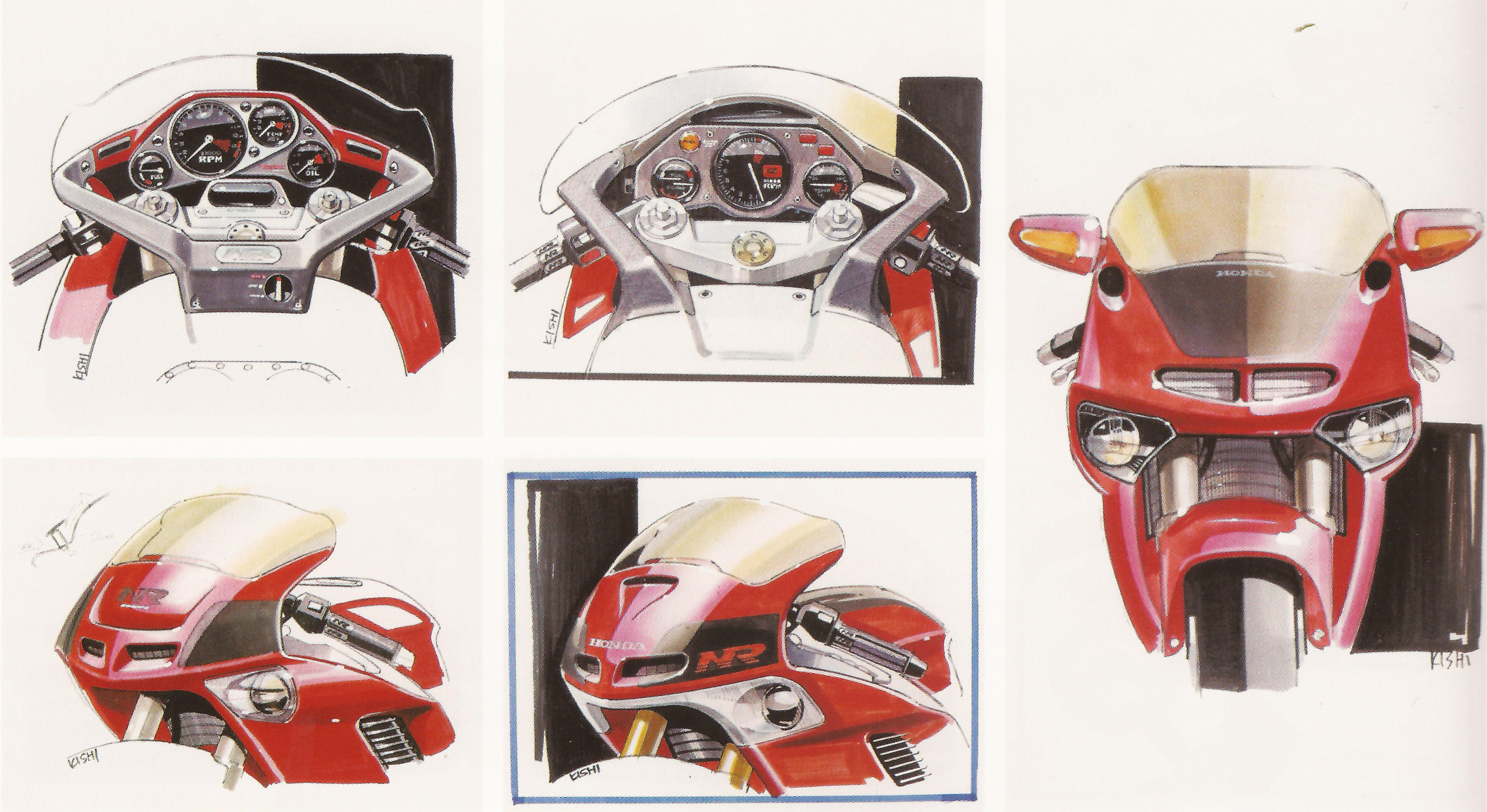
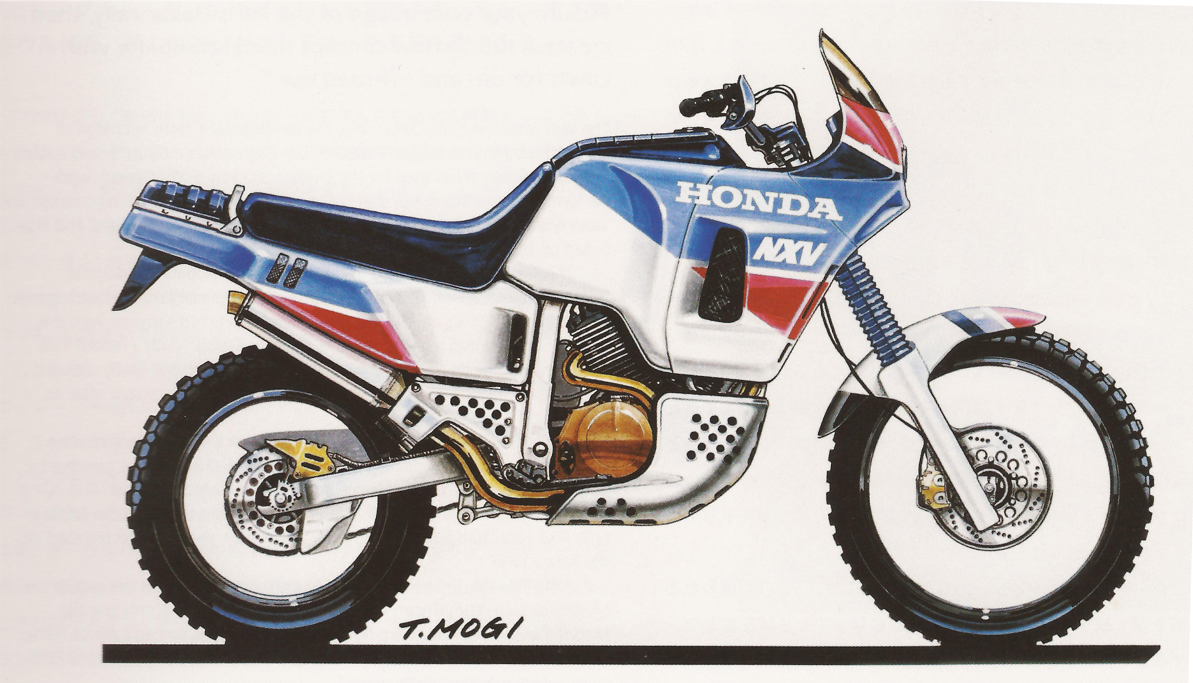
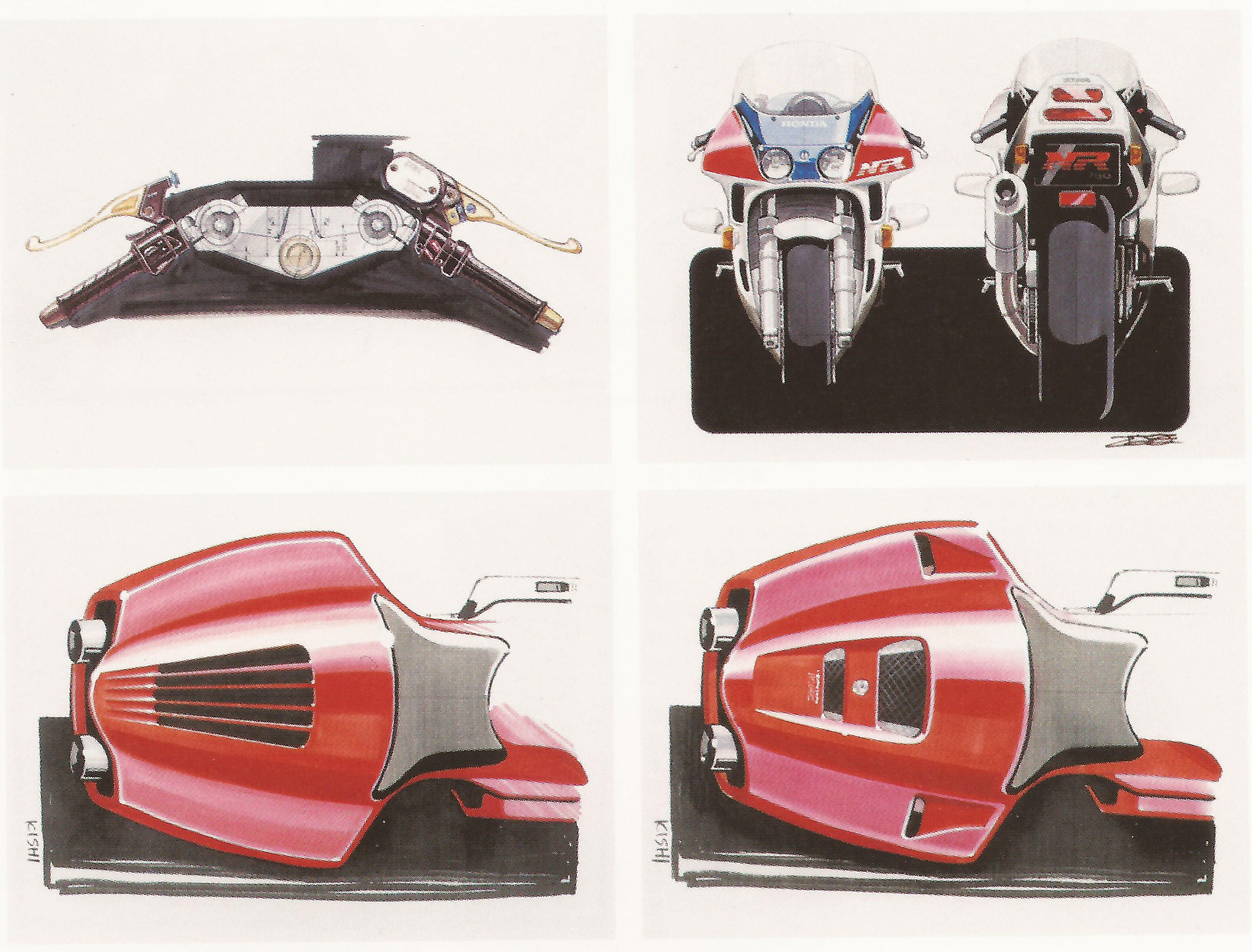
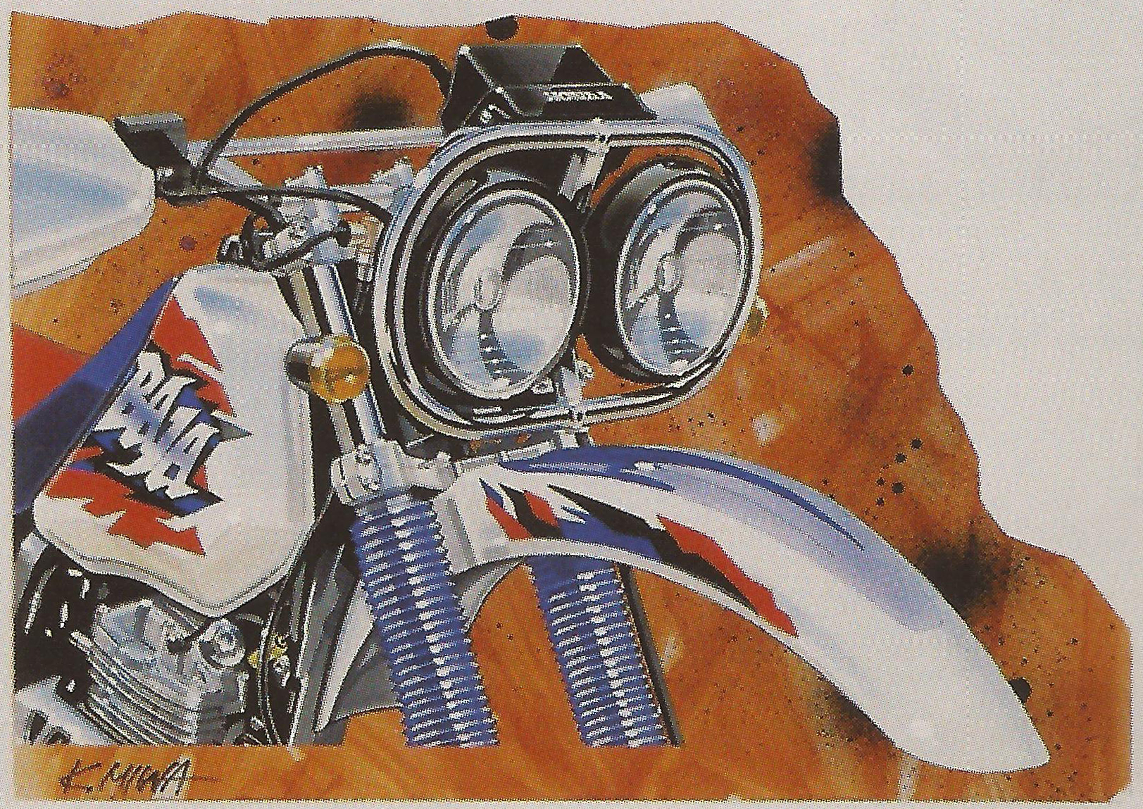
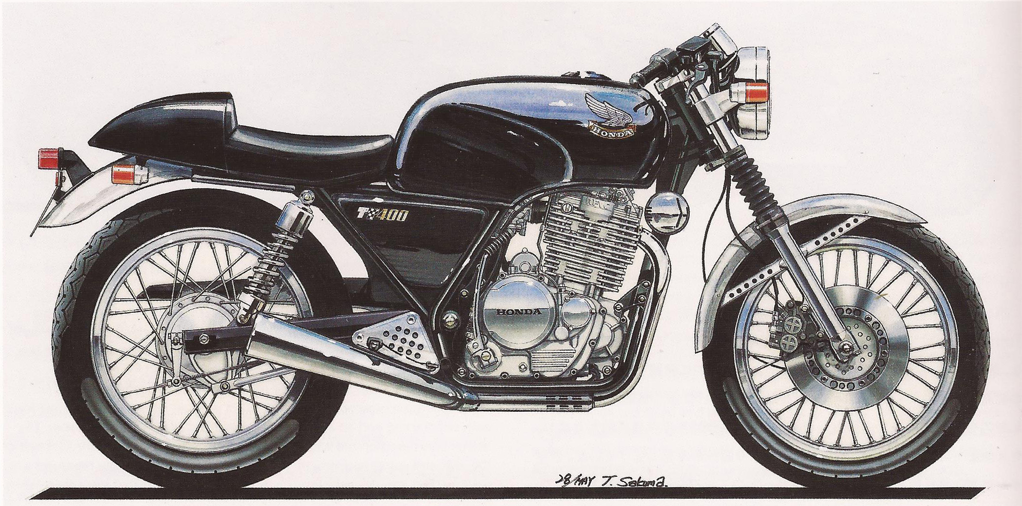
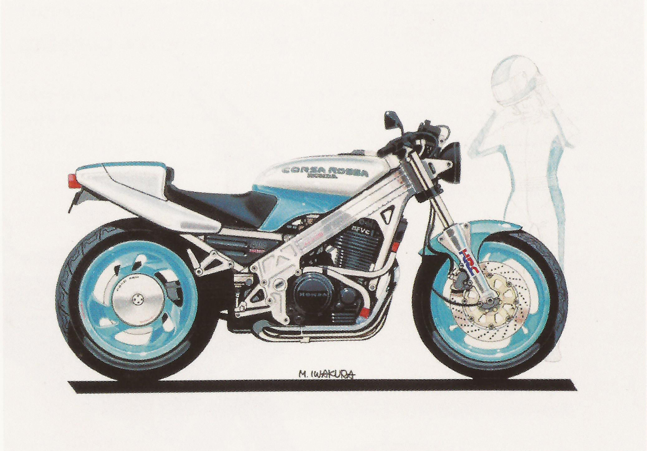
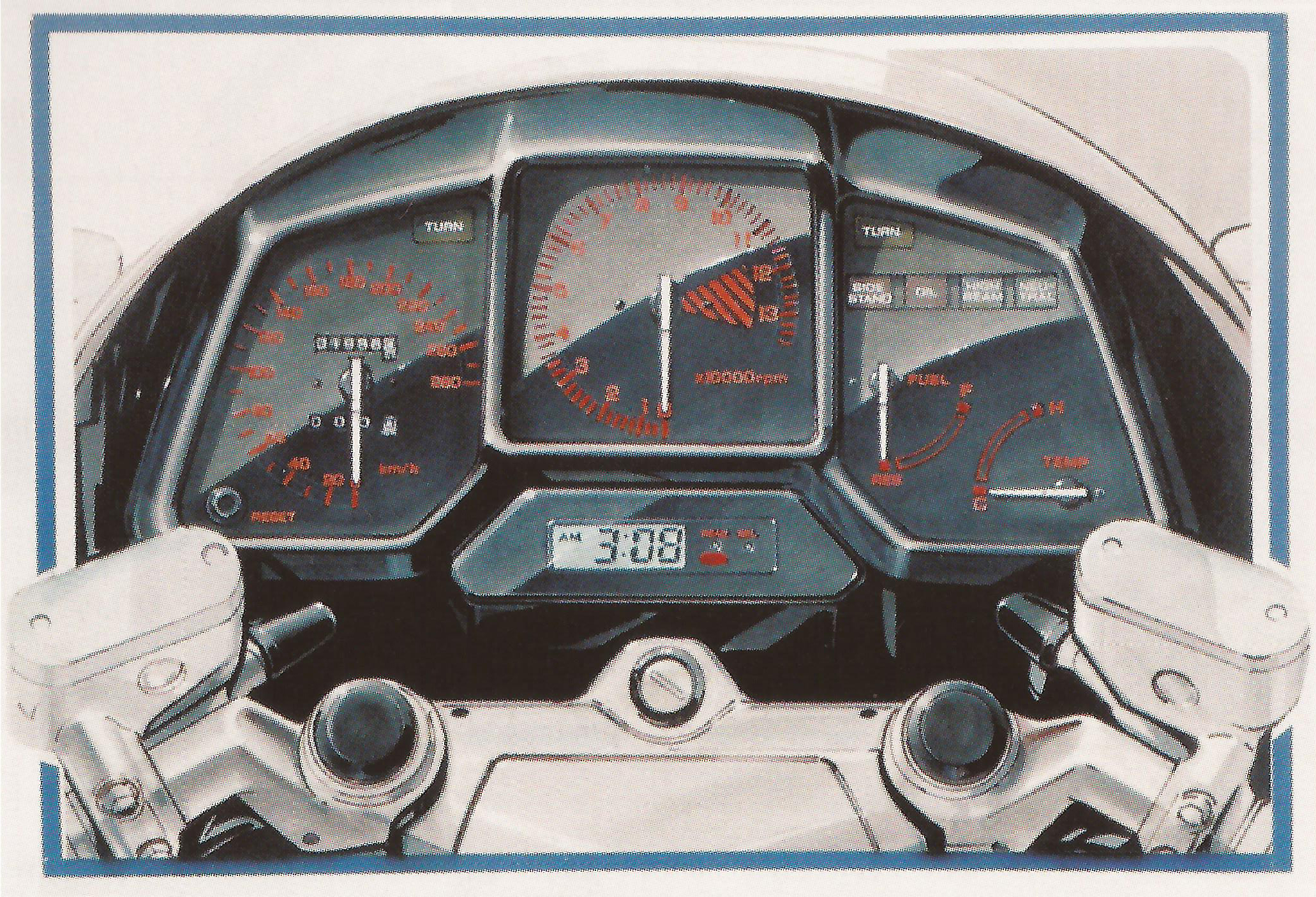
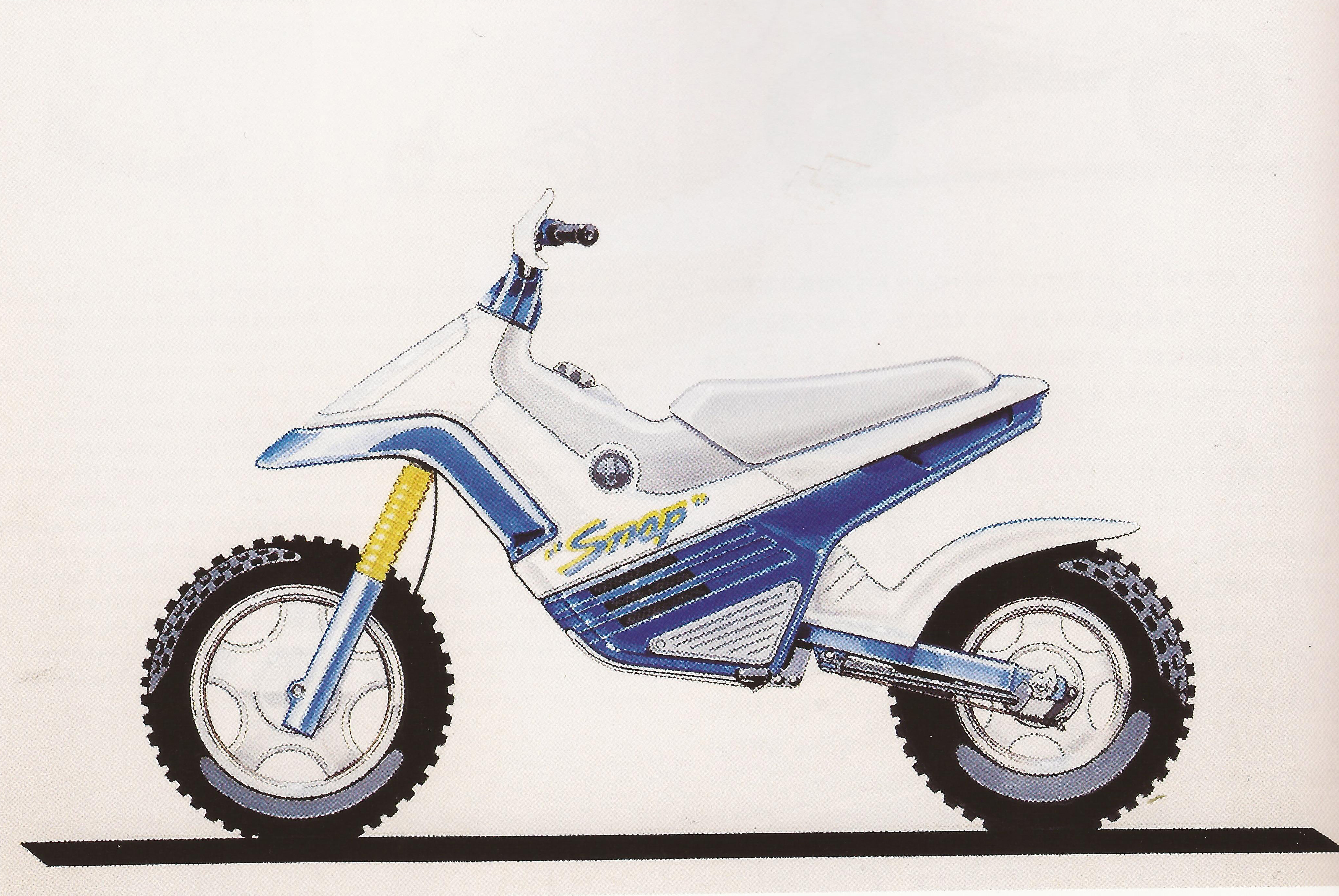
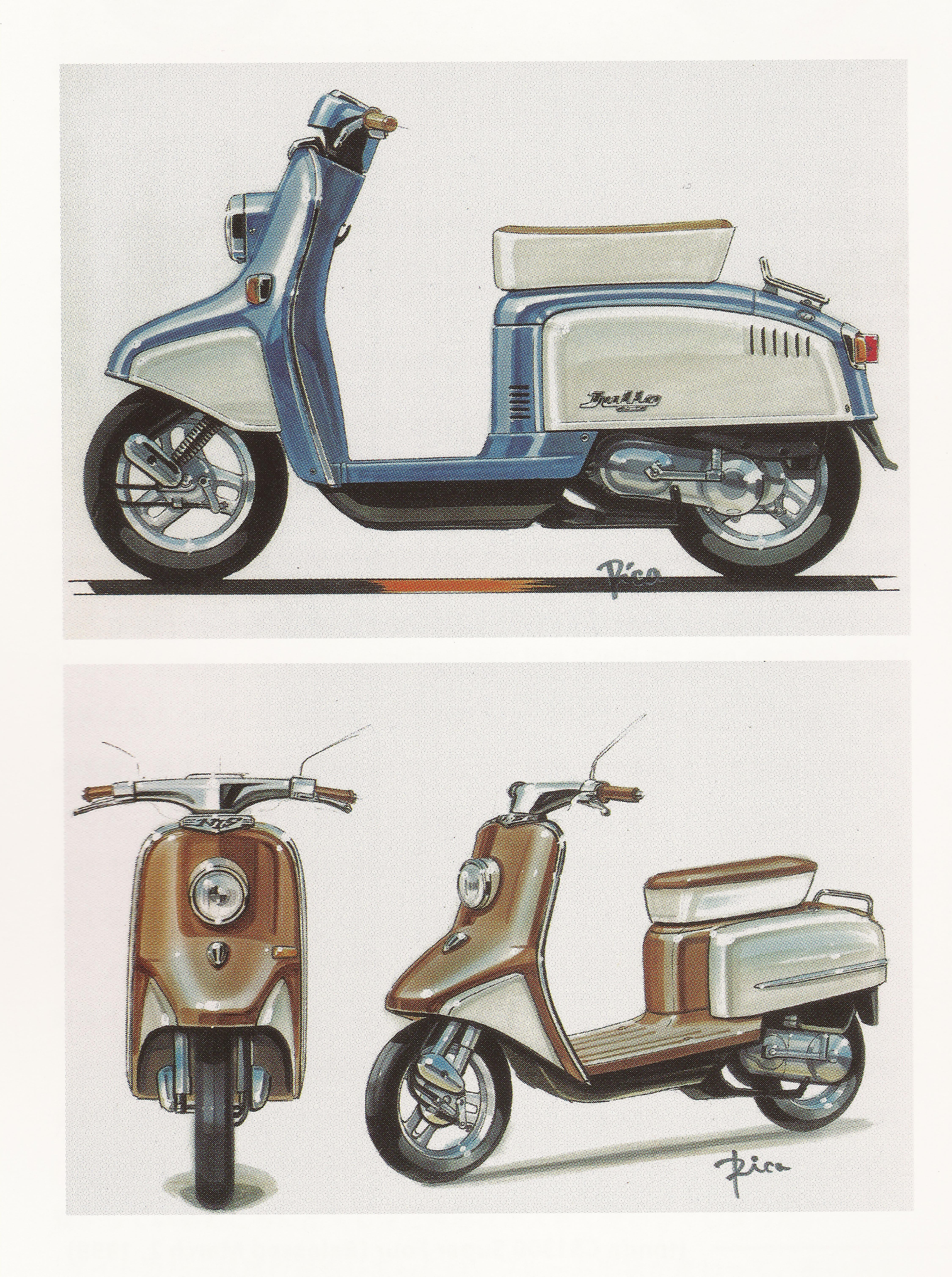
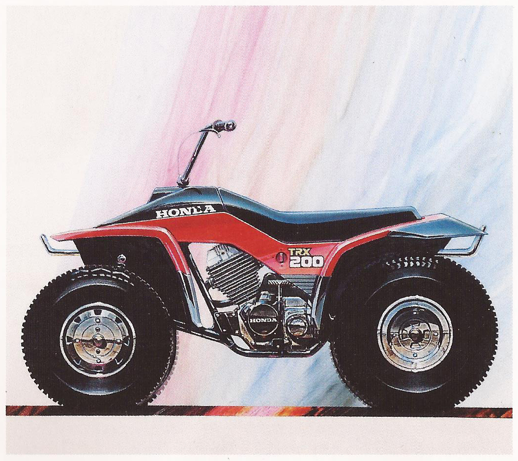
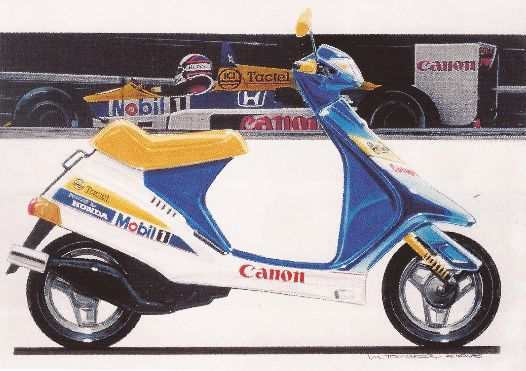
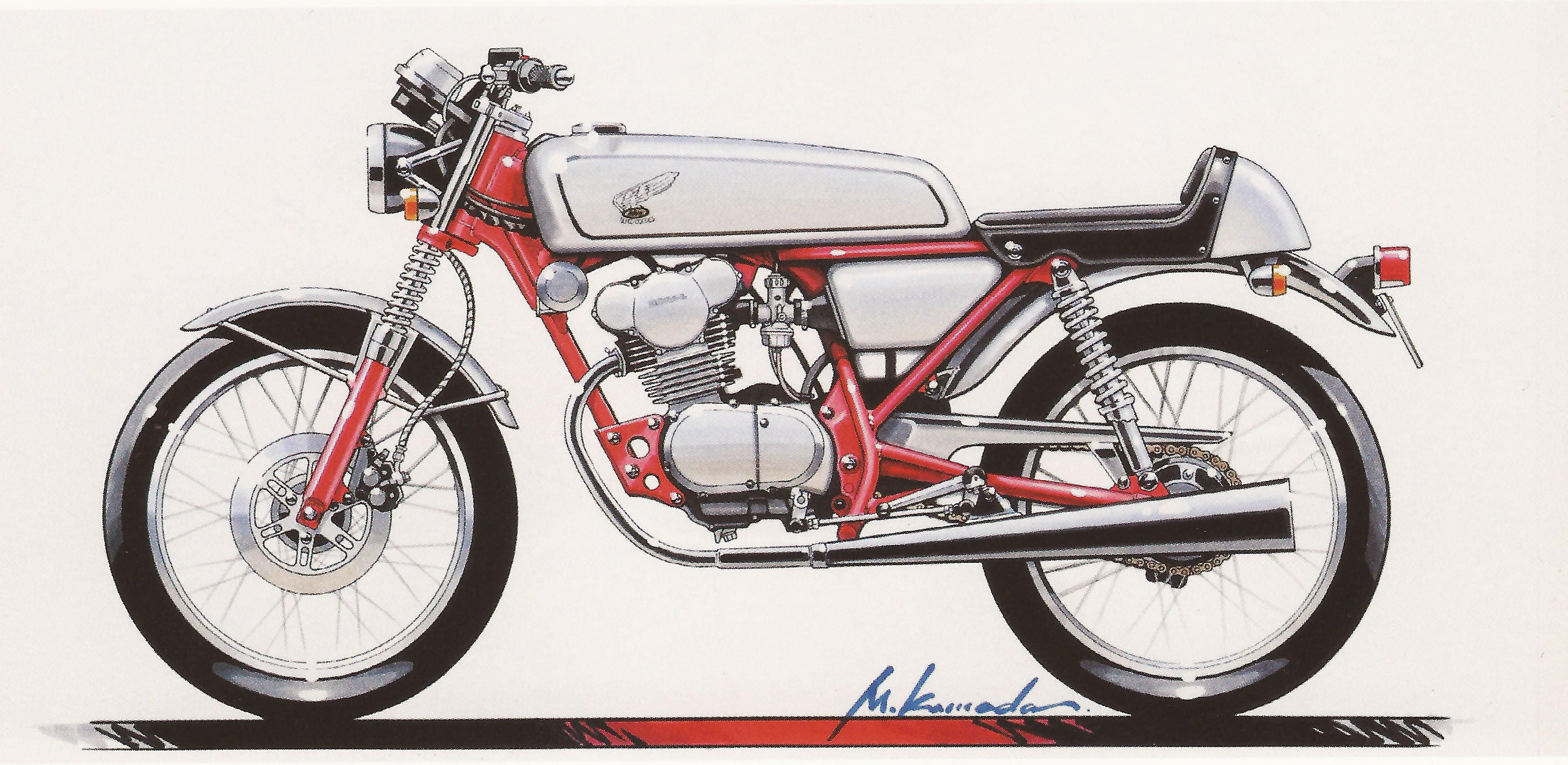
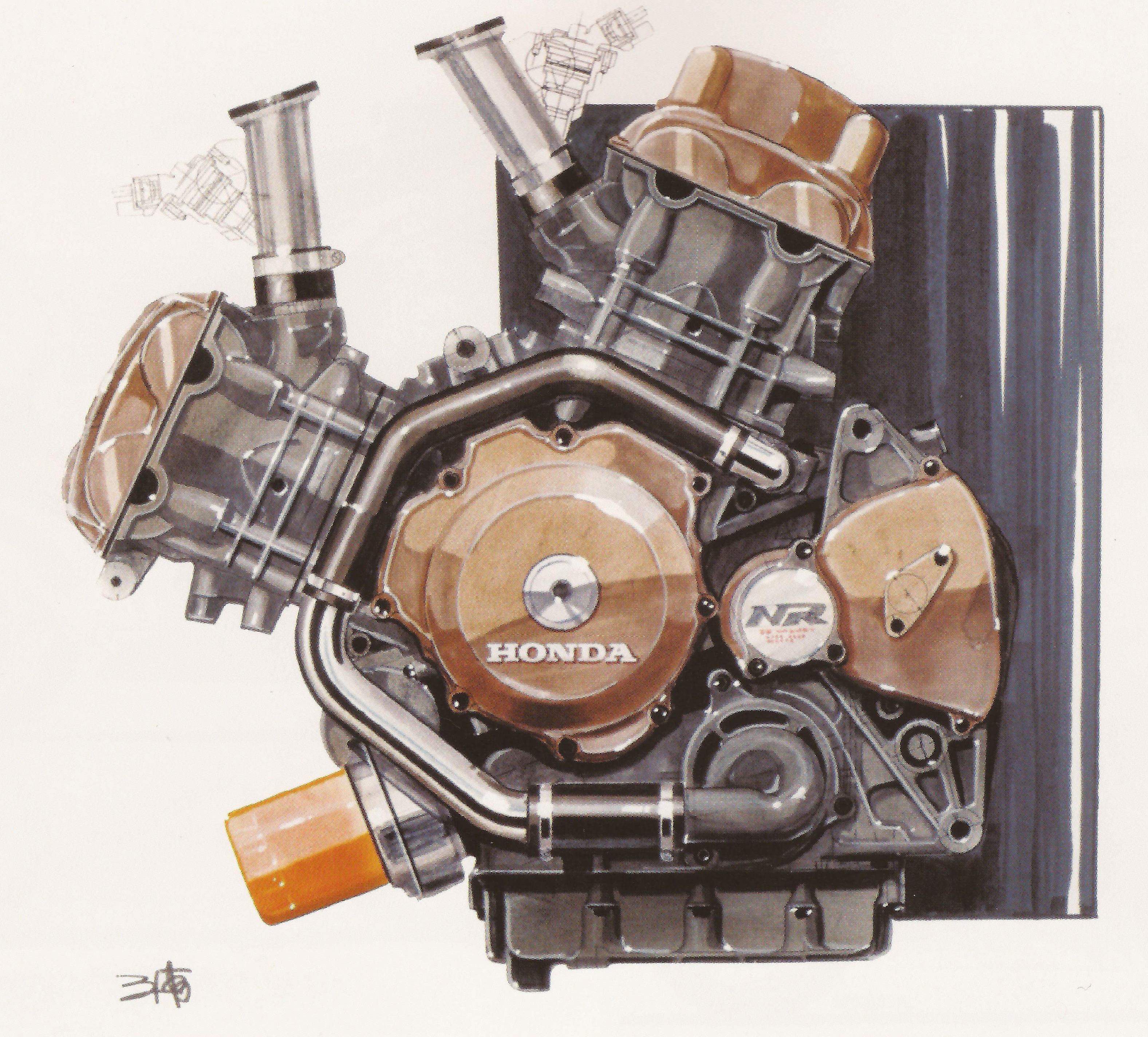
So Tycho just got back from the amazing Taico Festival [yes, really] in Nagano, and on our off day in Tokyo I had the pleasure of visiting the Tower Records book store in Shibuya. I cannot stress enough, this place was coffeetable book PARADISE, I walked out of there with slight buyers remorse, that is, until the flight back when the “in flight entertainment” consisted of endless episodes of Everybody Loves Raymond. I digress. Although they didn’t have the one i’ve been looking for for years, Part 1, they did have this second volume of Honda Design drawings from the mid eighties throughout the 2000’s. In this post I featured just a few of the exquisite hand-drawn mockups of some timeless Honda machines.
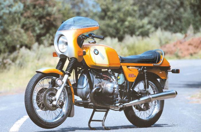
Just got my CB360 on the road yesterday [with rebuilt Mikuni carbs and CB750 forks], so this seemed like a fitting post for the weekend as I gear up to blast around the Berkshires. Enjoy!
[Published by Dainippon Kaiga, ISBN 978-4-499-32107-7]
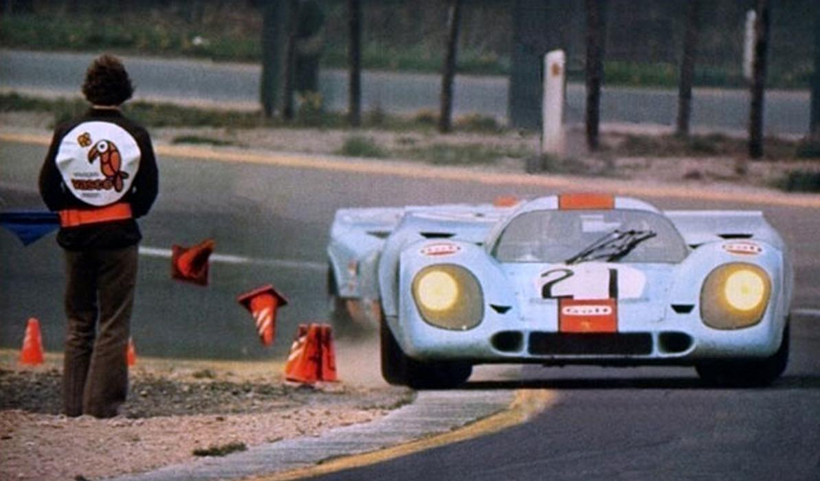
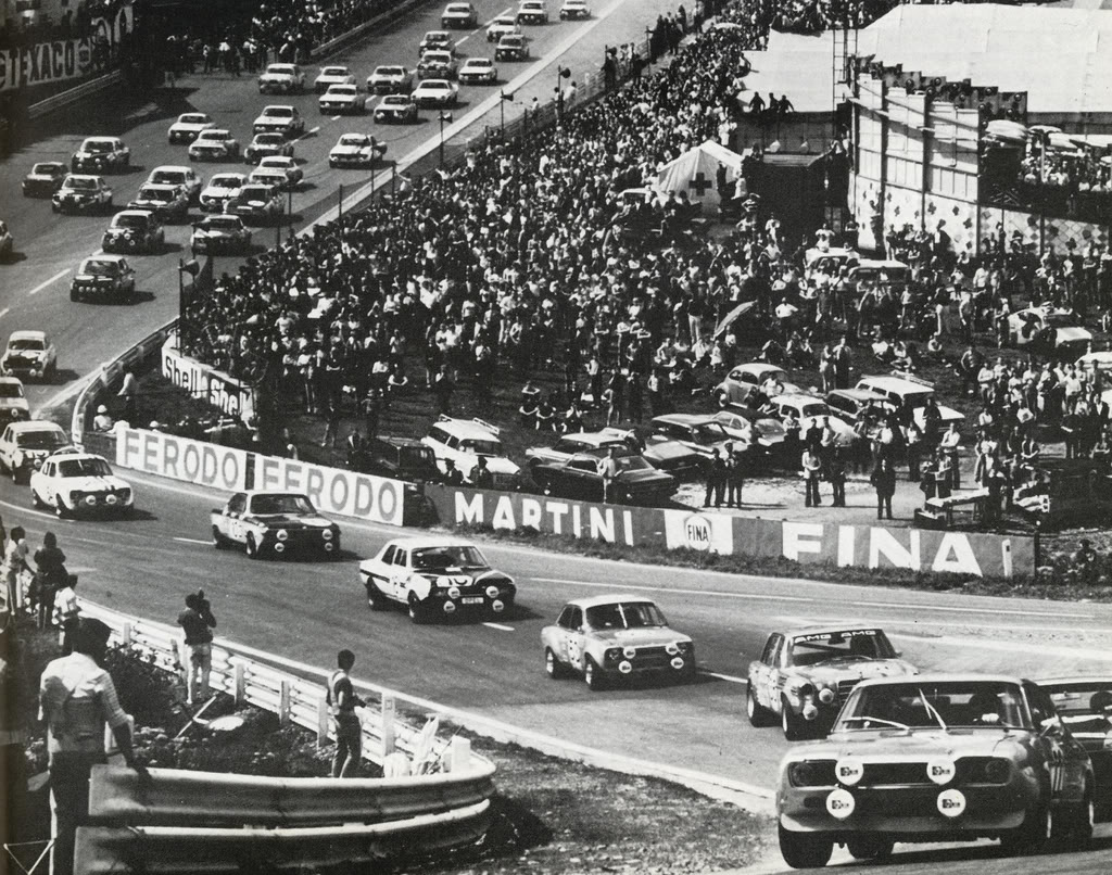
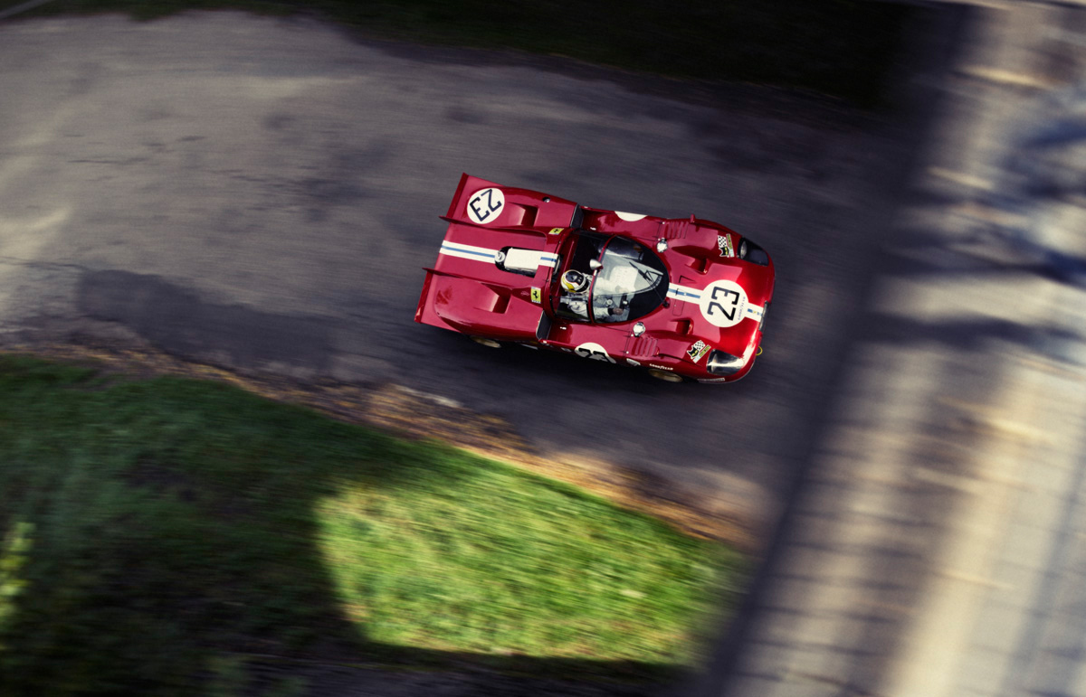
Ahhh, spring is here. So we head to the Continent for some of the best racing of the year. Its name has changed over the years, but the format has largely remained the same: fields of 40+ cars of varying classes (and relative speeds) going as fast as possible for irresponsible amounts of time on extremely long, dangerous tracks. Spa Francorchamps, the Nürburgring, Circuit de la Sarthe, Monza, all european locales known for high average speeds and hosting these prestigious 24 hour (or sometimes 1000km) events. After the jump is a collection of some of my favorite images from the late 50’s through the 1970’s, as well as a short video of the 1971 ADAC Nürburgring 1000km to give you a sense of the scope and speed of the old event. Continue reading →
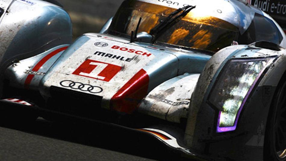
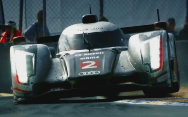
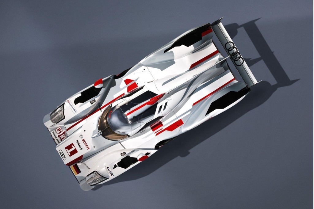
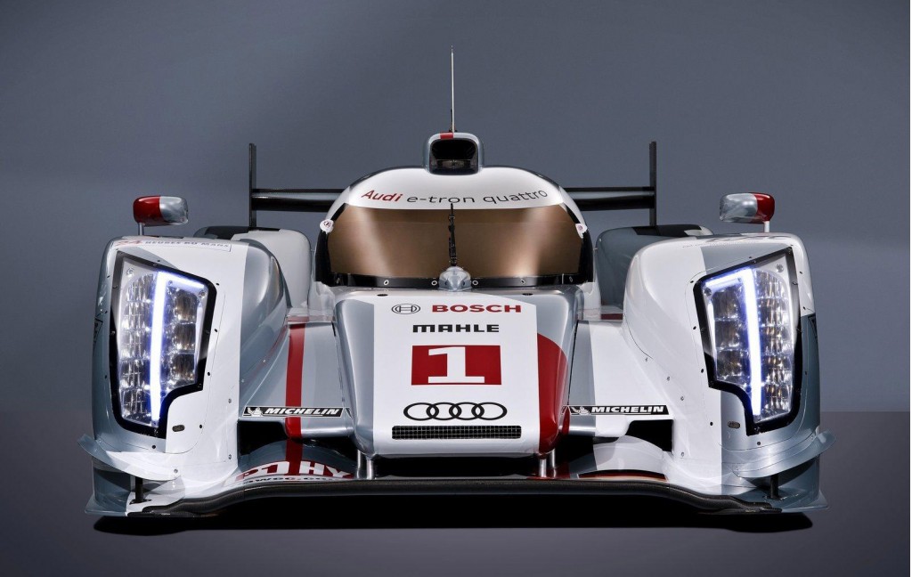
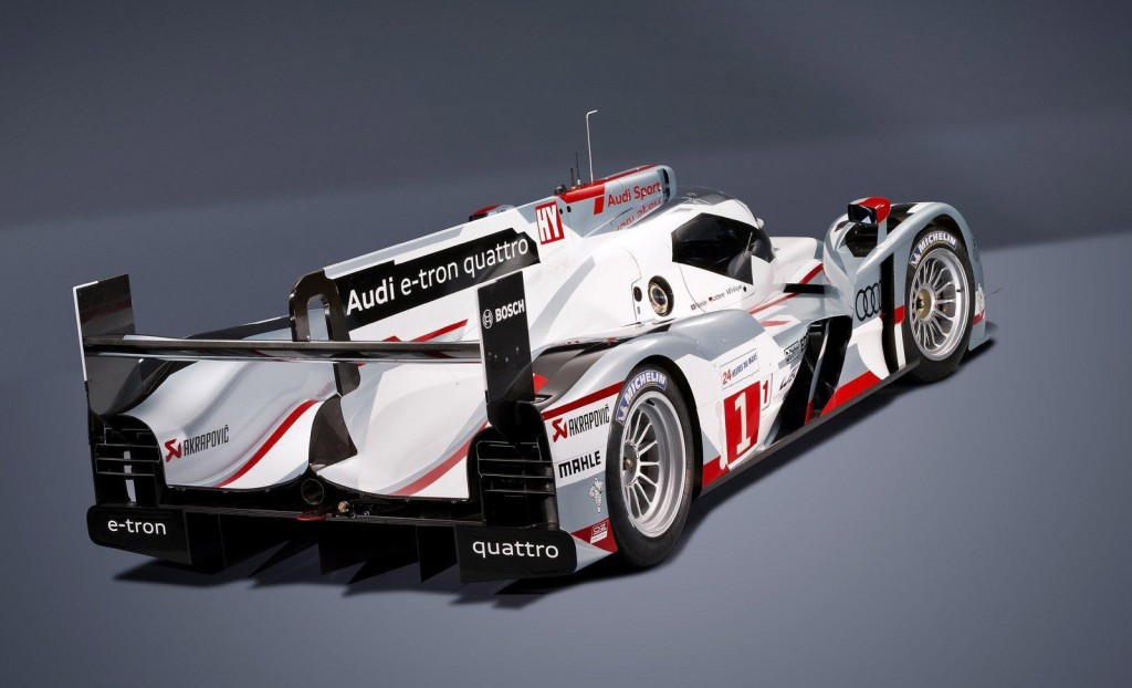
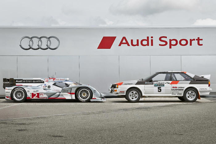
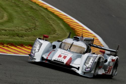
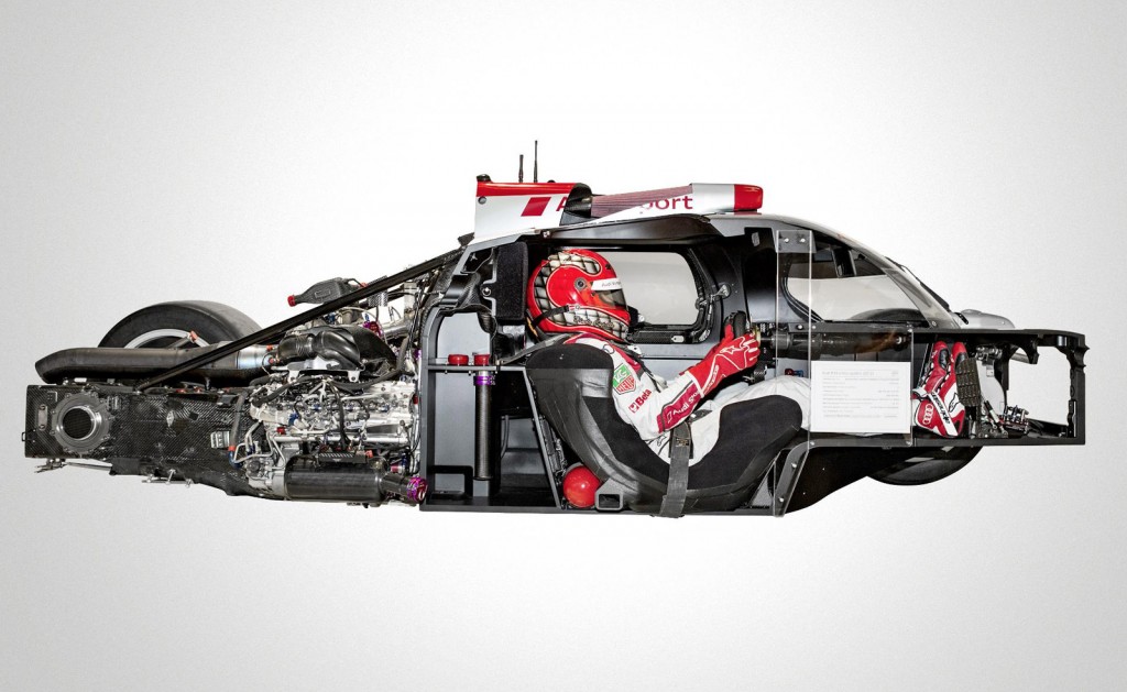
Some great shots of Audi’s R18 “E-Tron” Hybrid Le Mans Race Car. Terrible name aside, this thing looks insane. Here’s some footage of it taking corners at ridiculous speeds:
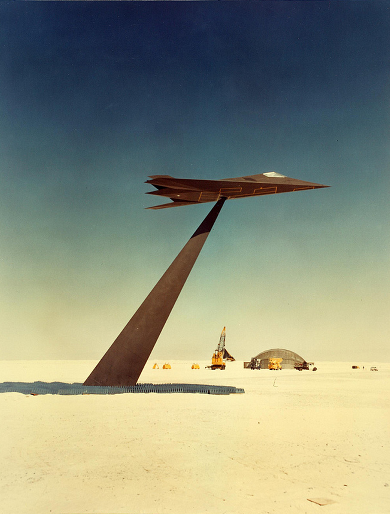
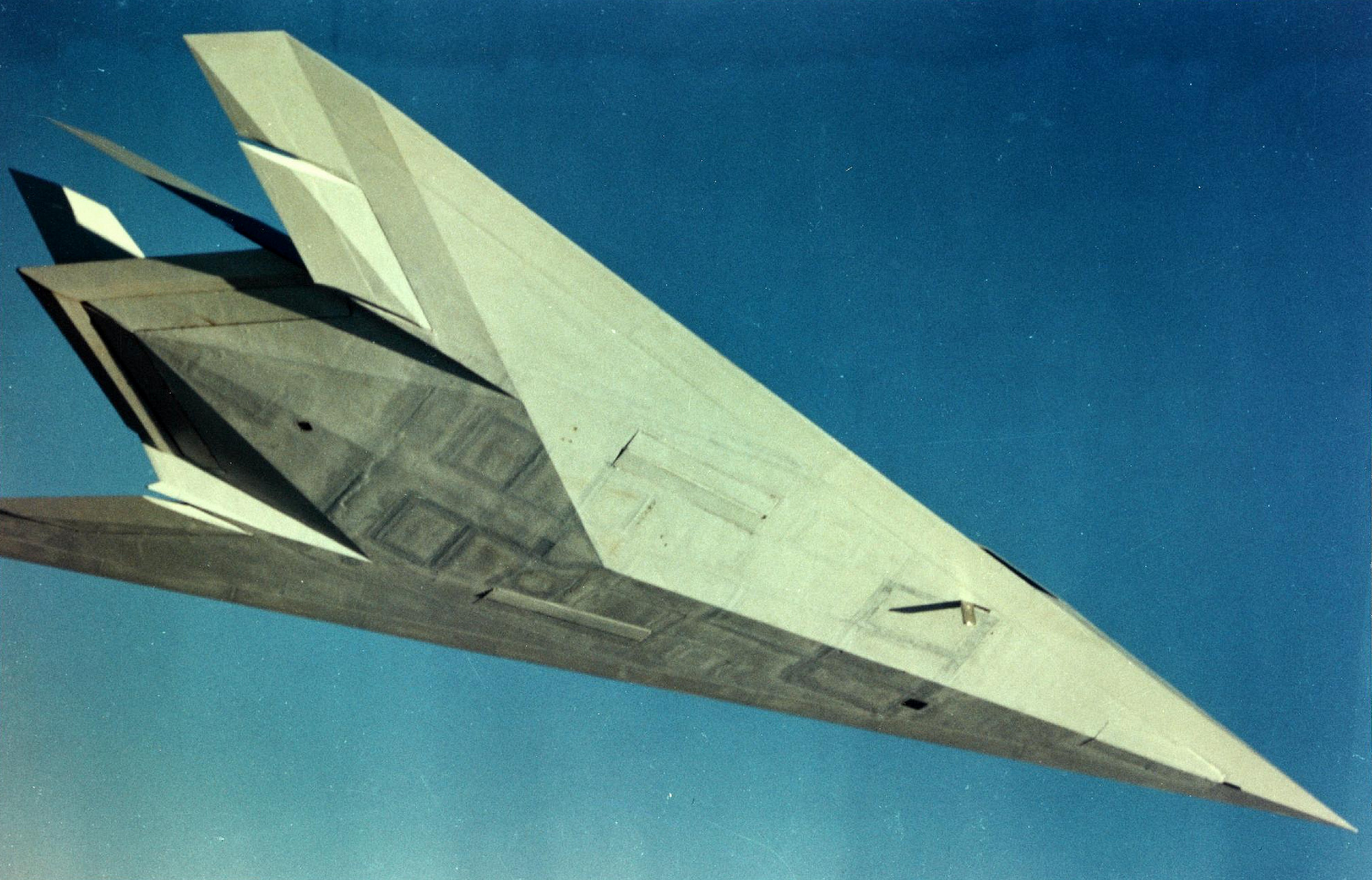
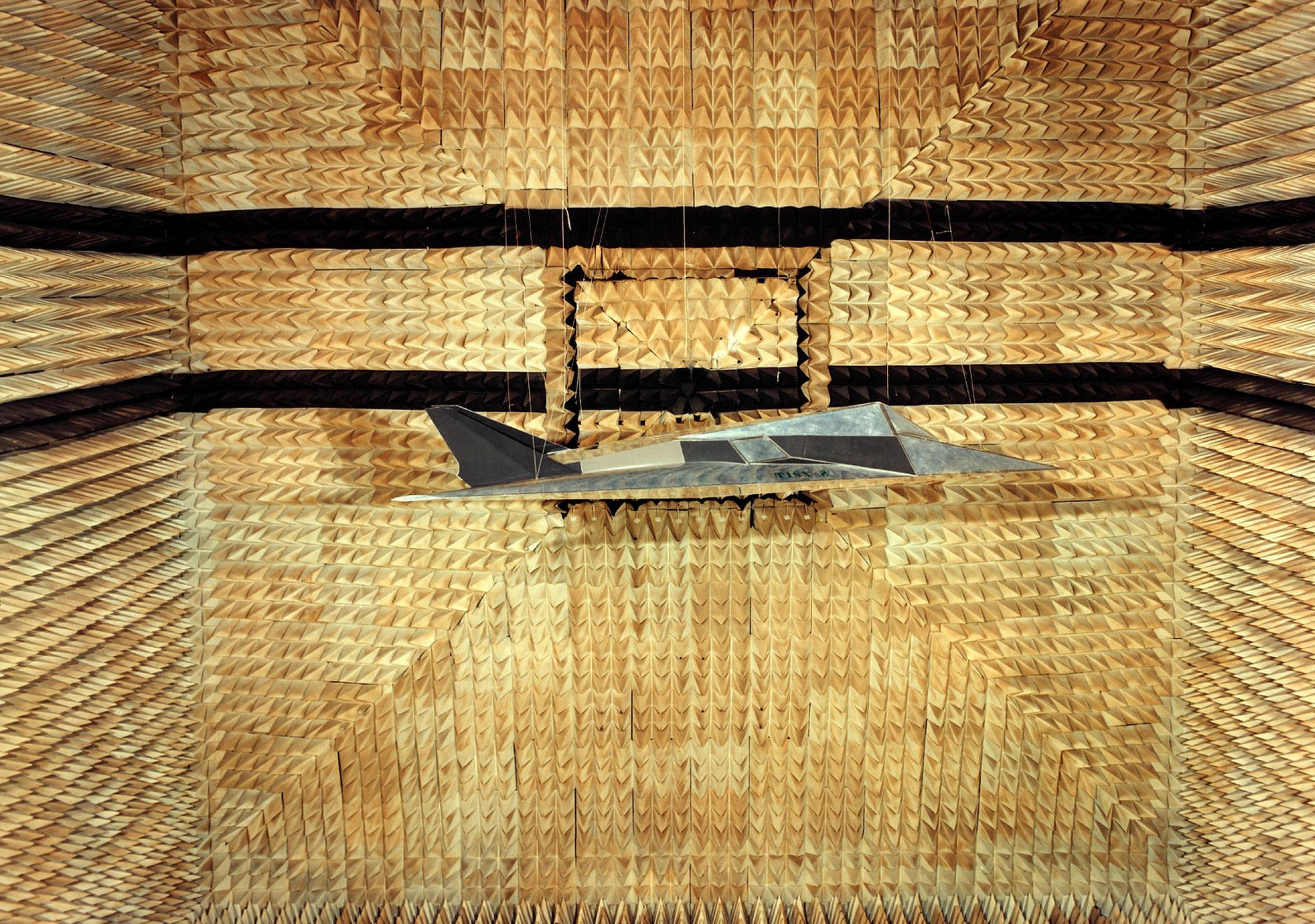
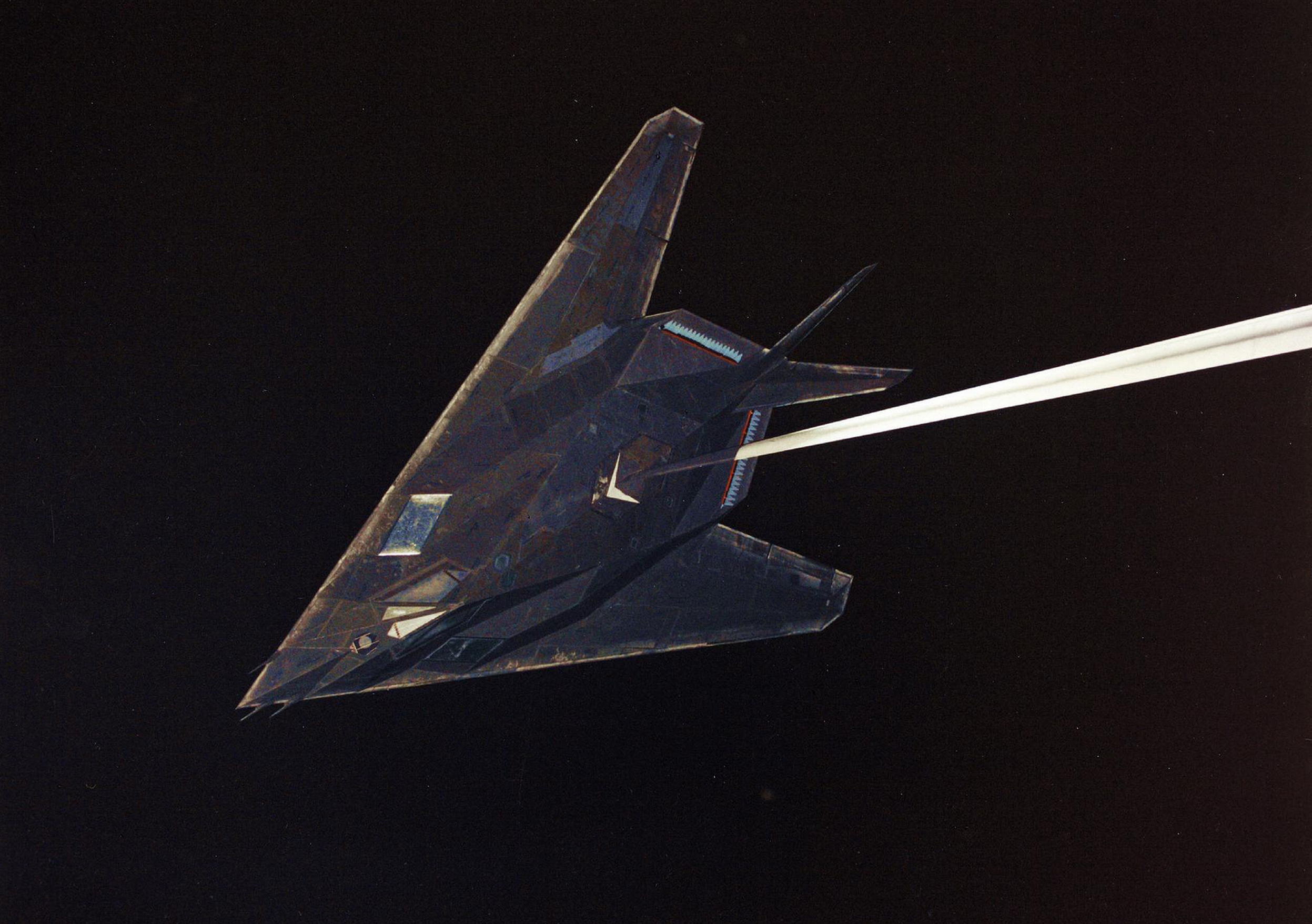
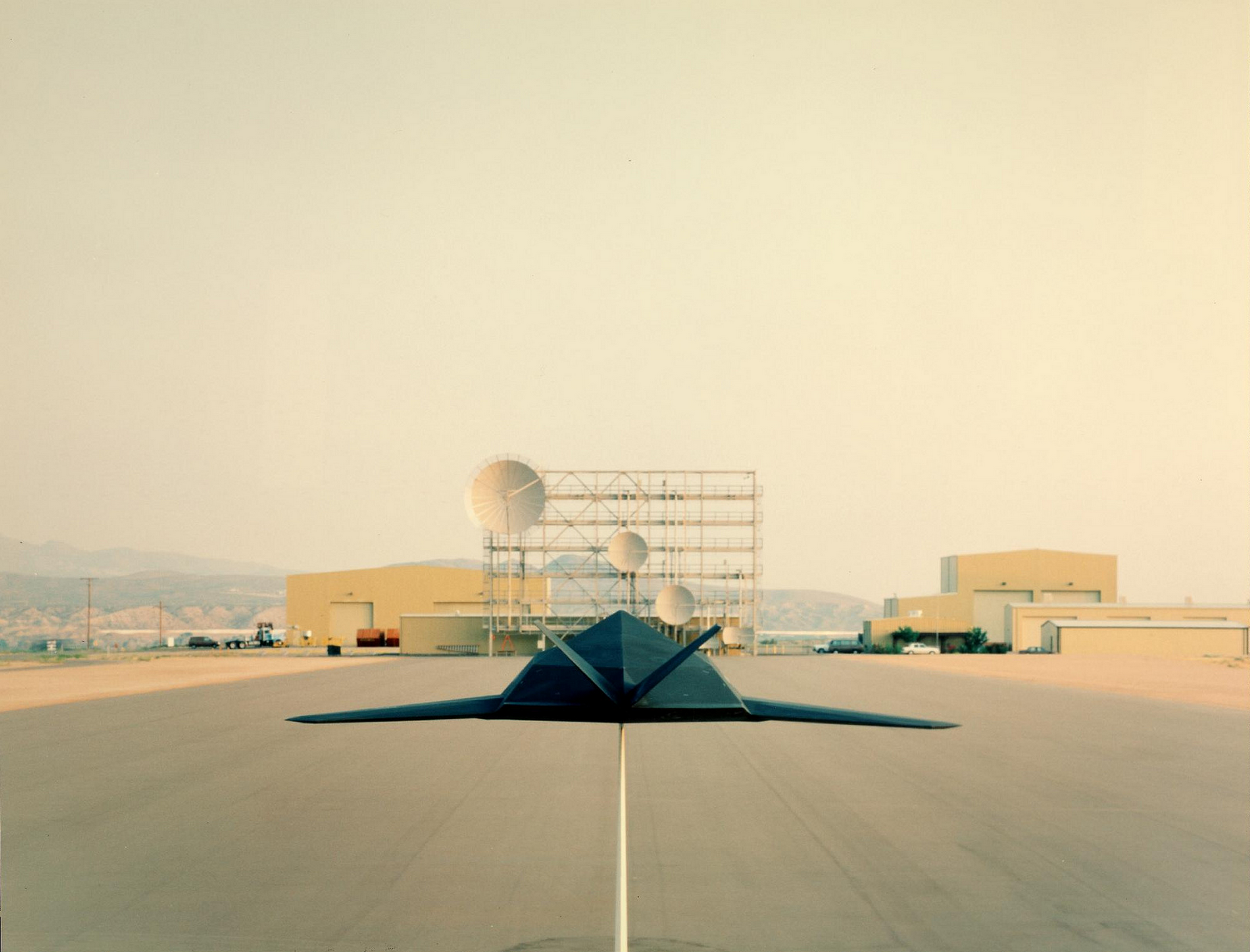
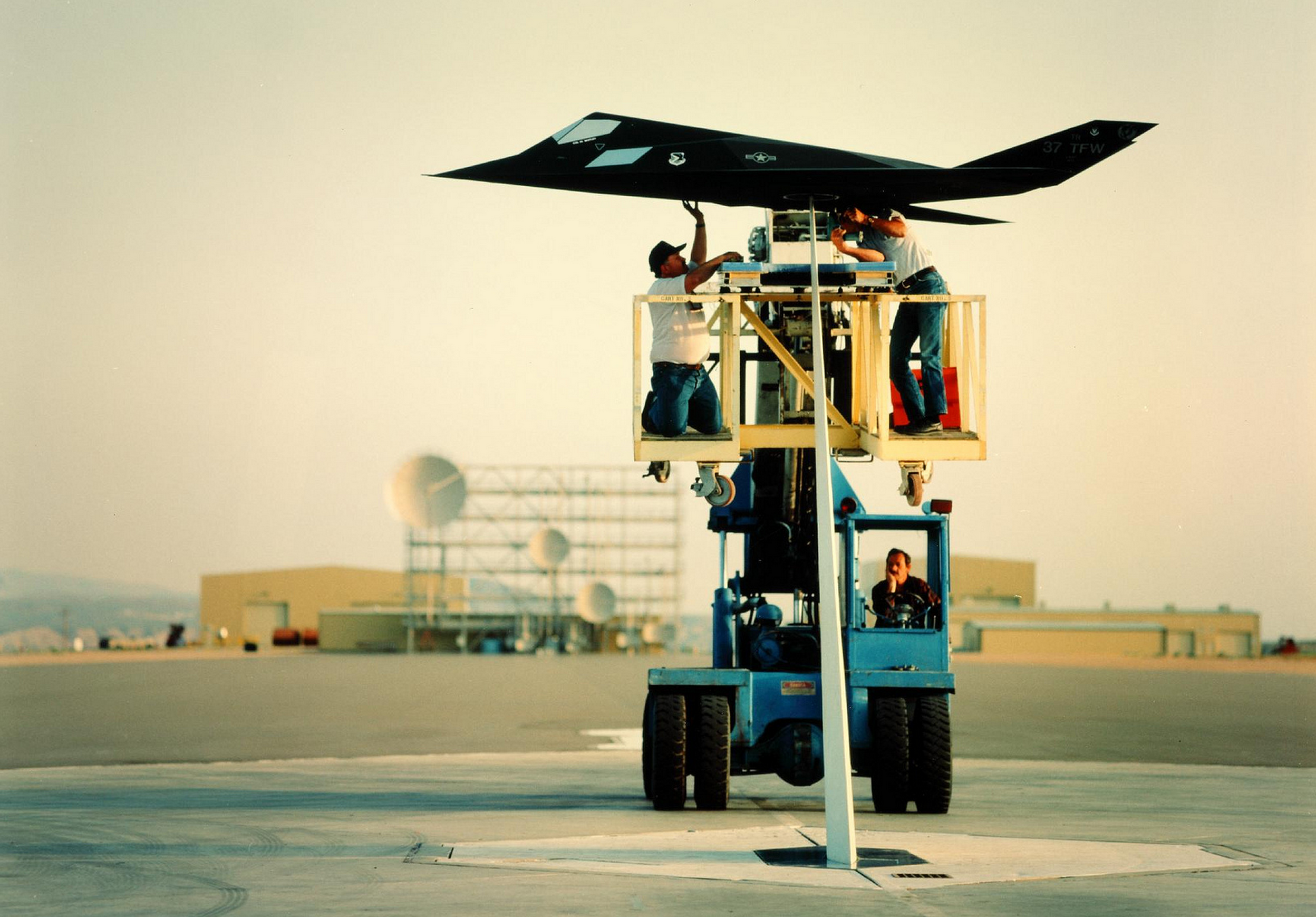
More goodness from the San Diego Air & Space Museum Archives on Flickr. These fantastically-yellowed photos, probably taken at the Skunkworks facility in Palmdale, CA in the 80’s, almost look like illustrations.
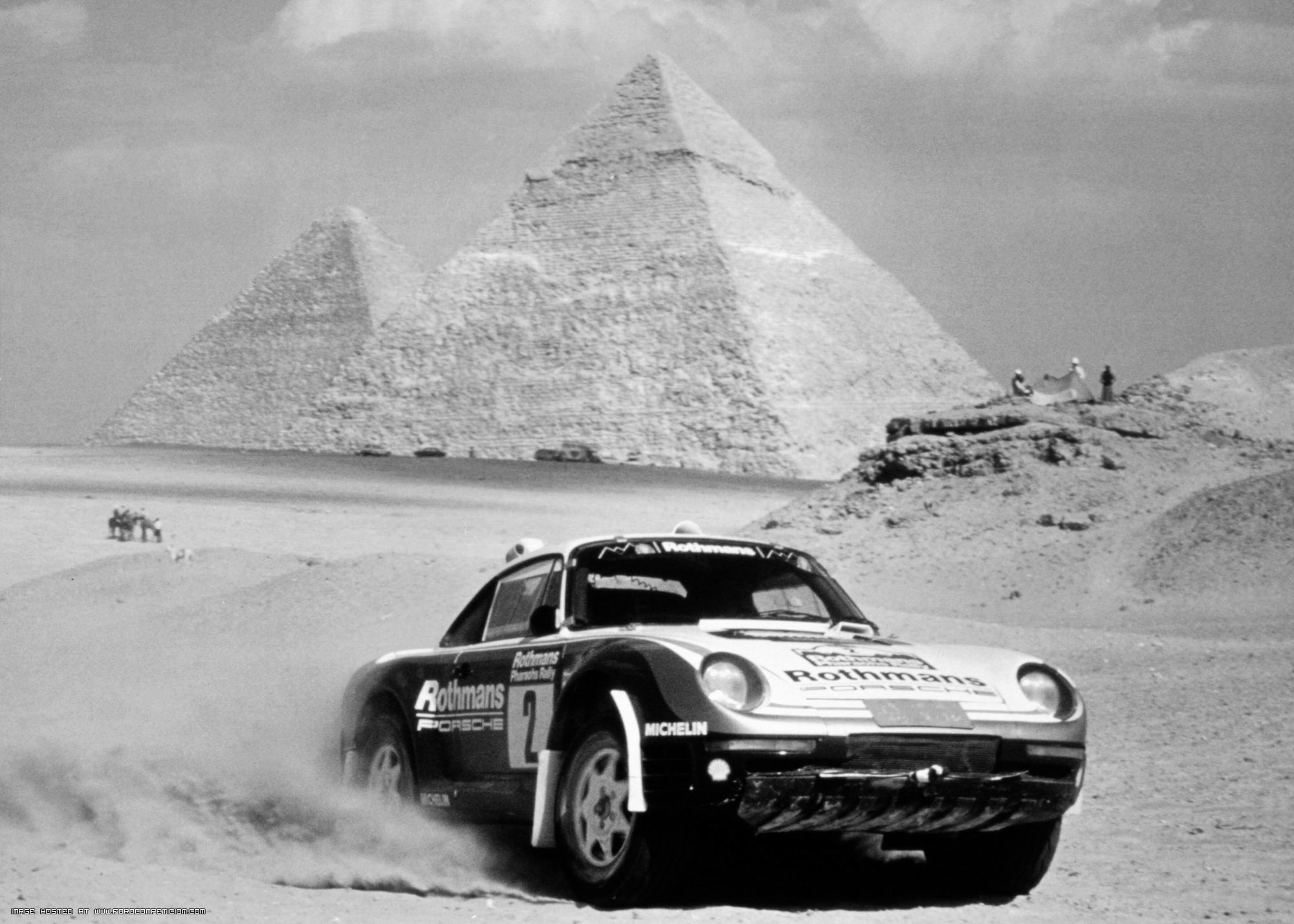
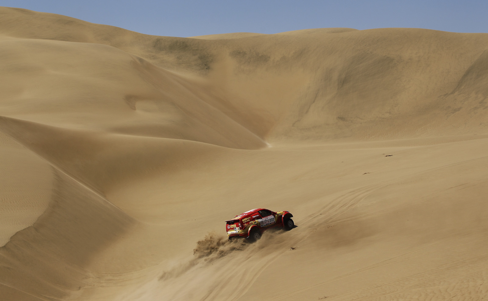
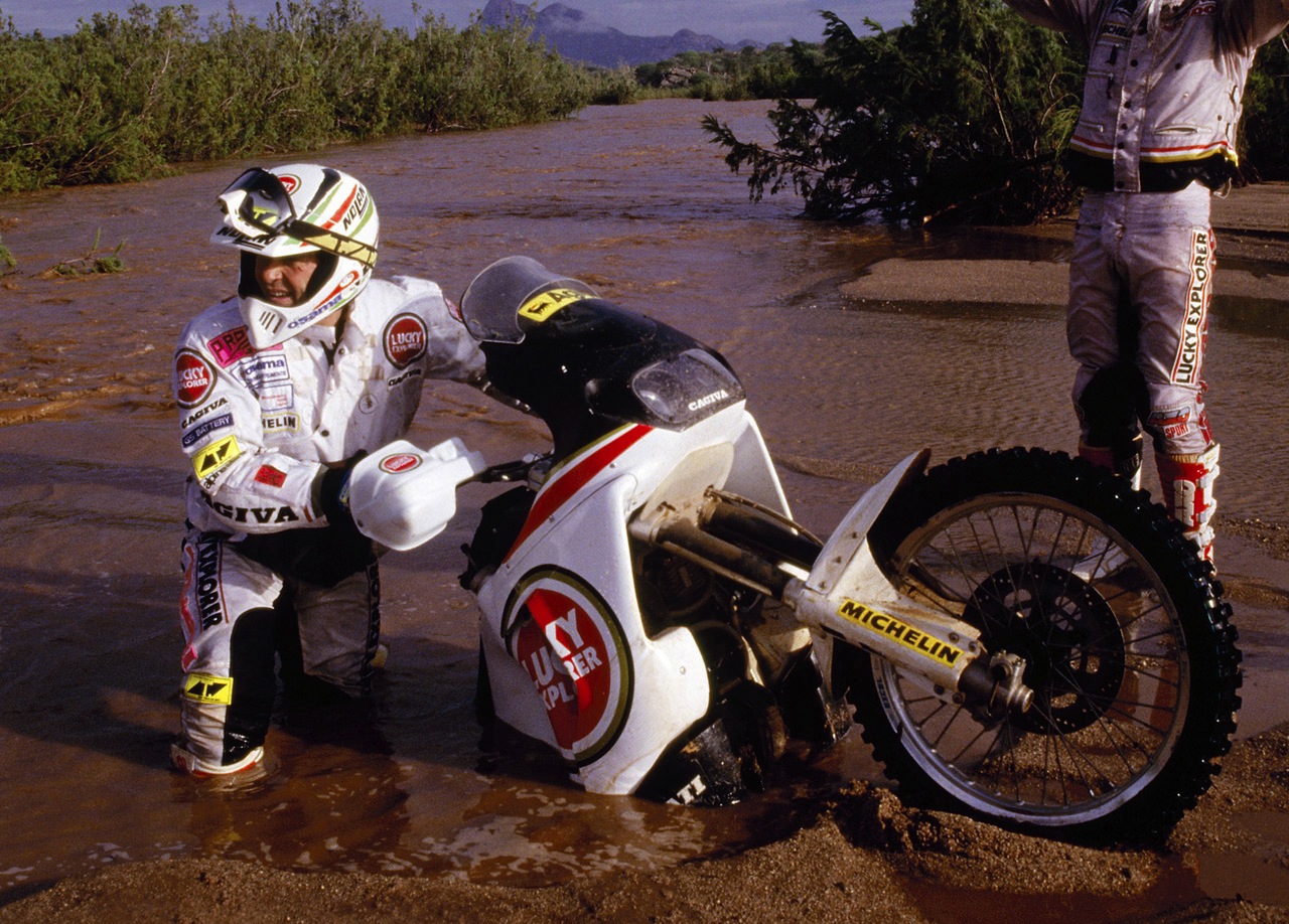
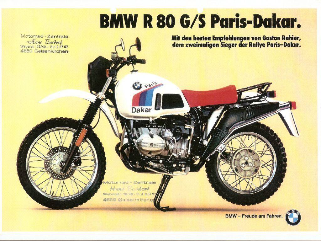
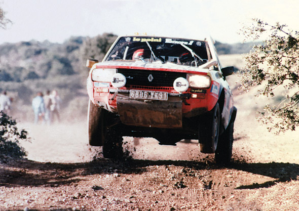
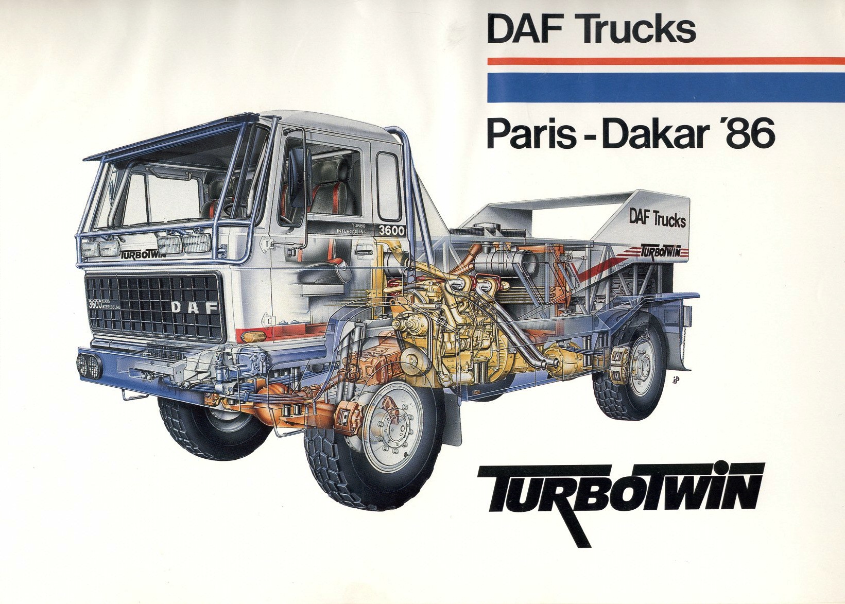
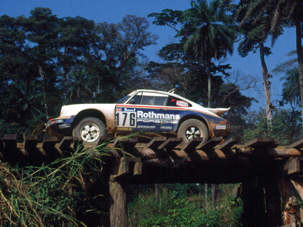
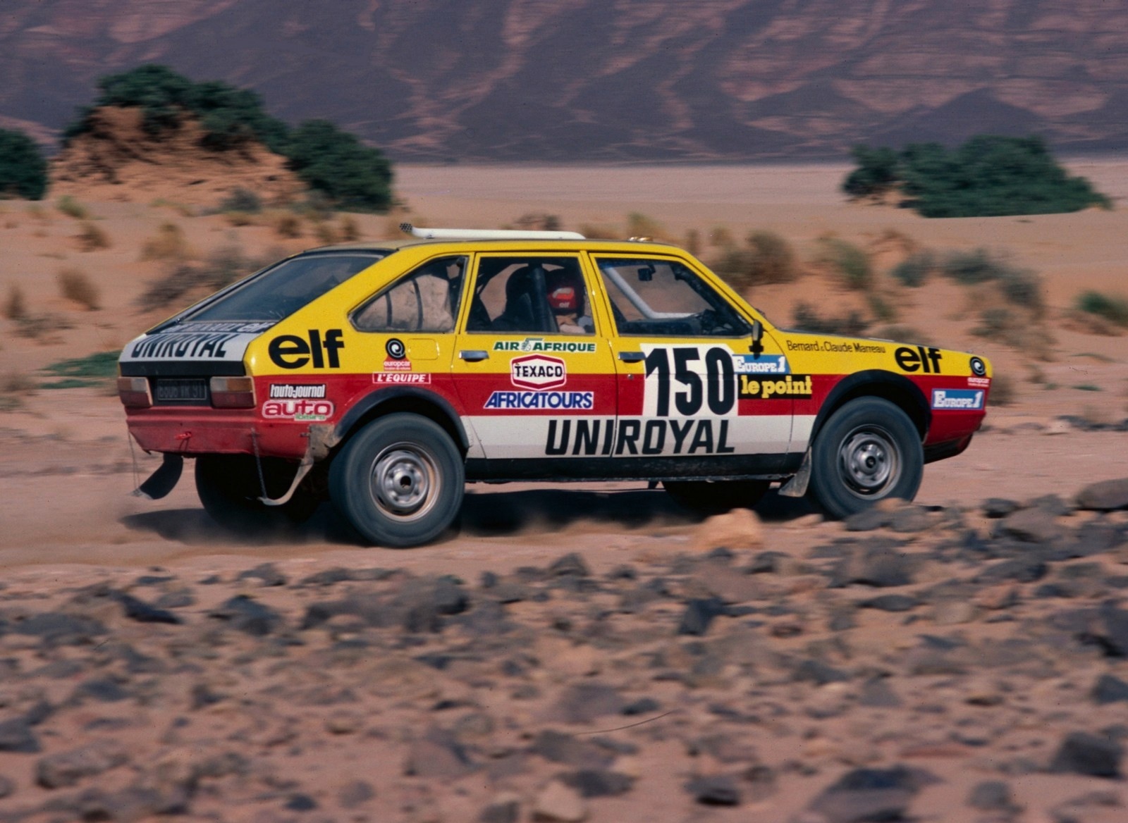
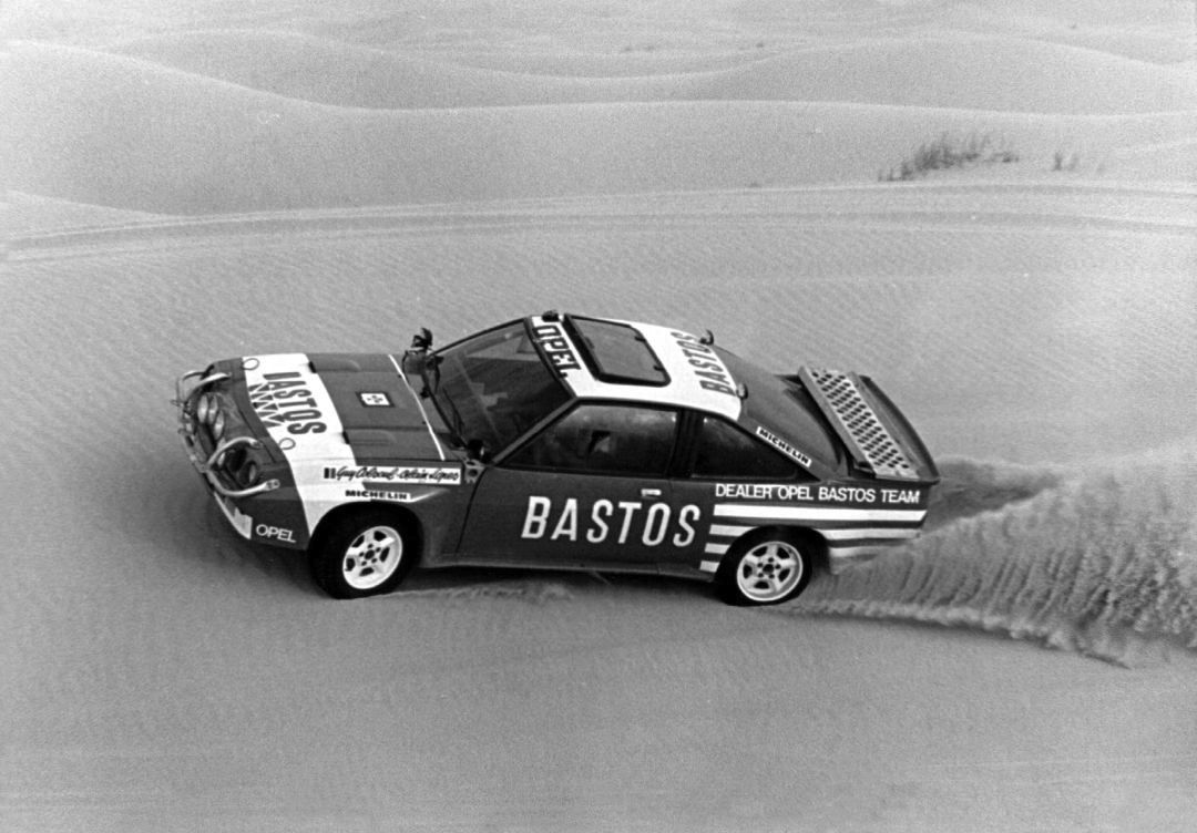
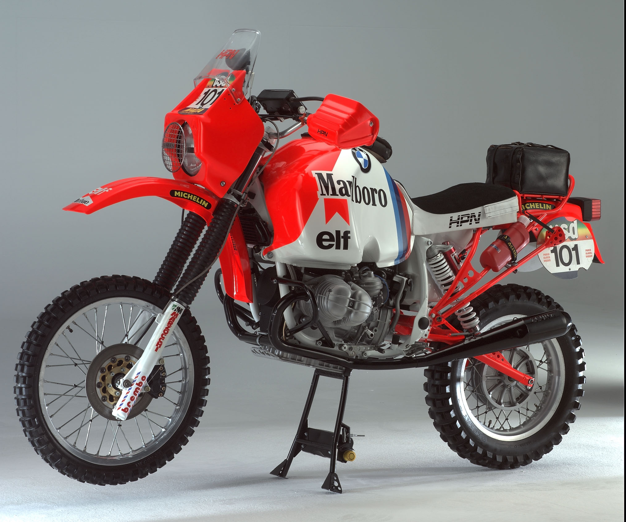
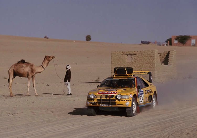
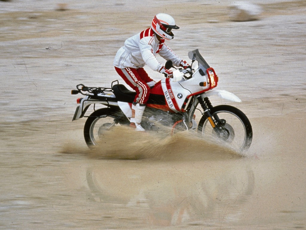
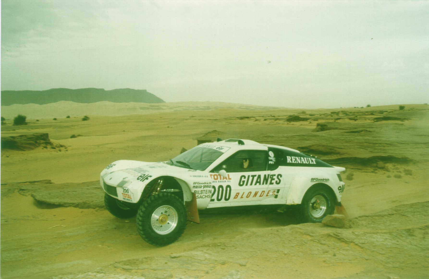
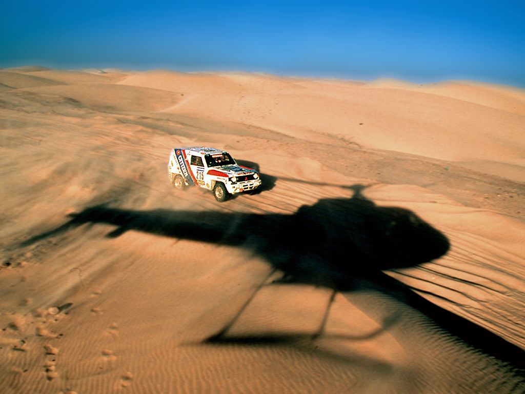
As busy as we are recording & preparing for the Tycho shows coming up, Dakar is celebrating it’s birthday this week and I didn’t want to miss out. Here is some great imagery captured in the 34 years since the rally raid’s inception.